UI redesign

Bug #648091 reported by moimael
38
This bug affects 8 people
Affects Status Importance Assigned to Milestone
OpenShot Video Editor
Fix Released
High
Unassigned

Bug Description

Hi,

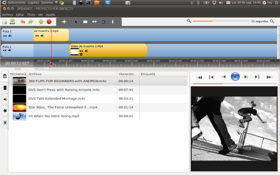
I think we should made a ui redesign for the next openshot major version (aka 1.3), so i asked Jan Hofmann, a german ui designer known for his evolution and rhythmbox elementary mockup to make us a mockup.

So here it is : http://dl.dropbox.com/u/155356/openshot.jpg

I found it very simple and beautiful, with a good use of the available space. Feel free to commant about it. (keep in mind that's just a first try, all suggestion are welcome)

We should also decide if this ui redesign, when approved, will be based on the upcoming gtk3 release (with openshot using pygobject, GtkApplication, gtk3, ...) or on the old legacy gtk2.

A new defaut theme has to be made (request by a lot of users), has to be more gnome friendly (so basically we should have at least 2 icons themes, one defaut higncolor theme and one for ubuntu, other distrib will follow) and fit with freedesktop recommendation (install icons system wide, ...).

This bug can be used to discuss all these suggestions.

Thanks. (and sorry for my english)

Tags: patch
Revision history for this message
moimael (moimael) wrote :
Revision history for this message
Andy Finch (fincha) wrote :

The downside to having effects & transitions in separate windows is the video preview window then becomes very small.

Revision history for this message
Jan Hofmann (elusive) wrote :

@andy you are able to make the effect and transition boxes smaller, so that there is only one culoumn! And btw. who did videoediting on a small monitor? ;)

Jan

Revision history for this message
moimael (moimael) wrote :

But if we implement the fullscreen on double click functionnality, or simply open a bigger preview window on double click. The problem is solved.

Anyway, i thunk we ahve to made a poll to see what our users think about this new UI ? Maybe we should get some good suggestion and comments ?

Revision history for this message
clay (gavin-clayshot) wrote :

Very nice. I would like to suggest that the play button is replaced by a combo play/pause button.

Matthew

Revision history for this message
Jonathan Thomas (jonoomph) wrote :

Jan,
Thanks for taking the time to work on this mock-up! We all want to make OpenShot as pretty and usable as possible. My initial feelings on this mock-up are mixed though. I really like the changes to the timeline (bottom of the screen), especially the dark ruler and stylish transition. I am not crazy about the transitions and effects boxes always visible, or the lack of a menu bar at the top.

One of the things that sets OpenShot apart from all other video editors on Linux is the non-intimidating look of the interface. It has very few things to interact with by default, and users have really responded positively. The biggest negative we hear is the icon themes clash with their Gnome themes, and the timeline is too shiny blue (also clashing).

So, this mock-up addresses the biggest complaints and gives us some new ideas about how the layout "could" look.

Another thought I had after seeing this mock-up was about the way we build this screen behind the scenes. It would be cool if a theme (or some preferences) could affect where each panel is attached. Maybe the user could quickly change a few preferences and have a screen very similar to this mock-up, with some panels always visible, no menu bar, etc... This is an interesting idea, and one that would allow power users to really configure their screen, while new users could just live with the super simple default layout. Just a thought. =)

Thanks!
-Jonathan

Revision history for this message
clay (gavin-clayshot) wrote :

Something like this perhaps?

http://dl.dropbox.com/u/10440533/openshotcombo.jpg

Matthew

Revision history for this message
moimael (moimael) wrote :

@clay : The play/pause button is now a bug. It should chnage his icon from play to pause when you click on it, it will be fixed soon, i hope.

@Jonathan :

Yeah i totaly agree, the mockup's ruller theme is awesome :D
Making openshot more flexible and configurable is a good idea. Providing some presets for the layout, for example one for new users and one for power user would be great (i would really like to have some way to make openshot like this mockup, using preferences would be great too).

But maybe we can take some other idea from this mokup like the no-border thing.

Revision history for this message
Andy Finch (fincha) wrote :

Jan - Me! Seriously though, we do find a number of users using netbooks, so small screen size is something we need to think about. But maybe moimaels & Jonathan's suggestions find a way around that...

If we do make the effects/transition panels visible by a preference or theme setting then we should also add a menu item on the clip right click menu to allow adding of effects/transitions, for when the panels would be hidden (maybe we should do that anyway, to save switching between tabs).

Revision history for this message
Andy Finch (fincha) wrote :

@clay - I think the only reason we don't currently switch between play/pause icons is due to redrawing issues, there's already a bug logged for that so I'm sure we'll try again soon.

Revision history for this message
Jan Hofmann (elusive) wrote :

I did a second mockup: http://dl.dropbox.com/u/155356/openshot2.jpg

I added a option to hide the transition and effect panes.

Revision history for this message
Jan Hofmann (elusive) wrote :

updated the second mockup, to show, how compact it could be.

Revision history for this message
Jan Hofmann (elusive) wrote :

updated the first mockup, added the show effects and show transition buttons

Revision history for this message
Joop Mevissen (jm) wrote :

Looks great, I like it! But personally I would leave the transition and effects to the left pane. And instead, I would replace the 'Show effects' and 'Show transistions' buttons with one option: Show clip properties. That way you can easily adjust the clip properties directly next to the preview window.

Revision history for this message
Jan Hofmann (elusive) wrote :

@Joop But what about people with big screens? Why not showing them all panes at the same time instead of tabs? Maybe both ways could be implemented: Tabs and/or three panes, configurable by the user.

A show clip properties buttons seems pretty usefull..

Revision history for this message
benjy.a (benjy-a) wrote :

On the first view it looks very nice and profesionel, but:

why are the boxes in the timeline desinged with rounded corners? I would prefer normal corners, because the you can work more exactly.

In the preview window i miss the "time" - could you add this?

Thanks for your work

Revision history for this message
clay (gavin-clayshot) wrote :

@moimael
@Andy Finch
I see the current bug/redrawing issue. What I meant was very simply having just the one play.png icon in the theme folder that had the one play and pause symbol on it. This would bypass the bug and make two icons (stop and pause) redundant. A very simple if temporary solution.

Revision history for this message
clay (gavin-clayshot) wrote :

My words are probably more suitable for the general forum but here is a screen shot of my set-up.
If any can tell me how to change the 'play' pop-up help to say 'play/pause' I would be grateful.

http://dl.dropbox.com/u/10440533/ModPlayPauseBut.jpg

Revision history for this message
Olivier Girard (eolinwen) wrote :

I'm late like always!!!!

First impression i was disappointed by this mockup .After, i found it modern and professional but like Andy, it is not everybody who use some "big " screens and a lot of people use it in a netbook. And i m not sure that everybody/every-user will like it.
Jonathan have launched an interesting idea i.e le fact to have the both : a Ui near of what we have actually, more modern and the possibility to expand for the experts users.

A new theme will be a good thing and why not a poll for having the opinion of our community. good idea.

On another side, i think there is a lot of things to do/include before this like the Audio who is your weakness.

Beautiful second mockup who being worth thinking about.

We have the time, remember you that Openshot is a young project (only two years ago).

Revision history for this message
Jan Hofmann (elusive) wrote :

First of all, i still don't get it, how you can do video editing on a netbook, but, that's none of my business ;)

I updated the mockups to get something that all of you is fine with!

 It seems that we need to have two different interfaces:
One for big screens, where you can have all thinks open, like the first mockup and one for small screens, like the second. I updated both and added a "tab" button beside the effects and transitions buttons to go back to the roots and show the tabs.

So now you have the choice what you want to see. In my opinion the unused space on the right side of the menubar is a good place for those three buttons.

Furthermore I added a timecode to the preview video and cut off the rounded borders for the clips in the timeline like suggest by benjy.a

So here they are:

First mockup (change in video and timeline like mentioned above, added tab button):
http://dl.dropbox.com/u/155356/openshot.jpg

Second mockup (shows tabs,change in video and timeline like mentioned above, added tab button)
http://dl.dropbox.com/u/155356/openshot2.jpg

What do you think?

Revision history for this message
benjy.a (benjy-a) wrote :

thanks for trying out my ideas:

i really like the timeline-boxes with the cut off rounded borders. so it looks more exactly, or i could work more exactly in this way.
But for people, who only want to have a nice surface, nice but not practical, the rounded boxes would make more sense.

i also like the timecode. but maybe it would be possible, that each user can decide, if he'd like to see it or not ->
if you could program a button in the options of openshot?

i would suggest two do two interfaces:
a professinal one: which sgot more information (like timecode) and angeled corners (one which looks more like adobe premiere)
a "nice" one for amateur film cutters: with rounded boxes and no timecode.

I don't know what the plans of Openshot are for the further future - will it get a semi-professionell programm for movie cutting (maybe like cinelerra)or will the development stops, as soon as, everything works?

Revision history for this message
Olivier Girard (eolinwen) wrote :

I want to precise that the main part of the OpenshotUsers are some amateurs and not professionals. And i know a lot of people who use it on Netbooks and some of this people are experts in Video on Linux. It is the reason for which Andy and Me have thought at this persons.

More and More interesting.

I have a question. I develop (and not only me ) severals features which will be only access in a section of the menu. How can you have an access if the main menu have disappeared ? What do you thing about that ? Have you a solution ?

Revision history for this message
Jan Hofmann (elusive) wrote :

@cenwen I'm, not against the menubar in general, but actually it isn't necessary to have it. All menutiems can be presented as buttons on the buttonbar. If this will change in the future, the menubar will be glad to come back :)

But, if it is possible to make a single button for that, i would prefer this. (depends on how many buttons there will be, will there be to many, a menuebar would be the better solution then...)

Revision history for this message
Olivier Girard (eolinwen) wrote :

me also but i said just that we can not pass all in the menubuttons. Do you see what i want to go to ? ie to tell ?

Revision history for this message
Joop Mevissen (jm) wrote :

Jan, I really like your mock-ups although I don't like the timecode in the preview window in your latest examples, it's making the preview window even smaller than it already is.

Just a thought: maybe it's an idea to move the video controls to the toolbar above the timeline. The zoomslider can go at a bottombar, wich also can hold some more information of the project currently working on. That way you have 3 main bars: at the top, in the middle an at the bottom (I don't know if it's possible or not, I'am not a programmer nor a UI designer).

Revision history for this message
fossfreedom (fossfreedom) wrote :

Hi there,
  my thoughts for what's it is worth.

When I'm editing videos, the two primary focus areas are the preview window and the time line. They must be front and central to any UI - that is why I like openshot so much. In the mockup - the play-rewind buttons etc take too much space - they should be all on one line. The icons are not central to the design and should be fairly small, but still obvious and displayed.

I think there should be three tabs to replace the current "file" section in the mockup - first tab called "Import" (default). The second called "Edit" and the third called "Make Movie" - i.e. you import clips, you edit the clips and finally you make the movie.

The "import" window should show all files to be displayed - there should be two views to this - one displaying the standard file - length -size etc as it does now. The second view should show the "scenes" within the chosen file. i.e. I personally like seeing scenes which I drag and drop rather than just whole files which I have to manually split.

The edit tab displays buttons to the left-hand side as a button bar - icon for "transition" (default), second "effect", third "audio" etc. Therefore the initial display should show all the possible "transitions" possible as icons.
Therefore you can drag and drop transitions easily. Applying effects is just by clicking the button bar "effect" icon. The section updates with all the "effects" icons.

All transitions and effects should display a text popup when hovering over it. The preview window should show the effect in action - ideally using the current video. e.g. hovering over a "fade-to-the-right" icon should preview the current video frame and then fade to black.

Revision history for this message
robert mccormick (nixnine) wrote :

I would suggest moving the top two toolbars. I noticed that Jan's layout only has one row dedicated to this. Is this an option? I would place the toolbars vertically at the left hand edge or maybe place the buttons just above the timeline, with the rest. I spend my time at the timeline and find it time consuming to have to keep bouncing up to the top toolbar to save, make a title, or export the video. It's different, but if I could lay mine out, I would do it like that.

Revision history for this message
ammonkey (am-monkeyd) wrote :

@Jan Hofmann i really like the mockups. I like the idea to get openshot stacking in tabs for small screen and if the window is large enought making panes. Sweet!

Revision history for this message
moimael (moimael) wrote :

I was thinking of replacing the white background behind tracks by something like dark gray, i guess the contrast will be better no ?

And after playing with the zoom i really think the timeline should always take all the size of the canvas.

Revision history for this message
Jonathan Thomas (jonoomph) wrote :
Revision history for this message
benjy.a (benjy-a) wrote :

@Jonathan Thomas

This one is really looking good. Only the rounded boxes in the timeline i don't like.

Revision history for this message
clay (gavin-clayshot) wrote :

openshot_redesign_by_ray_tm-d2zvary.png

Am I looking at the correct link?
Please no not this!!!!

But there again we live in a free world.
I will save this picture for next April 1st :-)

Revision history for this message
Olivier Girard (eolinwen) wrote :

I was not very hot for this (and i am not always very hot because i am thinking that there is a lot of things to do before this, specially the audio who is our weakness) but the vision/work of Jan Hofmann is very interesting. And i must same said that ..................like it. It provides us a feel of modern and same a bit professional. And i like specially the preview who is in the middle of the first part.
For the second, she,it is simple i don't like it. But i like the idea of the toolbar who is on the left for us at right at the "Jashaka". It can provides us the average to add some additional features who can modified a part of the appearance.

Revision history for this message
Joop Mevissen (jm) wrote :

I also vote for Jan Hoffmann's mock-ups because they look more consistent and has a better lay-out. In the screen-shot of Jonathan I count no less then 4 (four!) different icon-sets and as a result it looks very cluttered. Also, you have to move clips upwards to the time-line which feels a bit unnatural.

Revision history for this message
Olivier Girard (eolinwen) wrote :

Totaly agree with you, we feel in the Jan Hoffmann's mock-ups a professional touch that i don't think to have in the second. Sorry for this personn but it is what i'm thinking.

Revision history for this message
moimael (moimael) wrote :

A first alpha of the tracks theme presented on the mockup.

Made in a few minutes but looks good. Just a few details to modify in order to have the same as the mockup.

Revision history for this message
moimael (moimael) wrote :

Here is a second preview of the new theme, feel free to test it and report bugs or enhancements.

I attached a screenshot for those who dont want to test it.

Revision history for this message
moimael (moimael) wrote :

Here is a patch, i modified a little the theme engine in order to have the possibility to change the ruler position, so i tweaked all the themes to reflect this change. The patch contain the new theme wich is close to the mockup and the small theme engine improvement.

I'll make a second patch to use gtk stock icon for the player.

Revision history for this message
moimael (moimael) wrote :
Revision history for this message
moimael (moimael) wrote :
Revision history for this message
moimael (moimael) wrote :
Revision history for this message
moimael (moimael) wrote :

Here is the patch for stock buttons, need to be a little improved but seems nice ;)

Revision history for this message
moimael (moimael) wrote :

I made the transitions tab look more like the mockup with a iconview instead of a treeview. It's better because it looks more user friendly, and adapt itself to better use the allowed space.

A screenshot is attached.

Revision history for this message
moimael (moimael) wrote :
Revision history for this message
moimael (moimael) wrote :
moimael (moimael)
Changed in openshot:
milestone: none → 1.3.0
Revision history for this message
Fredrik Ekelund (leopld) wrote :

This might be somewhat conflicting with not intimidating with the UI, but placing the play etc.-buttons over the video and having them fade upon moving the mouse over and out of the video window and pressing <space> would perhaps clean up the interface and save space.
I think the time ruler should be placed under the video still, but it's a suggestion to move the buttons to overlay the video window.

Revision history for this message
moimael (moimael) wrote :

@Jan Hofmann : Just a concern regarding your mockups :

- Effetcs and transitions presentation is beautiful, but the names aren't showed, so the filter box can't be used.

And i think we should remove the openshot logo on effect images.When my father tested openshot, he found that disturbing (he though it was a play button)

Revision history for this message
Jonathan Thomas (jonoomph) wrote :

Mael,
Your transitions patch does not contain the IcvTransitions class. The patch gives me the following error:
ImportError: cannot import name IcvTransitions. Thanks!

Revision history for this message
Jonathan Thomas (jonoomph) wrote :

Mael,
I have merged in your "stock buttons" patch. I added a new preference to toggle between "Stock Icons" and "Theme Icons". Also, in the few cases where a stock icon does not exist, I am using the "Elementary" theme icons, which look more normal than most of the other theme icons. Thanks!

Revision history for this message
Jonathan Thomas (jonoomph) wrote :

Mael,
I just added the new "Fresh" theme, and set it as the default theme, for the time being. I would like to have a poll to determine the new default theme of OpenShot before we decide, but for now, I really like this one. =) I also applied the patch to the theme engine, so the timeline ruler position is correct. I only made 1 small change to your theme, to keep text from falling off of small clips. Thanks!

Changed in openshot:
status: Confirmed → In Progress
Revision history for this message
moimael (moimael) wrote :

Fixed version of transition patch (i forgot to add a file)

Revision history for this message
Jonathan Thomas (jonoomph) wrote :

Mael,
I am still having trouble with the transitions patch. It doesn't merge cleanly on the MainGTK.py.

On a different note, I have made a few subtle changes to the clip theme images, including the size of the "visible" and "mute" buttons, and the border color around the clip rectangle. I am trying to balance it, so the speaker button was not as "loud"... so to speak, and it's easier to see where one clip ends and the next one starts (i.e. darker border color).

Overall, I really love the new theme. Each release we can continue to refine, add additional views and options, etc... I am going to mark this bug completed as soon as I get the transitions patch merged. Thanks!

Revision history for this message
moimael (moimael) wrote :

Here is the new rebased transitionpatch ;)

To be consistent, i think we should apply the icon view to the effects tab too. I'll work on it as soon as the transition patch is merged.

Revision history for this message
Jonathan Thomas (jonoomph) wrote :

Mael,
The transitions patch has been committed, as well as the other 8 patches you sent me via email. I really appreciate all the help! I agree with you that the "Effects" tab needs the same treatment with an IconView instead of TreeView.

One more thing... I would love to add the search box and toggle buttons to the "transitions tab" as well. Not sure exactly what options would work best on those toggle buttons, but definitely a search box would be nice. Probably the same for the "Project Files" tab. Basically, the idea is to help users more quickly find a "file", "transition", or "effect". I guess the trick is to not let the GUI get ugly and cluttered with buttons and search boxes...

I suppose we can always have an option, "Enable Searching" (or something similar), which would enable all the search boxes for users who really need them. Something to think about. =)

Revision history for this message
Joop Mevissen (jm) wrote :

Nice work on the theme and UI, looks great!

I also made a mock-up, just to see how it would look with a bottom bar. As you can see I moved the zoom slider there and it can hold some other usefull information. To compensate the loss of vertical space with the use of a bottom bar, I moved the play-buttons to the edit toolbar. Or, if you can't move the play-buttons, it can be an option in the View menu (Bottom bar on/off). What do you think?

Revision history for this message
Jonathan Thomas (jonoomph) wrote :

Joop,
I took a few of your ideas, and modified the "Fresh" theme. The effect icon is now a "star" and in-line with the other 2 icons. I moved the "Previous Marker" and "Next Marker" toolbar buttons to the bottom toolbar (which I think is much less confusing).

Thanks!
-Jonathan

Revision history for this message
Joop Mevissen (jm) wrote :

@ Jonathan: Nice! Btw, attached are the clip icons of the mock-up, feel free to use them if you like them. Actually, the theme in the mock-up is something I'm still working on, but I don't have that much time so it's work in progress :)

Revision history for this message
Jonathan Thomas (jonoomph) wrote :

Thanks for all the help with the new theme and many related UI enhancements! This has really improved OpenShot for version 1.3.0. I think we done changing the UI for this release, so I'm marking this bug report as Fix Committed.

Changed in openshot:
assignee: moimael (moimael) → nobody
status: In Progress → Fix Committed
moimael (moimael)
Changed in openshot:
status: Fix Committed → Fix Released
tags: added: patch
To post a comment you must log in.
This report contains Public information  
Everyone can see this information.

Other bug subscribers

Remote bug watches

Bug watches keep track of this bug in other bug trackers.