Notifications should show up closer to top right

Bug #438536 reported by Patrick
842
This bug affects 191 people
Affects Status Importance Assigned to Milestone
Ayatana Design
Opinion
Undecided
Christian Giordano
One Hundred Papercuts
Opinion
Low
Unassigned
notify-osd (Ubuntu)
Opinion
Wishlist
Mirco Müller
Nominated for Jaunty by Mohammad Alhobayyeb
Nominated for Karmic by Mohammad Alhobayyeb

Bug Description

Binary package hint: notify-osd

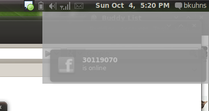
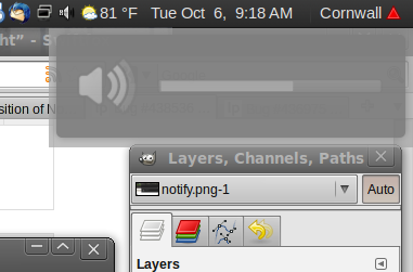
Currently the notify-osd notifications allot space for the volume control/brightness semi-notifications; this is rather jarring when the volume/brightness isn't being adjusted, unlike in Jaunty where application notifications default to above the volume/brightness.
-------------
Latest specs in the wiki for *Lucid* , https://wiki.ubuntu.com/NotifyOSD#Work%20for%20Lucid:

Change in position: The top of any notification bubble should be positioned near the bottom right corner such that if the bubble grows to its maximum height, it is snug at the bottom right corner. Confirmation bubbles should use a slot immediately above that notification bubble slot.
------------
The Karmic design was a design decision , any comments relating to the position can be discussed in the ayatana Mailing list or you can follow the discussion >
http://<email address hidden>/msg00741.html

-------------
Any discussions regarding the position need to be discussed in the ayatana mailing list. It is an open list anyone can join and participate.

This is a bug report and kindly do not post comments which do not add any useful information regarding the particular bug.

Also , To maintain a respectful atmosphere, please follow the code of conduct - http://www.ubuntu.com/community/conduct/

Revision history for this message
Patrick (veinor) wrote :
Julien Lavergne (gilir)
Changed in notify-osd (Ubuntu):
status: New → Confirmed
Revision history for this message
Julien Lavergne (gilir) wrote :

Confirmed on up-to-date karmic. There is a empty space between the window for general notifications and the panel. This space is for the volume or brightness notifications, but if those are not activated, it should not display this empty space.
It's a regression, in Jaunty the notification is correctly placed, if there is volume/brightness notification or not.

Changed in notify-osd (Ubuntu):
importance: Undecided → Low
Revision history for this message
Vish (vish) wrote :

Thank you for bringing this bug to our attention. However, a paper cut should be a small usability issue, in the default Ubuntu 9.10 install, that affects many people and is quick and easy to fix. So this bug can't be addressed as part of this project.

-This is a design decision.Not a papercut. One of the reasons , it was done, was due to complaints of the bubbles blocking the firefox search bar. This way the bubbles that are not triggered by the user dont cover that area.
For further information about papercuts criteria, please read https://wiki.ubuntu.com/PaperCut.

Changed in hundredpapercuts:
status: New → Invalid
Revision history for this message
Patrick (veinor) wrote :

Fair enough, but I think that it looks rather annoying. It looks... wrong.

Revision history for this message
Julien Lavergne (gilir) wrote : Re: [Bug 438536] Re: Notifications should show up closer to top right

Le dimanche 04 octobre 2009 à 06:03 +0000, mac_v a écrit :
> -This is a design decision.Not a papercut. One of the reasons , it was done, was due to complaints of the bubbles blocking the firefox search bar. This way the bubbles that are not triggered by the user dont cover that area.

I am not agree. It doesn't block the search bar, because you can always
put your mouse on it and enter text below the notification.
Now it's just ugly, the notification appear near the middle of the
screen !

Revision history for this message
Bret Kuhns (bkuhns) wrote :

> -This is a design decision.Not a papercut. One of the reasons , it was done, was due to complaints of the bubbles blocking the firefox search bar. This way the bubbles that are not triggered by the user dont cover that area.

So the decision was made to change a system-wide notification system for the sake of not covering up a single area of a single application. But wait, please see my attached screenshot. Oh right, so not only are we tailoring an entire notification system to one application, but also to users who leave their windows maximised at all times. Now every time I get a new notification when typing a paper or writing some code, it shows up pratically in the MIDDLE of the screen.

I know you said that it's just *one* reason, but it sure seems like a horrible reason to use as an example. I apologise if this comes off as rude, but I just can't believe that this decision was made. The result looks nothing more than a mistake.

Revision history for this message
Steve Dodier-Lazaro (sidi) wrote :

As far as I know, the complete story is:

The desktop experience team decided to try the bubbles in the middle right
of the screen, to avoid the problems with some apps' toolbars being
overridden. So, at the same time they reviewed the bubble placement to get
rid of the notifications stacking problems. When it was decided to put the
top right corner by default, the new placement stayed... and i'm personally
for removing it too. :)

Revision history for this message
Ian Hutchinson (ianhutchinson) wrote :

I'm sure it can be cooked up so that users who find it a little strange can change it from the slightly-lower position to the place it was in Jaunty? Makes sense in terms of usability, but it's a little dodgy on the design front..

Revision history for this message
Waldir Leoncio (wleoncio) wrote :

Yeah, notifications look way too odd and out of place with that gap. Please consider making it the way it is on Jaunty. Pretty please. With cherry on top. I got more complaints here: https://bugs.launchpad.net/notify-osd/+bug/436975

Changed in notify-osd:
status: New → Confirmed
Revision history for this message
Waldir Leoncio (wleoncio) wrote :

P.S.: The bug I linked above is not a duplicate. It addresses a different problem!

Revision history for this message
jhfhlkjlj (fdsuufijjejejejej-deactivatedaccount) wrote :

You realize that with the notifications coming more down, a more cramped feeling comes up? The notification system loses the beauty of it being an ephemeral, out-of-the-way system. Even if visually the top is now visible at (almost) all times, the area of space that Notify-OSD uses is increased. It's more intrusive, now. Besides, one is more likely to have text in that portion of the screen.

Basically, as always with this program, the solution is to allow easy customization!

Revision history for this message
jhfhlkjlj (fdsuufijjejejejej-deactivatedaccount) wrote :
Mirco Müller (macslow)
Changed in notify-osd:
importance: Undecided → Wishlist
Changed in notify-osd (Ubuntu):
importance: Low → Wishlist
Changed in notify-osd:
assignee: nobody → Mirco Müller (macslow)
Changed in notify-osd (Ubuntu):
assignee: nobody → Mirco Müller (macslow)
Changed in notify-osd:
milestone: none → ubuntu-9.10
Changed in notify-osd (Ubuntu):
milestone: none → ubuntu-9.10
Revision history for this message
Nicolas (nicolas-espina) wrote :

I don't understand well this... The behaviour of the notifications well be like jaunty or like now... I think that is a stupid idea to reserve space for specials notifications (sorry for the agresivity)... It's really intrusive in that way and looks really ugly. My propose is to use the bahaviour of the jaunty notifitcations...

Cheers!

Revision history for this message
Vish (vish) wrote :

There has been several objections to this change. But IMO , this doesnt seem wrong/ugly/intrusive!
They seem to have done it due to concerns raised by other bug reporters in other bugs.
We might not like how it looks at first but it doesnt need the negativism this bug has generated. new changes might seem different initially.... just my 2 cents :)

Revision history for this message
Mat Tomaszewski (mat.t.) wrote :

A good place to discuss the alternative solutions would be the Ayatana mailing list (<email address hidden>). Mark Shuttleworth made a decision to go for the pre-allocated slot to solve few problems:

- inconsistency in terms of where each bubble appears (predictability)
- uncover the Firefox search bar
- enable the asynchronous bubbles to append without "pushing" the confirmation bubbles down.

Would be great to discuss these issues further, so once again I'd encourage everyone to write to the mailing list (Mark may not be subscribed to all bug reports, therefore he may not be aware of some of the conversations).

Revision history for this message
Xhacker Liu (xhacker) wrote :

I really dont like the new DAMN empty space. When mouse is hover on the notify, it will be lighter, blur. That is good enough, the space is totally overdo. When we have a empty desktop, no apps started, it shows a big space, then the notify, damn ugly! I know you considered user experience, I just want to say, the jaunty notify is better, really.

Revision history for this message
Xhacker Liu (xhacker) wrote :

TOO anonying !!!

Revision history for this message
jhfhlkjlj (fdsuufijjejejejej-deactivatedaccount) wrote :

Yeah... you uncover the FF search bar, but you block other parts, now, too!

As far as predictability, they all go exactly where I know them to go. One right after the other. It's not rocket science. If I have an IM bubble, and I adjust my volume, it'd take a very dull person to not figure out that the volume bubble would be next!

Revision history for this message
Bret Kuhns (bkuhns) wrote :

There's actually a lot to be said for Chauncellor's comment. The original behavior in Jaunty is simple and mindless. Now there's rules of what goes where and why. The original goal of the new notifications, from my understanding, was to be simple and out of the way. Now the more common notifications (at least in my experience) are the ones showing up closer to the center of the screen, intruding more frequently on my work area, and notifications don't pop up linearly and it's not obvious why.

The fact that my first reaction was to report this behavior as a bug (and obviously I'm not alone) is proof that this isn't the correct approach.

Revision history for this message
Pedro Ribeiro (pmalvr) wrote :

I also don't like the notifications new position. It always seems like there's something wrong with them . So I ask you to put it in the same place as they whore on Jaunty. Thanks

David Barth (dbarth)
Changed in notify-osd:
milestone: ubuntu-9.10 → none
Changed in notify-osd (Ubuntu):
milestone: ubuntu-9.10 → none
Revision history for this message
Xhacker Liu (xhacker) wrote :

Although it's not a bug, but i think many people dont like the new position! So, please, put it closer to top right. And if there is a tool to change the position, it will be perfect.
So, dont put this 'bug' to wishlist! We really dont like the new position, its ugly!

Revision history for this message
Julien Lavergne (gilir) wrote :

Digging a bit more, I saw that this behavior is the slot_allocation policy, set to FIXED for Karmic instead of DYNAMIC for Jaunty. This is not a bad choice but it required that all applications have been fixed and all notifications properly set. And it's not the case. At least for me rhythmbox not behave right and according to many comments of this bug report, it's not the only case.

For people who want the Jaunty behavior back, I attached a patch to revert the change, and a package is available in my PPA : https://edge.launchpad.net/~gilir/+archive/updates/+packages

Revision history for this message
jhfhlkjlj (fdsuufijjejejejej-deactivatedaccount) wrote :

Excellent, at least I have a fallback method. Thank you very much, Julien.

Revision history for this message
Nicolas (nicolas-espina) wrote :

This little change solves the problem? If this solves the problem maybe the users can switch this in gconf for example (just a idea)

Revision history for this message
Bret Kuhns (bkuhns) wrote :

Thanks so much Julien! I just applied your patch and it works beautifully. I agree with Nicolas that this should really be some sort of configurable option, whether visible in a GUI somewhere, or definable in gconf.

Revision history for this message
jhfhlkjlj (fdsuufijjejejejej-deactivatedaccount) wrote :

Has anyone commented in the mailing list? I would love to not have to use Julien's excellent fix, and so would everyone else I know that uses Ubuntu.

David Barth (dbarth)
Changed in notify-osd:
milestone: none → ubuntu-9.10
status: Confirmed → Triaged
Revision history for this message
ChrisTomalty (christomalty-deactivatedaccount) wrote :

I completely agree! It looks ugly upon startup. Blocking the Firefox search bar, of course, is a much smaller problem than the aesthetics as the bubbles are by nature clickthrough and increasingly transparent as you approach them.

Regardless as to whether this is fixed there should be a customization dialogue under Prefs where you can set stuff like this, as well as corners and maybe shape, animation, a whole bunch of stuff.

But for the time being change it back!

Revision history for this message
jhfhlkjlj (fdsuufijjejejejej-deactivatedaccount) wrote :

Thank you for nominating this, Mr. Barth.

I messaged the mailing list quite some time ago. Has there been any further consideration towards this? Karmic is set to release in less than two weeks!

Revision history for this message
hassan121 (k7rata121) wrote :

hello everybody
i've read some of your posts but i want to say that perserving a space for the volume really is not a good idea !
IT'S ugly and annoying

plz find a solution to this problem "i think it is easy to make it like jaunty!" and bring the old notificationz configuration again

thank you

Revision history for this message
JanG (jan-ge) wrote :

For me and my 16:10 laptop screen they are still above the firefox search bar, which is no problem for me as you can simply hover them, but it looks really ugly.
If you want to have dedicated positions for the notifications why not change the positions for volume/brightness bar and normal notifications, as the normale ones are far more usual?

Revision history for this message
Fran Diéguez (frandieguez) wrote :

And why not differenciate notification events with colors or icons?

I think that with icons it will be more graphical and with a simple view of the notification you can "know" what is about.

Revision history for this message
mcDavid (david-ursem) wrote :

I think the best solution would be to put the notification in the highest
free position, so that if there are more notifications at the same time,
they show up underneath each other.

I think it would also be nice to have them slide up if a higher notification
disappears.

The best option by far would be to have a config tab in the
appearance-window, so everybody can choose his/her own favorite behavior.

2009/10/20 Francisco Diéguez <email address hidden>

> And why not differenciate notification events with colors or icons?
>
> I think that with icons it will be more graphical and with a simple view
> of the notification you can "know" what is about.
>
> --
> Notifications should show up closer to top right
> https://bugs.launchpad.net/bugs/438536
> You received this bug notification because you are a direct subscriber
> of a duplicate bug.
>
> Status in One Hundred Paper Cuts: Invalid
> Status in Notify OSD: Triaged
> Status in “notify-osd” package in Ubuntu: Confirmed
>
> Bug description:
> Binary package hint: notify-osd
>
> Currently the notify-osd notifications allot space for the volume
> control/brightness semi-notifications; this is rather jarring when the
> volume/brightness isn't being adjusted, unlike in Jaunty where application
> notifications default to above the volume/brightness.
>
> ProblemType: Bug
> Architecture: i386
> Date: Tue Sep 29 01:15:29 2009
> DistroRelease: Ubuntu 9.10
> GtkTheme: DarkRoom
> IconTheme: Humanity
> MachineType: ASUSTeK Computer INC. 1005HA
> Package: notify-osd 0.9.22-0ubuntu1
> ProcCmdLine: BOOT_IMAGE=/boot/vmlinuz-2.6.31-11-generic
> root=UUID=76c53fb3-d079-4002-a434-4fb674c9613e ro quiet splash
> ProcEnviron:
> LANG=en_US.UTF-8
> SHELL=/bin/bash
> ProcVersionSignature: Ubuntu 2.6.31-11.36-generic
> RelatedPackageVersions:
> xserver-xorg 1:7.4+3ubuntu5
> libgl1-mesa-glx 7.6.0~git20090817.7c422387-0ubuntu6
> libdrm2 2.4.13-1ubuntu1
> xserver-xorg-video-intel 2:2.8.1-1ubuntu2
> xserver-xorg-video-ati 1:6.12.99+git20090825.fc74e119-0ubuntu2
> SourcePackage: notify-osd
> Tags: ubuntu-unr
> Uname: Linux 2.6.31-11-generic i686
> WindowManager: gnome-wm
> dmi.bios.date: 09/23/2009
> dmi.bios.vendor: American Megatrends Inc.
> dmi.bios.version: 0905
> dmi.board.asset.tag: To Be Filled By O.E.M.
> dmi.board.name: 1005HA
> dmi.board.vendor: ASUSTeK Computer INC.
> dmi.board.version: x.xx
> dmi.chassis.asset.tag: 0x00000000
> dmi.chassis.type: 10
> dmi.chassis.vendor: ASUSTeK Computer INC.
> dmi.chassis.version: x.x
> dmi.modalias:
> dmi:bvnAmericanMegatrendsInc.:bvr0905:bd09/23/2009:svnASUSTeKComputerINC.:pn1005HA:pvrx.x:rvnASUSTeKComputerINC.:rn1005HA:rvrx.xx:cvnASUSTeKComputerINC.:ct10:cvrx.x:
> dmi.product.name: 1005HA
> dmi.product.version: x.x
> dmi.sys.vendor: ASUSTeK Computer INC.
>

Revision history for this message
Kazade (kazade) wrote :

I personally think that the notifications should be bottom-left, bottom-centre or bottom-right to avoid the problems with covering window buttons/firefox seach bar etc. However, then we are back to the "Notify-osd position should be configurable" debate, which would really solve the problem.

Revision history for this message
jhfhlkjlj (fdsuufijjejejejej-deactivatedaccount) wrote :

Mark Shuttleworth's comments from the mailing list:

"The position is final for 9.10 but can certainly be reconsidered for Lucid.

The factors that need to be considered are:

 * fitting things into the corner is most aesthetically pleasing

 * the "synchronous" notifications (like brightness and volume) are
fixed in size

 * the async notifications (IM's etc, things that happen elsewhere, not
in response to a keypress) are variable sized and can grow vertically

 * sliding things around when something else grows is really bad, it is
unpredictable and frustrating for a user trying to look at the thing
that suddenly moves, so:
     - synchronous should not be below async (so that it does not have
to slide down)
     - the bottom right corner doesn't work (because then async has to
grow "upwards")

 * the top right corner has a lot of stuff there - window decorations,
tabs, tab controls (new tab, close tab etc) and in many apps, a search
input. So even though the look-through and click-through is *cool*, it's
still better not to put async right into the top right corner

For 9.10, two positions were considered and tried:

In both cases, we put sync above and async below, to avoid sliding
problems. We put them on the right hand side of the screen, as that's a
less-used area.

In the first case, we used the midpoint of the right side of the screen
and placed the notifications there, with sync above and async below. It
seems slightly odd to have them "hanging in space", but they conflict
with far less content there. This was the plan for 9.10. However, when
it landed, there were a lot of complaints saying that folks didn't like
it "out of a corner".

As a compromise, we moved to plan b, which was to put them in the top
right, with sync above. That means that the common case, with async
notifications, appears to leave a "gap". But it also avoids the worst
overlaps with things like window and tab controls, and usually also the
search bar.

That's where we settled for 9.10. For 10.04 I would like to revisit the
midpoint of the right hand side. I would not want to rehash old
territory, so please factor in the above in proposing new ideas. I'm of
the view that this decision involves at least one ugly compromise no
matter which way it goes, and am happy to make the call so far (i.e.
happy to be the one with the thick skin).

If there is an implementation which avoids the issues and is sane, I'd
love to include it.

Mark"

Revision history for this message
jhfhlkjlj (fdsuufijjejejejej-deactivatedaccount) wrote :

mcDavid, the "sliding" behavior was actually an idea that was shown in the mockup. See:

http://www.markshuttleworth.com/archives/253

I've been waiting for this feature most eagerly!

Revision history for this message
parda (parda-dapar) wrote :

I just don't believe that this can be the default setting. It's so annoying and weird. The notifications just appears on my tabs all the time! I see that they are a lot of people complaining about this implementation, when i can't see crowd complaining about the top right implementation!? So why did the implementation change, and why now it'slike impossible to make it back like it was?

Revision history for this message
Vish (vish) wrote :

parda:
Have you checked the other bugs in notify-osd? this bug is regarding the position not being on the top , so obviously there would be complaints only regarding that :)
There are bugs complaining that the top position was blocking the search area. ;)

Revision history for this message
jhfhlkjlj (fdsuufijjejejejej-deactivatedaccount) wrote :

They're trying to make a better desktop experience. Even if none of us like what they're doing, they're trying to make it better for us. Some of their reasons were pretty interesting, and I had never heard some of them. Thankfully, we have Julien's fix to hold us through until we get the ability to customize notify-OSD. That's my biggest complaint right now, and this would fix so many complaints with people.

Revision history for this message
Grey Nicholson (greytheearthling) wrote :

We could put asynchronous notifications in the top-right corner if synchronous notifications were centred horizontally (top, middle or bottom).

Gnome 3's approach is to make asynchronous notifications fixed in height, so they can show at the bottom of the screen: http://blogs.gnome.org/mccann/2009/07/05/getting-the-message/

Revision history for this message
That Bum (jzachariou) wrote :

I think the way to solve all this usability brouhaha would be to allow the notification to be dragged around and have it be anywhere the user wants it, and all subsequent notifications will appear in the same place the original one was before it faded out.

Just my two-hundredths of a dollar.

David Barth (dbarth)
Changed in notify-osd:
milestone: ubuntu-9.10 → none
Vish (vish)
description: updated
65 comments hidden view all 145 comments
Revision history for this message
SilverWave (silverwave) wrote :

OK as a workaround I can confirm that manually setting gconf-key "/apps/notify-osd/gravity" to "2" sets it to display at Right-Center.

I still don't like it, it is intrusive and does not work in an intuitive manor, but at least I am not pulling my hair out over it.
This is _not_ a paper cut, this is more akin to someone pulling your finger nails out.

Also why does the notification not close when I click it!
Who's bright idea was it to make it(on mouseover) see through and click through?!

What kind of usability study could possibly have thought this is a good idea?

Look it notifies you of its message right? - Good!
But...
Then you go to dismiss it and it does not close! How frustrating.
But its actually worse because it does not even let you click the damn thing!
No instead you click whatever is behind it! Why would I _ever_ want this behavior?

> - added support for integer gconf-key "/apps/notify-osd/gravity"
> - supported values are 1 (NorthEast, top-right) and 2 (East,vertically centered at right of screen)

Revision history for this message
Scott Armitage (scott-armitage) wrote :

>
> What kind of usability study could possibly have thought this is a good
> idea?
>
> Look it notifies you of its message right? - Good!
> But...
> Then you go to dismiss it and it does not close! How frustrating.
> But its actually worse because it does not even let you click the damn
> thing!
> No instead you click whatever is behind it! Why would I _ever_ want this
> behavior?
>

Because you aren't supposed to dismiss it. The notifications are supposed to
be sufficiently out of the way that they do not interrupt your workflow. You
just leave them there. If you /need/ to access something behind them, e.g. a
toolbar button or something, then they allow you to see and interact with
the rest of your UI that is underneath them, again without interrupting you.

--
Scott Armitage, B.A.Sc., M.A.Sc. candidate
Space Flight Laboratory
University of Toronto Institute for Aerospace Studies
4925 Dufferin Street, Toronto, Ontario, Canada, M3H 5T6

Revision history for this message
Creak (romain-failliot) wrote :

Actually I kinda like the fact that the notification is just a notification and you can click trough it.
Maybe a close button could be a good idea though.

Revision history for this message
Scott Armitage (scott-armitage) wrote :

>
> Actually I kinda like the fact that the notification is just a notification
> and you can click trough it.
> Maybe a close button could be a good idea though.
>

What happens when the regular part of your interface that you are trying to
interact with is located below the close button? You would be forced to then
close the notification prior to being able to interact with your interface.
What's worse, is what if there are several notifications in the queue? Each
time you close one, the next one pops up -- you are prevented from
interacting with your desktop until the notification queue has been
depleted.

--
Scott Armitage, B.A.Sc., M.A.Sc. candidate
Space Flight Laboratory
University of Toronto Institute for Aerospace Studies
4925 Dufferin Street, Toronto, Ontario, Canada, M3H 5T6

Revision history for this message
sfantu (sfantus1) wrote :

I would like to see mumbles project working on karmic and also to be in active development because it gives more customization

but the default should be as it is (in JAUNTY not at all as in KARMIC) ... and if we have alternatives for those that like tinkering then that would be great.

Revision history for this message
mcDavid (david-ursem) wrote :
Download full text (4.8 KiB)

>What happens when the regular part of your interface that you are trying to
>interact with is located below the close button?

You could either locate the close-button somewhere else (like on the gnome
panel just above) or dismiss all queing notifications when a close-button is
clicked.

I also think the notifications are not faded enough right now. It's still
quite hard to see what you're clicking on through the notification bubble.

Groeten, David

2009/11/19 Scott Armitage <email address hidden>

> >
> > Actually I kinda like the fact that the notification is just a
> notification
> > and you can click trough it.
> > Maybe a close button could be a good idea though.
> >
>
> What happens when the regular part of your interface that you are trying to
> interact with is located below the close button? You would be forced to
> then
> close the notification prior to being able to interact with your interface.
> What's worse, is what if there are several notifications in the queue? Each
> time you close one, the next one pops up -- you are prevented from
> interacting with your desktop until the notification queue has been
> depleted.
>
> --
> Scott Armitage, B.A.Sc., M.A.Sc. candidate
> Space Flight Laboratory
> University of Toronto Institute for Aerospace Studies
> 4925 Dufferin Street, Toronto, Ontario, Canada, M3H 5T6
>
> --
> Notifications should show up closer to top right
> https://bugs.launchpad.net/bugs/438536
> You received this bug notification because you are a direct subscriber
> of a duplicate bug.
>
> Status in One Hundred Paper Cuts: Invalid
> Status in Notify OSD: Triaged
> Status in “notify-osd” package in Ubuntu: Confirmed
>
> Bug description:
> Binary package hint: notify-osd
>
> Currently the notify-osd notifications allot space for the volume
> control/brightness semi-notifications; this is rather jarring when the
> volume/brightness isn't being adjusted, unlike in Jaunty where application
> notifications default to above the volume/brightness.
>
> -------------
> This is a design decision , any comments relating to the position can be
> discussed in the ayatana Mailing list or you can follow the discussion >
> http://<email address hidden>/msg00741.html
>
> Any discussion regarding the position need to be discussed in the mailing
> list.
> --------------
>
> Mark Shuttleworth's comments from the mailing list:
>
> "The position is final for 9.10 but can certainly be reconsidered for
> Lucid.
>
> The factors that need to be considered are:
>
> * fitting things into the corner is most aesthetically pleasing
>
> * the "synchronous" notifications (like brightness and volume) are fixed
> in size
>
> * the async notifications (IM's etc, things that happen elsewhere, not in
> response to a keypress) are variable sized and can grow vertically
>
> * sliding things around when something else grows is really bad, it is
> unpredictable and frustrating for a user trying to look at the thing
> that suddenly moves, so:
> - synchronous should not be below async (so that it does not have to
> slide down)
> - the bottom right corner doesn't work (because then async has to grow
> "upwards")
>...

Read more...

Revision history for this message
Creak (romain-failliot) wrote :

> What happens when the regular part of your interface that you are trying
> to interact with is located below the close button?

Mmm...You're right...
Maybe the notification could unblur when shift or control is hold?
Like this, by default the notification would be completely click-proof but when the user wants it, you can click on it and so close it.

Revision history for this message
jhfhlkjlj (fdsuufijjejejejej-deactivatedaccount) wrote :

If you remove notify-osd, then you get notifications similar to many of the scenarios described with the legacy notification system

Revision history for this message
SilverWave (silverwave) wrote :

@Scott Armitage #107
>Because you aren't supposed to dismiss it.
>The notifications are supposed to be sufficiently out of the way that they do not interrupt your workflow.

OK they are not and they do. (Less so when set to display right center)

>You just leave them there.
I should have the choice to dismiss them.
Also part of the problem is they are displayed too long on screen. (Timer setting)?

>If you /need/ to access something behind them, e.g.
>a toolbar button or something, then they allow you to see and interact with
>the rest of your UI that is underneath them, again without interrupting you.

If I want to " interact with the rest of your UI that is underneath them" thats a pretty big hint that I want the notification to go away, not turn transparent.

Honestly who can possibly work with a load of notify bubbles hanging around. I need them to deliver the message and get out of the way.

Also this click through madness, I have never seen this implemented anywhere else and it is not expected behavior.

Revision history for this message
jhfhlkjlj (fdsuufijjejejejej-deactivatedaccount) wrote :

SilverWave: Remove Notify-OSD. You will get the EXACT behavior that you want. I don't understand why you are sticking with Notify-OSD when there is clearly a system for you that has been in use for some time.

Revision history for this message
Michael Martin-Smucker (mmartinsmucker) wrote :

This report is quickly turning into a catchall bug for "everything anyone wants to complain about relating to notify-osd." With more than 20 duplicates, there are a lot of people subscribed to this bug who get emails every time someone posts something. For their sake, please try to keep comments here related to the issue at hand (the position of notifications in Karmic). Really, even that topic has been hashed out pretty thoroughly by now, so comments at this point should be minimal.

For people wishing to discuss the color of notifications, the time-out of notifications, the ability to close notifications, and the click-through behavior of notifications, please take Mirco Müller's advice and move those conversations to the Ayatana mailing list. Even you have a good idea directly related to the position of notifications, that idea will make more of an impact if discussed on the mailing list than it will if you post it here in a comment.

Revision history for this message
SilverWave (silverwave) wrote :

Chauncellor #115
>SilverWave: Remove Notify-OSD.

Well I would prefer to run a standard desktop and just have this fixed but if I do as you have suggested I get this:

Additional changes required:
To Be Removed
gnome-power-manager
ubuntu-desktop
update-notifier

That does not look good.

Revision history for this message
jhfhlkjlj (fdsuufijjejejejej-deactivatedaccount) wrote :

>>$sudo apt-get remove notify-osd
>>The following packages will be REMOVED:
>> notify-osd ubuntu-desktop

Revision history for this message
Chris Roddy (cmr) wrote :

i am not buying that this was a design decision; no one with a sense of design or the capacity to see things through eyes would sign off on this. please just cop to the fact that there's some bug preventing the notifications from being drawn in the right place.

Vish (vish)
description: updated
Revision history for this message
Julian Andres Klode (juliank) wrote :

SilverWave, install notification-daemon and remove notify-osd:
   sudo aptitude install notification-daemon notify-osd-

If this wants to remove packages (excluding those starting with lib), abort the process and run "sudo aptitude unmarkauto <packages>" for them. Then retry it.

Revision history for this message
ShackJack (shackjack) wrote :

Just wanted wanted to chime in on a couple of the reasons for the OSD position decision noted in # 34...

 * sliding things around when something else grows is really bad, it is unpredictable and frustrating for a user trying to look at the thing that suddenly moves, so:
     - synchronous should not be below async (so that it does not have to slide down)
     - the bottom right corner doesn't work (because then async has to grow "upwards")

> I think the "badness" of this from the user perspective is being exaggerated here; it's not hard to read at all - wasn't before when it worked "right". The movement is very fluid and slow and the circumstances where you 'd have more than one notification popping up at once is on the rare side. I think it's *much* worse having an inconsistency of the positioning of the notifications on the screen...

 * the top right corner has a lot of stuff there - window decorations, tabs, tab controls (new tab, close tab etc) and in many apps, a search
input. So even though the look-through and click-through is *cool*, it's still better not to put async right into the top right corner

> This reason smacks more of a rationalization of the OSD position decision...

Also just wanted to addthat it would be nice to add some simple config options (as I know other's have mentioned) - Perhaps an extra tab under "Appearance"?... Background/text color and position on screen (top/bottom left/right)... Of course the sliding direction of the OSD and other positioning thing would have to be tweaked slightly...

Revision history for this message
t3rmin (matt-thetrents) wrote :

The default positioning in 9.10 screams "broken" to me. I was almost certain some app was wrong about my screen resolution and was mis-placing the bubbles. I never would have dreamed it was a design decision.

That said, "less customization" *is* definitely the way to go for the masses. Less is more these days. Look at the wild popularity of netbooks, Apple products, etc. -- extremely minimalistic and all the more functional for the most common usage patterns. And usage patterns are narrow and narrowing (web). People just want things to work out of the box. We (the masses) want stateless, androgynous black boxes with as much style, soul, and instant usability as possible. We don't want to know how it works, and we don't care to change it. But only if the default behaviors are spot-on in the first place.

That doesn't mean you can't have an "advanced" mode for the tinkerers. I used to be a tinkerer too, and that's great. But now I've got work to do...

Revision history for this message
Ralf Nieuwenhuijsen (ralf-nieuwenhuijsen) wrote :

I should be suprised by these things, but i'm not anymore.

They seem to think that we report bugs like this from a sort of theoretical point of view.
Not just because it annoys us.

Here's a solution:
  - pop up a message the first time somebody has a notification, explaining why it's so ugly.

Perhaps it will annoy it us less, if we knew what the flawed reasoning was.
122 comments, 20 duplicates.

Yeah, great call.

Revision history for this message
JanG (jan-ge) wrote :

Problem still exists in Lucid.
For most widescreens (16:10 and 16:9), which are becoming more and more popular, this does still cover the firefox searchbar which was apparently the reason for lowering the notifications.

Revision history for this message
Lee Hyde (anubeon) wrote :

Aesthetically speaking the fixed slot-allocation schema is, shall we say, less than perfect, as I'm sure has already been stated ad infinitum. How about moving asynchronous notifications (i.e. new mail and instant message notifications) to the bottom-right corner whilst maintaining synchronous notifications (i.e. volume and brightness adjustments) in the top-right corner. That way asynchronous notifications will not interfere with window controls or other application elements which is still an issue for some (myself included) under the current system.

I really do think that moving the asynchronous notifications (which triggered by applications and require no user input) to the bottom-right corner is the best solution here. It would remove that unsightly gap whilst bringing the notification system in-line with those of other operating systems (e.g. Windows). It's worth remembering that a significant number of Ubuntu users are converts from other operating systems or dual-boot into them, and speaking one such convert I can tell you now that the bottom-right is the first place I look for asynchronous notifications (even after three months of solid Ubuntu).

Lee.

Revision history for this message
Tom Pino (metalsmith-rangeweb) wrote :

I have no idea why this is listed as a "wish list" item.

I would list it as critical for being able to use the computer for more than giggles and gossip.

This may be great for twits (users of twitter) and folks just looking for entertainment.

As for being able to anything else on here it is just about impossible if I make the mistake of starting rhythmbox. Every time the tune changes I get this huge bubble on top of browser tabs, controls for boinc, text I am trying to read. Just great as long as I do not play music. Thanks a bunch for this improvement.

Mouse over the rhythmbox applet in the notification area and no nice, properly placed bubble comes up to give time and tittle.

But I do have this honkingly big thing that is of no use to cover my work and interupt what I am doing.

This is not a wish list item. This is an invitation to use a different desktop environment.

Revision history for this message
jhfhlkjlj (fdsuufijjejejejej-deactivatedaccount) wrote :

I actually would agree with the above comment. I thought some of the reasoning behind this was that it was covering up Firefox stuff. With this new placement, though, it's covering up more space than it was before. I even have a custom-css'ed UI that minimizes the space used by the top and this position still manages to cover up the important stuff. It's doubly nasty when I use a netbook (in which it STILL covers up important Firefox stuff!).

I really like a lot of the changes that Ayatana have been doing. Cleaning things up left and right (I even support the putting the buttons on the left). This move, however, was a terrible one.

I don't know if it is at all possible to change Mr. Shuttleworth's mind on this, since this report and an entire mailing list discussion has failed to catch his interest in the matter enough to even hint at putting it back.

Revision history for this message
ValentinV (valentinverde) wrote :

Julien or someone else could you please create a .deb file that will bring back the jaunty notifications for lucid ... the current one are hurting my eyes and the .deb file for karmic isn`t working on lucid :|

Revision history for this message
Julien Lavergne (gilir) wrote :

@ValentinV
It will be available in the same PPA (https://launchpad.net/~gilir/+archive/updates/+packages) in a couple of hours.

Revision history for this message
Mike.lifeguard (mikelifeguard) wrote :

Why are we avoiding covering search bars when we're now covering *content*? This actually blocks out what people are *reading* or interacting with and is still called a usability enhancement? At least in the corner, it covers as little of what people might be reading or interacting with as possible.

Revision history for this message
whaught (whaught) wrote :

The two tier notification system looks particularly bad on smaller netbook screens. Please consider a less intrusive option for smaller screens such as putting all notifications at the top.

Revision history for this message
Finog (finog) wrote :

Just disabled Pidgin's notifications because they:
(a) stayed around forever
(b) their positioning occluded parts of my tiny netbook screen that I was using
I must say I don't understand your rationale. The choice of notification space blocks content with which I am working.

This is definitely decreasing the quality of my user experience - thanks notification overlords.

Revision history for this message
Jeremy Kolb (kjeremy) wrote :

I'm not even using a netbook. My display is 1080I

On Fri, May 14, 2010 at 11:39 AM, Finog <email address hidden> wrote:

> Just disabled Pidgin's notifications because they:
> (a) stayed around forever
> (b) their positioning occluded parts of my tiny netbook screen that I was
> using
> I must say I don't understand your rationale. The choice of notification
> space blocks content with which I am working.
>
> This is definitely decreasing the quality of my user experience - thanks
> notification overlords.
>
> --
> Notifications should show up closer to top right
> https://bugs.launchpad.net/bugs/438536
> You received this bug notification because you are a direct subscriber
> of a duplicate bug.
>
> Status in One Hundred Paper Cuts: Invalid
> Status in Notify OSD: Triaged
> Status in “notify-osd” package in Ubuntu: Confirmed
>
> Bug description:
> Binary package hint: notify-osd
>
> Currently the notify-osd notifications allot space for the volume
> control/brightness semi-notifications; this is rather jarring when the
> volume/brightness isn't being adjusted, unlike in Jaunty where application
> notifications default to above the volume/brightness.
> -------------
> Latest specs in the wiki for *Lucid* ,
> https://wiki.ubuntu.com/NotifyOSD#Work%20for%20Lucid:
>
> Change in position: The top of any notification bubble should be positioned
> near the bottom right corner such that if the bubble grows to its maximum
> height, it is snug at the bottom right corner. Confirmation bubbles should
> use a slot immediately above that notification bubble slot.
> ------------
> The Karmic design was a design decision , any comments relating to the
> position can be discussed in the ayatana Mailing list or you can follow the
> discussion >
> http://<email address hidden>/msg00741.html
>
> -------------
> Any discussions regarding the position need to be discussed in the ayatana
> mailing list. It is an open list anyone can join and participate.
>
> This is a bug report and kindly do not post comments which do not add any
> useful information regarding the particular bug.
>
> Also , To maintain a respectful atmosphere, please follow the code of
> conduct - http://www.ubuntu.com/community/conduct/
>
> To unsubscribe from this bug, go to:
> https://bugs.launchpad.net/hundredpapercuts/+bug/438536/+subscribe
>

Revision history for this message
Barry Warsaw (barry) wrote :

AFAICT, only gravity 1 (NE) and 2 (E) actually do anything. All other gravity values just squash the notifications to the NE (upper right).

The central misunderstanding behind the decision to fix the osd bubble and not provide configurability is that you know how a user is using their desktop. E.g. since users have the choice of mail client, you can't know whether the osd obscures important real-estate during message composition. In my case, that's exactly what happens. So when osd is displayed, I'm effectively interrupted and prevented from continuing to write the email I was working on. That's a horrible productivity killer.

I fully support making opinionated decisions to give a good user experience in the default case. There must be some accommodations for customization though, or you'll really need to prevent the use of alternative editors, mail clients, web browsers, or even positioning of IM clients, etc. Either you have to lock down the entire desktop, or you have to provide people with a way to customize intrusive notifications. The alternative is to seriously negatively impact productivity for some slice of users.

Revision history for this message
Barry Warsaw (barry) wrote :

BTW, there is a model of an application that I think does notification-like positioning really well. Mail Act-On is a third party add on for Mail.app on OS X. Its results window is positionable through a preference pane option. When you click on the "Show results window" button in the preference pane, you can then just drag the results window to wherever you want to put it. Then you click on the button (which now reads "Hide results window"), the notification window's position is remembered so that it always comes up in the user positioned location. Very simple, clear, and with exactly the right amount of configurability that you want.

Revision history for this message
Bret Kuhns (bkuhns) wrote :

Barry, I completely agree with your points, but I feel as though I should direct you to the Ayatana mailing list to discuss this issue. It's been mentioned above that a discussion over this "design decision" should be brought up on the mailing list. You seem to be quite active in it Ayatana list, so I'm not sure why you're wasting your very good points on this bug report that the benevolent dictator doesn't follow. This issue couldn't be address and *fixed* soon enough, but I don't believe this is the correct outlet.

Revision history for this message
Jan Schürmann (visionfactory.net) wrote :

in Lucid with elementary installed everything was fine. the notification shows just under the panel and if volume is changed the notification goes under the volume notification.

i don't like the bubbles with that space to the panel, it verytime looks like a bug to me.

is it so complicated to change that behaviour? perhaps it IS possible with gconf-editor parameters?

Revision history for this message
Paul Sladen (sladen) wrote :

Jan: I believe the origin of the gap was to ensure that any window manager icons were still easily visible. Now that the default theme has the bubble semi-transparent and the default window-manager icons moved to the left-hand side this is probably less of an issue. It is of course intention, but you do raise a point that other make not think it to be so!

Revision history for this message
Fire (redsoul) wrote :

What about this position?

Changed in hundredpapercuts:
status: Invalid → New
Revision history for this message
ValentinV (valentinverde) wrote :

Where can we download that configuration app?

Revision history for this message
Fire (redsoul) wrote :
Changed in hundredpapercuts:
status: New → Confirmed
Revision history for this message
jhfhlkjlj (fdsuufijjejejejej-deactivatedaccount) wrote :

I have a thought.

With unity coming up there will be quite a lot of space saved with the nifty global menu and the housing of the window buttons on the top panel.

Essentially, the titlebar disappearing on maximize causes the search bar in firefox (and many other apps, actually) to be right smack under the top panel, only taking up a few centimeters under it.

I think this shift can be taken advantage of in terms of notify-osd as well. See, the brightness/volume notification bubbles are pretty big (to fill up the space for the current model, I'm guessing). These notifications can get reduced in size to accommodate the fact that the important stuff is now flush with the panel. This way the other bubbles can get moved up a bit and free up a little room: Similarly, the system bubbles are even less intrusive (since the person is causing the adjustment these notifications require far less attention-grabbing). This also consistently differentiates system bubbles and the rest.

Take a look at the attached for an example. I did not alter the sizes of the actual screenshots, just the notify-osd bubble. The fonts are just used differently in Natty than in Maverick so it appears altered.

I hope Mr. Muller is still monitoring this report for I would be curious to know his opinion on the matter.

Changed in hundredpapercuts:
importance: Undecided → Wishlist
importance: Wishlist → Low
Changed in hundredpapercuts:
status: Confirmed → Triaged
assignee: nobody → Papercuts Ninja (papercuts-ninja)
Akarsh (akarsh-es)
Changed in hundredpapercuts:
status: Triaged → In Progress
Changed in hundredpapercuts:
milestone: none → precise-5-indicators
Revision history for this message
jhfhlkjlj (fdsuufijjejejejej-deactivatedaccount) wrote :

Please avoid random changing of bug statuses and explain why they are being changed.

Revision history for this message
Pavlo Verba (pavlo.s.verba) wrote :

Yes, please resolve this until Precise. This thing have been with us for almost three years now!

John Lea (johnlea)
Changed in ayatana-design:
status: New → Opinion
assignee: nobody → Christian Giordano (nuthinking)
Changed in notify-osd (Ubuntu):
status: Confirmed → Opinion
Changed in notify-osd:
status: Triaged → Opinion
Revision history for this message
Chris Wilson (notgary-deactivatedaccount) wrote :

Marking as Opinion and removing assignment since this needs design.

Changed in hundredpapercuts:
status: In Progress → Opinion
assignee: Papercuts Ninja (papercuts-ninja) → nobody
no longer affects: notify-osd
Displaying first 40 and last 40 comments. View all 145 comments or add a comment.