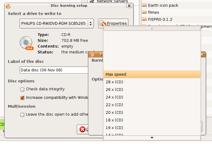
ComboBox has a big blank area above the position of its control

Bug #388633 reported by mati
274
This bug affects 26 people
Affects Status Importance Assigned to Milestone
GTK+
Invalid
Medium
One Hundred Papercuts
Triaged
Low
Unassigned
gtk+2.0 (Ubuntu)
Triaged
Low
Unassigned

Bug Description

(when there are a lot of entries or the control is in the bottom of the screen - see attached screenshots)

ComboBox wants to place the current selected option under the cursor, but in the presented corner cases it is a wrong choice. See the discussion in Gnome bugzilla (where there is also a patch).

Tags: ayatana
Revision history for this message
mati (mati-wroc) wrote :
Revision history for this message
mati (mati-wroc) wrote :
Changed in gtk+2.0 (Ubuntu):
assignee: nobody → Ubuntu Desktop Bugs (desktop-bugs)
importance: Undecided → Low
status: New → Triaged
Changed in gtk:
status: Unknown → New
Revision history for this message
Sergey Nizovtsev (snizovtsev) wrote :

This bug appears when gtk wants to place combobox out of screen borders. I've created 2 simple programs to show behaviour of a combobox with gtk and qt.

Revision history for this message
Vish (vish) wrote :

The patch exists, but not sure why upstream is reluctant to use it!

Maybe gtk+2.0 (Ubuntu) alone , could be patched.

Changed in hundredpapercuts:
status: New → Confirmed
Revision history for this message
Johannes Mockenhaupt (mockenh-deactivatedaccount) wrote :

mac_v, upstream hasn't applied it because they consider it a feature rather than a bug. From 2002 on lots of people have filled bugs against this, the reasons for rejection of a patch are detailed here http://bugzilla.gnome.org/show_bug.cgi?id=129463 . Unfortunately this issue is trickier than just removing the empty space.

Revision history for this message
Matthew Paul Thomas (mpt) wrote :

For many option menus, the items you are most likely to want to choose are those immediately before or after the currently selected one. This is true for more menus than those where you are most likely to want to change to the first item or the last item. Therefore, the most efficient behavior for an option menu is opening it so that the currently selected item is immediately under the pointer, because that results in least mouse movement and eye movement to access the previous/next items. Opening some menus this way, and some another way -- or worse, the same menu different ways depending on where the window happens to be on the screen -- would be nasty, because you could no longer rely on where the previous and next items were going to be, so you would be slower every time you used an option menu. (Indeed, we already have this problem with option menus in Firefox, Thunderbird, and OpenOffice.org, because they do not use the native GTK controls.)

This placement means that sometimes there are items that you need to scroll the menu to see, even though there is initially space available above or below the currently visible items. Currently GTK does this by drawing the menu to cover the area the items would take up if you scrolled far enough. In some cases this also provides a useful hint as to how long the menu is altogether (the Language menu in Epiphany's "Detailed Font Settings" is a good example of this). The drawback is that it looks a little odd.

It would be quite hard to measure whether abolishing the initial empty area slowed people down at all when using the menu, and if it did, whether the increase in beauty was worth it. But it isn't a clear enough case for us to diverge from upstream GTK.

Changed in hundredpapercuts:
status: Confirmed → Invalid
Changed in gtk+2.0 (Ubuntu):
status: Triaged → Invalid
Revision history for this message
Vish (vish) wrote :

@Johannes Mockenhaupt:
Actually i have read that *whole* report , but was not convinced by the devs choice... and there was no point in commenting on a closed report!

If all they wanted was to let the selected option be known , they could just keep the present selected option highlighted/dimmed/shaded/italicized differently from the rest of the menu. That report and its dup bugs have mockups which clearly show that not having the blank spaces makes the UI better looking.

The UX team needs make a call on this.

There are better approaches to this, than showing blank spaces.

Revision history for this message
Vish (vish) wrote :

ah mpt commented just while i was typing... ;p
@mpt:
But the empty space on top/bottom can be avoided, and still show the present option as the center.
why does an empty space have to be maintained, if there is no space to list all the options, then the size of the menu should fit the available space and then allow scrolling , rather than having a fixed space for the number of menu options...

But is such a fix easy/simple?

Revision history for this message
Matthew Paul Thomas (mpt) wrote :

Probably that change would be easy, but as I said, it would be rather difficult to judge whether the increase in elegance was greater than the decrease in obviousness of the "you can scroll this!" visual hint.

Revision history for this message
Vish (vish) wrote :

@mpt :
I have done a rough mockup, from the mati's screenshot above : I think the "you can scroll this!" visual hint is achievable.

Revision history for this message
mati (mati-wroc) wrote :

mac_v: This approach makes it look more pleasant, but let's take another approach and look at it from some perspective.

Ideally, when the ComboBox menu is shown, all items are visible and the selected option is placed under the cursor.
We all agree this is requested behaviour and we see this in 90% of Gnome applications.

Problems arise in 2 situations:
1. There are too many options to display them all in a manner described above.
2. ComboBox is placed near the bottom of the screen.

Both are corner cases.

Ad. 1. User know there are many options and excepts arrows allowing her to see all entries. Presenting the current item under the cursor may be a good thing, because otherwise it could be even a few-screens-of-scrolling away.

Ad. 2. GTK+ Developers chose here to prefer the "Error prevention" principle rather than "Visibility" principle.
Therefore it is easy to click and don't change selected entry (by clicking at the current entry, pressing Escape or clicking somewhere else), while it's harder to see all options and make a choice.

In a dialogue between user and the computer, developers chose that user will probably click the ComboBox and don't change it's value, rather than click in order to change it.

***

Looking at consistency at the whole desktop level, it may puzzle some users ("why it doesn't display all entries? when window was placed in the other part of the screen, all of them were visible?"). Moreover, GNOME Human Interface Guidelines [1] says that menu items (it should in a way apply to ComboBox items too) should all be visible: "Do not remove command items from the menu when they are unavailable, make them insensitive instead". When all items are visible when there is place for them (even disabled ones!), we should apply this rule to all the cases in order to improve consistency.

When disabled items are drawn using other style ("insensitive", disabled ones), the other style could be used to mark out the current item (bold?). Then it would be still easy to "go back" and all options could be visible without the awkward arrows.

Maybe user testing would be useful here - upstream probably won't make any change here:
"good that this bug is already closed. otherwise I would be tempted to WONTFIX it at this point."
(comment by Matthias Clasen from Gnome bug 129463)

[1] http://library.gnome.org/devel/hig-book/stable/menus-design.html.en

Changed in gtk:
status: New → Invalid
Revision history for this message
Vish (vish) wrote :

Since the papercuts invalid list is growing , some good ideas are getting lost , hence assigned it to Ayatana[after discussing with David Siegel] for further consideration.

A reasonable design solution needs to be achieved. Blank spaces need to be avoided *without compromise to usability* .

affects: hundredpapercuts → ayatana
Changed in ayatana:
status: Invalid → New
Changed in ayatana:
status: New → Invalid
tags: added: ayatana
Deryck Hodge (deryck)
affects: dead-ayatana → hundredpapercuts
Revision history for this message
Vish (vish) wrote :

Won't Fix in papercuts , but is tagged "ayatana" to be overseen in the Ayatana project

Changed in hundredpapercuts:
status: Invalid → Won't Fix
Revision history for this message
Evgeniy (goujat) wrote :

Terrible.
Posted new picture.

Revision history for this message
Evgeniy (goujat) wrote :

Forgot the picture

Revision history for this message
Vish (vish) wrote :

Setting bug to "Wont Fix" , which is the more appropriate status , as this is an intended design. [all bugs are being duped to https://bugzilla.gnome.org/show_bug.cgi?id=129463 ]
Also , because users are filing dups since "invalid" bugs dont show up in searches

Changed in gtk+2.0 (Ubuntu):
status: Invalid → Won't Fix
Changed in gtk:
importance: Unknown → Medium
status: Invalid → Unknown
Changed in gtk:
importance: Medium → Unknown
Changed in gtk:
importance: Unknown → Medium
status: Unknown → Confirmed
Revision history for this message
Omer Akram (om26er) wrote :

the currently linked upstream bug is not yet closed as 'wontfix' lets wait for it to be marked as such first ;)

Changed in gtk+2.0 (Ubuntu):
assignee: Ubuntu Desktop Bugs (desktop-bugs) → nobody
status: Won't Fix → Triaged
Revision history for this message
cameleon (el-cameleon-1) wrote :

I just ask to the Shotwell list why this menu doesn't displayed entirely and they tell me that it is a "feature"...
I think this is clearly bad, and I hope it will be changed one time.

I attach a screen-shot of how it is displayed in Ubuntu 10.10 and Shotwell 0.9.1.

Changed in hundredpapercuts:
status: Won't Fix → Confirmed
milestone: none → raring-gtk
Changed in hundredpapercuts:
status: Confirmed → Triaged
importance: Undecided → Low
Changed in gtk:
status: Confirmed → Invalid
Revision history for this message
Stu (stu-axon) wrote :

Can we get some user testing on this and various alternatives to it ?

To post a comment you must log in.
This report contains Public information  
Everyone can see this information.

Other bug subscribers

Remote bug watches

Bug watches keep track of this bug in other bug trackers.