
Enable the new presence control panel
| Affects | Status | Importance | Assigned to | Milestone | |
|---|---|---|---|---|---|
| Coccinella |
New
|
Wishlist
|
Mats | ||
Bug Description
Enable the new presence control panel.
| Changed in coccinella: | |
| assignee: | nobody → matsben |
| importance: | Undecided → Wishlist |

| Mats (matsben) wrote : | #1 |
| sander (s-devrieze) wrote : Re: [Bug 149805] Re: Enable the new presence control panel | #2 |
The one you were working on in the month before previous release: when
you click on the Coccinella logo this panel opens and it shows stuff
like presence state, mood, activity etc
| Mats (matsben) wrote : | #3 |
All this needs to be restructered since it was an experiment.
I think my "slot" idea is worth considering so the user can pick various slots
for different tasks. I was also thinking of replacing the voip dialog
with a slot,
but I'm having some problems figuring out how to fit everything.
This voip slot is displayed when an active call and then removed when
no active call.
On 10/6/07, sander <email address hidden> wrote:
> The one you were working on in the month before previous release: when
> you click on the Coccinella logo this panel opens and it shows stuff
> like presence state, mood, activity etc
>
> --
> Enable the new presence control panel
> https:/
> You received this bug notification because you are a bug assignee.
>
| sander (s-devrieze) wrote : | #4 |
This can also be solved with such a panel: http://
| Mats (matsben) wrote : | #5 |
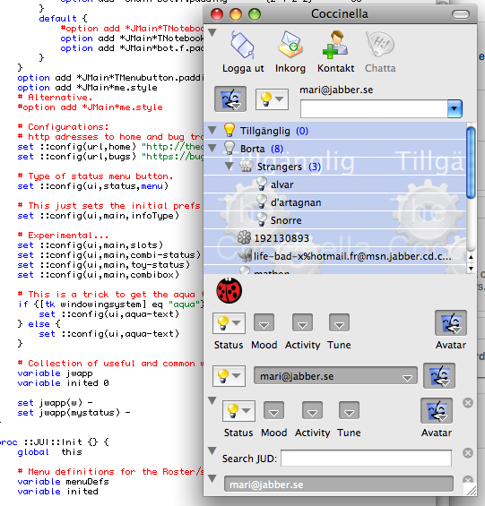
- slotted-roster-shot.png Edit (100.5 KiB, image/png)
Like this one, see attached shot :-)
Perhaps it is time to make an attack here...
| Mats (matsben) wrote : | #6 |
- Bild 2.png Edit (108.0 KiB, image/png)
Just checked in a ton of fixes and code additions for the slot mechanism.
Some are just dummies without any function or very incomplete.
There are four main ways to add status etc. stuff:
# Experimental...
set ::config(
set ::config(
set ::config(
set ::config(
see JUI.tcl
What I want you to see is the generic "slot mechanism" where it is
possible to just add a slot in the main window with all control
kept in the caller. I mean, there is a search slot which handles everything
inside the Search package. It just registers with the slot handler.
You can control each slots display in two ways:
1) collapse clicking the arrow, or
2) close clicking the close button
Close/Open is also handled via the Info/Slots submenus
so you can recreate a closed slot.
This way the user control a lot.
In cvs I also activated the combibox at the top which is pretty slick.
Next step is to try to combine the slot mechanism with the other.
Not sure how. Some info is overlapping but this can be hard to avoid.
See attachment here.
Try also RMB on collapse arrow, see tooltip.
One obvious candidate for a slot is the iaxclient phone.
It should be possible to squeeze it to fit a small space.
| sander (s-devrieze) wrote : | #7 |
It's not exactly what I want, though one bug report: the inactive close button is wrong on Mac OS X.
| Mats (matsben) wrote : | #8 |
You can do some experiments yourself by picking various combinations of:
# Experimental...
set ::config(
set ::config(
set ::config(
set ::config(
in JUI.tcl. I think you meant the:
set ::config(
set ::config(
set ::config(
set ::config(
combination.
Which "inactive close button is wrong on Mac OS X."?
I will try to develop all four ways to handle the presence/UI so they all work,
and then we'll see which prooves most useful.
| sander (s-devrieze) wrote : | #9 |
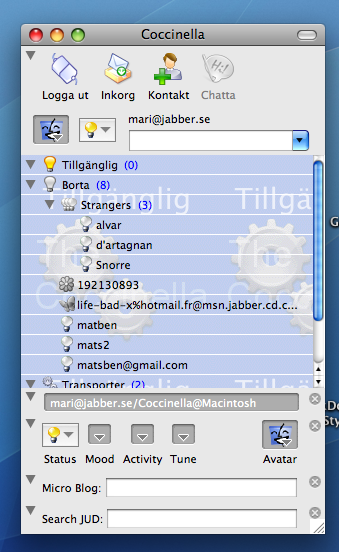
- Afbeelding 1.png Edit (40.9 KiB, image/png)
See screenshot. you can see the right icons at the left in the chat dialog tabs (grey icons). The red icons at the right (5 in screenshot) are the wrong ones.
Other bugs:
can't read "state(
can't read "state(
while executing
"if {$level != $state(
::Phone:
}"
(procedure "::NotifyCall:
invoked from within
"::NotifyCall:
invoked from within
"$w set [$w get $x $y]"
(procedure "ttk::scale::Drag" line 4)
invoked from within
"ttk::scale::Drag .jmain.
(command bound to event)
can't read "state(
can't read "state(
while executing
"if {$level != $state(
::Phone:
}"
(procedure "::NotifyCall:
invoked from within
"::NotifyCall:
invoked from within
"$w set [$w get $x $y]"
(procedure "ttk::scale::Drag" line 4)
invoked from within
"ttk::scale::Drag .jmain.
(command bound to event)
| sander (s-devrieze) wrote : | #10 |
> in JUI.tcl. I think you meant the:
> set ::config(
> set ::config(
> set ::config(
> set ::config(
Yes, that's the one I love the most. It's not yet polished enough of course...
| sander (s-devrieze) wrote : | #11 |
Ideas:
* drag and drop to move slots (change order and location (top/bottom/
* center the button in toy-status
* add support for other slots in toy-status
* always show the icon to show the connection security indication (low/medium/high). In toy-status, this should be on the same line as the open/hide panel button
* some mood icons can be found here: http://
* some activity icons can be found here: http://
* when removing an entry in toy-status, the other entries should be outlined again
* in toy-status, the mouseover icon maybe should be an icon pointing down or up depending on whether or not the panel is opened
* in toy-status the menu icon should be 16x16 sized or 22x22 sized
| Mats (matsben) wrote : | #12 |
On Thu, Jul 31, 2008 at 9:33 PM, sander <email address hidden> wrote:
> See screenshot. you can see the right icons at the left in the chat
> dialog tabs (grey icons). The red icons at the right (5 in screenshot)
> are the wrong ones.
>
This is one of the themeing issues still unsolved.
The problem is how custom controls shall be themeable since
they are defined very differently.
In principle they should be defined for each ttk (tile) theme but that
takes way too much work (and graphics skill which we don't have).
Since there are two ways to do thems/skins:
1) ttk (tile) which is actually the desktop UI and belongs to the OS
2) and images that are application specific.
So the question is, which is the close-aqua button?
> Other bugs:
>
> can't read "state(
> can't read "state(
Much more code in cvs now but this is only work in progress.
Nothing working yet.
| Mats (matsben) wrote : | #13 |
On Fri, Aug 1, 2008 at 1:12 AM, sander <email address hidden> wrote:
> Ideas:
> * drag and drop to move slots (change order and location (top/bottom/
Missing on Mac :-(
> * center the button in toy-status
> * add support for other slots in toy-status
> * always show the icon to show the connection security indication (low/medium/high). In toy-status, this should be on the same line as the open/hide panel button
This is also missing in the slots. I'm aware of it.
> * some mood icons can be found here: http://
> * some activity icons can be found here: http://
Checking out the complete trunk...
> * when removing an entry in toy-status, the other entries should be outlined again
> * in toy-status, the mouseover icon maybe should be an icon pointing down or up depending on whether or not the panel is opened
> * in toy-status the menu icon should be 16x16 sized or 22x22 sized
>
I'll first do the slots so they function allright.
Maybe it would be possible to integrate the slots in toy-status, or vice versa?
I don't know right know but some kind of merge is needed.
| sander (s-devrieze) wrote : | #14 |
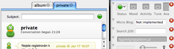
> So the question is, which is the close-aqua button?
See chat dialog.
| sander (s-devrieze) wrote : | #15 |
Ideas for slots:
* A long time ago there was an ugly status bar in Coccinella with application information (e.g. "Connection...", "Loading contacts...", "userX went online", "The roster crashed", "File download complete", and so forth). Maybe you can reintroduce something like this as a by default disabled slot. Of course it should be nicier ;-)
* Download manager (this slot will only show up when there are downloads in progress
* something to update User Nickname
| Mats (matsben) wrote : | #16 |
My question was a bit more general. To which themeing engine should
custom control belong, ttk (tile) or the application themeing?
The problem is to define custom control with images from the
application themeing.
Mats
On Fri, Aug 1, 2008 at 4:18 PM, sander <email address hidden> wrote:
>> So the question is, which is the close-aqua button?
>
> See chat dialog.
>
> --
> Enable the new presence control panel
> https:/
> You received this bug notification because you are a bug assignee.
>
| sander (s-devrieze) wrote : | #17 |
I don't know what you are talking about. So I guess you can better
answer this question yourself.
| Mats (matsben) wrote : | #18 |
On Fri, Aug 1, 2008 at 7:49 PM, sander <email address hidden> wrote:
> I don't know what you are talking about. So I guess you can better
> answer this question yourself.
>
Sorry, the question was meant to myself but I was speaking load.
Mats
| Mats (matsben) wrote : | #19 |
On Fri, Aug 1, 2008 at 1:12 AM, sander <email address hidden> wrote:
> Ideas:
> * drag and drop to move slots (change order and location (top/bottom/
No DnD on mac.
> * center the button in toy-status
Done.
> * add support for other slots in toy-status
I have now merged the slots with toy-status so that the present config()
displays the slots when the toy-status is pressed. I think this merge
was needed.
> * always show the icon to show the connection security indication (low/medium/high). In toy-status, this should be on the same line as the open/hide panel button
Done, but I have no medSecure icon in Crystal.
> * some mood icons can be found here: http://
Added all to cvs and code.
> * some activity icons can be found here: http://
Added all to cvs and code.
> * when removing an entry in toy-status, the other entries should be outlined again
?
> * in toy-status, the mouseover icon maybe should be an icon pointing down or up depending on whether or not the panel is opened
You mean instead of the coccinella?
> * in toy-status the menu icon should be 16x16 sized or 22x22 sized
>
?
There are stil many fixes to the toy-status/
will continue tomorrow.
However, there are many fine details fixed/added which is not so easy to see.
Note the mood and activity in the mega presence slot. Cool!
Mats
| sander (s-devrieze) wrote : | #20 |
>> * always show the icon to show the connection security indication
> (low/medium/high). In toy-status, this should be on the same line as the
> open/hide panel button
>
> Done, but I have no medSecure icon in Crystal.
That's why I sent you the Oxygen icon set ;-)
PS: when you added Oxygen to svn, remove the Crystal set and sent it
to me so that I can update it.
<snip>
>> * some activity icons can be found here:
> http://
>
> Added all to cvs and code.
PS: I read in the commit logs that the Gajim people will add more
activity icons. So you might want to check it again in a few weeks for
updates.
>> * when removing an entry in toy-status, the other entries should be
> outlined again
>
> ?
When you remove the Mood block for instance, there is a large gap.
>> * in toy-status, the mouseover icon maybe should be an icon pointing
> down or up depending on whether or not the panel is opened
>
> You mean instead of the coccinella?
Yes, but it's only showed on mouseover. When the mouse is not on the
button, you still see the ladybug.
>> * in toy-status the menu icon should be 16x16 sized or 22x22 sized
>>
>
> ?
== The ladybug icon.
> There are stil many fixes to the toy-status/
> will continue tomorrow.
You introduced a bug:
can't read "myMoods": no such variable
while executing
"foreach mood $myMoods {
$m add radiobutton -label [mc $mood2mLabel(
$mood -image [::Theme:
[nam..."
(procedure "MPBuild" line 19)
invoked from within
"MPBuild .jmain.
(in namespace inscope "::Mood" script line 1)
invoked from within
"::namespace inscope ::Mood MPBuild .jmain.
("uplevel" body line 1)
invoked from within
"uplevel #0 $widgets($name,cmd) $box.$column"
(procedure "Build" line 55)
invoked from within
"Build .jmain.f.logo.mp.1"
(in namespace inscope "::MegaPresence" script line 1)
invoked from within
"::namespace inscope ::MegaPresence Build .jmain.f.logo.mp.1"
("uplevel" body line 1)
invoked from within
"uplevel #0 $slot($name,cmd) $w.$row"
(procedure "SlotBuild" line 13)
invoked from within
"SlotBuild $wmp"
(procedure "::JUI::Build" line 166)
invoked from within
"::JUI::Build $wDlgs(jmain) "
(procedure "::Jabber::Init" line 38)
invoked from within
"::Jabber::Init"
(file "Coccinella.tcl" line 322)
> However, there are many fine details fixed/added which is not so easy to see.
> Note the mood and activity in the mega presence slot. Cool!
I only see Coccinella not starting for the moment :-)
| Mats (matsben) wrote : | #21 |
On Sat, Aug 2, 2008 at 5:49 PM, sander <email address hidden> wrote:
>
> I only see Coccinella not starting for the moment :-)
>
Try
rm components/Mood.tcl
cvs update components/Mood.tcl
since I don't see how this bug should be possible and mine works OK,
and the right file is in cvs.
| sander (s-devrieze) wrote : | #22 |
That did the trick.
Some feedback:
* PEP seems to only work with Openfire, not with ejabberd any more
* The User Activity button menu only includes the generic activities,
it does not include not the subactivities in submenus.
* Replace the text "User Activity" with "Activity" (shorter)
* For the Activity button it is maybe better to use a menu similar to
the Avatar menu (people can see all activity icons at once).
| Mats (matsben) wrote : | #23 |
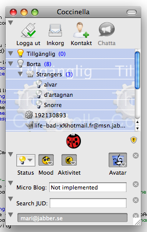
- Bild 1.png Edit (61.2 KiB, image/png; name="Bild 1.png")
On Sun, Aug 3, 2008 at 9:45 AM, sander <email address hidden> wrote:
> That did the trick.
>
> Some feedback:
> * PEP seems to only work with Openfire, not with ejabberd any more
Works with jabber.se which uses ejabberd, see attached shot.
But the buttons are disabled if no PEP service detected with the login server.
> * The User Activity button menu only includes the generic activities,
> it does not include not the subactivities in submenus.
There were no icons for them. I just start out with the simplest.
Maybe I should add a menu entry for the complete settings dialog.
Think I'll do.
> * Replace the text "User Activity" with "Activity" (shorter)
Done.
> * For the Activity button it is maybe better to use a menu similar to
> the Avatar menu (people can see all activity icons at once).
>
This is a missing feature on AquaTk that there are no menu icons.
Other platforms have them.
Mats
PS: Not yet updated cvs.
| sander (s-devrieze) wrote : | #24 |
> Works with jabber.se which uses ejabberd, see attached shot.
> But the buttons are disabled if no PEP service detected with the login server.
ok, I though jabber.org had PEP.
>> * The User Activity button menu only includes the generic activities,
>> it does not include not the subactivities in submenus.
>
> There were no icons for them. I just start out with the simplest.
Just copy the generic icon for all activities and show the activity
name some way (maybe balloon text?).
> Maybe I should add a menu entry for the complete settings dialog.
> Think I'll do.
-1: people don't like popups.
>> * For the Activity button it is maybe better to use a menu similar to
>> the Avatar menu (people can see all activity icons at once).
>>
>
> This is a missing feature on AquaTk that there are no menu icons.
> Other platforms have them.
It works in the avatar menu on Mac OS X...
Other feedback:
* Allow people to RMB click everywhere to open the "arrow context
menu" (similar behavior as the big slot at the top with Login/Add
Contact/Chat.
* Remove the close button. I just realize it takes to much valuable
space. Replace it by an entry in the "arrow context menu". As an
alternative, you also can move the close button under the arrow
button.
* Also add the close entry to the Login/Add Contact/Chat slot.
* Can you add an animation for the presence control panel similar as
on this page? (the right image):
http://
closing the menu and Prev button like opening it)
| Mats (matsben) wrote : | #25 |
On Sun, Aug 3, 2008 at 5:56 PM, sander <email address hidden> wrote:
>> Works with jabber.se which uses ejabberd, see attached shot.
>> But the buttons are disabled if no PEP service detected with the login server.
>
> ok, I though jabber.org had PEP.
>
>>> * The User Activity button menu only includes the generic activities,
>>> it does not include not the subactivities in submenus.
>>
>> There were no icons for them. I just start out with the simplest.
>
> Just copy the generic icon for all activities and show the activity
> name some way (maybe balloon text?).
This gets a very complex popup with tons of submenus.
OK, I'll see.
>
>> Maybe I should add a menu entry for the complete settings dialog.
>> Think I'll do.
>
> -1: people don't like popups.
I mean the menu is already there but there is just an extra entry at its end.
Code is in cvs.
>
>>> * For the Activity button it is maybe better to use a menu similar to
>>> the Avatar menu (people can see all activity icons at once).
>>>
>>
>> This is a missing feature on AquaTk that there are no menu icons.
>> Other platforms have them.
>
> It works in the avatar menu on Mac OS X...
What you see there is actually not Tk menu widget but me hacked together
a very complex toplevel window which is designed like a menu.
This is a very bad thing to do.
I know Danial has added another menu mechanism which is more
low level and allows images but I haven't looked at it.
Correct: I looked at it but didn't get anywhere from a quick look.
>
> Other feedback:
> * Allow people to RMB click everywhere to open the "arrow context
> menu" (similar behavior as the big slot at the top with Login/Add
> Contact/Chat.
Done.
> * Remove the close button. I just realize it takes to much valuable
> space. Replace it by an entry in the "arrow context menu". As an
Nope, I want it there. Looks good.
> alternative, you also can move the close button under the arrow
> button.
This gets very messy since it can be hard to tell which slot a close button
actually closes.
> * Also add the close entry to the Login/Add Contact/Chat slot.
That is not a slot, but the toolbar. Well, that's an idea.
But on Mac we already have the button in the window list,
no need to duplicate that.
> * Can you add an animation for the presence control panel similar as
> on this page? (the right image):
> http://
> closing the menu and Prev button like opening it)
>
No Tk support for things like this. I guess you mean it should slide
slowly up and down. Cool but there's a reason only Apple does such things.
More:
Coccinella icon: now size 22x22; it needs a graphics designer to add arrows.
Application status slot: added; note the chasing arrows when logging in.
| sander (s-devrieze) wrote : | #26 |
>> * Also add the close entry to the Login/Add Contact/Chat slot.
>
> That is not a slot, but the toolbar. Well, that's an idea.
> But on Mac we already have the button in the window list,
> no need to duplicate that.
For end users there is no difference between a slot and a toolbar; for
them both are the same!
>> * Can you add an animation for the presence control panel similar as
>> on this page? (the right image):
>> http://
>> closing the menu and Prev button like opening it)
>>
>
> No Tk support for things like this. I guess you mean it should slide
> slowly up and down.
Yes!
> Cool but there's a reason only Apple does such things.
Which reason? You're also able to do amazing things! ;-) Also, I think
KDE4 also can do such things.
> More:
>
> Coccinella icon: now size 22x22; it needs a graphics designer to add arrows.
There exist Oxygen arrows AFAIK... or do you mean a ladybug looking
like an arrow?
> Application status slot: added; note the chasing arrows when logging in.
nice
| Mats (matsben) wrote : | #27 |
On Mon, Aug 4, 2008 at 5:32 PM, sander <email address hidden> wrote:
>>> * Also add the close entry to the Login/Add Contact/Chat slot.
>>
>> That is not a slot, but the toolbar. Well, that's an idea.
>> But on Mac we already have the button in the window list,
>> no need to duplicate that.
>
> For end users there is no difference between a slot and a toolbar; for
> them both are the same!
Maybe I could. But then not on Mac since I don't want to have duplicates.
Must fix other issues first.
>
>>> * Can you add an animation for the presence control panel similar as
>>> on this page? (the right image):
>>> http://
>>> closing the menu and Prev button like opening it)
>>>
>>
>> No Tk support for things like this. I guess you mean it should slide
>> slowly up and down.
>
> Yes!
>
>> Cool but there's a reason only Apple does such things.
>
> Which reason? You're also able to do amazing things! ;-) Also, I think
> KDE4 also can do such things.
>
Now you are pushing me ;-)
The easy answer is no since Tk has no access to such low level
rendering mechanisms, but maybe there is a way. Need to go to the lab
and do some experiments...
>> More:
>>
>> Coccinella icon: now size 22x22; it needs a graphics designer to add arrows.
>
> There exist Oxygen arrows AFAIK... or do you mean a ladybug looking
> like an arrow?
>
No, I just meant it is not just to add arrows over the ladybug icon since
shape and colours must make up a consistent entity, and that takes a designer.
>> Application status slot: added; note the chasing arrows when logging
> in.
>
> nice
>
The status messages, however, are just an old relic that I happened to
have kept, so they form a archeological snapshot in time.
| Mats (matsben) wrote : | #28 |
On Tue, Aug 5, 2008 at 9:55 AM, Mats Bengtsson <email address hidden> wrote:
>>
>>>> * Can you add an animation for the presence control panel similar as
>>>> on this page? (the right image):
>>>> http://
>>>> closing the menu and Prev button like opening it)
>>>>
>>>
>>> No Tk support for things like this. I guess you mean it should slide
>>> slowly up and down.
>>
>> Yes!
>>
>>> Cool but there's a reason only Apple does such things.
>>
>> Which reason? You're also able to do amazing things! ;-) Also, I think
>> KDE4 also can do such things.
>>
>
> Now you are pushing me ;-)
> The easy answer is no since Tk has no access to such low level
> rendering mechanisms, but maybe there is a way. Need to go to the lab
> and do some experiments...
>
It looks as if this would be possible using the place geometry manager
and possibly using a fake window. Some testing shows that place
doesn't have weird repacking behaviour since the geometry is never
propagated anywhere. It is worth investing in since it looks very cool
when I do some toy experiments using the full presence control panel.
Likely to show up other issues.
| sander (s-devrieze) wrote : | #29 |
I am eagerly awaiting this feature B-)
btw: what about changing the name of the "presence control panel" into "Control Panel".
Strings: Info/mSlots-
Reason: there is more in it than presence related slots.
Other strings:
* Notify Call-->Call Notification
* Mega Presence-->Presence Control
* Search JUD-->Directory Search
* JID-->Contact ID
* Own JID-->Own Contact ID
* Own full JID-->Own Full Contact ID
| Mats (matsben) wrote : | #30 |
On Tue, Aug 5, 2008 at 5:02 PM, sander <email address hidden> wrote:
> I am eagerly awaiting this feature B-)
>
> btw: what about changing the name of the "presence control panel" into
> "Control Panel".
>
> Strings: Info/mSlots-
>
> Reason: there is more in it than presence related slots.
>
> Other strings:
> * Notify Call-->Call Notification
> * Mega Presence-->Presence Control
> * Search JUD-->Directory Search
> * JID-->Contact ID
> * Own JID-->Own Contact ID
> * Own full JID-->Own Full Contact ID
>
Done, but not a complete cvs commit at this time.
Most things should be there.
BUT, there are performance issues on Mac as expected due to the lousy
widget layout mechanism inherited from Classic, which was equally
lousy there.
I run it on my fairly old XP box and there it looks very cool. Just
sliding it up and down... Maybe I should try to make a simplified
slide layout and display an empty frame while sliding instead of the
complete slots. That should be much faster. Also, even on XP is some
flickering when it has slide up since I need to switch geometry
manager. If I could do a dummy copy of the complete window that is
sliding I could use that as an overlay and do the usual packaging
behind it and then just remove the dummy. That should remove the
flickering, but lot of work.
FYI: there is a guy working on a Cocoa port of the compete Tk on Mac,
see the MACTCl mailing list archive:
http://
| sander (s-devrieze) wrote : | #31 |
> Done, but not a complete cvs commit at this time.
Wow, I said you can do amazing things! ;-)
> Most things should be there.
> BUT, there are performance issues on Mac as expected due to the lousy
> widget layout mechanism inherited from Classic, which was equally
> lousy there.
Yes, I see that.
> I run it on my fairly old XP box and there it looks very cool. Just
> sliding it up and down... Maybe I should try to make a simplified
> slide layout and display an empty frame while sliding instead of the
> complete slots. That should be much faster.
-1: I guess that will result in a "big blink once experience".
> Also, even on XP is some
> flickering when it has slide up since I need to switch geometry
> manager. If I could do a dummy copy of the complete window that is
> sliding I could use that as an overlay and do the usual packaging
> behind it and then just remove the dummy. That should remove the
> flickering, but lot of work.
But worth the work ;-)
Other bug: when sliding, the search block is temporary made invisible
when it is opened (Ctrl/Command+F).
Other feedback:
* move the security-* icon to the left. In this way it will be always
visible on Mac OS X
* The micro blog and directory search slots do not yet work (I guess
you know that)
* Directory search slot: instead of showing the text "Search JUD",
show the icon service-
(for icon AND field): "Search People in Directory" + show the
magnifier icon in the search field, just like when searching contacts
in the contact list + show greyed out text "Search" in the field and
hide it when the field is active and empty (just like in Firefox), do
also the same for the search block for the contact list
* Micro blog slot: get inspiration here:
http://
this.
> FYI: there is a guy working on a Cocoa port of the compete Tk on Mac,
> see the MACTCl mailing list archive:
> http://
Great, tilqt, tilegtk, and Cocoa! B-)
| Mats (matsben) wrote : | #32 |
On Wed, Aug 6, 2008 at 3:50 PM, sander <email address hidden> wrote:
>> Done, but not a complete cvs commit at this time.
>
> Wow, I said you can do amazing things! ;-)
>
>> Most things should be there.
>> BUT, there are performance issues on Mac as expected due to the lousy
>> widget layout mechanism inherited from Classic, which was equally
>> lousy there.
>
> Yes, I see that.
>
>> I run it on my fairly old XP box and there it looks very cool. Just
>> sliding it up and down... Maybe I should try to make a simplified
>> slide layout and display an empty frame while sliding instead of the
>> complete slots. That should be much faster.
>
> -1: I guess that will result in a "big blink once experience".
>
Done.
It still looks pretty cool. There is no flickering at all this time
since I made a complete fake widget that I use to slide over any
existing widgets. So all is happening under the fake (frame) sliding
widget and thus no flickering when I remove it since they are
overlapping exactly.
Experiment with these:
# Let the slots slide up/down. Performance issues with this.
set ::config(
# Simplified slide widget which just shows an empty frame for the panel.
set ::config(
Doing the rest tomorrow.
| sander (s-devrieze) wrote : | #33 |
>> -1: I guess that will result in a "big blink once experience".
>>
>
> Done.
> It still looks pretty cool. There is no flickering at all this time
> since I made a complete fake widget that I use to slide over any
> existing widgets. So all is happening under the fake (frame) sliding
> widget and thus no flickering when I remove it since they are
> overlapping exactly.
Ok, you convinced me, but maybe you should combine it with an
extremely short fade effect to make it look more smooth?
Hide:
1) 10ms fade away
2) slide down
Show:
1) slide up
2) 10ms fade again
btw, when you switch between the Contacts tab and the Services tab,
you also see blinking. Maybe this is related to the overlay that is
only available in the Contacts tab. Maybe the blink will dissapear or
reduce when you also add this overlay in the Services tab? (I am
talking about the presence status and related message that is showed
in the background) Or maybe this blinking will go away when switching
to the new tkpath and using an SVG background?
| sander (s-devrieze) wrote : | #34 |
Other wishes:
* In the Search contact block (Ctrl+F), the close button is at the opposite side. Either move the close button in the search block to the right, or either move the button in the slots to the left. Consistency!
* Add a key command to open/close the control panel. What about Ctrl/Cmd+O, the "O" from WOW? ;-) Also, add this command between brackets at the end of the balloon text of the Spanish button.
* Always put the Control Panel slot at the bottom, as it is so high, the close button is not hided partially behind the resize handle on Mac OS X.
Another thing that I found out myself is that this control panel slide effect is addicting, and that is a good thing! B-)
| Mats (matsben) wrote : | #35 |
On Wed, Aug 6, 2008 at 3:50 PM, sander <email address hidden> wrote:
>
>> Also, even on XP is some
>> flickering when it has slide up since I need to switch geometry
>> manager. If I could do a dummy copy of the complete window that is
>> sliding I could use that as an overlay and do the usual packaging
>> behind it and then just remove the dummy. That should remove the
>> flickering, but lot of work.
>
> But worth the work ;-)
I think we leave it with the simplified slide mechanism for the moment.
Note that you may speed it up by setting
set UI::slide(ms) 1
but this makes it too fast on non Macs.
>
> Other bug: when sliding, the search block is temporary made invisible
> when it is opened (Ctrl/Command+F).
>
We have to live with that since the search block belongs to the roster
window and does not slide with the control panel.
It actually lives behind the sliding window when it slides down, just
as the roster is behind it.
> Other feedback:
> * move the security-* icon to the left. In this way it will be always
> visible on Mac OS X
Done.
> * The micro blog and directory search slots do not yet work (I guess
> you know that)
They are just dummies. Search slot is being worked on today but still
not finished.
> * Directory search slot: instead of showing the text "Search JUD",
> show the icon service-
> (for icon AND field): "Search People in Directory" + show the
> magnifier icon in the search field, just like when searching contacts
> in the contact list + show greyed out text "Search" in the field and
> hide it when the field is active and empty (just like in Firefox), do
> also the same for the search block for the contact list
Some of this in cvs, but did you actually mean to have two mag glasses?
If not I prefer to keep the one inside the entry widget.
> * Micro blog slot: get inspiration here:
> http://
> this.
>
Inspiration isn't a problem :-)
But you need to give me a little time to catch up, otherwise I end up
having lot of unfinished pieces here and there.
| Mats (matsben) wrote : | #36 |
On Wed, Aug 6, 2008 at 6:23 PM, sander <email address hidden> wrote:
> Other wishes:
> * In the Search contact block (Ctrl+F), the close button is at the opposite side. Either move the close button in the search block to the right, or either move the button in the slots to the left. Consistency!
Done.
> * Add a key command to open/close the control panel. What about Ctrl/Cmd+O, the "O" from WOW? ;-) Also, add this command between brackets at the end of the balloon text of the Spanish button.
> * Always put the Control Panel slot at the bottom, as it is so high, the close button is not hided partially behind the resize handle on Mac OS X.
>
I was thinking of adding a kind of hint when slots register themselves.
High prio puts them higher up, and/or vice versa.
> Another thing that I found out myself is that this control panel slide
> effect is addicting, and that is a good thing! B-)
>
It is the geek test. If you do it more then three times in a row you
are at risc; ten times and more you are there and need severe
anti-geek treatment :-)
Mats
| Mats (matsben) wrote : | #37 |
On Wed, Aug 6, 2008 at 6:02 PM, sander <email address hidden> wrote:
>>> -1: I guess that will result in a "big blink once experience".
>>>
>>
>> Done.
>> It still looks pretty cool. There is no flickering at all this time
>> since I made a complete fake widget that I use to slide over any
>> existing widgets. So all is happening under the fake (frame) sliding
>> widget and thus no flickering when I remove it since they are
>> overlapping exactly.
>
> Ok, you convinced me, but maybe you should combine it with an
> extremely short fade effect to make it look more smooth?
>
This time I say that there is no chance this can happen with current Tk.
There just aren't low level tools to do this, at least right now.
Instead, I was thinking of doing a sinus shaped movement when sliding
instead of linear as it is now. Needs testing.
>
> btw, when you switch between the Contacts tab and the Services tab,
> you also see blinking. Maybe this is related to the overlay that is
> only available in the Contacts tab. Maybe the blink will dissapear or
> reduce when you also add this overlay in the Services tab? (I am
> talking about the presence status and related message that is showed
> in the background) Or maybe this blinking will go away when switching
> to the new tkpath and using an SVG background?
>
This is the lousy Mac subwindow implementation of Tk. Other platforms
are much better at this.
| sander (s-devrieze) wrote : | #38 |
>>> Also, even on XP is some
>>> flickering when it has slide up since I need to switch geometry
>>> manager. If I could do a dummy copy of the complete window that is
>>> sliding I could use that as an overlay and do the usual packaging
>>> behind it and then just remove the dummy. That should remove the
>>> flickering, but lot of work.
>>
>> But worth the work ;-)
>
> I think we leave it with the simplified slide mechanism for the moment.
If you think the control panel will get even +10% more addictive, you
should consider this ;-)
>> Other bug: when sliding, the search block is temporary made invisible
>> when it is opened (Ctrl/Command+F).
>>
>
> We have to live with that since the search block belongs to the roster
> window and does not slide with the control panel.
> It actually lives behind the sliding window when it slides down, just
> as the roster is behind it.
Keep it in mind and fix it as soon as you see how to fix it; it'll
make the experience even more polished.
>> * move the security-* icon to the left. In this way it will be always
>> visible on Mac OS X
> Done.
I don't see the icon any more! Is it broken?
>> * Directory search slot: instead of showing the text "Search JUD",
>> show the icon service-
>> (for icon AND field): "Search People in Directory" + show the
>> magnifier icon in the search field, just like when searching contacts
>> in the contact list + show greyed out text "Search" in the field and
>> hide it when the field is active and empty (just like in Firefox), do
>> also the same for the search block for the contact list
>
> Some of this in cvs, but did you actually mean to have two mag glasses?
> If not I prefer to keep the one inside the entry widget.
No, I'm already using the Oxygen icon theme right here. The Crystal
icon theme just has a wrong icon for service-
will update this icon with a better one when Oxygen is snipped out of
cvs as a separate download)
> Inspiration isn't a problem :-)
> But you need to give me a little time to catch up, otherwise I end up
> having lot of unfinished pieces here and there.
Yeah, giving you a little time to catch up is on my TODO list ;-)
| sander (s-devrieze) wrote : | #39 |
>> * Always put the Control Panel slot at the bottom, as it is so high, the close button is not hided partially behind the resize handle on Mac OS X.
>>
>
> I was thinking of adding a kind of hint when slots register themselves.
> High prio puts them higher up, and/or vice versa.
How do you mean it will work?
>> Another thing that I found out myself is that this control panel slide
>> effect is addicting, and that is a good thing! B-)
>>
>
> It is the geek test. If you do it more then three times in a row you
> are at risc; ten times and more you are there and need severe
> anti-geek treatment :-)
hehe, can you do some blog post based on this quote about the new
Control Panel? Title can be something like "Caution: Coccinella gets
More Addictive!"
| sander (s-devrieze) wrote : | #40 |
>> Ok, you convinced me, but maybe you should combine it with an
>> extremely short fade effect to make it look more smooth?
>>
>
> This time I say that there is no chance this can happen with current Tk.
> There just aren't low level tools to do this, at least right now.
You said the same last time!! B-)
> Instead, I was thinking of doing a sinus shaped movement when sliding
> instead of linear as it is now. Needs testing.
What is "sinus shaped movement"?
> This is the lousy Mac subwindow implementation of Tk. Other platforms
> are much better at this.
Maybe you can fix or work around this?
--
Mvg, Sander Devrieze.
| sander (s-devrieze) wrote : | #41 |
Other bug: Coccinella does not remember which slots are hidden between Coccinella sessions; it always shows all of them.
| Mats (matsben) wrote : | #42 |
On Thu, Aug 7, 2008 at 6:03 PM, sander <email address hidden> wrote:
>>>> Also, even on XP is some
>>>> flickering when it has slide up since I need to switch geometry
>>>> manager. If I could do a dummy copy of the complete window that is
>>>> sliding I could use that as an overlay and do the usual packaging
>>>> behind it and then just remove the dummy. That should remove the
>>>> flickering, but lot of work.
>>>
>>> But worth the work ;-)
>>
>> I think we leave it with the simplified slide mechanism for the moment.
>
> If you think the control panel will get even +10% more addictive, you
> should consider this ;-)
>
We just remeber this and see later if time allows...
>>> Other bug: when sliding, the search block is temporary made invisible
>>> when it is opened (Ctrl/Command+F).
>>>
>>
>> We have to live with that since the search block belongs to the roster
>> window and does not slide with the control panel.
>> It actually lives behind the sliding window when it slides down, just
>> as the roster is behind it.
>
> Keep it in mind and fix it as soon as you see how to fix it; it'll
> make the experience even more polished.
>
I don't consider this a bug since the find window really belongs to the
roster window, and that is hidden below the sliding window anyway.
The same is actually true for the complete roster window but there we
are used to it since we use the scrollbars. I think it is OK.
>
>>> * move the security-* icon to the left. In this way it will be always
>>> visible on Mac OS X
>> Done.
>
> I don't see the icon any more! Is it broken?
Works here.
>
>>> * Directory search slot: instead of showing the text "Search JUD",
>>> show the icon service-
>>> (for icon AND field): "Search People in Directory" + show the
>>> magnifier icon in the search field, just like when searching contacts
>>> in the contact list + show greyed out text "Search" in the field and
>>> hide it when the field is active and empty (just like in Firefox), do
>>> also the same for the search block for the contact list
>>
>> Some of this in cvs, but did you actually mean to have two mag glasses?
>> If not I prefer to keep the one inside the entry widget.
>
> No, I'm already using the Oxygen icon theme right here. The Crystal
> icon theme just has a wrong icon for service-
> will update this icon with a better one when Oxygen is snipped out of
> cvs as a separate download)
>
>> Inspiration isn't a problem :-)
>> But you need to give me a little time to catch up, otherwise I end up
>> having lot of unfinished pieces here and there.
>
> Yeah, giving you a little time to catch up is on my TODO list ;-)
>
I have a long bug/todo list myself just so I wont miss anything while
working on this slot stuff. It is a whole page. Nothing for the
tracker since it is just a lot of details.
| Mats (matsben) wrote : | #43 |
On Thu, Aug 7, 2008 at 6:12 PM, sander <email address hidden> wrote:
>>
>> I was thinking of adding a kind of hint when slots register themselves.
>> High prio puts them higher up, and/or vice versa.
>
> How do you mean it will work?
The slots when register can have a '-priority 0-100' option, and when
slots are then drawn they are are drown using the sorted prio list;
top down or vice versa.
So if we want something on the top for sure we use -priority 100 or 0.
>
>>> Another thing that I found out myself is that this control panel slide
>>> effect is addicting, and that is a good thing! B-)
>>>
>>
>> It is the geek test. If you do it more then three times in a row you
>> are at risc; ten times and more you are there and need severe
>> anti-geek treatment :-)
>
> hehe, can you do some blog post based on this quote about the new
> Control Panel? Title can be something like "Caution: Coccinella gets
> More Addictive!"
>
I was actually thinking of blogging about recent advances made in the
Tcl/Tk community, tilegtk and all that... See if I can get the time
today.
| Mats (matsben) wrote : | #44 |
On Thu, Aug 7, 2008 at 6:15 PM, sander <email address hidden> wrote:
>>> Ok, you convinced me, but maybe you should combine it with an
>>> extremely short fade effect to make it look more smooth?
>>>
>>
>> This time I say that there is no chance this can happen with current Tk.
>> There just aren't low level tools to do this, at least right now.
>
> You said the same last time!! B-)
>
This time it i for sure.
>> Instead, I was thinking of doing a sinus shaped movement when sliding
>> instead of linear as it is now. Needs testing.
>
> What is "sinus shaped movement"?
Implemented and tested. On by default. Actually, it gets even cooler!
Please experiment yourself using:
namespace eval ::UI {
variable slide
#set slide(mode) linear
set slide(mode) sinus
set slide(step) 20
# On slower OS/machines we should decrease this value.
if {[tk windowingsystem] eq "aqua"} {
set slide(ms) 20
} else {
set slide(ms) 40
}
}
in UI.tcl or just do:
set UI::slide(ms) 1
etc.
>
>> This is the lousy Mac subwindow implementation of Tk. Other platforms
>> are much better at this.
>
> Maybe you can fix or work around this?
>
Cocoa is the way to go. And it's a long way. If you look at the
tcl-mac mailing list archive maybe you can find the guy who said he
was doing this blog.
Another one: menu now added, Cmd-S not good for this. Edit the line
set m {command mShowControlPanel {::JUI:
in JUI.tcl to
set m {command mShowControlPanel {::JUI:
or whatever.
| sander (s-devrieze) wrote : | #45 |
>> If you think the control panel will get even +10% more addictive, you
>> should consider this ;-)
>>
>
> We just remeber this and see later if time allows...
It's better to make 1 great thing than several things that are just
"good": people ignore things that are good whilst they notice
greatness. Of course you decide ;-)
>>>> Other bug: when sliding, the search block is temporary made invisible
>>>> when it is opened (Ctrl/Command+F).
>>>>
>>>
>>> We have to live with that since the search block belongs to the roster
>>> window and does not slide with the control panel.
>>> It actually lives behind the sliding window when it slides down, just
>>> as the roster is behind it.
>>
>> Keep it in mind and fix it as soon as you see how to fix it; it'll
>> make the experience even more polished.
>>
>
> I don't consider this a bug since the find window really belongs to the
> roster window, and that is hidden below the sliding window anyway.
> The same is actually true for the complete roster window but there we
> are used to it since we use the scrollbars. I think it is OK.
(Also see the email about Psi.)
>>>> * move the security-* icon to the left. In this way it will be always
>>>> visible on Mac OS X
>>> Done.
>>
>> I don't see the icon any more! Is it broken?
>
> Works here.
I think it was temporary broken for an unknown reason; or maybe I
didn't looked good enough. No idea. At least it is working now.
> I have a long bug/todo list myself just so I wont miss anything while
> working on this slot stuff. It is a whole page. Nothing for the
> tracker since it is just a lot of details.
That must be a B0-sized sheet of paper! ;-) (see
http://
| Mats (matsben) wrote : | #46 |
On Fri, Aug 8, 2008 at 11:16 AM, sander <email address hidden> wrote:
>
> That must be a B0-sized sheet of paper! ;-) (see
> http://
>
Folded A4 = A5
| sander (s-devrieze) wrote : | #47 |
Other idea to add more coolness to it: automatically close the control panel after some time.
It should work like this:
* When the panel is opened and the mouse is *not* above the control panel, start a counter (5, 10, 15, 20, or more secs?).
* When the counter is finished, the menu is closed
* When the mouse is put above the menu again before the counter is finished, the counter is stopped *and* reset
* People should *not* be able to configure this behavior in the preferences
* When the user logs on to his account, the menu should be automatically opened so that he can set his/her presence, avatar, Mood of the moment, current Activity, etc. Also, add an option to the preferences "Open control panel after login" and enable this option by default.
Why these are a good features (advantages):
1) A user that uses Coccinella for the first time will *see* that there is a control panel behind the button, that it can be closed and opened, and he will be amazed by the sexyness of it (it's like a drugs dealer giving free drugs so that they get addicted and want more of it; people need to stay using Coccinella! ;-) )
2) Most likely users want to set their Mood, Status (message), Activity, Avatar, Nickname, etc udring startup. That's why it needs to be automatically opened after login.
3) Users should not change their presence details each 5 minutes, automatically closing the menu will create a small barrier that would reduce such behavior.
4) The goal is that Coccinella automatically sets all presence values to match the actual presence of the user. Hence, the user only needs the panel to manually set different presence information.
5) There is the risk that stupid people never close the menu if it is not automatically closed. This is a problem because it makes Coccinella less userfriendly for them (they can see fewer contacts).
6) People are lazy and don't want to hit a button to close a panel
7) On mobile devices like a phone, it may require even more effort to close the panel than on a regular computer (e.g. a phone with a touch screen).
| Mats (matsben) wrote : | #48 |
The search slot has now been completed. I use the treectrl widget for this which is completely different from the normal search result widget which uses tablelist. Perhaps a bit plain but it serves its purpose. Remaining: I use checkbuttons for the search fields which means that a logic AND is used in the search engine. This is perhaps wrong and we should use OR (radiobuttons) instead. I guess the search fields to start with. Saves band width.
| Mats (matsben) wrote : | #49 |
I strongly oppose aginst this since I cannot find anything more
annoying for a user like this one. It is like you have the light go
out every two minutes in the basement. Very annoying. We should put
all control with the user.
But you are right about the problem. I suggest that instead we have it
open by default but only display the basic presence control slot. All
states are now remembered between launches, see other post, so this is
possible.
On Fri, Aug 8, 2008 at 4:01 PM, sander <email address hidden> wrote:
> Other idea to add more coolness to it: automatically close the control
> panel after some time.
>
> It should work like this:
> * When the panel is opened and the mouse is *not* above the control panel, start a counter (5, 10, 15, 20, or more secs?).
> * When the counter is finished, the menu is closed
> * When the mouse is put above the menu again before the counter is finished, the counter is stopped *and* reset
> * People should *not* be able to configure this behavior in the preferences
> * When the user logs on to his account, the menu should be automatically opened so that he can set his/her presence, avatar, Mood of the moment, current Activity, etc. Also, add an option to the preferences "Open control panel after login" and enable this option by default.
>
> Why these are a good features (advantages):
> 1) A user that uses Coccinella for the first time will *see* that there is a control panel behind the button, that it can be closed and opened, and he will be amazed by the sexyness of it (it's like a drugs dealer giving free drugs so that they get addicted and want more of it; people need to stay using Coccinella! ;-) )
> 2) Most likely users want to set their Mood, Status (message), Activity, Avatar, Nickname, etc udring startup. That's why it needs to be automatically opened after login.
> 3) Users should not change their presence details each 5 minutes, automatically closing the menu will create a small barrier that would reduce such behavior.
> 4) The goal is that Coccinella automatically sets all presence values to match the actual presence of the user. Hence, the user only needs the panel to manually set different presence information.
> 5) There is the risk that stupid people never close the menu if it is not automatically closed. This is a problem because it makes Coccinella less userfriendly for them (they can see fewer contacts).
> 6) People are lazy and don't want to hit a button to close a panel
> 7) On mobile devices like a phone, it may require even more effort to close the panel than on a regular computer (e.g. a phone with a touch screen).
>
> --
> Enable the new presence control panel
> https:/
> You received this bug notification because you are a bug assignee.
>
| sander (s-devrieze) wrote : | #50 |
> I strongly oppose aginst this since I cannot find anything more
> annoying for a user like this one. It is like you have the light go
> out every two minutes in the basement. Very annoying. We should put
> all control with the user.
>
> But you are right about the problem. I suggest that instead we have it
> open by default but only display the basic presence control slot. All
> states are now remembered between launches, see other post, so this is
> possible.
I still believe it is not annoying when you implement it exactly like
I described. The key thing is that you set long enough intervals
before the menu is automatically closed, and that the counter is reset
every time the user puts the mouse above the control panel (the
counter only starts working when the mouse is not above the control
panel.
Regarding you basement example of the light go off in the basement: in
fact, in modern buildings, you very often see these days lights that
automatically go on and off. The reason for this is that it is
practically for you and that it saves energy. Examples:
* You get home at night when it is dark and when you are in front of
the door, an electronic eye detects you and switches on the light.
Thanks to this light, you can easily put your key into the key hole
(even when you drunk a bit ;-) ). You enter the house, and a few
minutes later the light automatically switches off (so you can't
forget doing that).
* You walk into the corridor and the lights automatically swicht on
thanks to an electronic eye. A few minutes after the eye does not
detect any movement, the lights are automatically switched off. The
advantage of this system is that you either don't have to have the
lights always switched on (energy savings), or that you never can
forget about switching the lights off again.
* At my university, the lights automatically switch off when there is
nobody in the room any more (or accidentally when students are too
silent and sitting still :D )
Summary:
1) Always open the control panel at Coccinella startup.
2) (new!) *Only* start the counter when logged on; *never* start the
counter when logged off.
3) When logged on and the mouse pointer is above the open control
panel, don't start the counter.
4) When logged on and the mouse pointer is moved away from an open
control panel, start the counter.
5) When logged on, the counter is counting down, and the mouse pointer
is moved above the open control panel again, reset and stop the
counter. Start the counter again when the mouse cursor is moved away
from the control panel, and so forth.
6) The counter interval is *long* enough to be not annoying (a few
minutes), but short enough to help the user (you don't want to move
backwards every 2 secs because that's the interval for the electronic
eye when you are searching for the key hole while being drunk!)
6) The user always manually can open and close the control panel. So,
the user has all control: he can close the control panel when he
likes, he can open the control panel when he prefers, and he can keep
the control panel open when he puts the mouse pointer above the
control panel!
7) There is no counter when the control panel is closed. When the user
o...
| sander (s-devrieze) wrote : | #51 |
Some random remarks:
* The submenus in the Action menu are broken
* Replace "Dialog..." with "Custom Mood..." and "Custom Activity..."
* Maybe it is better to give the Avatar block the same size as the Mood and Activity blocks?
* The menu item "Custom Status..." has a & in the Dutch version, but this & is showed on Mac OS X = ugly
* In the Mood dialog, the string "Mood:" has int he Dutch version an & in it and this is showed on Mac OS X = ugly
* In the Activity dialog there is a delete button, this button is not available in the Mood dialog-
* For the balloon text of both the Mood and Activity buttons, you should use lower case names. So instead of e.g. "Mood: Happy", you should show "Mood: happy". This means all Mood and activity strings need a lower case duplicate version. To make it easier for translators you probably best put the lower case version under the original version of th string.
| Mats (matsben) wrote : | #52 |
On Fri, Aug 15, 2008 at 9:42 PM, sander <email address hidden> wrote:
>> I strongly oppose aginst this since I cannot find anything more
>> annoying for a user like this one. It is like you have the light go
>> out every two minutes in the basement. Very annoying. We should put
>> all control with the user.
>>
>> But you are right about the problem. I suggest that instead we have it
>> open by default but only display the basic presence control slot. All
>> states are now remembered between launches, see other post, so this is
>> possible.
>
> I still believe it is not annoying when you implement it exactly like
> I described. The key thing is that you set long enough intervals
> before the menu is automatically closed, and that the counter is reset
> every time the user puts the mouse above the control panel (the
> counter only starts working when the mouse is not above the control
> panel.
>
> Regarding you basement example of the light go off in the basement: in
> fact, in modern buildings, you very often see these days lights that
> automatically go on and off. The reason for this is that it is
> practically for you and that it saves energy. Examples:
> * You get home at night when it is dark and when you are in front of
> the door, an electronic eye detects you and switches on the light.
> Thanks to this light, you can easily put your key into the key hole
> (even when you drunk a bit ;-) ). You enter the house, and a few
> minutes later the light automatically switches off (so you can't
> forget doing that).
> * You walk into the corridor and the lights automatically swicht on
> thanks to an electronic eye. A few minutes after the eye does not
> detect any movement, the lights are automatically switched off. The
> advantage of this system is that you either don't have to have the
> lights always switched on (energy savings), or that you never can
> forget about switching the lights off again.
> * At my university, the lights automatically switch off when there is
> nobody in the room any more (or accidentally when students are too
> silent and sitting still :D )
>
We have the same kind of light outside our garage which is only lit up at nights
if someone moves close to it. I think we give up this parallele since
it is not fruitful.
> Summary:
> 1) Always open the control panel at Coccinella startup.
> 2) (new!) *Only* start the counter when logged on; *never* start the
> counter when logged off.
> 3) When logged on and the mouse pointer is above the open control
> panel, don't start the counter.
> 4) When logged on and the mouse pointer is moved away from an open
> control panel, start the counter.
> 5) When logged on, the counter is counting down, and the mouse pointer
> is moved above the open control panel again, reset and stop the
> counter. Start the counter again when the mouse cursor is moved away
> from the control panel, and so forth.
> 6) The counter interval is *long* enough to be not annoying (a few
> minutes), but short enough to help the user (you don't want to move
> backwards every 2 secs because that's the interval for the electronic
> eye when you are searching for the key hole while being drunk!)
> 6) The user alwa...
| sander (s-devrieze) wrote : | #53 |
> We need to reiterate this to see which problem we are trying to solve.
> It was the one that a user wont find the slots from the beginning and
> therefore misses a lot.
That's only one part of the problem. The other reason for always
opening the menu at startup is that the user very likely wants to
change his presence information (his mood changed, he is doing
something else, he wants to set an avatar for that day, he wants to
log on with a specific presence status and message, etc. So the
reasoning behind my idea to automatically close the control panel and
to open it at startup is *comfort*:
1) Less clicks needed after Coccinella startup
2) The menu closes automatically after some time to use use the
available screen space as economically as possible so that many
contacts can be visible at the same time.
> And we don't want to fill up the main window with all slots.
> My suggestion is therefore: the initial vanilla state for first
> installation is to show the control panel open, but only display the
> mega presence slot and not any other. This makes it fairly similar to
> the present situation, but with the addition of the PEP stuff.
>
> So if the user doesn't close it, it wont disappear. And if he or she
> close it they figure out how to open it again. And if they start
> digging deeper, they'll find all the extra slots and how to control
> their display.
Stupid user do not digg deeper into software as they are afraid of
doing something wrong. They are afraid to break their computer. Only
geeks digg deeper...
> I think this is a fairly elegant way of solving the problem to keep UI
> very plain, but still retaining all the complexity underneath.
-1: stupid people may not see that you can add slots. Stupid people
however easily see how they can remove a slot (close button). When
they closed a slot and want to add it again at some time, they can
look around. Also, when there is only 1 slot in the control panel,
people may not see they can close the menu. If we by default show all
sexy slots, the user may look around for hiding all this stuff. When
he then accidentally hits the Spanish button to close the panel, the
satisfaction will be higher and the user will percept the control
panel as even more sexy (psychology).
So, I think it is better to show all sexy slots by default (2 slots
for the upcoming release):
* application status: not sexy
* megapresence: sexy
* micro blog: something that does not yet work is not sexy, should be
fully disabled in case it is not final in the upcoming release
* search people: sexy
> If we decided to implement your method it wouldn't be a good idea to
> show all the slots for newcomers anyway, so we need to pick one single
> slot that is the most basic.
-1 for picking only 1 slot: by default, *all* *sexy* slots should be
showed that add value for stupid users
| Mats (matsben) wrote : | #54 |
On Sun, Aug 17, 2008 at 11:14 AM, sander <email address hidden> wrote:
> Some random remarks:
> * The submenus in the Action menu are broken
This is the old mac menu bug. Just click elsewhere in your desktop and
then back again to coccinella.
If you want a fix for this you have to do it yourself. Daniel who is
very clever failed...
> * Replace "Dialog..." with "Custom Mood..." and "Custom Activity..."
> * Maybe it is better to give the Avatar block the same size as the Mood and Activity blocks?
No because avatars are normally much larger than simple status icons.
These icons are always 16x16 which no avatar has. Well, I scale down
avatars anyway so they fit, but scaling a normal avatar size 64x64 to
16x16 makes absolutely no sense.
> * The menu item "Custom Status..." has a & in the Dutch version, but this & is showed on Mac OS X = ugly
> * In the Mood dialog, the string "Mood:" has int he Dutch version an & in it and this is showed on Mac OS X = ugly
> * In the Activity dialog there is a delete button, this button is not available in the Mood dialog-
Think all these are fixed now.
> * For the balloon text of both the Mood and Activity buttons, you should use lower case names. So instead of e.g. "Mood: Happy", you should show "Mood: happy". This means all Mood and activity strings need a lower case duplicate version. To make it easier for translators you probably best put the lower case version under the original version of th string.
If it is possible to user upper case names this makes life much easier
for translators. I have this comment in en.msg:
...
::msgcat::mcset en mThirsty Thirsty
::msgcat::mcset en mWorried Worried
::msgcat::mcset en moodEvent {Mood change}
::msgcat::mcset en moodRetracted {retracted mood}
# Why not reuse them above?
::msgcat::mcset en heIs is
::msgcat::mcset en because because
...
Question is if I should not skip all the mSomeMood in favour of "Some Mood".
Although they are used in menus there should never be any "&"
(underline) in them anyway, except maybe for the mMood and mActivity.
Mats
| sander (s-devrieze) wrote : | #55 |
>> * Maybe it is better to give the Avatar block the same size as the Mood and Activity blocks?
>
> No because avatars are normally much larger than simple status icons.
> These icons are always 16x16 which no avatar has. Well, I scale down
> avatars anyway so they fit, but scaling a normal avatar size 64x64 to
> 16x16 makes absolutely no sense.
And can you put the 16x16 mood and activity icons in blocks as large
as the avatar block? (in the future we have to replace the moods with
22x22 sized icons, but then we need the SVG source of the icons.
>> * For the balloon text of both the Mood and Activity buttons, you
> should use lower case names. So instead of e.g. "Mood: Happy", you
> should show "Mood: happy". This means all Mood and activity strings need
> a lower case duplicate version. To make it easier for translators you
> probably best put the lower case version under the original version of
> th string.
>
> If it is possible to user upper case names this makes life much easier
> for translators. I have this comment in en.msg:
What do you mean??
| Mats (matsben) wrote : | #56 |
On Sun, Aug 17, 2008 at 5:31 PM, sander <email address hidden> wrote:
>>> * Maybe it is better to give the Avatar block the same size as the Mood and Activity blocks?
>>
>> No because avatars are normally much larger than simple status icons.
>> These icons are always 16x16 which no avatar has. Well, I scale down
>> avatars anyway so they fit, but scaling a normal avatar size 64x64 to
>> 16x16 makes absolutely no sense.
>
> And can you put the 16x16 mood and activity icons in blocks as large
> as the avatar block? (in the future we have to replace the moods with
> 22x22 sized icons, but then we need the SVG source of the icons.
>
* Added icon size for mood and activity as a variable instead of hardcoded.
* Changed the gridding in mega presence.
It is not perfect because for some reason the avatar wants some more space.
Haven't figured out how a more exact layout should be made. Hard.
Anyway, I think it is OK to have the avatar larger than the other.
In any case the size of mood and activity icons is now set via
variable, which can be made into config() instead.
>
>>> * For the balloon text of both the Mood and Activity buttons, you
>> should use lower case names. So instead of e.g. "Mood: Happy", you
>> should show "Mood: happy". This means all Mood and activity strings need
>> a lower case duplicate version. To make it easier for translators you
>> probably best put the lower case version under the original version of
>> th string.
>>
>> If it is possible to user upper case names this makes life much easier
>> for translators. I have this comment in en.msg:
>
> What do you mean??
>
So they don't need to translate both "Happy" and "happy".
Mats
| sander (s-devrieze) wrote : | #57 |
> >> If it is possible to user upper case names this makes life much easier
> >> for translators. I have this comment in en.msg:
> >
> > What do you mean??
> >
>
> So they don't need to translate both "Happy" and "happy".
This is not a good idea as in some languages they sometimes use
capital letters for simple words (e.g. for German this may be a
problem for some activity translations?)
Which Presence Control Panel? Sorry, but I sometimes get confused by staring at my code...