
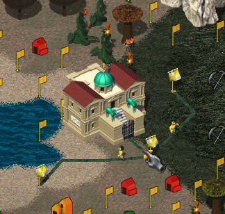
Hard to tell the difference between actual flags and possible flags for the yellow player
| Affects | Status | Importance | Assigned to | Milestone | |
|---|---|---|---|---|---|
| widelands |
Fix Released
|
Low
|
Chuck Wilder | ||
Bug Description
(I'm not really sure what can be done with this, and I know there are already some reports regarding colors.)
I just noticed when playing as the yellow player, that it was a bit hard to tell the difference between where I had placed flags and where it was possible. While I do use shift-click to place roads so that they are filled automatically, it was a bit confusing in the beginning.
To clearify, I don't really have any suggestions for how this could be changed, or even if it *should* be changed, but I thought I'd report it.
-------
The vote as of 17 Jan.:
......1st Choice=3pts 2nd Choice=2pts 3rd Choice=1pt....Total Pts
Axe ..... 2 votes ....... 4 ............. 0 ...............14
Slash ... 1 ............. 0 ............. 1 ............... 4
Rough \ . 3 ............. 2 ............. 0 ...............13
"X" ..... 0 ............. 0 ............. 1 ............... 1
Wolf .... 0 ............. 0 ............. 1 ............... 1

| tags: | added: graphic |
| description: | updated |
| description: | updated |
| Changed in widelands: | |
| status: | Confirmed → In Progress |
The point with the screenshot is that one of the flags on the road is not placed.