
Technical: Mono: discern level of scaling to fit in terminal cell
| Affects | Status | Importance | Assigned to | Milestone | |
|---|---|---|---|---|---|
| Ubuntu Font Family |
Fix Released
|
High
|
Unassigned | ||
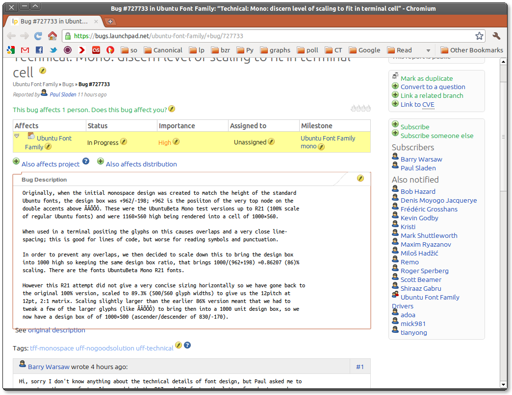
Bug Description
Originally, when the initial monospace design was created to match the height of the standard Ubuntu fonts, the design box was +962/-198; +962 is the posiiton of the very top node on the double accents above ǞǠȪȬȰ. These were the UbuntuBeta Mono test versions up to R21 (100% scale of regular Ubuntu fonts) and were 1160×560 high being rendered into a cell of 1000×560.
When used in a terminal positing the glyphs on this causes overlaps and a very close line-spacing; this is good for lines of code, but worse for reading symbols and punctuation.
In order to prevent any overlaps, we then decided to scale down this to bring the design box into 1000 high so keeping the same design box ratio, that brings 1000/(962+198) =0.86207 (86)% scaling. There are the fonts UbuntuBeta Mono R21 fonts.
However this R21 attempt did not give a very concise sizing horizontally so we have gone back to the original 100% version, scaled to 89.3% (500/560 glyph widths) to give us the 12pitch at 12pt, 2:1 matrix. Scaling slightly larger than the earlier 86% version meant that we had to tweak a few of the larger glyphs (like ǞǠȪȬȰ) to bring then into a 1000 unit design box, so we now have a design box of of 1000×500 (ascender/descender of 830/-170).

| Barry Warsaw (barry) wrote : | #1 |
| description: | updated |
| Martin Pool (mbp) wrote : | #2 |
- launchpad.png Edit (196.9 KiB, image/png)
I think it's quite important the monospace font at x points look basically the same size as the proportional font at x points. I think it's a fairly serious bug if they don't, and I'd like to see the Ubuntu fonts adopt this as a constraint.
I realize the definition of "size" for fonts is subtle, but also that we would all agree that at the moment Ubuntu Monospace 10 looks a lot smaller than Ubuntu 10. Perhaps we should say they should have the same x-height, or some other metric (or combination of metrics.)
One way to get there would be to increase the character cell size rather than shrinking the characters.
As an example of the problems caused by the current fonts, look at the attachment giving a screenshot of Launchpad using this font: the monospace bug descriptions appear oddly and unintentionally smaller than the other text. (This problem wasn't present with R17.) If the Ubuntu font ships like this, Launchpad might insert CSS rules to scale up the monospace font, but that probably won't get it exactly right, and it may cause knock on annoyances for people using other fonts.
There are cases such as in program documentation where people want for example sample commands to look visually distinct from the rest of the text. Since the Ubuntu monospace font is fairly similar to the proportional font, if they're the same size, it will not be very distinct. However, I think the solution there is for people to set the commands in a different size, weight, or color. Start out consistent in the font itself, and then users can make it look smaller if they want to.
I think that <https:/
| Martin Pool (mbp) wrote : | #3 |
Regarding Barry's comments: there seems to be an inherent tradeoff between (some) programmers wanting tightly-packed cells for usually-
It seems to me Ubuntu Monospace is not trying to be specifically a programmer-oriented font[1], but considering the project's values it would be good to make it work well there.
One option would be to make two fonts which use the same shapes but that have different metrics: a non-default programmer oriented one with very dense character cells, for people who prefer the tradeoff they got in R17. I don't know how hard that would be, but perhaps not very hard.
| Mark Shuttleworth (sabdfl) wrote : Re: [Bug 727733] Re: Technical: Mono: discern level of scaling to fit in terminal cell | #4 |
The font should look great on web pages with bug correspondence as much
as terminals. I think the spacing is important from a visual balance
point of view. Cramming as much info into the screen as possible is not
a goal.
| Martin Pool (mbp) wrote : | #5 |
Given Mark's comment, I hope to see the shrinking reverted, and then we can as a separate possible future enhancement make a variant of the font that is tightly packed for those who want that. There's no reason that variant would necessarily have to be done by the Ubuntu font team or shipped in the main package.
| Barry Warsaw (barry) wrote : | #6 |
I don't think we need to cram as much as possible onto the screen, but something closer to R17 would (IMHO of course) work better as a programmer font. I hope that use case isn't abandoned though because the Ubuntu Mono font is *really* nice and quite easy on the eyes for programming!
| Martin Pool (mbp) wrote : Re: [Bug 727733] Re: Technical: Mono: discern level of scaling to fit in terminal cell | #7 |
Maybe there's a happy medium where we can keep the x-height the same,
not have too much overlap, and still have moderate density.
Martin
| tags: |
added: uff-monospace removed: tff-monospace |
| Paul Sladen (sladen) wrote : | #8 |
- ubuntu-mono-nominal-size-r17-r21.pdf Edit (55.8 KiB, application/pdf)
As Martin notes it is a hard problem and it's probably one that we should have been developing in parallel from the start with the proportional fonts. As I understand it, originally the proportionally-
The question is, what are the various terminals using when they choose their layout line-height. I or somebody else needs to categorically figure out and document this, at which point is should in theory all be easy!
1160×560 is too squashed, 1160×482 is too gappy. 1000×500 is ... etc. Malcolm is currently working on a 500-width test which fits in with the rational 1:2 ratio for a monospace and which people are used to reading. The next step is to figure out the tiling, which is why a minimal set of box-drawing characters have been added (again, I know, we should have done this on day one and got it right then).
Barry, I don't the aim should be to "cram it in"... we're aiming for good, universal defaults here. The logic for the 83% scaling was perhaps fairly thin, but at the time it was the fastest way to get a test that might solve the overlaps. On the attached PDF you can see how the line-counts should compare. The current test proposal would give 48 lines (vs. originally 52 with with unsatisfactory overlaps, or 42 without overlaps).
The one thing that hasn't been tried yet is 1120×560; this does not have the historical beauty of matching the 12 CPI (12 characters per 25.4 mm) but would be equivalent to the current downsizing of extreme accents that is being done and would have a 2:1 ratio and would keep the same ascender, descender and x-height as the Proportional. The question is whether it can be done, if it can, it makes future expansion easier as characters of about the right width port straight across (currently 'abcde' are identical in both).
The really BIG question is, if we could make a small change to the default TypoGap line-spacing of the proportional (which is perhaps a little) tight and have a more coherent result across the board, would we do that at this stage?
| Barry Warsaw (barry) wrote : | #9 |
Hi Paul. While the technical details of font design are going over my head
:), I really do appreciate you keeping an eye out for the programming use
case. As I said, the Ubuntu Mono fonts are so beautiful, I really want to be
using them!
On Mar 08, 2011, at 08:14 AM, Paul Sladen wrote:
>Barry, I don't the aim should be to "cram it in"... we're aiming for
>good, universal defaults here. The logic for the 83% scaling was
>perhaps fairly thin, but at the time it was the fastest way to get a
>test that might solve the overlaps. On the attached PDF you can see how
>the line-counts should compare. The current test proposal would give 48
>lines (vs. originally 52 with with unsatisfactory overlaps, or 42
>without overlaps).
I can also appreciate the trade-offs involved, and agree that Ubuntu Mono
should not have a goal of cramming as much information onto the screen as
possible. Maybe the middle font (500@13pt 2:1 ratio) will be a good trade
off.
Thanks for keeping us programmers in mind and I look forward to trying the
next iteration of the Mono fonts. I've settled back on R17 for the last
couple of weeks, but I'll go back to trying R21 at a smaller point size, at
least until the next iteration comes out.
Cheers.
| Barry Warsaw (barry) wrote : | #10 |
Oops, I meant R21 at the larger point size.
| Mark Shuttleworth (sabdfl) wrote : Re: [Bug 727733] Re: Technical: Mono: discern level of scaling to fit in terminal cell | #11 |
On 08/03/11 08:14, Paul Sladen wrote:
> The really BIG question is, if we could make a small change to the
> default TypoGap line-spacing of the proportional (which is perhaps a
> little) tight and have a more coherent result across the board, would we
> do that at this stage?
How is that question being discussed and resolved?
| Malcolm Wooden (malcolm-daltonmaag) wrote : | #12 |
- UbuntuLucidaDejaVu.pdf Edit (733.5 KiB, application/pdf)
On 08/03/11 08:14, Paul Sladen wrote:
> The really BIG question is, if we could make a small change to the
> default TypoGap line-spacing of the proportional (which is perhaps a
> little) tight and have a more coherent result across the board, would we
> do that at this stage?
I think the TypoLineGap of the proportional fonts should really not be changed now unless there is a VERY good reason to do so. In the vast majority of the applications that use the proportional fonts the interline spacing will be defined by the user in terms of leading relative to the point size. In applications that do not have user defined leading by default, the interline spacing (which TypoLineGap is part) should be set to at least a value that will clear the vertical design box, which it does.
The question here surely is one of scale.
We have offered two scales of the monospaced and it appears that neither has been overwhelmingly endorsed by the users in the community. So should we be looking at developing another trial version for the community to try out?
Looking at the comparative sizes of the fonts in the attached 100pt PDF, the Ubuntu 500 is by far the smallest. If we abandon the neat 12pich @ 12pt (2:1) solution that this 500 version gives and go back to our original 560 width version, should we look at making some other compromises to the design size relative to the Regular Sans (perhaps making the caps about 12% - 13% smaller as is the case with Lucida) so that the vertical design box stays with the em size (1000) for terminal style use? Or alternatively abandon the vertical em limitation altogether (as in DejaVuSansMono) and make the vertical rules of the box forms overly big so that they join no matter what application may be using them?
Many monospaced typefaces do not have related proportional designs, probably because it is so difficult to create a good relationship between them, but I do think we are close to making UbuntuMono an excellent addition to the Ubuntu font family.
So to recap , the decision required for the scaling is one of the following:
1. Use the 500 width version which gives an excellent design relationship with the proportional fonts, albeit at a smaller scale.
2. Go back to the 560 width version which gives a better size relationship to the proportional fonts but is outside the vertical em.
3. Go back to the 560 width version and modify the larger glyphs (including reducing the capital size) to restrict the vertical size to the em, making the design less compatible with the proportional fonts.
Suggestions welcome!
| Paul Sladen (sladen) wrote : | #13 |
Malcolm: yeah, (3.) which is 560×1120 is the one I've been wanting to knock up here at the weekend and test for practicalness to see if it's possible. If the terminals on GNOME/KDE/Mac OS/Win32 will all accept and use an WinDescent/
The same work to bring the outriggers into that 560×1120 vertical bound /will/ still need doing, but it would then have the same x-height and cap-height as the proportional.
The question about the metrics is because there's currently inconsistency anyway, and I have no idea which set is getting used as a result. Here's the three groups for the original Proportional regular and the original Mono regular (nominally the same vertical size, but a spread between 1017 and 1127):
>>> 932+189, 932+189+28, 776+185+56 (Proportional: Win, Typo, HHead)
(1121, 1149, 1017)
>>> 932+195, 776+185+56, 776+185+56 (Mono R21: Win, Typo, HHead)
(1127, 1017, 1017)
If option (3.) works for the monospace (1120, 1120, 1120) then the proportional might for consistency want to be (1160, 1120, 1120)... the 1160 being the design extends of the double accents in the regular, which would be knowingly brought into 2:1 for the Monospace.
| Dave Crossland (davelab6) wrote : | #14 |
I must admit I do not FULLY understand everything here, and without screenshots its hard to be sure, but I believe (3) is also optimal.
| Martin Pool (mbp) wrote : Re: [Bug 727733] Re: Technical: Mono: discern level of scaling to fit in terminal cell | #15 |
If I understand (3) correctly then if we have
Some proportional text with "echo Hello World" as an example command
then the H and W will look somewhat shorter than the S? That might be
less bad than, as in R21, having the whole monospace section look
smaller, but it may still look inconsistent or jarring. Or maybe not;
I'm not sure without seeing it.
Mixing monospace and proportional within the same page or even the
same line is going to be really common for these fonts and I think
it's important it looks good. (Keeping consistent line spacing in
naive programs when people mix these fonts would also be nice..)
Is there an option (4) which is to keep the glyphs the same size as in
R17 (1160×560?) and increase the cell to fit? (Is that what Malcolm's
talking about "abandon the vertical em limitation altogether"?) Would
there be any down side to that?
Martin
| Paul Sladen (sladen) wrote : | #16 |
An update; the latest 'UbuntuBeta_
$ showttf UbuntuBeta_
HHEAD table (at 308)
ascender=932
descender=-188
linegap=0
OS/2 table (at 376 for 96 bytes)
stypeascend
stypedescen
stypelinegap=56 <--
usWinAscent=932
usWinDescen
The 776+185+56 appear to be some interaction with being offsets from the 1/1000 em-square.
Martin: "the capitals" here are the extreme double-accents found in transcription/
| Paul Sladen (sladen) wrote : | #17 |
- ubuntu-light-with-mono-1120.png Edit (174.2 KiB, image/png)
Screenshot from planet.ubuntu.com using Ubuntu Light for the body copy and Ubuntu Mono 1120 for the <code></code>. These share the same x-height and cap-height. The constrast here is being created by the difference in weight.
| Miloš Hadžić (miloshadzic) wrote : | #18 |
Could someone post a screenshot with the regular Ubuntu font?
| Mark Shuttleworth (sabdfl) wrote : Re: [Bug 727733] Re: Technical: Mono: discern level of scaling to fit in terminal cell | #19 |
On 18/03/11 10:36, Paul Sladen wrote:
> Screenshot from planet.ubuntu.com using Ubuntu Light for the body copy
> and Ubuntu Mono 1120 for the <code></code>. These share the same
> x-height and cap-height. The constrast here is being created by the
> difference in weight.
The x-height is definitely different between those two fonts. Look
closely in gimp (pull in a guideline or two from the top ruler if you
have any doubt).
Mark
| Malcolm Wooden (malcolm-daltonmaag) wrote : Re: [Bug 727733] Re: Technical: Mono: discern level of scaling to fit in terminal cell | #20 |
That's a bit unfortunate to show Light against Monospaced for x-height
comparison as the Light is designed to have a slightly smaller x-height to
the Regular.
The Regular and Monospaced (full size) definitely have the same Cap and
x-heights.
Malcolm
On Fri, Mar 18, 2011 at 1:06 PM, Mark Shuttleworth <
<email address hidden>> wrote:
> On 18/03/11 10:36, Paul Sladen wrote:
> > Screenshot from planet.ubuntu.com using Ubuntu Light for the body copy
> > and Ubuntu Mono 1120 for the <code></code>. These share the same
> > x-height and cap-height. The constrast here is being created by the
> > difference in weight.
>
> The x-height is definitely different between those two fonts. Look
> closely in gimp (pull in a guideline or two from the top ruler if you
> have any doubt).
>
> Mark
>
> --
> You received this bug notification because you are a member of Ubuntu
> Font Family Drivers, which is subscribed to Ubuntu Font Family.
> https:/
>
> Title:
> Technical: Mono: discern level of scaling to fit in terminal cell
>
> Status in Ubuntu Font Family:
> In Progress
>
> Bug description:
> Originally, when the initial monospace design was created to match the
> height of the standard Ubuntu fonts, the design box was +962/-198;
> +962 is the posiiton of the very top node on the double accents above
> ǞǠȪȬȰ. These were the UbuntuBeta Mono test versions up to R21 (100%
> scale of regular Ubuntu fonts) and were 1160×560 high being rendered
> into a cell of 1000×560.
>
> When used in a terminal positing the glyphs on this causes overlaps
> and a very close line-spacing; this is good for lines of code, but
> worse for reading symbols and punctuation.
>
> In order to prevent any overlaps, we then decided to scale down this
> to bring the design box into 1000 high so keeping the same design box
> ratio, that brings 1000/(962+198) =0.86207 (86)% scaling. There are
> the fonts UbuntuBeta Mono R21 fonts.
>
> However this R21 attempt did not give a very concise sizing
> horizontally so we have gone back to the original 100% version, scaled
> to 89.3% (500/560 glyph widths) to give us the 12pitch at 12pt, 2:1
> matrix. Scaling slightly larger than the earlier 86% version meant
> that we had to tweak a few of the larger glyphs (like ǞǠȪȬȰ) to bring
> then into a 1000 unit design box, so we now have a design box of of
> 1000×500 (ascender/descender of 830/-170).
>
| Paul Sladen (sladen) wrote : | #21 |
Mark: it is hopefully just at artefact of the engineering not being done yet and a small number of pixels. They should all match up; for example if load the following nasty hack into Firefox:
<html>
<head>
<style>
p { font-family: UbuntuBeta; font-size: 72pt; color: rgba(255,0,0,.333); position: absolute; left: 10px; top: 10px;}
code { font-family: UbBetaMono; font-size: 72pt; color: rgba(0,255,0,.333); position: absolute; left: 10px; top: 10px;}
div { font-family: Ubuntu; font-size: 72pt; color: rgba(0,0,255,.333); position: absolute; left: 10px; top: 10px;}
</style>
</head>
<body>
<p>Hxflirt1mE
<code>
<div>
</body>
</html>
Then they all align up; The attachment above is the result of "Print to PDF" on that output:
| Paul Sladen (sladen) wrote : | #22 |
- box-drawing-90-degrees-ratio.pdf Edit (13.1 KiB, application/pdf)
Playing with the box drawing characters with then it's possibly in theory to check the cell bounds and ratios. The attached PDF has a box drawn, and then rotated 90-degrees and laid on top of itself. For unifont the result is an overlap; for the 560x1120 mono and DejaVu Sans Mono the result is not, it is wider than it is high.
| Soren Hansen (soren) wrote : | #23 |
What is the progress on this?
Most of us are still really looking forward to see and use this *lovely* (from the looks of the screenshots) new font. It's getting really quite late for Natty. :(
| Paul Sladen (sladen) wrote : | #24 |
Soren: I certain agree with your characterisation that people are really looking forward to the Ubuntu Mono (the number of questions about its state of development reflects that too).
Regarding Ubuntu 11.04: there was a bit of a storm even from Dustin landing bug #730672 ("Improve Console Colours") after freeze and that was even 6 weeks ago now. I don't think I would want to propose to put the Ubuntu Mono in now, even if it /was/ ready (which it isn't, it needs hinting and engineering). Ubuntu Mono really needs implementing top-to-bottom, not just in the GUI terminals, but also the bootloader, virtual consoles, installer/bterm and gfxboot CD menus.
We could probably technically put in an unhinted Ubuntu Mono, but it wouldn't be representative of the final product. The bi-level bitmap rendering are going to /require/ having done careful hinting, with extra special concentration at 16 PPEM (8×16 pixels). Because of the licence difference between interium Ubuntu Font Licence and that used for Unifont we'll probably also have to develop patches to dynamically load a main and fallback from two separate font files and then send those upstream for each of the four bitmap/console text renderers listed above (help graciously accepted, it should be a fun little project!). There was also an issue (until very recently) with the .ttf not loading in KDE Konsole, which you're probably got strong opinions about too! :)
Do you fancy getting together at UDS to investigate further on how to get the maximum impact for the next cycle, or organising a session (hopefully we'll have something publicly PPAed by then). If it goes in at the start of the cycle there should be a nice comfortable six months to work out how smooth the corners off, rather than rushing something out now.
| Soren Hansen (soren) wrote : | #25 |
2011/4/6 Paul Sladen <email address hidden>:
> Regarding Ubuntu 11.04: there was a bit of a storm even from Dustin
> landing bug #730672 ("Improve Console Colours") after freeze and that
> was even 6 weeks ago now.
I'm not suggesting we put it in and make it the default font. I'm merely
suggesting making it available on a broader basis. Judging by who has
commented on this bug, the font seems to be available exclusively to
people in Canonical?
> I don't think I would want to propose to put the Ubuntu Mono in now,
>even if it /was/ ready (which it isn't, it needs hinting and
>engineering). Ubuntu Mono really needs implementing top-to- bottom,
>not just in the GUI terminals, but also the bootloader, virtual
>consoles, installer/bterm and gfxboot CD menus.
Certainly, and I'd love to see this happen in Oneiric. For now, though,
I'd be perfectly happy if I could just get to use this lovely new font
in my terminal and my code editor. Heck, it doesn't even have to be
packaged! A downloadable ttf marked "alpha snapshot - don't use for
print or else!" would be *awesome*.
--
Soren Hansen | http://
Ubuntu Developer | http://
OpenStack Developer | http://
| Mark Shuttleworth (sabdfl) wrote : Re: [Bug 727733] Re: Technical: Mono: discern level of scaling to fit in terminal cell | #26 |
The mono got stuck on a technicality about how we accommodate languages
which have multiple, stacked accents in the standard box without having
overlaps or unsightly vertical gaps. We expect to get rolling with it,
and share an unhinted version more widely in the next few weeks. A fully
hinted version should land and be the default in Oneiric.
Mark
| Soren Hansen (soren) wrote : Re: [Bug 727733] Re: Technical: Mono: discern level of scaling to fit in terminal cell | #27 |
Sounds great, Mark. Thanks.
| Cody Boisclair (codeman38) wrote : | #28 |
It's been a few weeks since the 6th, Natty is finally out, and I still don't see a beta version of the monospaced font even in ~ubuntu-
| Mark Shuttleworth (sabdfl) wrote : Re: [Bug 727733] Re: Technical: Mono: discern level of scaling to fit in terminal cell | #29 |
We made a final call on width/height/
will be a beta out shortly.
| Paul Sladen (sladen) wrote : | #30 |
Cody: The plan is a 50/56 (89...%) scaling relative to the x-height of the main proportional fonts, this gives a 500x1000 design square which everything can be fitted into. I'm sorry that this decision wasn't updated here on the bug report.
Bruno, Mark, Ivanka, Marcus and I had a meeting last week on 2011-04-18 to review the various bug reports that were blocking things and the possible solutions. From the comments and discussions, the 500 width seems to work out better. The plan is:
1. Ubuntu Mono 500x1000 design box (scale by 56/50 == 89.2857%)
2. All vertically-
3. All horizontally-
4. Line drawing/box characters touching this design box
5. One em default line-spacing/zero typo-gap
This gives:
* By default helps to differentiate Ubuntu proportional and Ubuntu Mono in the same line of text at the same font size. (If you don't want that, it's simple to apply a 12% font-size increase)
* Keeps the overall line length about the same (because of spaces, Ubuntu Mono would be longer without)
* Allows the Ubuntu Mono to be used as an 8x16 bitmap console font
* Gives a 12 CPI (characters per inch). As a reference this is the same as Inconsolata
Hope that's useful! (And sorry for not having written it sooner).
| Cody Boisclair (codeman38) wrote : | #31 |
Yes, that answers my questions.
I like the point about differentiating mono and proportional text, because I had a run-in with that myself recently. I use the Liberation fonts as defaults in Firefox, and the post I had been reading mentioned something about "an `a` tag". Because the 'a' characters in Liberation Sans and Mono look almost identical, it took me far longer to parse that sentence than it should have.
As someone who spends a lot of time staring at source code on three different OSes, I'm quite eager to test the beta version.
| Paul Sladen (sladen) wrote : | #32 |
UbuntuBeta Mono 0.3 and above: 100/112 (89.3%) scaling of Ubuntu Mono compared to Ubuntu Proportional; Final design square of 500×1000 with everything fitted except certain polytonics (to be reviewed following testing).
| Changed in ubuntu-font-family: | |
| status: | In Progress → Fix Released |
| tags: | added: uff-style |
| Dave Crossland (davelab6) wrote : | #34 |
I agree about LineGap=0 and just registered https:/
Hi, sorry I don't know anything about the technical details of font design, but Paul asked me to comment on the mono fonts. I've used both the R17 and R21 fonts, the latter for about a week.
Immediately after installing the R17 fonts, I thought they were a little vertically crowded, but I quickly got used to it. In Emacs windows, Terminal windows and my mail client, I thought the R17 fonts were quite nice at 12pt scale. The only minor downside was that it was difficult to fit two 12pt 80 column wide Terminal windows side-by-side on a 1400x900 screen. There is a little overlap but it's not brutal. :)
The R21 fonts shrank the vertical height of the characters such that 12 point font was too small to comfortably see. Cranking the font size up to 14 (in say Terminal) gave a better result, but had the big downside of shrinking the full-screen height of Terminal by 8 lines. A compromise of 13 point is a little better, but losing the vertical lines in Emacs really isn't acceptable. The only positive to the R21 fonts is that 80 column Terminals at 13 points are narrower than 80 column Terminal R17 font at 12 point, so I can easily fit two Terminals side-by-side in R21.
I'm not sure what the answer is. At this point I like the look of the R17 fonts, but the horizontal spacing of the R21 fonts. Something in the middle that preserves the stingier vertical space of R17 with the stingier horizontal space of R21, with slightly taller glyphs might be a good compromise. Sounds like the changes you're making might help and I'll definitely try them out when they are released.
Cheers.