
Some Ubuntu monospace bold chara look squished
Bug #793485 reported by
George Ryan
This bug report is a duplicate of:
Bug #727733: Technical: Mono: discern level of scaling to fit in terminal cell.
Edit
Remove
This bug affects 1 person
| Affects | Status | Importance | Assigned to | Milestone | |
|---|---|---|---|---|---|
| Ubuntu Font Family |
New
|
Undecided
|
Unassigned | ||
Bug Description
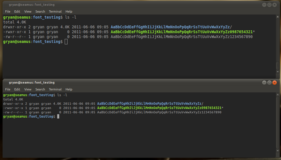
I don't know if this would be classified as a bug or not, but it's my observation. I have attached a screen capture of a comparison of the standard Monospace font for 11.04 and the Ubuntu Mono font in a terminal with bolding enabled. These are take at 96 DPI, both 10 point font size.
The standard monospace fonts compare quite well between the bold and regular versions of the characters, however in the Ubuntu Mono window, you can see that overall, the feeling of the bold characters is much more tall and squished than the regular fonts.
In particular, the uppercase Q, D, A, and O seem to be the characters that are giving this effect.
Thanks.

To post a comment you must log in.
Hello George, thank you for your input. DejaVu Sans Mono is ~600/1000 em wide (10 characters per inch) and Inconsolata and Ubuntu Mono are set at 500/1000 em wide (12 character per inch).
To compensate, you'll may want to increase the font size for "UbuntuBeta Mono" in the Terminal by 1 notch or two; eg. using 12 point if you were using 11 point.
I'm tempted to mark this as a dup of bug #727733 ("Technical: Mono: discern level of scaling to fit in terminal cell") as that has the longer backstory and discussion leading up to the discussion. When/if we set Ubuntu Mono as a default in the Terminals in the distribution we can probably increase the size by default (the same would apply if using Inconsolata by default which has the same bounding box size).
Does that make sense? Is there anything I can try to expand on?