[1 mod] Cyrillic: soft-en 'њ' ligature bowl does not meld with horizontal bar

Bug #654192 reported by Ристе Ристевски
20
This bug affects 3 people
Affects Status Importance Assigned to Milestone
Ubuntu Font Family
Fix Committed
High
Shiraaz Gabru

Bug Description

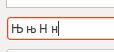
The letter 'Њ' is a ligature of 'Н' and 'Ь' and it should look like the two letters "molten" together.
In this new Ubuntu font, the small version of the letter (њ) is a little bit out of position (the right part of the letter (ь) is a little bit upper than the left part - 'н').

Proposed solution:

 1. Upright Њ be changed to have flat top and bottom on bowl. Top of bowl aligned to bar.
 2. Cursive Њ be changed to have flat top and rounded bottom on bowl. Top of bowl aligned to bar.
 3. Н Њ consistency to be maintained (important)
 4. lj Њ consistency to be maintained (medium importance)
 5. Ь Њ consistency least of worries (lowest importance, because these don't appear together in the real-world)

Revision history for this message
Ристе Ристевски (risteristevski) wrote :
Paul Sladen (sladen)
summary: - The Cyrillic letter 'њ' is not perfectly positioned
+ Ligature: Cyrillic: 'њ' outline compared to 'нь'
Revision history for this message
Paul Sladen (sladen) wrote : Re: Ligature: Cyrillic: 'њ' outline compared to 'нь'

Riste: that is a wonderful diagram; please could you expand it to show 'н' and 'ь' separately, and then 'њ' as it currently, and then how you believe it should look (the diagram above, for both lower and captials). Having everything in one place makes it much easier to have a quick visual comparison.

Changed in ubuntu-font-family:
status: New → Incomplete
tags: added: ttf-cyrillic ttf-ligature
Revision history for this message
adoa (adoa) wrote :

I am not quite sure I understand about the problem but here is a screenshot of the Characters in question.

I mentioned that every single character taken for itself looks correct, but comparing н and њ, the horizontal stroke has different levels for some smaller font-sizes, as 13pt for example. For very big font-sizes the characters look absolutely perfect.
I think it is more likely that this is a problem of the hinting. The Character њ emerged as a ligature of н and ь.
http://en.wikipedia.org/wiki/Nje

I do not know all the languages this character is used, Wikipedia mentions Serbian and Macedonian. The Macedonian and the Serbian keyboards,however, have a special key for that character. So I don't think it is a ligature in the terms of typography.
http://mk.wikipedia.org/wiki/%D0%A2%D0%B0%D1%81%D1%82%D0%B0%D1%82%D1%83%D1%80%D0%B0
http://sr.wikipedia.org/sr/%D0%A2%D0%B0%D1%81%D1%82%D0%B0%D1%82%D1%83%D1%80%D0%B0

Revision history for this message
Paul Sladen (sladen) wrote :

Yes and screenshot is needed for debugging these issues, as because of the Hinting there can be quite alot of potential variance in rendering (hinting enabled, what DPI, what exact pixels-per-em) and of course, the exact size that is showing the issue!

I've spent an hour or so playing with these, depending on the style and weight the cut-line height use between the Н and Њ; the bowl height is also slightly different between Ь and Њ (one has been moved up, and one has been moved down as a compromise). I assume what is happening here is as the size reduces hinting has to eventually make a decision about whether to nudge the cut-line up 0.5 pixel lines, or 0.5 pixels lines; and the choices made differ.

It might be possible to cure this with hinting alone, but possibly it might warrant some tweaking to fundementally bring the cut-line and bowl height closer. I'll ask DM to have a look at this later in the development cycle about this.

Revision history for this message
Ристе Ристевски (risteristevski) wrote :

The letter њ is indeed a ligature, but we do have a separate key for it.
I wasn't able to explain this problem professionally, but thanks to comment #3 by adoa who did it for me.

For smaller font sizes, the horizontal stroke has different levels (the right line is a little bit higher than it should be).

Additional info:
I'm using the size 9 of the font as my Application and Desktop font and only the lowercase letter is affected.

Revision history for this message
Paul Sladen (sladen) wrote :

Riste: it would still be useful if you could post a screenshot, as "size 9" on your machine could be very different to "size 9" on somebody else's machine, depending on DPI, and the hinting set used. On your machine the difference was obviously extreme enough to notice, could you please share that.

Revision history for this message
Ристе Ристевски (risteristevski) wrote :

I didn't wanted to zoom in the screenshot, because of it's original size, but the problem still can be seen on this attachment I provided.

Also, I noticed that this problem appears only with the Sub-pixel smoothing option turned on.
The Best Contrast, Best Shapes and Monochrome rendering options are rendering the letter normally.

Revision history for this message
Launchpad Janitor (janitor) wrote :

[Expired for Ubuntu Font Family because there has been no activity for 60 days.]

Changed in ubuntu-font-family:
status: Incomplete → Expired
Revision history for this message
Данило Шеган (danilo) wrote :

It does look crappy.

Changed in ubuntu-font-family:
status: Expired → New
Revision history for this message
Paul Sladen (sladen) wrote :

Confirming this after a few hours spent wondering around Belgrade today. I could not find a single instance of a soft-en with the bowl and stem not lined as though drawn as a single stroke (see example in attached PDF for how it's drawn by hand).

Данило: Would you be able to expland on /why/ the soft-en looks sub-optimal? I presume that whatever the solution for soft-en is should then be applied to soft-el as well?

Changed in ubuntu-font-family:
status: New → Triaged
importance: Undecided → High
milestone: none → 1.00
Revision history for this message
Paul Sladen (sladen) wrote :

PDF of current and handwritten stroke method.

Revision history for this message
Данило Шеган (danilo) wrote :

To elaborate: the way one usually writes њ is to draw the left vertical stem, and then start from the top of the right vertical stem, work your way down, turn right for the bowl and cross the right stem horizontally towards the left stem. That basically precludes having unaligned bowl and the horizontal cross-stem. Different fonts do have some minor variations but mostly to provide a good optical balance. The way they align in examples like last Ристе's example[1] looks very unnatural (especially the lowercase њ version).

[1]https://bugs.launchpad.net/ubuntu-font-family/+bug/654192/+attachment/1670349/+files/Untitled.png

As for the soft el (љ, Љ), yes, the bowl should generally match the bowl of њ, Њ, at least in general appearance.

Revision history for this message
Данило Шеган (danilo) wrote :

And of course, as mentioned earlier, Њ is the soft Н, and Љ is the soft Л, so relationship should be maintained in glyphs when possible (iow, it's ok if the widths differ in monospace).

Revision history for this message
Malcolm Wooden (malcolm-daltonmaag) wrote :

Just for comparison, here is a range of design of the character in question. From us, Microsoft, Adobe and some others.

Revision history for this message
Paul Sladen (sladen) wrote :

For reference, the soft-N/soft-n collection shown in Malcolm's PDF are:

  Arial Arno Pro, Book Antiqua, Bookman Old Style, Calibri, Cambria, Candara, Century,
  Comic Sans MS, Consolas, Constantia, Corbel, Courier New, Franklin Medium Gothic, Garamond Premr Pro, Georgia, Impact
  InferFace Corp, Minion Pro, Myriad Pro, Segoe UI, Tahoma, Verdana

Based on what I've seen, Cambria, Candara, Consolas, Corbel, Myriad Pro and possibly Impact would appear to be sub-optimal with the rest being passable.

Danilo/Riste: would you be able to look at Malcolm's PDF above and give a +2/+1/0/-1/-2 quality assessment for each of the glyphs in the fonts above?

Revision history for this message
Paul Sladen (sladen) wrote :

adoa, Miloš Hadžić, Данило Шеган, Ристе Ристевски: your input is needed in order to guide the fixing of this. Please could you rate each of the glyphs in the above PDF:

  https://bugs.launchpad.net/ubuntu-font-family/+bug/654192/+attachment/2133676/+files/Untitled-1.pdf

on a +2/+1/0/-1/-2 (good/neutral/bad) scale?

tags: added: uff-serbian uff-sr uff-style
Changed in ubuntu-font-family:
status: Triaged → Incomplete
milestone: 1.00 → mono
Revision history for this message
adoa (adoa) wrote :

Well, as far as I can tell, the glyph itself is not wrong. It is a pure hinting problem.

I try to explain it by pure exaggeration: In the sketch, the style of the Ubuntu Font is imitated: the arc, that extends under the baseline and over the centerline. The Glyph itself is O.K. But when the hinting process starts and the pixels are divided by the gray line, the letters become wrong in shape.

Revision history for this message
adoa (adoa) wrote :

At the same time, the horizonal bars of њ and н should have the exact same height to make it consistent. In the screenshot I made LibreOffice Writer render the following characters:
Њ НЬ њ нь 

Could a native Serbian speaker please confirm the following statements?

 • pure hinting problem, i.e. the glyph is correctly rendered in high resolutions/font sizes
 • bars of њ and н should have the exact same height

Revision history for this message
adoa (adoa) wrote :

If all these problems cannot be solved at the same time, which attribute is the least important?
• consistency of Њ and њ with respect to hinting
• consistency of shapes of њ and н
• consistency of shapes of њ and ь

Revision history for this message
Paul Sladen (sladen) wrote :

adoa: My understanding is that it is two-part:

  1. The crossbar and bowl being disjoint (tolerable but not ideal)
  2. The hinting [rounding error] either fixes that (great), or amplifies the issue (problem)

Revision history for this message
Данило Шеган (danilo) wrote :

I don't have the time to go through all the glyphs, but the fact that the top bowl stem is not horizontal is not a big deal to me (though, all of the glyphs where bowl visibly extends above the horizontal cross look weirder, like variants 5 and 6 in row 1, variant 3 in row 3), as long as it (seems to) join at where the horizontal stem is on the Н part. I guess I find the over-extending bowl much more of a problem with sans-serif fonts, because I don't seem to mind it at all in serif fonts (I notice it if I look hard for it, but I don't mind it). And also interestingly enough, the heavy bold Impact version (2nd row, final variant) doesn't bother me all that much at all.

So, I could agree that lack of proper (or any) hinting might be the main issue, but it also seems that the bowl that doesn't seamlessly connect into the horizontal crossbar is much more bothersome in sans-serif fonts.

As far as adoa's final question, the least important is the consistency of shapes of њ and ь: "ь" is not even used in Serbian (ever), so it's a moot point from the consistency stand-point. Consistency between Њ and Н, and hinting consistency are both equally important, imho. If some trade-offs need to be made at very small sizes, I'd guess that consistency between the letters should suffer first (especially for monospace, where width will have to change).

One can also make a case for consistency between bowls in Њ, њ and Љ, љ, considering they are similarly derived from Н, н, Л, л and they all do appear in Serbian.

Changed in ubuntu-font-family:
status: Incomplete → Confirmed
Revision history for this message
Данило Шеган (danilo) wrote :

I am guessing Impact version doesn't bother me because the horizontal cross bar is not that much of a line for me to want it to continue into the bowl.

Revision history for this message
Paul Sladen (sladen) wrote :

adoa, Miloš Hadžić, Данило Шеган, Ристе Ристевски: not heard back from *any* of you. Could you please:

  1. have a look at the PDF in comment #14 and rate the other glyphs
  2. have a look at the PDF in this comment and comment on the three designs (a,b,c ).

Revision history for this message
Paul Sladen (sladen) wrote :

Данило: mid-air collision. Many thanks for the detailed feedback: the analysis of /why/ certain of the treatments are better or worse (what appeals, what is readable) is probably even more useful!

In the second PDF I've drawn a quick mock-up in Inkscape:

  a. curved bowl (protruding above the x-height and below baseline)
  b. Њ, њ with a flat-topped bowl (level with x-height, curved below baseline)
  c. Њ, њ with a flattened bowl (level with x-height, level with baseline).

Revision history for this message
Данило Шеган (danilo) wrote :

b and c both look good to me. My personal preference would be towards c, but I don't think I'd mind the b variant either (depending on how it looks in some longer text).

Revision history for this message
Ристе Ристевски (risteristevski) wrote : Re: [Bug 654192] Re: Ligature: Cyrillic: 'њ' outline compared to 'нь'

Too bad I can't login to my launchpad account anymore. I've sent three
reports about my problem, but nobody solved that. I'll try to reply to this
bug via e-mail and see what happens.

I've just looked into your mock-ups from the last pdf and the third one is
most appealing to me, because the bowl is flattened from both sides.

On Tue, Jun 7, 2011 at 2:06 PM, Paul Sladen <email address hidden> wrote:

> Данило: mid-air collision. Many thanks for the detailed feedback: the
> analysis of /why/ certain of the treatments are better or worse (what
> appeals, what is readable) is probably even more useful!
>
> In the second PDF I've drawn a quick mock-up in Inkscape:
>
> a. curved bowl (protruding above the x-height and below baseline)
> b. Њ, њ with a flat-topped bowl (level with x-height, curved below
> baseline)
> c. Њ, њ with a flattened bowl (level with x-height, level with baseline).
>
> --
> You received this bug notification because you are a direct subscriber
> of the bug.
> https://bugs.launchpad.net/bugs/654192
>
> Title:
> Ligature: Cyrillic: 'њ' outline compared to 'нь'
>

Revision history for this message
Ристе Ристевски (risteristevski) wrote :

Finally I've managed to login to my launchpad account.

@Paul Sladen
I've just looked into your mock-ups from the last pdf and the third one is most appealing to me, because the bowl is flattened from both sides.

Revision history for this message
Miloš Hadžić (miloshadzic) wrote :

Sorry it's taken me so long to reply.

I agree with Danilo that b and c look good. My preference would also be c.

To me, the curved bowl protruding above the x-height looks strange at all sizes. I'm not sure if it's still necessary to rate all those glyphs, the point would be the same. Here's a few examples of Serbian-made(I think) fonts:

Resavska BG: http://www.tipometar.org/aktuelno/akcija!/ResavskaBG/img/01XL.jpg
Resavska BG Sans: http://www.tipometar.org/aktuelno/akcija!/ResavskaBGSans/img/01XL.jpg
Adamant BG: http://www.tipometar.org/aktuelno/akcija!/AdamantBG/img/01XL.gif
Neoplanta BG: http://www.tipometar.org/aktuelno/akcija!/NeoplantaBG/img/01XL.jpg

Revision history for this message
Mladen Mijatov (meaneye-rcf) wrote : Re: Ligature: Cyrillic: 'њ' outline compared to 'нь'

Okay. I can confirm that lower case "њ" has problems. On this letter "stomach" on the right is a bit taller than the horizontal line. They need to look as if they are the part of the same line.

This only happens when hinting is set to "Slight" and for font sizes up to 14 points. This letter looks normal in all other hinting cases including None, Medium and Full regardless of "Smoothing" setting. Font resolution was set to 96dpi.

Revision history for this message
Paul Sladen (sladen) wrote :

MeanEye: talks for the feedback on the soft-en rendering in the Ubuntu Font Family.

What happens if you load up an application (eg. Inkscape) and type a lowercase 'њ' the full-size of the screen. Does the general *style* of the character match what you'd expect, or would you expect something closer to the designs in the PDF on comment #24 above?

Out of interest, what's your interest in Cyrillic Serbian. Are you a native speaker/reader of the script?

Paul Sladen (sladen)
summary: - Ligature: Cyrillic: 'њ' outline compared to 'нь'
+ Type: Cyrillic: soft-en 'њ' ligature outline compared to 'нь'
summary: - Type: Cyrillic: soft-en 'њ' ligature outline compared to 'нь'
+ Style: Cyrillic: soft-en 'њ' ligature outline compared to 'нь'
Revision history for this message
Mladen Mijatov (meaneye-rcf) wrote : Re: Style: Cyrillic: soft-en 'њ' ligature outline compared to 'нь'

Paul Sladen: Yes I am native speaker. Solution C in PDF you posted looks best.

In attached screenshot you can see that Ubuntu font on the left looks "fatter" than it really should. On the right, for comparison, is DejaVu Sans.

Revision history for this message
Paul Sladen (sladen) wrote :

MeanEye: I think Данило above will be very interested to hear about your preference for DejaVu Sans having worked on that! :-)

In the mean-time, I think we're starting to get enough independent reports about the soft-en to try and look into doing looking at doing something about it. Are there any other Serbian Cyrillic-related issues you've noticed (you should be able to click on the 'uff-serbian' tag link at the top to see the others).

Revision history for this message
Paul Sladen (sladen) wrote : Re: Style: Cyrillic: soft-en 'њ' ligature outline compared to 'нь'

Collage of њ/soft-en/nj photographs taken during Debconf11 in Бања Лука, Република Српска, Bosnia. All of these have a bowl that moulds smoothly into the horizontal bar.

To my mind from taking and looking these, it's abundantly clear that the present form in the typeface at the moment is at best sub-optimal, and at worst completely wrong for Serbian speakers.

Revision history for this message
Paul Sladen (sladen) wrote :

Seems Inkscape used /FlateDecode instead of /DCTDecode for the JPEG images (bug #168708) inside the PDF ! Try this one at 1/10th of the size.

summary: - Style: Cyrillic: soft-en 'њ' ligature outline compared to 'нь'
+ Style: Cyrillic: soft-en 'њ' ligature bowl does not meld with horizontal
+ bar
Paul Sladen (sladen)
Changed in ubuntu-font-family:
assignee: nobody → Shiraaz Gabru (shiraaz)
Revision history for this message
Paul Sladen (sladen) wrote : Re: Style: Cyrillic: soft-en 'њ' ligature bowl does not meld with horizontal bar

Shiraaz: could you assign this to somebody on your side in order to work on it; the upright needs redesigning (monospace and proportional) with a flattened top and bottom to the bowl matching the examples in the PDF in comment #45.

For the italics, it should be okay to have a 270-degree rounded loop/circle transitioning from the vertical round on itself to the horizontal (single stroke, down, round, and then left across the bar); there's a bit more flexibility here to go below the baseline in the italic.

Paul Sladen (sladen)
Changed in ubuntu-font-family:
milestone: mono → 0.72
Paul Sladen (sladen)
summary: - Style: Cyrillic: soft-en 'њ' ligature bowl does not meld with horizontal
- bar
+ Cyrillic: soft-en 'њ' ligature bowl does not meld with horizontal bar
Paul Sladen (sladen)
Changed in ubuntu-font-family:
milestone: 0.82 → 0.9x-design
description: updated
tags: added: proposed-solution reviewed
Revision history for this message
Paul Sladen (sladen) wrote : Re: Cyrillic: soft-en 'њ' ligature bowl does not meld with horizontal bar

PDF showing proposed solution from Amélie Bonet (see pages 1–3).

Is this solution acceptable? Does the nj look better? Does the lj match suitably? Does nj need a flat bottom on the uprights?

Revision history for this message
Данило Шеган (danilo) wrote :

It definitely looks much better than it is now, and I'd say it's acceptable. I did state my preference for flattening on both sides before, but I wouldn't insist on it until seeing this proposed variant in text (if it helps them maintain design cues over different letters) rendered on-screen.

I assume the relationship between Н/Њ and Л/Љ is preserved, because they are not included in the PDF side-by-side (and that's just as important as lining up the top bit of the bowl with the crossbar).

I can't make any comment on the rest of the symbols listed, since they are not part of the Serbian alphabet.

Revision history for this message
Ladislav Urošević (urosldp) wrote :

As @danilo in comment #48 say`s, this definitely looks good to me, no need for any other immprovement.

Revision history for this message
Slobodan Terzić (githzerai) wrote :

AFAIC, last proposition has met a basic requirement: that noone will have any doubt what those letters are, or have a problem to distinguish them from others . Any further improvements can only be cosmetical, and up to font designer.
Users can always choose to use some other font familly to their likings, but the most important thing is that, with the current proposition, the default font would be readable and usable for anyone.
Great job.

Revision history for this message
Mladen Mijatov (meaneye-rcf) wrote :

Yes, it looks good now!

Revision history for this message
Adnan Hodzic (fooctrl) wrote :

From what I see in last proposition it seems as that's *it* really, great job.

Shiraaz Gabru (shiraaz)
Changed in ubuntu-font-family:
status: Confirmed → In Progress
Revision history for this message
Shiraaz Gabru (shiraaz) wrote :

Thank you all for your comments. We'll amend to the design suggest by Amélie Bonet

Changed in ubuntu-font-family:
status: In Progress → Fix Committed
summary: - Cyrillic: soft-en 'њ' ligature bowl does not meld with horizontal bar
+ [1 mod] Cyrillic: soft-en 'њ' ligature bowl does not meld with
+ horizontal bar
To post a comment you must log in.
This report contains Public information  
Everyone can see this information.

Other bug subscribers

Remote bug watches

Bug watches keep track of this bug in other bug trackers.