
ttf-wqy-zenhei and other Chinese fonts got mixed up where the same style is expected
| Affects | Status | Importance | Assigned to | Milestone | |
|---|---|---|---|---|---|
| ttf-wqy-zenhei (Ubuntu) |
Invalid
|
Wishlist
|
Unassigned | ||
Bug Description
ttf-wqy-zenhei is a new excellent Hei Ti Chinese font included in Hardy. I find it's mixing up with ttf-arphic-uming at places where the same font style is expected, which makes Chinese text display inconsistent and ugly.
Steps to reproduce:
1. Boot Hardy beta desktop CD in English mode. Open firefox and browse Chinese websites, you'll notice that the same Chinese font is used in web pages, address bar, bookmarks, etc.
2. After installing Hardy beta onto the harddisk, you'll find that firefox and other applications no longer use the same Chinese font as usual. For example, the firefox address bar and some Chinese web pages use wqy-zenhei, while other Chinese web pages use ttf-arphic-uming. This inconsistency is very annoying for Chinese users. - Small truetype wqy-zenhei font is actually very blurry and hard to read (this has been fixed. LP#203571).
The workaround I found is to remove the symbolic link /etc/fonts/
If the Ubuntu CJK team considers wqy-zenhei the best font, please make it the default for serif and other common chinese font aliases as well. Otherwise, different chinese fonts will be used on the same website and even on the same web page where the same font style is expected. This is the status quo.
Is it because of wqy's GPL license that you chose zenhei? I really doubt it's the general consensus that wqy-zenhei is the best font, visually speaking, for Chinese users.

| Wenzhuo Zhang (wenzhuo) wrote : | #1 |
| Wenzhuo Zhang (wenzhuo) wrote : | #2 |
| ZhengPeng Hou (zhengpeng-hou) wrote : Re: [Bug 206018] Re: ttf-wqy-zenhei and xfonts-wqy mixed up | #3 |
recommend you to use zh_CN.UTF-8 locales as default, otherwise plz use
fontconfig-voodoo to set fontconfig to use zh_CN config, then it will
be ok
On Mon, Mar 24, 2008 at 10:22 PM, Wenzhuo Zhang <email address hidden> wrote:
>
> ** Attachment added: "a typical firefox window after removing 63-wqy-zenhei.con"
> http://
>
>
>
> --
> ttf-wqy-zenhei and xfonts-wqy mixed up
> https:/
> You received this bug notification because you are subscribed to ttf-
> wqy-zenhei in ubuntu.
>
| Wenzhuo Zhang (wenzhuo) wrote : Re: ttf-wqy-zenhei and xfonts-wqy mixed up | #4 |
Under zh_CN.UTF-8 locale, the problem still exists. Personally, I don't like running applications under zh_CN.UTF-8 locale, because the fonts chosen for latin characters are simply not right, and Chinese translations are either incomplete or inaccurate. I haven't tried fontconfig-voodoo yet. I don't think it's really a solution. Ideally, the OS should automatically choose the best font for each language if at all possible, without manual configuration.
With previous Ubuntu releases, I had to customize in /etc/fonts/
For most purposes, WenQuanYi Bitmap font is clearly the winner. WenQuanYi Hei Ti should be used only when needed, e.g. web page titles, <b> and <strong> tags. If you must use WenQuanYi Hei Ti, its embedded bitmap font is clearly much better than the truetype font. The truetype font is so blurry that you cannot see the strokes clearly. See <http://
Let me summarize my opinions:
1. Don't let Hei Ti and normal fonts have a opportunity to mix up.
2. Don't use Hei Ti everywhere. Use it only when needed.
3. If He Ti has to be used, the embedded bitmap font of WenQuanYi Hei Ti is preferred.
| Changed in ttf-wqy-zenhei: | |
| assignee: | nobody → arnegoetje |
| Qishuai Liu (lqs) wrote : | #5 |
I think 85-xfonts-wqy.conf should be removed from /etc/fonts, and remove all "edit name=blabla" in 44-wqy-zenhei.conf
Please check this bug: https:/
| Wenzhuo Zhang (wenzhuo) wrote : | #6 |
- Screenshot-拉萨3-14打砸抢烧事件_新闻中心_新浪网 - Mozilla Firefox 3 Beta 4.png Edit (390.6 KiB, image/png)
I just tried your font setting. It doesn't solve the problem. See attached screenshot. There are both bitmap and truetype WenQuanYi Zen Hei fonts on the same page, where the same font style is expected. If you look closely at sina.com web pages, you'll notice that some pages uses WenQuanYi Bitmap Song and some uses WenQuanYi Zen Hei (either bitmap or truetype) by default. I don't think truetype WenQuanYi Zen Hei is acceptable as the default font. Its strokes are very blurry, which hurts eyes and is very bad for people learning Chinese, esp. children. - Perhaps the font rendering engine is not optimized for truetype Chinese fonts. But that's the fact for now.
If you do a poll, I'll definitely vote against using truetype WenQuanYi Zen Hei as the default font. Its embedded bitmap font is acceptable though.
Moreover, WenQuanYi Zen Hei is still in testing stage <http://
| Qishuai Liu (lqs) wrote : | #7 |
- wqy-test.htm Edit (1.2 KiB, text/html)
sina.com uses 14px size for the links, but wqy-bitmap has only 12px, 13px, 15px and 16px.
| Wenzhuo Zhang (wenzhuo) wrote : | #8 |
WenQuanYi Bitmap Song provides CJK glyphs at four different sizes (9pt-12x12 pixel, 10pt-13x13 pixel, 11pt-15x15 pixel, 12pt-16x16 pixel) and two weights (medium and bold). - I am not sure if the embedded bitmap font of WenQuanYi Zen Hei is exactly the same as WenQuanYi Bitmap Song. The release notes of WenQuanYi Zen Hei says so. However, the embedded one is sans serif, while the separate one is serif. I am a little bewildered.
Anyway, just let WenQuanYi Bitmap Song take precedence over WenQuanYi Zen Hei, so that users can enjoy the best of both: WenQuanYi Bitmap Song for 9-12pt fonts, and the truetype WenQuanYi Zen Hei for the rest. I consider it the best solution for now.
| Qishuai Liu (lqs) wrote : | #9 |
The current version of fontconfig cannot detect whether a specified size of character exists in a font file. If WenQuanYi Bitmap Song take precedence over WenQuanYi Zen Hei, fontconfig will not use WenQuanYi Zen Hei at all.
| Qishuai Liu (lqs) wrote : | #10 |
- 44-wqy-zenhei.conf Edit (769 bytes, text/html)
Wenzhuo Zhang, please check if this configuration is working.
| Wenzhuo Zhang (wenzhuo) wrote : | #11 |
Quoting myself:
> I am not sure if the embedded bitmap font of WenQuanYi Zen Hei is exactly
> the same as WenQuanYi Bitmap Song. The release notes of WenQuanYi Zen Hei
> says so. However, the embedded one is sans serif, while the separate one is
> serif. I am a little bewildered.
Ah! I mistook Arphic UMing for WenQuanYi Bitmap Song. Sorry for the confusion.
Arphic UMing is serif, while WenQuanYi Bitmap Songis sans serif. I prefer the former
personally.
So the bug report title should really read "anti-aliased truetype ttf-wqy-zenhei and bitmap Chinese fonts got mixed up where the same style is expected".
| Wenzhuo Zhang (wenzhuo) wrote : Re: [Bug 206018] Re: ttf-wqy-zenhei and xfonts-wqy mixed up | #12 |
刘其帅 wrote:
> Wenzhuo Zhang, please check if this configuration is working.
>
> ** Attachment added: "44-wqy-
> http://
>
It replaces 14px with 13px. Looks acceptable. But some pages use
Arphic UMing, while some uses WenQuanYi Bitmap Song. - Default settings,
English locale, replaced conf.avail/
version.
Confusion having been cleared up, my favorite scheme boils down to:
sticking with Arphic Uming.
I am not a fan of WenQuanYi Bitmap. It doesn't look quite right
in my eyes.
| Wenzhuo Zhang (wenzhuo) wrote : Re: ttf-wqy-zenhei and xfonts-wqy mixed up | #13 |
- Screenshot-HeiTiWebPage- Mozilla Firefox 3 Beta 5.png Edit (202.7 KiB, image/png)
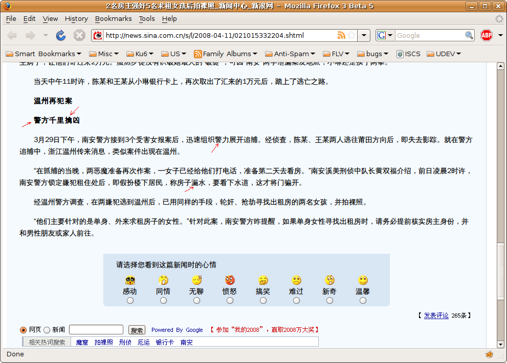
Chinese web designers don't seem to discern betwen serif and sans serif fonts. If 63-wqy-zenhei.conf is enabled, some Chinese web pages show the serif Arphic Ming font, and others in the same website show the sans serif wqy-zenhei font, where the same font style expected. Therefore, I suggest removing conf.d/
Look at the truetype wqy zenhei font in the attached screenshot. The blurry glyphs marked by red arrows are really unacceptable. You cannot see the strokes clearly at all.
| description: | updated |
| catinsnow (catinsnow) wrote : | #14 |
- Screenshot-Mozilla Firefox.png Edit (65.9 KiB, image/png)
Does the latest ttf-wqy-zenhei 0.5.23-1ubuntu2 still not working for you? it seems to use this configuration:
http://
with same page you point,looks fine here. please see the attachment.
| Wenzhuo Zhang (wenzhuo) wrote : | #15 |
- Screenshot-新闻中心首页_新浪网 - Mozilla Firefox 3 Beta 5.png Edit (291.7 KiB, image/png)
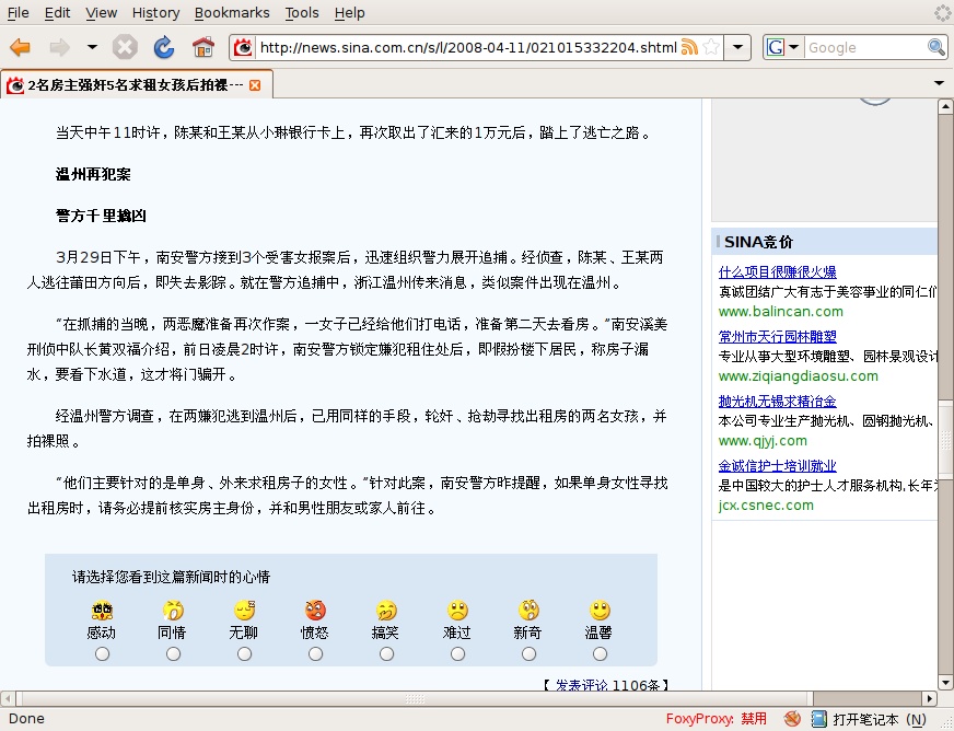
No. Loot at the attached Firefox screenshot of http://
| Wenzhuo Zhang (wenzhuo) wrote : | #16 |
- Screenshot-外国媒体称我国GDP总量今年有望超过德国_新闻中心_新浪网 - Mozilla Firefox 3 Beta 5.png Edit (98.4 KiB, image/png)
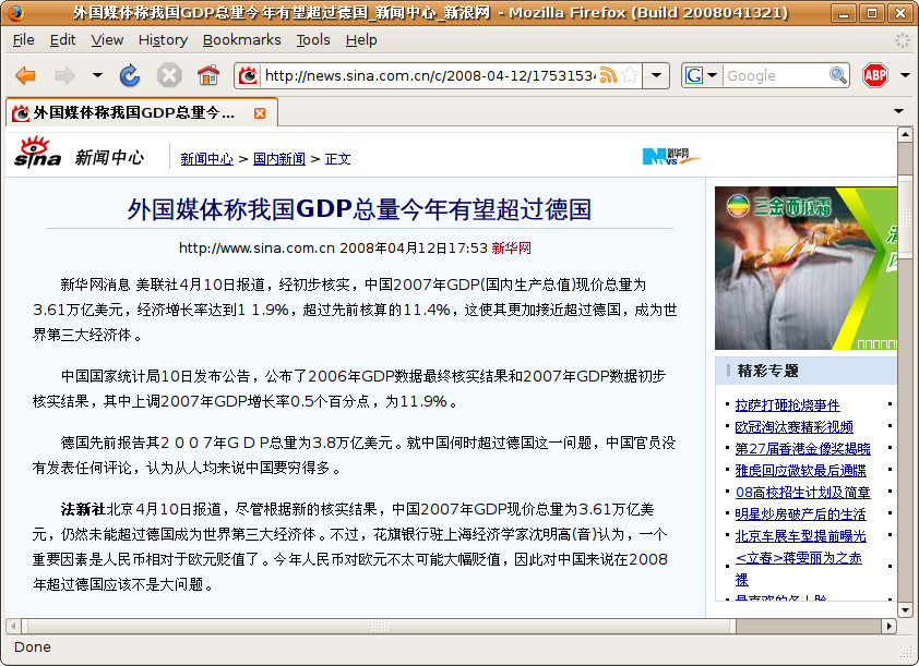
The sans serif font wqy zenhei is used on the news article web page <http://
Both screenshots taken with default ttf-wqy-zenhei 0.5.23-1ubuntu2 settings.
| Wenzhuo Zhang (wenzhuo) wrote : | #17 |
- defects_of_ttf_wqy_14px.png Edit (46.3 KiB, image/png)
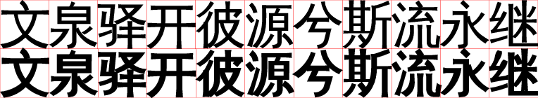
Some 14px ttf-wqy characters are still unacceptable.
| Wenzhuo Zhang (wenzhuo) wrote : | #18 |
- 30-cjk-aliases.conf.diff Edit (418 bytes, text/plain)
Those web pages rendered in arphic uming explicitly specifies "宋体" as the font-family. Therefore I suggest adding "WenQuanYi Zen Hei" to the accepted font family for "宋体", if you must use "WenQuanYi Zen Hei" as the default Chinese font.
| Wenzhuo Zhang (wenzhuo) wrote : | #19 |
Personally I still vote agaist using WenQuanYi Zen Hei bitmap font as the default font. Please stick with Arphic UMing. I think using WenQuanYi Zen Hei as the default font under current circumstances will negatively affect the user perception of the Ubuntu desktop environment for Chinese users.
| description: | updated |
| Qianqian Fang (fangq) wrote : | #20 |
The comments in https:/
Also, the bitmaps glyphs embedded in ZenHei is identical to those in xfonts-wqy. They are extensively polished (including 6000 more CJK Hanzi and unified styles) versions of firefly's bitmaps which is what was shown when using uming.
The current set up on Ubuntu is that Uming is serving the default "serif" fonts, which is what "Song Ti" is supposed to be; ZenHei is the default "sans-serif" font, as "Hei Ti" is supposed to be. I see nothing wrong here. The only thing maybe when using bitmaps, they are supposed to be identical (except the shape polishing).
| Wenzhuo Zhang (wenzhuo) wrote : | #21 |
OK, let me summarize my arguments agaist using Zen Hei as the default Chinese font under current circumstances:
1. Blurry strokes of truetype fonts.
2. Missing 14px bitmap font.
3. No pre-designed bold face, and either xft or freetype make a mess of the strokes of complex and not-so-complex characters.
4. Ubuntu has come a long way to achieve the visual effect of Chinese characters as seen in Gutsy and Hardy beta Desktop CD, which is already quite satisfactory (I think). No need to make radical changes at present, which is seemingly a step backward.
5. Other packages, e.g. language-selector, still prefers Arphic UMing.
6. Although both adopts Firefly's bitmaps as you said, Zen Hei just lacks the professional touches of Uming, IMHO.
fangq, thank you for your hard work in creating the open source Zen Hei. As I said in the bug description, it is an excellent new font. I am reporting this bug from a user's perspective which, I believe, can represent the opinions of a good portion of users. I wish Zen Hei and font rendering libraries would further mature to a state that Zen Hei can become a satisfactory default font for most Chinese users.
| Arne Goetje (arnegoetje) wrote : Re: [Bug 206018] Re: ttf-wqy-zenhei and other Chinese fonts got mixed up where the same style is expected | #22 |
-----BEGIN PGP SIGNED MESSAGE-----
Hash: SHA1
Wenzhuo Zhang wrote:
> OK, let me summarize my arguments agaist using Zen Hei as the default
> Chinese font under current circumstances:
>
> 1. Blurry strokes of truetype fonts.
If you turn off anti-aliasing, the strokes will look much uglier,
because the fonts don't contain hints and the autohinter is doing a bad
job on CJK fonts. Also the embedded bitmap glyphs are enforced for 9pt
to 12pt size. Therefor the is only blurry for sizes <9pt and >12pt. But
it looks better than with anti-aliasing turned off.
> 2. Missing 14px bitmap font.
Has been solved with the latest update. 13px fonts are used instead,
which is what you also see in UMing. In fact, 11/12px, 13/14px and
15/16px are the same.
> 3. No pre-designed bold face, and either xft or freetype make a mess of the strokes of complex and not-so-complex characters.
None of the CJK fonts available has pre-designed bold faces. So the
rendering issue applies to all of them.
> 4. Ubuntu has come a long way to achieve the visual effect of Chinese characters as seen in Gutsy and Hardy beta Desktop CD, which is already quite satisfactory (I think). No need to make radical changes at present, which is seemingly a step backward.
At that time no other decent font was available. But I always disliked
to have UMing for both serif and sans-serif. Simply because Uming does
not fit to other sans-serif fonts. Similarly I also don't agree with
making ZenHei being chosen as serif, because it doesn't fit.
> 5. Other packages, e.g. language-selector, still prefers Arphic UMing.
No, they don't. We have space restrains on the Live CD, that's why we
can only ship one font as the default Chinese font. The decision this
time was made to keep UMing in place, because it's partly funded by
Canonical (I'm the author of the UKai and Uming fonts and I got hired by
Canonical partly to speed up development of these fonts). As ZenHei came
around the corner, I took the opportunity to include it for sans-serif,
because it has a fairly good Unicode coverage already and is actively
developed. I had plans to create my own HeiTi font, but as it looks like
now, I'm more likely to collaborate with WQY to improve the ZenHei font.
However, I hope that in future UMing can be used for both Chinese and
Japanese desktops, so that we can kick out the Kochi Mincho font, which
is a real hog. If ZenHei can be accepted by the Japanese user community,
then it maybe can replace the Kochi Gothic font on the CD.
> 6. Although both adopts Firefly's bitmaps as you said, Zen Hei just lacks the professional touches of Uming, IMHO.
ZenHei has been touched much more professionally than UMing. The bitmaps
in UMing have not been modified for the CJK glyphs. They are the
original Firefly bitmaps and only cover Big5 and GB2312. All additional
glyphs don't have bitmaps at all, simply because I don't have enough
time to do it myself. Also I cannot import the WQY bitmaps, because of
license issues. The UMing font is APL, the WQY fonts are GPL.
But let me stress it one more time: none of the existing CJK fonts is
perfect, all have some pros and cons. However, at least the UKai/Uming
and WQY fonts are a...
| Wenzhuo Zhang (wenzhuo) wrote : Re: [Bug 206018] Re: ttf-wqy-zenhei and other Chinese fonts got mixed up where the same style is expected | #23 |
Arne Goetje wrote:
> Wenzhuo Zhang wrote:
>> OK, let me summarize my arguments agaist using Zen Hei as the default
>> Chinese font under current circumstances:
>
>> 1. Blurry strokes of truetype fonts.
>
> If you turn off anti-aliasing, the strokes will look much uglier,
> because the fonts don't contain hints and the autohinter is doing a bad
> job on CJK fonts. Also the embedded bitmap glyphs are enforced for 9pt
> to 12pt size. Therefor the is only blurry for sizes <9pt and >12pt. But
> it looks better than with anti-aliasing turned off.
I understood this before adding my previous comment. I meant the strokes
are unacceptably blurry when embedded bitmap glyphs were not enforced
for sizes between 9pt to 12pt inclusive. I don't care much about other
font sizes because they are not seen often.
>> 2. Missing 14px bitmap font.
>
> Has been solved with the latest update. 13px fonts are used instead,
> which is what you also see in UMing. In fact, 11/12px, 13/14px and
> 15/16px are the same.
Are you sure? Please download UMing10px-15px.htm below and open it using
firefox. Fonts obviously become bigger as font size increases.
>> 3. No pre-designed bold face, and either xft or freetype make a mess
> of the strokes of complex and not-so-complex characters.
>
> None of the CJK fonts available has pre-designed bold faces. So the
> rendering issue applies to all of them.
Perhaps I was biased when comparing bold faces of the two fonts.
>> 4. Ubuntu has come a long way to achieve the visual effect of Chinese
> characters as seen in Gutsy and Hardy beta Desktop CD, which is already
> quite satisfactory (I think). No need to make radical changes at
> present, which is seemingly a step backward.
>
> At that time no other decent font was available. But I always disliked
> to have UMing for both serif and sans-serif. Simply because Uming does
> not fit to other sans-serif fonts. Similarly I also don't agree with
> making ZenHei being chosen as serif, because it doesn't fit.
You are right that serif Chinese fonts don't fit with sans-serif fonts
of other languages. But serif and sans serif Chinese fonts don't belong
together on one web page as well. I think the latter is more important
for Chinese users. With current font settings, UMing and ZenHei tend to
mix up in one page. Clicking on a UMing link to open a ZenHei web page
is not something that looks quite right as well.
>> 5. Other packages, e.g. language-selector, still prefers Arphic UMing.
>
> No, they don't. We have space restrains on the Live CD, that's why we
> can only ship one font as the default Chinese font. The decision this
> time was made to keep UMing in place, because it's partly funded by
> Canonical (I'm the author of the UKai and Uming fonts and I got hired by
> Canonical partly to speed up development of these fonts). As ZenHei came
> around the corner, I took the opportunity to include it for sans-serif,
> because it has a fairly good Unicode coverage already and is actively
> developed. I had plans to create my own HeiTi font, but as it looks like
> now, I'm more likely to collaborate with WQY to improve the ZenHei font.
> However, I hope that in future UMing can be used ...
| Wenzhuo Zhang (wenzhuo) wrote : | #24 |
| Qianqian Fang (fangq) wrote : | #25 |
If you are unhappy about the outline part of Zen Hei, I can fully understand that. The outline quality of the font is still a long way from commercial ones. However, on the other hand, I can also see that the outline fonts are entirely "usable" (as screen fonts), particularly for those frequently used Chinese characters. It simply take years of efforts to polish all the rough edges and make a good outline font, and we are doing it everyday, you are welcome to report "sub-optimal" characters or polish by yourself using our wiki.
But if you are complaining about the wqy bitmaps vs firefly's bitmaps, that does seem to be a bit surprising. Based on my own observation from most Chinese Linux online forums (particularly http://
I do support for a poll between different choices for CJK fonts. I actually thought about doing it long time ago. A survey about the preference of bitmap vs vector, Song vs Ming vs Hei, wqy bitmaps vs firefly's vs simsun vs OpenSUSE Founder fonts will be very informative for CJK font developers.
One thing I want to point out though, the 12pt CJK glyphs in wqy's fonts are exact copies of Chinese National Standard GB19966-2005, which was "professionally" developed by Beijing Founder Electronics (Fang Zheng). Glyphs of other sizes in wqy's bitmaps were "standardized" using 12pt as reference.
| Boning Chen (neodarksaver) wrote : | #26 |
I personally would suggest we use Song-Ti for Simplified Chinese, because it
is just a popular font that has been used around for many many years. There
is no need to change to something else just to differentiate from microsoft
software, unless we have some copyright issues.
On Mon, Apr 14, 2008 at 2:03 PM, fangq <email address hidden> wrote:
> If you are unhappy about the outline part of Zen Hei, I can fully
> understand that. The outline quality of the font is still a long way
> from commercial ones. However, on the other hand, I can also see that
> the outline fonts are entirely "usable" (as screen fonts), particularly
> for those frequently used Chinese characters. It simply take years of
> efforts to polish all the rough edges and make a good outline font, and
> we are doing it everyday, you are welcome to report "sub-optimal"
> characters or polish by yourself using our wiki.
>
> But if you are complaining about the wqy bitmaps vs firefly's bitmaps,
> that does seem to be a bit surprising. Based on my own observation from
> most Chinese Linux online forums (particularly
> http://
> comments among simplified Chinese users (for traditional Chinese users,
> some of them may prefer the Ming-Ti-styled serif decorations in
> firefly's bitmaps).
>
> I do support for a poll between different choices for CJK fonts. I
> actually thought about doing it long time ago. A survey about the
> preference of bitmap vs vector, Song vs Ming vs Hei, wqy bitmaps vs
> firefly's vs simsun vs OpenSUSE Founder fonts will be very informative
> for CJK font developers.
>
> One thing I want to point out though, the 12pt CJK glyphs in wqy's fonts
> are exact copies of Chinese National Standard GB19966-2005, which was
> "professionally" developed by Beijing Founder Electronics (Fang Zheng).
> Glyphs of other sizes in wqy's bitmaps were "standardized" using 12pt as
> reference.
>
> --
> ttf-wqy-zenhei and other Chinese fonts got mixed up where the same style
> is expected
> https:/
> You received this bug notification because you are a member of Ubuntu
> Simplified Chinese Translators, which is subscribed to ttf-wqy-zenhei in
> ubuntu.
>
| Qianqian Fang (fangq) wrote : | #27 |
Copyright issue is certainly the key if you are talking about SimSun (known as Song Ti on windows 9x - 2000). SimSun was developed by Beijing ZhongYi Inc, M$ bought the license to use this font on their windows product (SimSun18030 and YaHei now licensed by Founder). It is neither open-source, nor free (as beer), and the license fee is HUGE.
If Zhongyi had released SimSun under any type of open license, nobody would have spend years of his/her time to make a font of his/her own. Furthermore, I doubt any of these Chinese font companies would open-source their fonts (at least in the near future) as Arphic did, because they used to get huge profit from this.
| Boning Chen (neodarksaver) wrote : | #28 |
The point i was making is, there is no need to change font from any previous
releases of ubuntu. I was just using SimSun as an example, maybe a really
bad one, sorry. Anyways, I would just say stick with the Arphic UMing, as
Wenzhuo said. I mean we do want to make improvement to it. There is a reason
that the SimSun font is a successful font, because people simply like it.
The closest we can get to is the Arphic Uming, then let's use it. What we
should do is to improve the Arphic font, not to create a new font and put it
in a LTS release. I know the font is great work, and it's open sourced. But
i think we have time to perfect it, a LTS release should not contain
anything that is not tested enough, the same reason that Kubuntu with KDE4
is not going to be LTS.
Boning Chen
On Mon, Apr 14, 2008 at 3:08 PM, fangq <email address hidden> wrote:
> Copyright issue is certainly the key if you are talking about SimSun
> (known as Song Ti on windows 9x - 2000). SimSun was developed by Beijing
> ZhongYi Inc, M$ bought the license to use this font on their windows
> product (SimSun18030 and YaHei now licensed by Founder). It is neither
> open-source, nor free (as beer), and the license fee is HUGE.
>
> If Zhongyi had released SimSun under any type of open license, nobody
> would have spend years of his/her time to make a font of his/her own.
> Furthermore, I doubt any of these Chinese font companies would open-
> source their fonts (at least in the near future) as Arphic did, because
> they used to get huge profit from this.
>
> --
> ttf-wqy-zenhei and other Chinese fonts got mixed up where the same style
> is expected
> https:/
> You received this bug notification because you are a member of Ubuntu
> Simplified Chinese Translators, which is subscribed to ttf-wqy-zenhei in
> ubuntu.
>
| Qianqian Fang (fangq) wrote : | #29 |
I am not pushing wqy's font as the default font at all. I am only trying
to tell you what it is, and how it differers from the others fonts that
people
are using. Whether it is suitable to be included in ubuntu as the
default font, it is a decision totally up to the Ubuntu management team,
in this case, Arne and his colleagues at Ubuntu.
On the other hand, I personally do not like firefly's bitmaps, so do many
friends that I know, that's why we modify it since 2004. This is just flavor
differences, and we are happy that we have seen many supporters from
CJK users in the past.
Boning Chen wrote:
> The point i was making is, there is no need to change font from any previous
> releases of ubuntu. I was just using SimSun as an example, maybe a really
> bad one, sorry. Anyways, I would just say stick with the Arphic UMing, as
> Wenzhuo said. I mean we do want to make improvement to it. There is a reason
> that the SimSun font is a successful font, because people simply like it.
> The closest we can get to is the Arphic Uming, then let's use it. What we
> should do is to improve the Arphic font, not to create a new font and put it
> in a LTS release. I know the font is great work, and it's open sourced. But
> i think we have time to perfect it, a LTS release should not contain
> anything that is not tested enough, the same reason that Kubuntu with KDE4
> is not going to be LTS.
>
>
> Boning Chen
>
| Pan, SZ (pan.sz) wrote : 答复: Re: [Bug 206018] Re: ttf-wqy-zenhei and other Chinese fonts got mixed up where the same style is expected | #30 |
I don't think there will be much people second your point. Using a serif
style font "Sont Ti" as the default screen font is ugly and many people
could not accept it any more. That is the reason both "Microsoft" and
"Apple" had switched to sans-serif style font "Hei Ti" as the main screen
font. Apple is the first, Microsoft Windows Vista is the second, why not
Linux do the switch?
I agree that there's no need to change font just for showing something
different from Windows. But you should know that Windows vista use
san-serif style font "Ya Hei" as the default screen font NOW!
For LTS, I think the WQY is actually tested more that uming, why? Because
many people around me will install WQY immediately after they install the
ubuntu linux. That is not to say uming is bad, that is to say a san-serif
style font serves better for the default screen font than the serif style
font did.
--
Sincerely, Pan, Shi Zhu.
<email address hidden> 写于 2008.04.15 06:28:55:
> The point i was making is, there is no need to change font from any
previous
> releases of ubuntu. I was just using SimSun as an example, maybe a really
> bad one, sorry. Anyways, I would just say stick with the Arphic UMing, as
> Wenzhuo said. I mean we do want to make improvement to it. There is a
reason
> that the SimSun font is a successful font, because people simply like it.
> The closest we can get to is the Arphic Uming, then let's use it. What we
> should do is to improve the Arphic font, not to create a new font and put
it
> in a LTS release. I know the font is great work, and it's open sourced.
But
> i think we have time to perfect it, a LTS release should not contain
> anything that is not tested enough, the same reason that Kubuntu with
KDE4
> is not going to be LTS.
>
>
> Boning Chen
| Pan, SZ (pan.sz) wrote : | #31 |
I don't know whether WQY is the best font or not. But I know it is much better to use a sans-serif-style font as the default screen font than a serif-style one.
Yes WQY is not perfect, and IMO it is far inferior than the STXIHEI (华文细黑) and SIMHEI (黑体), but we can improve it, can't we? And it is at least much better than continuing with a serif-style font as the default screen font.
Someone thinks that the blurry font is bad for children learning Chinese, Yes, and I personally think any font below 16pt is too bad for children to learn, I seriously suggest those who has children to use a huge font for them. That's a good practice anyway.
BTW: as far as I know, if we are not talking about bitmap, truetype UMing is more blurry than the truetype WQY, or if I had missed something?
| catinsnow (catinsnow) wrote : | #32 |
| catinsnow (catinsnow) wrote : | #33 |
| Boning Chen (neodarksaver) wrote : Re: [Bug 206018] Re: ttf-wqy-zenhei and other Chinese fonts got mixed up where the same style is expected | #34 |
That does look a lot better :)
On Tue, Apr 15, 2008 at 12:31 AM, catinsnow <email address hidden> wrote:
> May be we can just disable embolden for WenQuanYi Zen Hei large than
> 16px to workaround the blurry strokes.
>
> ** Attachment added: "after.png"
> http://
>
> --
> ttf-wqy-zenhei and other Chinese fonts got mixed up where the same style
> is expected
> https:/
> You received this bug notification because you are a member of Ubuntu
> Simplified Chinese Translators, which is subscribed to ttf-wqy-zenhei in
> ubuntu.
>
| Qianqian Fang (fangq) wrote : | #35 |
- wqy_bold_test.png Edit (23.9 KiB, image/png; name="wqy_bold_test.png")
I am not so sure if this can be less confusing as the case where
bold char have connecting strokes, particularly when people tag
the text as bold to emphasize.
Indeed, it is not difficult at all for me to generate a separate bold face
(see attachment). However, I kind of reserved this as a major feature
improvement for our next release (more of a release management
concerns):
http://
but again, if you all think that it is worth to include another 13M bold
face Zen Hei file, I can give a try.
catinsnow wrote:
> May be we can just disable embolden for WenQuanYi Zen Hei large than
> 16px to workaround the blurry strokes.
>
> ** Attachment added: "after.png"
> http://
>
>
| Qishuai Liu (lqs) wrote : | #36 |
2008/4/15, fangq <email address hidden>:
> Indeed, it is not difficult at all for me to generate a separate bold face
It's better to use the current one for bold version, and make a thiner
one for normal version.
| Wenzhuo Zhang (wenzhuo) wrote : | #37 |
Again, I suggest adding "WenQuanYi Zen Hei" to the accept list for the Aliases for Simplified Chinese Windows fonts, so that UMing and ZenHei have less chances to mix up. See attachment 30-cjk-
| Changed in ttf-wqy-zenhei: | |
| assignee: | arnegoetje → mvo |
| Wenzhuo Zhang (wenzhuo) wrote : | #38 |
To achieve consistent and acceptable Chinese text rendering, please either apply 30-cjk-
| Pan, SZ (pan.sz) wrote : | #39 |
Just be curious, what is the definition of "where the same style is
expected"?
IMO if the same style is really *expected*, it is the web page itself who
is responsible to use the same font style.
If the web page specified different style of font in the html or css, then
the different style is *expected*, then we *should* see different style
anyway, and we *should* see different chinese font in the same page.
Should we ignore the font settings of the web page, just because *we* think
the same style is expected?
--
Sincerely, Pan, Shi Zhu.
<email address hidden> 写于 2008.05.05 12:14:21:
> To achieve consistent and acceptable Chinese text rendering, please
> either apply 30-cjk-
> zenhei.conf. As far as I am concerned, removing conf.d/63-wqy-
> zenhei.conf, i.e. choosing UMing as the default Chinese font, gives the
> best visual effect of Chinese text in Ubuntu.
>
> --
> ttf-wqy-zenhei and other Chinese fonts got mixed up where the same
> style is expected
> https:/
> You received this bug notification because you are a member of Ubuntu
> Simplified Chinese Translators, which is subscribed to ttf-wqy-zenhei in
> ubuntu.
| Wenzhuo Zhang (wenzhuo) wrote : | #40 |
Pan, Shi Zhu wrote:
> Just be curious, what is the definition of "where the same style is
> expected"?
Common sense, or resemblance to what you see in Windows.
If you choose Zen Hei as the default font, make sure it is in the most
preferred font for some common Chinese font aliases as well.
I have tried my best to get used to Zen Hei. I had to remove
conf.d/
than 13px on a 12" XGA LCD; 2) the width of Latin character glyphs in
Zen Hei doesn't seem to match that of CJK characters.
Wenzhuo
| Arne Goetje (arnegoetje) wrote : | #41 |
-----BEGIN PGP SIGNED MESSAGE-----
Hash: SHA1
Wenzhuo Zhang wrote:
> Pan, Shi Zhu wrote:
>> Just be curious, what is the definition of "where the same style is
>> expected"?
>
> Common sense, or resemblance to what you see in Windows.
Which version of Windows are you talking about?
And why is it common sense to enforce one font style only? At least here
in Taiwan most chinese newspapers use a Hei Ti font for the headings and
a Song/Ming Ti font for the rest of the article texts. Therefor I don't
see what's wrong with webpages which prefer different font styles for
different parts of the website... this is mostly done to have a visual
distinction between the different parts of the website and is fully
intended.
If you don't like that, I suggest that you either ask the website author
why he has done so, or change the settings on your local computer. There
are a number of ways to prefer UMing as the default font for everything,
starting from editing the font preferences in your browser, to just
removing the package from your system.
> If you choose Zen Hei as the default font, make sure it is in the most
> preferred font for some common Chinese font aliases as well.
>
> I have tried my best to get used to Zen Hei. I had to remove
> conf.d/
> than 13px on a 12" XGA LCD; 2) the width of Latin character glyphs in
> Zen Hei doesn't seem to match that of CJK characters.
Latin characters usually don't have the same width like CJK glyphs.
Either they are Monospaced and therefor half the width of a CJK glyph,
or they are proportional and don't fit at all to CJK glyph widths. Most
Western fonts are proportional and even on Windows, you will find that
the SimSun and MingLiU Chinese fonts come in two versions, one with
Monospaced Latin glyphs and the other with Proportional Latin glyphs.
In short, if you don't like ZenHei, just remove it from your system.
It's as easy as that.
As a more general note:
It will be impossible to find a font setting that fits everyone! People
just have different preferences, regarding default font for the
languages they use in various locale environments, whether or not
bitmaps, anti-aliasing, hinting, etc. should be used or even which
hinting level for which font and which application is preferred. And of
course people have different screens (LCD or CRT) and different
screensizes and resolutions and therefor prefer different font settings.
So, for the distribution we try to give the users an acceptable default
setting. And as many users prefer a Hei Ti font for their desktop, we
chose to include WQY ZenHei and set it as preferred font for sans-serif.
And if any user, including you, does not like that, he is free to change
his local settings. But I and many others do not agree with the claim
that it should be expected to have only one Chinese font visible on the
system. Even Windows come with a multitude of Chinese fonts installed by
default. And if websites request the rendering to be done by serif,
sans-serif fonts or a mixture of them, it will surely be done so.
Just my 2 NT$...
-----BEGIN PGP SIGNATURE-----
Version: GnuPG v1.4.6 (GNU/Linux)
Comment:...
| Jiahua Huang (huangjiahua) wrote : | #42 |
Agree with Pan Shi Zhu.
This poll <http://
truetype WQY ZenHei without bitmaps to be leading (75%).
| Pan, SZ (pan.sz) wrote : | #43 |
Use wqy or not, it is not my point.
My point is that there should be different chinese font for sans-serif and
serif, and they *can* be shown in the same web page if the author intend
to. No common-sense has forced that there should only be one chinese font
in the same web page.
--
Sincerely, Pan, Shi Zhu.
| Wenzhuo Zhang (wenzhuo) wrote : | #44 |
Arne Goetje 写道:
> Wenzhuo Zhang wrote:
>> Pan, Shi Zhu wrote:
>>> Just be curious, what is the definition of "where the same style is
>>> expected"?
>> Common sense, or resemblance to what you see in Windows.
>
> Which version of Windows are you talking about?
Any Simplified Chinese version.
> And why is it common sense to enforce one font style only? At least here
> in Taiwan most chinese newspapers use a Hei Ti font for the headings and
> a Song/Ming Ti font for the rest of the article texts. Therefor I don't
> see what's wrong with webpages which prefer different font styles for
> different parts of the website... this is mostly done to have a visual
> distinction between the different parts of the website and is fully
> intended.
It's my habbit as well. The problem here is that web pages belonging to the same website section use different fonts for the same part of page bodies. It's indeed because website authors do not specify font families in some pages while specifying one for others.
However, since you (CJK team) made UMing the preferred font for SimSun or "宋体", why cannot you make ZenHei the preferred font for these common Chinese font aliases after making the decision to include WQY ZenHei as the preferred font for sans-serif?
> If you don't like that, I suggest that you either ask the website author
> why he has done so, or change the settings on your local computer. There
> are a number of ways to prefer UMing as the default font for everything,
> starting from editing the font preferences in your browser, to just
> removing the package from your system.
You don't really seem to understand the problem here. - I know how to change font settings and I've done so already. By opening a bug report here and discussing with you, I meant to see Ubuntu constantly improving as a product. Specifically, I hope Chinese users can comfortable use a default install of Ubuntu, without having to manually edit any configuration files.
>> If you choose Zen Hei as the default font, make sure it is in the most
>> preferred font for some common Chinese font aliases as well.
>
>> I have tried my best to get used to Zen Hei. I had to remove
>> conf.d/
>> than 13px on a 12" XGA LCD; 2) the width of Latin character glyphs in
>> Zen Hei doesn't seem to match that of CJK characters.
>
> Latin characters usually don't have the same width like CJK glyphs.
> Either they are Monospaced and therefor half the width of a CJK glyph,
> or they are proportional and don't fit at all to CJK glyph widths. Most
> Western fonts are proportional and even on Windows, you will find that
> the SimSun and MingLiU Chinese fonts come in two versions, one with
> Monospaced Latin glyphs and the other with Proportional Latin glyphs.
>
> In short, if you don't like ZenHei, just remove it from your system.
> It's as easy as that.
>
>
> As a more general note:
> It will be impossible to find a font setting that fits everyone! People
> just have different preferences, regarding default font for the
> languages they use in various locale environments, whether or not
> bitmaps, anti-aliasing, hinting, etc. should ...
| Wenzhuo Zhang (wenzhuo) wrote : | #45 |
W.r.t. the poll, it has seen too little participation to be representative. Truetype ZenHei is horrible for my eyes on whichever display I have access to.
| ZhengPeng Hou (zhengpeng-hou) wrote : Re: [Bug 206018] Re: ttf-wqy-zenhei and other Chinese fonts got mixed up where the same style is expected | #46 |
On 一, 5月 05, 2008 at 09:46:04上午 -0000, Wenzhuo Zhang wrote:
> Arne Goetje 写道:
> > Wenzhuo Zhang wrote:
> >> Pan, Shi Zhu wrote:
> >>> Just be curious, what is the definition of "where the same style is
> >>> expected"?
> >> Common sense, or resemblance to what you see in Windows.
> >
> > Which version of Windows are you talking about?
>
> Any Simplified Chinese version.
>
> > And why is it common sense to enforce one font style only? At least here
> > in Taiwan most chinese newspapers use a Hei Ti font for the headings and
> > a Song/Ming Ti font for the rest of the article texts. Therefor I don't
> > see what's wrong with webpages which prefer different font styles for
> > different parts of the website... this is mostly done to have a visual
> > distinction between the different parts of the website and is fully
> > intended.
>
> It's my habbit as well. The problem here is that web pages belonging to
as you've said, its your owns habbit, bot not all other Chinese users.
> the same website section use different fonts for the same part of page
> bodies. It's indeed because website authors do not specify font families
> in some pages while specifying one for others.
>
> However, since you (CJK team) made UMing the preferred font for SimSun
> or "宋体", why cannot you make ZenHei the preferred font for these common
> Chinese font aliases after making the decision to include WQY ZenHei as
> the preferred font for sans-serif?
Because we have tested this type configure before release, we're
satisfy with the configure what is now.
>
> > If you don't like that, I suggest that you either ask the website author
> > why he has done so, or change the settings on your local computer. There
> > are a number of ways to prefer UMing as the default font for everything,
> > starting from editing the font preferences in your browser, to just
> > removing the package from your system.
>
> You don't really seem to understand the problem here. - I know how to
> change font settings and I've done so already. By opening a bug report
> here and discussing with you, I meant to see Ubuntu constantly improving
> as a product. Specifically, I hope Chinese users can comfortable use a
> default install of Ubuntu, without having to manually edit any
> configuration files.
>
> >> If you choose Zen Hei as the default font, make sure it is in the most
> >> preferred font for some common Chinese font aliases as well.
> >
> >> I have tried my best to get used to Zen Hei. I had to remove
> >> conf.d/
> >> than 13px on a 12" XGA LCD; 2) the width of Latin character glyphs in
> >> Zen Hei doesn't seem to match that of CJK characters.
> >
> > Latin characters usually don't have the same width like CJK glyphs.
> > Either they are Monospaced and therefor half the width of a CJK glyph,
> > or they are proportional and don't fit at all to CJK glyph widths. Most
> > Western fonts are proportional and even on Windows, you will find that
> > the SimSun and MingLiU Chinese fonts come in two versions, one with
> > Monospaced Latin glyphs and the other with Proportional Latin glyphs.
> >
> > In short, if you don't like...
| caohui (cscc-net) wrote : Re:Re: [Bug 206018] Re: ttf-wqy-zenhei and other Chinese fonts got mixed up where the same style is expected | #47 |
| caohui (cscc-net) wrote : 来自曹慧的邮件 | #48 |
| Lechuan (lechuan) wrote : | #49 |
@Wenzhuo Zhang
This is to me a matter of preference, and with all due respect, your preference for uming does not make you more representative than the poll. The way to go is to raise the publicity of the poll so we can get more representative results, and then make the most popular default, with an easy option for people who prefer otherwise.
I do understand that this bug is about consistency, and I understand that it is important, but reverting to bitmap does not seem to be a clearly popular choice.
| Changed in ttf-wqy-zenhei: | |
| importance: | Undecided → Wishlist |
| Aron Xu (happyaron) wrote : | #50 |
This bug may need some love, does it still persist in Karmic?
| Pan, SZ (pan.sz) wrote : | #51 |
This is not a bug, nor does it being a wishlist.
Sans font family and Serif font family are different font family, in Chinese, they refers to “有衬线” and “无衬线” font.
Song Ti and Uming are typical type of Serif font family, i.e. “有衬线” font.
Hei Ti is the typical type of Sans font family, i.e. “无衬线” font.
If the web site specifies different font family within the same page, we should display as is, this is really the correct behavior, not a bug.
IE6 in WinXP cannot display both sans-family chinese font and serif-family chinese font in the same webpage, this is a bug. You should not blame Firefox when it is doing the right thing.
| Michael Vogt (mvo) wrote : | #52 |
I unassigned myself, I'm very sorry but I don't know enough about this problem to judge. Arne is in a better position here.
| Changed in ttf-wqy-zenhei (Ubuntu): | |
| assignee: | Michael Vogt (mvo) → nobody |
| assignee: | nobody → Michael Vogt (mvo) |
| Changed in ttf-wqy-zenhei (Ubuntu): | |
| assignee: | Michael Vogt (mvo) → nobody |
| Changed in ttf-wqy-zenhei (Ubuntu): | |
| status: | New → Confirmed |
| penalvch (penalvch) wrote : | #53 |
ttf-arphic-uming is not available in a supported Desktop release.
| Changed in ttf-wqy-zenhei (Ubuntu): | |
| status: | Confirmed → Invalid |
The same firefox window when 63-wqy-zenhei.conf is there.