

© 2004
Canonical Ltd.
•
Terms of use
•
Data privacy
•
Contact Launchpad Support
•
Blog
•
Careers
•
System status
•
0e1f616
(Get the code!)
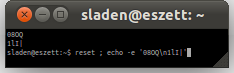
Hello maco. At the default (lie) of "96 dpi/(72 pt/inch)" there are is a 4:3 relationship between the pixel-count (dots) and the nominal point size (points). In the UbuntuBeta Mono and Inconsolata the height (line-spacing) of the font is exactly 1 em with 2:1 height:width ratio and all spacing is internal. The font rendering is dependent upon the number of pixels available for drawing within that fixed height called the pixels-per-em ("PPEM"). So, at 96 dpi:
8 ppem == 6 point (getting close to the hinting limit; only 4×8 pixels)
12 ppem == 9 point ('font.png' screenshot above; 6×12 pixels)
16 ppem == 12 point (Console/VGA size; 8×16 pixels)
Bi-level 8×16 pixels is the really important one for bitmap console use. However, with sub-pixel rendering you get slightly better granularity for monochrome text in one axis (generally horizontal) at the cost of colour-shifts.
The attached screenshot is at 4×8 pixels unhinted (hinting has not been done yet), which was more usable than I expected and probably would gain from visual recognition in regular use if you really need a terminal with 350×130 character cells. I think Amélie prepared a addition '1' possibility with a slightly wider slab serif but with the monospace this time of thing can be refined afterwards. How does it look to you?