Hinting: Optimise tiny point-sizes in the monospace font for programming use.

Bug #660420 reported by Mondane
12
This bug affects 2 people
Affects Status Importance Assigned to Milestone
Ubuntu Font Family
Fix Released
Medium
Unassigned

Bug Description

For programming purposes, there are several fonts available which have really small points and still look great (and are readable). This is a plus since now much more code can be seen on the screen at once.

Examples:

Dina: http://www.donationcoder.com/Software/Jibz/Dina/
Anonymous Pro: http://www.ms-studio.com/FontSales/anonymouspro.html

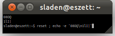
In those fonts, it's also really good to see the difference between zero (0), small and capital 'o', small and capital l and i and one (1). But that's already covered with the basic Ubuntu font, so I assume it will be in the monospaced one.

So basically, I want, for example 4 or 5 pt size in the monospace font.

Revision history for this message
Mark Shuttleworth (sabdfl) wrote : Re: [Bug 660420] [NEW] Tiny points in the monospace font for programming use.

OK, noted. I'll wait for DM to comment.

Mark

Revision history for this message
David Marshall (dave-daltonmaag) wrote :

The absolute smallest a font can go and still be generally usable is an
x-height of 5 pixels. Any less than that and there simply aren't enough
pixels to get the message across. How large that is in pt depends on
your dpi settings, but if other monospace fonts are readable at your
chosen size, ours should be too - but we can't work miracles with too
few pixels.

Dave

Revision history for this message
Paul Sladen (sladen) wrote : Re: Tiny points in the monospace font for programming use.

Hello Mondane, I think the small sizes in the monospace will be where manual hinting instruction will really be able to shine (and the monospace, because I stare at it all day is what I'm personally waiting for!).

(It should be possible to go down to 4-pixels for the x-height and 5-pixels cap-height, which is what the current Deja-based monospace can do).

Changed in ubuntu-font-family:
importance: Undecided → Medium
milestone: none → monospace
status: New → Triaged
summary: - Tiny points in the monospace font for programming use.
+ Hinting: Optimise tiny point-sizes in the monospace font for programming
+ use.
Revision history for this message
Bruno Maag (bruno-daltonmaag) wrote :

Paul, you do realise that you simply have not got enough space to show double-storey characters such as 'a' and 'e' correctly at 4pixel x-height. They will show up as a black blob. At 5pixels cap height is sufficient, yes, but the problem the exists how you show the 'i' which requires at least 7px, based on 5px x-height. So, at least 7px cap and 5px x-height, with 2px descender (for the 'g').

Revision history for this message
Mondane (mondane-woodworker) wrote :

Great to see this picked up, I'll be following the progress. Furthermore, at work in Windows XP, I have replaced my GUI font with the Ubuntu one (looks great, just misses a few characters in password screen and gimp percentage list).

The same will happen in my Netbeans code when the monospace is available so I can test it.

Revision history for this message
Paul Sladen (sladen) wrote :

Bruno: yup, with four pixels for the x-height you end up with both halves of the double-storey adjacent to each other (leaving the third-pixel of the four for the whitespace within the main bowl).

I think what the original poster is getting at, is that we should actually /try/ to make a special effort at the really small sizes, rather than just dismissing them as hard/not possible.

Admittedly without the pixel count it just won't be possible to be particularly stylistic, and most tiny fonts will tend towards each other: since there's only so many ways that something can remain readable.

Revision history for this message
Justin Callaghan (email-jcalla) wrote :

There have been various design strategies to make lowercase legible at heights smaller than 5px, usually by angling the bowls something like so:

###
  ##
## #
####

I was reminded of Vincent Connare's example of shape modification through hinting, found here: http://www.microsoft.com/typography/hinting/hinttut7.htm

So it might be possible, technically, to hint a font to be legible (more or less) at such extremely small sizes, although I suspect even the most visually acute programmer doesn't work at less than 9ppem.

Revision history for this message
Mackenzie Morgan (maco.m) wrote :

Do O/0 and 1/l/I look different enough at 8px high?

Attaching a screenshot of
08O
1lI

in Inconsolata size 8

Revision history for this message
Paul Sladen (sladen) wrote :

Hello maco. At the default (lie) of "96 dpi/(72 pt/inch)" there are is a 4:3 relationship between the pixel-count (dots) and the nominal point size (points). In the UbuntuBeta Mono and Inconsolata the height (line-spacing) of the font is exactly 1 em with 2:1 height:width ratio and all spacing is internal. The font rendering is dependent upon the number of pixels available for drawing within that fixed height called the pixels-per-em ("PPEM"). So, at 96 dpi:

  8 ppem == 6 point (getting close to the hinting limit; only 4×8 pixels)
  12 ppem == 9 point ('font.png' screenshot above; 6×12 pixels)
  16 ppem == 12 point (Console/VGA size; 8×16 pixels)

Bi-level 8×16 pixels is the really important one for bitmap console use. However, with sub-pixel rendering you get slightly better granularity for monochrome text in one axis (generally horizontal) at the cost of colour-shifts.

The attached screenshot is at 4×8 pixels unhinted (hinting has not been done yet), which was more usable than I expected and probably would gain from visual recognition in regular use if you really need a terminal with 350×130 character cells. I think Amélie prepared a addition '1' possibility with a slightly wider slab serif but with the monospace this time of thing can be refined afterwards. How does it look to you?

Revision history for this message
Mondane (mondane-woodworker) wrote :

As the reporter, I must say I'm really pleased with the results! Looking great!

Revision history for this message
Matthew Paul Thomas (mpt) wrote :

Mondane, is there anything more to do here? Or is this fixed as far as you're concerned?

Changed in ubuntu-font-family:
status: Triaged → Incomplete
Revision history for this message
Mondane (mondane-woodworker) wrote :

Matthew, I just checked the font again in Ubuntu 14.10 and it looks great at tiny points. Consider this fixed.

Revision history for this message
Matthew Paul Thomas (mpt) wrote :

Cool, thanks Mondane.

Changed in ubuntu-font-family:
status: Incomplete → Fix Released
To post a comment you must log in.
This report contains Public information  
Everyone can see this information.

Other bug subscribers

Remote bug watches

Bug watches keep track of this bug in other bug trackers.