UI Useability Improvement propositions
| Affects | Status | Importance | Assigned to | Milestone | |
|---|---|---|---|---|---|
| Odoo Web Client |
Fix Released
|
Undecided
|
OpenERP Useability Experts (OBSOLETE) | ||
Bug Description
We are working with useability experts to improve the user interface of the v5.2 fo OpenERP. Our deadlines:
- January 2010 : finish all wireframes and start developments
- February 2010: finish all designs
We made some very early drafts wireframes to show you some ideas. The biggest changes:
Search Views
-----------------
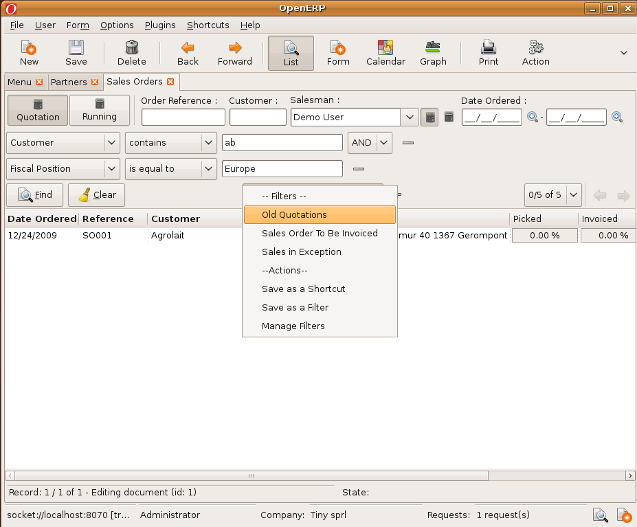
In trunk, we have new search views that can integrate buttons, business logic, custom filters, ... You can design custom search views per object. The search elements can change the domain (filter on records) or the context (change the values displayed of computed fields: example: the stock real and virtual depends on the selected warehouse in the search view of products.) Relational fields are available as selection box, where you can select or write text.The search view integrates custom filters, ability to create shortcuts, ...
See the attached screenshot for more info. It already works in trunk GTK and web client.
Menus
---------
We'd like to change how OpenERP is perceived. Instead of being a "Global ERP that does everything", we'd like to change our image into a "Suite of Integrated Management Applications". The homepage, after the login, allows you to choose in which 'application' you want to work: Project Management, Accounting, ...
After entering in an application, you see the menu of this application that always remains on the left side. All applications are visible on the above tabs. Someone can set is default application in his preferences. (a developper will remain in the Projact Management application and default to a context which is his current project).
When you are in an 'application', you can set a default context. For example, in project management, you can select a project. Then all menus (bugs, tasks, features requests, wiki specifications, ...) automatically filters on this project. You may not select any project and you will see all tasks (like currently).
For example, in the sales management tab, the context will be the department (case section) you are working in.
Note, that this is just for the useability of the user interface. It doesn't change the way all objects are integrated together in OpenERP.
In attached files, you have a draft wireframe design of this new UI and a sample .ODS file that describe the new menu structure.
Dashboards
---------------
We designed more collaborative dashboards (notes on projects, discussions, ...)
Lists
------
We will improve a lot the design of elements in a list. The attachment system will be simplified a lot, see the bottom right corner (normally on forms, not on lists). We don't open anymore the list/form of attachement.
NOTE:
* This is the first draft, I just received a completly different proposition from an other useability expert. Everything is still under discussion, feel free to contribute/propose others designs.

| Fabien (Open ERP) (fp-tinyerp) wrote : | #1 |
| Fabien (Open ERP) (fp-tinyerp) wrote : | #2 |
| Fabien (Open ERP) (fp-tinyerp) wrote : | #3 |
| Changed in openobject-client-web: | |
| assignee: | nobody → Open ERP's Ergonomy Experts (openerp-expert-ergonomy) |
| Yannick Warnier (ywarnier) wrote : | #4 |
| Ferdinand (office-chricar) wrote : | #5 |
Menu:
* find menu: users (and even expert users) very often do not find where certain menu entries are placed. its a matter of taste, but IMHO OpenSUSE start menu style with koo full text search support would ease the use of OpenERP a lot.
"Suite of Integrated Management Applications"
we have to distinguish between small sized and bigger companies
for bigger companies this concept looks somewhat promising as people have more or less dedicated tasks
for small sized companies usually a very small number of people have to do ALL jobs so they have to work in ALL applications.
IMHO the way favorites are organized should get a work centric layout - with the possibility to
- either remember last opened apps
- and/or open a selected subset of favorite apps at start up. (one is not enough)
the number of tabs risk to not fit on one line especially if the tab names are getting longer (German!)
screen height: pls consider laptops wide screen
all/most forms should fit without vertical scrolling - so either hiding or putting certain elements from top into a left side bar would improve usability a lot
may be a "normal" and "wide" and "small" screen option should exist.
| vrs (vrs-brt) wrote : | #6 |
Menu:
there must be option to hide menu. Often there is need to have large/wide form (such as large number of details to see in sales order line, list). Reducing screen width by ~20% is significant loss.
Workplace panel: i think that one system-wide menu tree is all you need. Menu content is according to user role setup, so there shouldn't be confusion for warehouse employee or CRM operator. To have one more choice-screen after login is confusing imo. (I am self-proclaimed expert though ;) ).
Button panel:
right-side panel is excelent - should be visible also in list view. Good to have it pre-organized. (users will quickly get accustomised to look for them in right hand panel).
Button panel should be flexible: I have designed workplaces where a form entry (sales order) may have like 20 or more buttons (actions, printouts). There should be some auto-hiding included (i.e. when screen height can not accomodate all buttons they are grouped under "action" "report" ... headers and users can access them with two clicks (action>send sms). Also to consider - developer can make subtrees for buttons. i.e. create Actions>
Relations: those can get lenghty too. i.e. from Partner form you should see all relations (can be some 50 tables).
new wishes:
- user can add filter fields. (no need to call consultant and change application if user suddenly wants to filter partners by telephone number).
| Nhomar - Vauxoo (nhomar) wrote : Re: [Bug 501297] Re: UI Useability Improvement propositions | #7 |
Hello.
The improvements looks fine, the problem is, the documentation, to final
users is so important have all documentation, and change the order of menus
is than bad like change the names of variables and methods to a programer, i
think that this changes must be for the 6.0 version not the 5.2 in this way
we can work in documentation based in two complet different versions.
To Us, has taken at least 5 month make all functional proof to use the web
and gtk client, if you decide change the order of menus all functional
documentation will go to garbage, or It will give us the obligation to
re-translate so many screenshots and forms.
I think we need make more solid documentation even change in the the order
of stuff...
But this opinion is not for all improvements.
About this document:
http://
Page 1:
Looks great, the wizards generally are self-documented.... IMHO to 5.2
Page 2:
-- Excelent, but IMHO, these improvement needs to be checked based on the
speed of response, because the web client is so slow yet, and make this
changes may be become more slow the app! after review i decide if it will
be for 5.2 or 6.0.
-- I think that if you have a tool for work, the conection with google
gadget is not functional, i wouldn't put google gadgets on the main screen
to my emloyees!!!
Page 3:
the board looks great, but the problem with documentation is so important,
.... IMHO 5.2
Page 4:
-- All the new feature with emergency importance for 5.2....
-- the button "Translate" near t customize looks grat!
Thanks....
2009/12/30 Ferdinand @ ChriCar <email address hidden>
> Menu:
> * find menu: users (and even expert users) very often do not find where
> certain menu entries are placed. its a matter of taste, but IMHO OpenSUSE
> start menu style with koo full text search support would ease the use of
> OpenERP a lot.
>
> "Suite of Integrated Management Applications"
> we have to distinguish between small sized and bigger companies
> for bigger companies this concept looks somewhat promising as people have
> more or less dedicated tasks
> for small sized companies usually a very small number of people have to do
> ALL jobs so they have to work in ALL applications.
> IMHO the way favorites are organized should get a work centric layout -
> with the possibility to
> - either remember last opened apps
> - and/or open a selected subset of favorite apps at start up. (one is not
> enough)
>
> the number of tabs risk to not fit on one line especially if the tab
> names are getting longer (German!)
>
> screen height: pls consider laptops wide screen
> all/most forms should fit without vertical scrolling - so either hiding or
> putting certain elements from top into a left side bar would improve
> usability a lot
> may be a "normal" and "wide" and "small" screen option should exist.
>
> --
> UI Useability Improvement propositions
> https:/
> You received this bug notification because you are subscribed to
> OpenObject.
>
> Status in OpenObject Web Client: Confirmed
>
> Bug description:
> We are working with useability experts to improve the user interface of the
>...
| Fabien (Open ERP) (fp-tinyerp) wrote : | #8 |
> for small sized companies usually a very small number of people have to do ALL jobs so they have to work in ALL applications.
It's more a matter of context than a matter of "all possible tasks a user may have to do". When I work on a project, I like to have only things related to project management: planings, tasks, bugs, specifications, ... When I am doing some sales, I'd like to have menus related to sale: leads, meetings, customers, sales order, ...
To illustrate this concept, in small companies:
* most salesman waste 90% of their time managing sales (but I agree, sometimes, they want to check tasks, quality manuals, expenses, their holidays, ...)
* most developers waste 90% of their time doing project management
They will like to have a dedicated environment. But they will have the possibility to easily switch from one environment to another one.
Sometimes the context is more specific: I am doing some project management and (for a few hours) I will work on the 'Project ABC".
What we did with this new menu is to organize the menus around this concept of contexts. (don't forget that a user can switch from one context to another one with just one click) So, the menus and links between different actions are more clear when they are together.
Have a look at the .ODS file, it's much more clear than the current menu structure of OpenERP v5.0. For me, one question remains, do we need a context
| Fabien (Open ERP) (fp-tinyerp) wrote : | #9 |
- Proposition 002 Edit (819.8 KiB, application/pdf)
Hello,
Here is a completly different proposition. See attached document (proposition 002) where we tried to avoid popups.
I know it's complex to understand without the explanations but, after all, the end user will not have any explanations.
Thanks,
| Ferdinand (office-chricar) wrote : | #10 |
reorganization of the right bar - its getting to long for forms like partners
we need favorites as described in one of the expert threads (I do not have access currently)
| Ferdinand (office-chricar) wrote : | #11 |
@Fabien
the context in small companies is organized along the workflow
SO/PO - Picking - Invoice - Payment
or
Project - Time sheet - Invoice - Payment
and done by the entrepreneur or assistant
the navigation up and down must be (better) supported - not only "create" but also "open created" and "show parent document(s)"
I tried to do implement this in price_unit branch
| Raphaël Valyi - http://www.akretion.com (rvalyi) wrote : | #12 |
Hello all,
I didn't analyse too much to proposals and I'm not such a usability expert
anyway. What I like in that process is that working the UI will force Tiny
to fix the lack of genericity of their Openobject clients in ways that will
benefit all usages. It's currently costly to extend OpenERP because you have
to constantly trick the framework to work around its UI limitations such
as:
https:/
https:/
https:/
https:/
https:/
...
An in any case, there are tons of different ways to achieve a better
usability than the current one anyway. In any case I hope Tiny will always
favor generic changes rather than changes requiring to create yet new
objects without fixing the lack of generiticy of the existing UI concepts.
In that sense I welcome the new search view thing because indeed it has been
a very simple change which will dramatically improves usability.
Now, I totally agree with Ferdinand, the best way to deal with right side
links would probably be the "favorite" stuff we discussed in that framework
expert list:
https:/
I also think it might be import Tiny listen to people that have a real
OpenERP experience (the expert lists they asked to create) and can propose
things that are good engineering compromises between the cost of
change/development and the usability improvement rather than auto-proclaimed
usability experts that have probably no ERP experience and might sell good
proposals but which are totally disconnected from the
development/
projects. In that sense I consider very relevant the remark from Ferdinand:
in small companies a few guys will do all tasks and it's important not
bloating their user daily work, while larger companies will be totally
seduced by an ERP that seems to please all department with some dedicated
bullshit dashboard.
Let me also just comment upon the "Google Gadget" stuff. I'm among the ones
calling for DHTML gadget ability. Being Google or something else doesn't
matter at all, iGoogle is just one illustration of that new post-portlet
portal generation. What is needed is a way to serve OpenERP view into gadget
portals such as iGoogle and also be able to embed iframe DHTML gadgets into
OpenERP:
https:/
https:/
Here is what everyone will be able to do when OpenERP will finally support
dead simple iframes gadgets: http://
Of course, 95% of gadgets are not functional marketing stuff. But it's very
important to be able to work with the 5% that are functional. Let's say you
integrate OpenERP with Salesforce CRM, if Salesforce give you such a gadget
for free, it would just...
| Ana Juaristi Olalde (ajuaristio) wrote : | #13 |
Hi!!!
New search menus: I think that only having the possibility of searching with "or" operator is a great advantage.
I agree with Nhomar that making so big changes on their daily working way will suppose a first viewing shock on most than one final user.
Usability improvements on sales order screen... Is that pointed line a drag and drop functionality from right products list to the sales order line? If it is... thats really great. IMHO in some little companies where they have to include order lines in a quick way, it will be much more usefull using editable grids on order lines, than using New button and opening a new screen (same functionality that is built by now on POS module)... so having the posibility of drag and drop the product directly is almost better than using the grid. Both together would be impressive.
Another big improvent on sales order would be, having the possibility of consulting the real and virtual stock of each product directly when salesman is creating the order, without having to open a new windows to consult the data. I can see, on the right list of new screen there is some numbers with different colors that it seems to be the stock of product... so this improvement would be also solved if it is like that...
Great news and great job... Congratulations!!
Ana
| Grzegorz Grzelak (OpenGLOBE.pl) (grzegorz-og.pl) wrote : | #14 |
To expand the wishlist: As we have more functionality around the list window we have less place for records. Even now we can see only 18 records. When we have better filters (we should) they will take more place. One solution is to have possibility for user to drug them to the right/left or hide them. But please consider one click switching the view mode to thinner font for records only or to whole application. Other OpenSource ERP can have almost 34 records on screen this way.
On the other hand I expected only small UI improvements for 5.2. Such revolutionary things should be left for 6.0. I think we should work on functionality first. We have a lot of bugs/wishes and blueprints. I would appreciate fe. FIFO costing or warehouse from warehouse replenishment functionality. But maybe I am alone in such opinion.
| Ana Juaristi Olalde (ajuaristio) wrote : | #15 |
2009/12/30 Grzegorz Grzelak (Cirrus) <email address hidden>
> To expand the wishlist: As we have more functionality around the list
> window we have less place for records. Even now we can see only 18
> records. When we have better filters (we should) they will take more
> place. One solution is to have possibility for user to drug them to the
> right/left or hide them. But please consider one click switching the
> view mode to thinner font for records only or to whole application.
> Other OpenSource ERP can have almost 34 records on screen this way.
>
> On the other hand I expected only small UI improvements for 5.2. Such
> revolutionary things should be left for 6.0.
I totally agree with this. As I said before big functional and form
usability changes could be shocking to final customer.
> I think we should work on
> functionality first. We have a lot of bugs/wishes and blueprints.
Agreed again.
> I
> would appreciate fe. FIFO costing or warehouse from warehouse
> replenishment functionality. But maybe I am alone in such opinion.
>
> I would appreciate a lot of improvements on manufacturing and logistic
(warehouses) side. We are thinking about implementing new missing
functionality on this area but i don't want going by our way but discussing
and improving general functionality to be included on future releases of
OpenERP. I opened some blueprints about it, but not clue about if they are
interesting or not for tiny and community. Any comment would be appreciated.
> --
> UI Useability Improvement propositions
> https:/
> You received this bug notification because you are a direct subscriber
> of the bug.
>
> Status in OpenObject Web Client: Confirmed
>
> Bug description:
> We are working with useability experts to improve the user interface of the
> v5.2 fo OpenERP. Our deadlines:
> - January 2010 : finish all wireframes and start developments
> - February 2010: finish all designs
>
> We made some very early drafts wireframes to show you some ideas. The
> biggest changes:
>
> Search Views
> -----------------
>
> In trunk, we have new search views that can integrate buttons, business
> logic, custom filters, ... You can design custom search views per object.
> The search elements can change the domain (filter on records) or the context
> (change the values displayed of computed fields: example: the stock real and
> virtual depends on the selected warehouse in the search view of products.)
> Relational fields are available as selection box, where you can select or
> write text.The search view integrates custom filters, ability to create
> shortcuts, ...
>
> See the attached screenshot for more info. It already works in trunk GTK
> and web client.
>
> Menus
> ---------
>
> We'd like to change how OpenERP is perceived. Instead of being a "Global
> ERP that does everything", we'd like to change our image into a "Suite of
> Integrated Management Applications". The homepage, after the login, allows
> you to choose in which 'application' you want to work: Project Management,
> Accounting, ...
>
> After entering in an application, you see the menu of this application that
> always remains on the left ...
| Nhomar - Vauxoo (nhomar) wrote : | #16 |
I think Both blueprint that fabien attached are so great!...
In other hands, i agree with Raphaël Valyi, we need to put all effort to
make the 5.2 version more strong an solid.
In our expirence "for now" when the final user needs some improvement, we
pray for the _ Concept works fine _ when you program, there are so much
bugs to repair yet and "Simples Blueprint" to develop, we think if we put
our efforts to make really solid and stable both clients, to the next Year,
and develop this improvements fo the 6.0 version would be great!
The tools that has better usability is what you better knows, the
Documentation is vital, we need mathmatical examples, functional examples,
test concept, but some times proof a simple CRM concept Linked with Project
for example without documentation of this CONCEPT left only the option of
read code!! and reading the code to an python programer that doesn't know
nothing about CRM or only a little bit is so difficult....
For example:
this
https:/
It is a great improvement.... but we need dedicate, 50% of time in
pogramming, and 50% on explain the concept.... if we make the improve only
and commint the change, only a pogrammer will understand the objective, an
make the relaton with th real world would take month!
And TEST TEST TEST TEST, all the _actual_ functionality
Thanks!!!
2009/12/30 Ana Juaristi Olalde <email address hidden>
> Hi!!!
>
> New search menus: I think that only having the possibility of searching
> with "or" operator is a great advantage.
>
> I agree with Nhomar that making so big changes on their daily working
> way will suppose a first viewing shock on most than one final user.
>
> Usability improvements on sales order screen... Is that pointed line a
> drag and drop functionality from right products list to the sales order
> line? If it is... thats really great. IMHO in some little companies
> where they have to include order lines in a quick way, it will be much
> more usefull using editable grids on order lines, than using New button
> and opening a new screen (same functionality that is built by now on POS
> module)... so having the posibility of drag and drop the product
> directly is almost better than using the grid. Both together would be
> impressive.
>
> Another big improvent on sales order would be, having the possibility of
> consulting the real and virtual stock of each product directly when
> salesman is creating the order, without having to open a new windows to
> consult the data. I can see, on the right list of new screen there is
> some numbers with different colors that it seems to be the stock of
> product... so this improvement would be also solved if it is like
> that...
>
> Great news and great job... Congratulations!!
>
> Ana
>
> --
> UI Useability Improvement propositions
> https:/
> You received this bug notification because you are subscribed to
> OpenObject.
>
> Status in OpenObject Web Client: Confirmed
>
> Bug description:
> We are working with useability experts to improve the user interface of the
> v5.2 fo OpenERP. Our deadlines:
> - January 2...
| Julian Robbins (joolsr) wrote : | #17 |
In the OpenOffice calc file, it mentions 'planification'. Please, please do not use this word ! Its not an English word !! To a an English speaker it just sounds gibberish. i dont think there is a direct translation, but possibly, just 'Planning' would suit better.
I also agree that Products doesnt fit into the Warehouse. Where it does fit best I'm not so sure though ...
Hope this helps ;-)
Julian
| Fabien (Open ERP) (fp-tinyerp) wrote : | #18 |
- Proposition 003 Edit (730.2 KiB, application/pdf)
Here is the latest proposition of the UI review. We tried to not change too much things according to v5.0, as requested. But we changed lots of small details having big importance. I like this latest one, so any feedback is welcome.
| Satyamitra(www.enova-tech.net) (maansatyamitra) wrote : | #19 |
I think the latest blue print attached by fabien seems quiet promising ....
i would like to add some of my experience with my clients i dnt know they are being considered with 5.2 or not as they are not mentioned .
@@@Regarding search :-
my question is if we need any specific search comprizing of two different objects how to do it . is there any provision or flexibility to do it ( i am not specifiying about the search on the current object which we do by creating searchable = true but on the objects which are inherited into current objects )
For example :
lead form :-
In lead form we have inherited partner object . partner object include a field "city" if we need a sercing field in lead form which is city ( included in partner object only not duplicated in lead ) .
i agrees with all the general possibility but i am taking about its flexibility as each of our customers have their own specific searching requirement .
do consider it as it limit the higly proactive capability of object orientnes and if its already considered thanks to you ..
i have few more to add will soon update ..............
| Husen Daudi (husendaudi) wrote : | #20 |
@ Satya
You can use fields.related to use related object's field in search view.
| David Janssens (david.j-almacom) wrote : Re: [Bug 501297] [NEW] UI Useability Improvement propositions | #21 |
In the web interface, it would be nice to have editable grids of data.
(improves the current editable="bottom" mode by removing the need to
click on each line before editing it)
Please see the following screenshot for an example of how this can be done:
http://
It can really speed up the editing process a lot.
Another good improvement would be to remove the need to click 2 times to
add a one2many item to an object in the web client. (for example to add
a line to an invoice, you currently have to click 2 times. I don't see
any reason why it is currently like this and it can become annoying when
using the web interface a lot)
Thanks,
--
David Janssens
Almacom (Thailand) Ltd.
Fabien (Open ERP) wrote:
> <pre wrap>Public bug reported:
>
> We are working with useability experts to improve the user interface
> of the v5.2 fo OpenERP. Our deadlines:
> - January 2010 : finish all wireframes and start developments
> - February 2010: finish all designs
>
> We made some very early drafts wireframes to show you some ideas. The
> biggest changes:
>
> Search Views
> -----------------
>
> In trunk, we have new search views that can integrate buttons, business
> logic, custom filters, ... You can design custom search views per
> object. The search elements can change the domain (filter on records) or
> the context (change the values displayed of computed fields: example:
> the stock real and virtual depends on the selected warehouse in the
> search view of products.) Relational fields are available as selection
> box, where you can select or write text.The search view integrates
> custom filters, ability to create shortcuts, ...
>
> See the attached screenshot for more info. It already works in trunk GTK
> and web client.
>
> Menus
> ---------
>
> We'd like to change how OpenERP is perceived. Instead of being a "Global
> ERP that does everything", we'd like to change our image into a "Suite
> of Integrated Management Applications". The homepage, after the login,
> allows you to choose in which 'application' you want to work: Project
> Management, Accounting, ...
>
> After entering in an application, you see the menu of this application
> that always remains on the left side. All applications are visible on
> the above tabs. Someone can set is default application in his
> preferences. (a developper will remain in the Projact Management
> application and default to a context which is his current project).
>
> When you are in an 'application', you can set a default context. For
> example, in project management, you can select a project. Then all menus
> (bugs, tasks, features requests, wiki specifications, ...) automatically
> filters on this project. You may not select any project and you will see
> all tasks (like currently).
>
> For example, in the sales management tab, the context will be the
> department (case section) you are working in.
>
> Note, that this is just for the useability of the user interface. It
> doesn't change the way all objects are integrated together in OpenERP.
>
> In attached files, you have a draft wireframe design of this new UI and
> a sample .ODS file that...
| Satyamitra(www.enova-tech.net) (maansatyamitra) wrote : | #22 |
@ husen
we are using that only as the last option but as per we have tried related fealds are not serchable .
Still my issue is more strategical rather than technical development .
i feel it as one of the mazor drawback openERP following . It rules out mazor orientedness of the system where we cannot use the serching from two different table .
@@ Regarding partner contact management
This is also one of highly asked feature absent in Open erp
most of the organization need to setup some access rights to their contacts,
again i would like to clear i am speking about the entities not the fields
For example:--- Mr Rajkumar , Mr Satyamitra , Mr Husen are 3 contacts of partner Enova
in case we would like to setup some restrictions on partner mr husen to Department1 to read it only not update the information into it but i want Department2 can update and read as well but Department3 can also delete that .
Next if i add Mr Rajkumar i want Department1to read it write it and delete it but department3 can only view it .
it seems a bit tedious at the first site but you can match it with the file management system provided by windows you right click and set the permition to access it for users and group ..
i know it can be developed technically i can provide you the module for the contacts we have develped
but i believe this kind of restriction if can applied on each of the entity in each of the table inside the database that wold provide an amazing edge to Open ERP .
to be continued .......
| Raphaël Valyi - http://www.akretion.com (rvalyi) wrote : | #23 |
Hello, I would like to emphasis I absolutely supports David here:
1) editable grids in web client would be a lot more user friendly (even more
if you could have buttons in list view)
2) having to make 2 clicks in the web clients for the one2many widgets is a
HUGE limitation that has no great justification. The OpenERP server is
perfectly able to create/update trees of objects passes as hashed, I think
it's just too bad if the web client doesn't leverage it unlike the GTK
client. Please notice that in my OOOR Ruby client, I have the same
limitation currently, but I long ago acknowledged it as a bug instead:
http://
The problem are not only the boring two clicks! The problem is also mostly
that if you you force the user to save the containing object object even if
he his actually only exploring the one2many data, he has to save the
containing object he he wants a on_change filling a one2many to fire. This
happens even when you work with transient osv_memory wizard objects, like
with the product configurator. Meaning you potentially force the user to
create useless object in the database/memory and then you have to take
care/make the user take care of their lifecycle.
Currently, I would say this is almost only because of 2) that most of our
customers rather use the GTK client as their primary client, using the web
only occasionally, especially if they don't have the GTK on their PC (it was
also because of the many web client bugs, but I admit it's much much better
now). Fabien, fixing 2) seems more important to me than all of the things
you specified for the real web client usage we all want.
Here are only two reports of that same catch that confuse users/developers:
https:/
https:/
Now, aside from that, I like all usability improvements from the last
proposal. I like splitting the menu in 2 levels horizontally and vertically.
I also like the home page with the first level menu large icon (like Google
Chrome), if using appealing icons it will be very good for the branding
(please make also sure it's easy to switch the CSS and the icons). But
please really consider fixing 2), now at least I'm not along claiming it's a
stupid limitation in the web client.
--
Raphaël Valyi
http://
On Wed, Jan 6, 2010 at 9:12 AM, David Janssens <email address hidden>wrote:
> In the web interface, it would be nice to have editable grids of data.
> (improves the current editable="bottom" mode by removing the need to
> click on each line before editing it)
> Please see the following screenshot for an example of how this can be done:
> http://
> It can really speed up the editing process a lot.
>
> Another good improvement would be to remove the need to click 2 times to
> add a one2many item to an object in the web client. (for example to add
> a line to an invoice, you currently have to click 2 times. I don't see
> any reason why it is currently like this and it can become annoying when
> using the web interface a lot)
>
...
| Fabien (Open ERP) (fp-tinyerp) wrote : | #24 |
- detail_result.png Edit (125.9 KiB, image/png; name="detail_result.png")
- trunk_menus.ods Edit (19.1 KiB, application/vnd.oasis.opendocument.spreadsheet; name="trunk_menus.ods")
Hello,
Buttons in list are already implmented GTK and eTiny. The two clicks
removal is also in the pipeline. We also implemented the group_by
feature on any list (but we still have to work on the design). Here are
the screenshots for the GTK version.
For grids, we will not have to time/resources to implement full editable
grid before new version.
> I like splitting the menu in 2 levels horizontally and vertically.
Note that it's not simply splitting the menu into horizontal/
It's really an isolation of different context/
you do not have anymore a crm, partner or product main menu.
-> partners is in sales and procurements (as suppliers, with filter)
-> crm is splitted in sales mgt, project mgt (bugs, features requests), hr
-> ...
I attach the latest version of the menus to get an explanation.
--
Fabien Pinckaers
CEO Tiny - OpenERP Editor
Chaussée de Namur 40
B-1367 Grand-Rosière
Belgium
Phone: +32.81.81.37.00
Fax: +32.81.73.35.01
Web: http://
Great Achievements Start With Tiny Investments
-- Marty, 2005
| Parthiv Patel (parthiv-patel-deactivatedaccount) wrote : | #25 |
Hi, Group by concept seems to be very much promising, will it it possible to show the O2M lines in a tree view with such gropby functionality instead of showing number of records. Same groupby icon, clicking on which will show the O2M record.
Regards.
PPR
| Fabien (Open ERP) (fp-tinyerp) wrote : Re: [Bug 501297] Re: UI Useability Improvement propositions | #26 |
yes, group by works for one2many.
ppr (axelor) wrote:
> Hi, Group by concept seems to be very much promising, will it it
> possible to show the O2M lines in a tree view with such gropby
> functionality instead of showing number of records. Same groupby icon,
> clicking on which will show the O2M record.
>
> Regards.
> PPR
>
--
Fabien Pinckaers
CEO Tiny - OpenERP Editor
Chaussée de Namur 40
B-1367 Grand-Rosière
Belgium
Phone: +32.81.81.37.00
Fax: +32.81.73.35.01
Web: http://
Great Achievements Start With Tiny Investments
-- Marty, 2005
| Raphaël Valyi - http://www.akretion.com (rvalyi) wrote : | #27 |
Hello, the current o2m displaying the number "m" or related records in list
view also has a performance issue I think: it seems it makes 'm' requests to
name_get to the server to when counting the 'm' it will display (while it is
useless). For instance in the base_external_
drop the feature of displaying how many external mapping has each mapped
model because it was too slow, making hundreds of extra requests. I hope the
new system doesn't has this issue; sorry, so far I can't remember if that
was happening under the GTK or web client or both.
On Thu, Jan 7, 2010 at 4:18 AM, ppr (axelor) <email address hidden> wrote:
> Hi, Group by concept seems to be very much promising, will it it
> possible to show the O2M lines in a tree view with such gropby
> functionality instead of showing number of records. Same groupby icon,
> clicking on which will show the O2M record.
>
> Regards.
> PPR
>
> --
> UI Useability Improvement propositions
> https:/
> You received this bug notification because you are a member of OpenERP
> Drivers, which is subscribed to OpenObject Web Client.
>
> Status in OpenObject Web Client: Confirmed
>
> Bug description:
> We are working with useability experts to improve the user interface of the
> v5.2 fo OpenERP. Our deadlines:
> - January 2010 : finish all wireframes and start developments
> - February 2010: finish all designs
>
> We made some very early drafts wireframes to show you some ideas. The
> biggest changes:
>
> Search Views
> -----------------
>
> In trunk, we have new search views that can integrate buttons, business
> logic, custom filters, ... You can design custom search views per object.
> The search elements can change the domain (filter on records) or the context
> (change the values displayed of computed fields: example: the stock real and
> virtual depends on the selected warehouse in the search view of products.)
> Relational fields are available as selection box, where you can select or
> write text.The search view integrates custom filters, ability to create
> shortcuts, ...
>
> See the attached screenshot for more info. It already works in trunk GTK
> and web client.
>
> Menus
> ---------
>
> We'd like to change how OpenERP is perceived. Instead of being a "Global
> ERP that does everything", we'd like to change our image into a "Suite of
> Integrated Management Applications". The homepage, after the login, allows
> you to choose in which 'application' you want to work: Project Management,
> Accounting, ...
>
> After entering in an application, you see the menu of this application that
> always remains on the left side. All applications are visible on the above
> tabs. Someone can set is default application in his preferences. (a
> developper will remain in the Projact Management application and default to
> a context which is his current project).
>
> When you are in an 'application', you can set a default context. For
> example, in project management, you can select a project. Then all menus
> (bugs, tasks, features requests, wiki specifications, ...) automatically
> filters on this project. You may not select any project and you will see a...
| Fabien (Open ERP) (fp-tinyerp) wrote : | #28 |
| asyraf9 (asyraf9) wrote : | #29 |
Hi,
you're latest version of the useability mockups look great. I just wanted to share an idea for the menu system that i see from Drupal's admin menu module - you can see it here:
http://
and a bigger screenshot here:
http://
it's basically a drop down menu that sits right at the top of the page. Drupal has an extensive admin menu to navigate too, and without this module, it really becomes a mess of clicks and waiting for pages to load to navigate the entire admin system.
I have the same experience with current OpenERP UI - each time i need to navigate, it means i have to do a lot of clicking and waiting, eventhough AJAX is used. I believe this kind of menu, although simple, helps reduce number of clicks to just one - you just click on exactly the place you want to go. saves bandwidth and server processing, and increases user satisfaction - win-win!
just wanted to share this idea. hope it helps!
| Nhomar - Vauxoo (nhomar) wrote : | #30 |
Hello
I use this Drupal Menu!!!, is Soooo great, if Fabien write to me, i can give
him access to review it.
Nhomar
2010/1/13 asyraf9 <email address hidden>
> Hi,
>
> you're latest version of the useability mockups look great. I just
> wanted to share an idea for the menu system that i see from Drupal's
> admin menu module - you can see it here:
>
> http://
>
> and a bigger screenshot here:
> http://
>
> it's basically a drop down menu that sits right at the top of the page.
> Drupal has an extensive admin menu to navigate too, and without this
> module, it really becomes a mess of clicks and waiting for pages to load
> to navigate the entire admin system.
>
> I have the same experience with current OpenERP UI - each time i need to
> navigate, it means i have to do a lot of clicking and waiting,
> eventhough AJAX is used. I believe this kind of menu, although simple,
> helps reduce number of clicks to just one - you just click on exactly
> the place you want to go. saves bandwidth and server processing, and
> increases user satisfaction - win-win!
>
> just wanted to share this idea. hope it helps!
>
> --
> UI Useability Improvement propositions
> https:/
> You received this bug notification because you are subscribed to
> OpenObject.
>
> Status in OpenObject Web Client: Confirmed
>
> Bug description:
> We are working with useability experts to improve the user interface of the
> v5.2 fo OpenERP. Our deadlines:
> - January 2010 : finish all wireframes and start developments
> - February 2010: finish all designs
>
> We made some very early drafts wireframes to show you some ideas. The
> biggest changes:
>
> Search Views
> -----------------
>
> In trunk, we have new search views that can integrate buttons, business
> logic, custom filters, ... You can design custom search views per object.
> The search elements can change the domain (filter on records) or the context
> (change the values displayed of computed fields: example: the stock real and
> virtual depends on the selected warehouse in the search view of products.)
> Relational fields are available as selection box, where you can select or
> write text.The search view integrates custom filters, ability to create
> shortcuts, ...
>
> See the attached screenshot for more info. It already works in trunk GTK
> and web client.
>
> Menus
> ---------
>
> We'd like to change how OpenERP is perceived. Instead of being a "Global
> ERP that does everything", we'd like to change our image into a "Suite of
> Integrated Management Applications". The homepage, after the login, allows
> you to choose in which 'application' you want to work: Project Management,
> Accounting, ...
>
> After entering in an application, you see the menu of this application that
> always remains on the left side. All applications are visible on the above
> tabs. Someone can set is default application in his preferences. (a
> developper will remain in the Projact Management application and default to
> a context which is his current project).
>
> When you are in an 'application', you can set a default context. For
> example, in project management,...
| Fabien (Open ERP) (fp-tinyerp) wrote : | #31 |
Hello,
I just tested the Drupal menu. We thought about something similar in our
firsts prototype but I think the latest proposal better fits OpenERP's
needs.
The drupal menu is useful for quick accessing the elements but I think
our proposition of menus per context with a good structuration is easier
to use and find the menu you need. I will try to release a working
version asap, so that you can test and provide feedback.
In others words, if I have to choose between a "Very Useful and Easy"
menu" or a "Very Easy and Useful" menu, I will choose the second one.
Mainly because the complexity and size of the menu is one of the biggest
complexity of OpenERP. OpenERP has really a lot of menus, and it's
complex for new users to find what they are looking for.
Thanks,
Fabien
| Nhomar - Vauxoo (nhomar) wrote : | #32 |
Hello.
I'm agree with fabien.
I think when de modularity in the clients (WEB and GTK) will be available
and documented, this improvements will be more easy to develop for us the
community!.
In this moment I dont think that this improvement (drupal Admin Menus) would
be necesary.
Is important know that the order of the menus maybe have variance between
customer and customer.
Nhomar
2010/1/12 Fabien (Open ERP) <email address hidden>
> Hello,
>
> I just tested the Drupal menu. We thought about something similar in our
> firsts prototype but I think the latest proposal better fits OpenERP's
> needs.
>
> The drupal menu is useful for quick accessing the elements but I think
> our proposition of menus per context with a good structuration is easier
> to use and find the menu you need. I will try to release a working
> version asap, so that you can test and provide feedback.
>
> In others words, if I have to choose between a "Very Useful and Easy"
> menu" or a "Very Easy and Useful" menu, I will choose the second one.
> Mainly because the complexity and size of the menu is one of the biggest
> complexity of OpenERP. OpenERP has really a lot of menus, and it's
> complex for new users to find what they are looking for.
>
>
> Thanks,
>
> Fabien
>
> --
> UI Useability Improvement propositions
> https:/
> You received this bug notification because you are subscribed to
> OpenObject.
>
> Status in OpenObject Web Client: Confirmed
>
> Bug description:
> We are working with useability experts to improve the user interface of the
> v5.2 fo OpenERP. Our deadlines:
> - January 2010 : finish all wireframes and start developments
> - February 2010: finish all designs
>
> We made some very early drafts wireframes to show you some ideas. The
> biggest changes:
>
> Search Views
> -----------------
>
> In trunk, we have new search views that can integrate buttons, business
> logic, custom filters, ... You can design custom search views per object.
> The search elements can change the domain (filter on records) or the context
> (change the values displayed of computed fields: example: the stock real and
> virtual depends on the selected warehouse in the search view of products.)
> Relational fields are available as selection box, where you can select or
> write text.The search view integrates custom filters, ability to create
> shortcuts, ...
>
> See the attached screenshot for more info. It already works in trunk GTK
> and web client.
>
> Menus
> ---------
>
> We'd like to change how OpenERP is perceived. Instead of being a "Global
> ERP that does everything", we'd like to change our image into a "Suite of
> Integrated Management Applications". The homepage, after the login, allows
> you to choose in which 'application' you want to work: Project Management,
> Accounting, ...
>
> After entering in an application, you see the menu of this application that
> always remains on the left side. All applications are visible on the above
> tabs. Someone can set is default application in his preferences. (a
> developper will remain in the Projact Management application and default to
> a context which is his current project).
>
> When you ar...
| Fabien (Open ERP) (fp-tinyerp) wrote : | #33 |
Update:
The development have started:
* http://
And we also made a proposition for the design:
* http://
We are working on the others screens.
| Changed in openobject-client-web: | |
| status: | Confirmed → In Progress |
| SeanBoran (sean-boran) wrote : | #34 |
Two comments...
- I'm a big fan of Drupal admin_menu, but consider it as an additional menu only for power admins, not normal users. But the standard and admin_menu have their uses. Perhaps openerp could also have the same.
- It should be possible to tie down the UI sho it one should a small simple set of operations for certain users. if someone is stores has to do delivery dockets that is all he should (optionally) see, no email/chat/
| Borja López Soilán (NeoPolus) (borjals) wrote : | #35 |
The last design looks nice, some comments:
- Maybe we should have an alternative set of CSS with a more compact look, and let the user decide which one to use. I mean, the current prototype looks great, but the sale order lines have too much padding for low resolutions screens (10 sale order lines would not fit in a 1024x768 screen).
- It would be nice to be able to hide the left toolbar just as we do with the right toolbar. Again this is aimed to be nicer to low resolution guys. Maybe we could use a bit of javascript so the bars show up automatically when the user moves the cursor over the left/right border of the screen, and hide them again when the cursor moves out of them.
| jpcsaraiva (jpcsaraiva) wrote : | #36 |
Design is simply fantastic! It represents a dramatic improvement from
previous one... Excellent job!
There are a few comments on it that I would also comment:
1) true that is more dedicated to high level users but that's good! I will
later make a proposal to something lighter for a multi-task user like an F&A
person. Still that should be another tab and let's keep the rest the way
things are.
2) I fully agree on sugestions from Borja Soilán, when possible:
a) allow to hide and unhide left toolbar
b) Try to compact a bit more SO to more efficient space management
Anyway (main thing!), congratulations for new excellent design!
On Sun, Feb 21, 2010 at 9:25 AM, Fabien (Open ERP) <email address hidden> wrote:
> Update:
>
> The development have started:
> * http://
>
> And we also made a proposition for the design:
> * http://
>
> We are working on the others screens.
>
> ** Changed in: openobject-
> Status: Confirmed => In Progress
>
> --
> UI Useability Improvement propositions
> https:/
> You received this bug notification because you are a direct subscriber
> of the bug.
>
> Status in OpenObject Web Client: In Progress
>
> Bug description:
> We are working with useability experts to improve the user interface of the
> v5.2 fo OpenERP. Our deadlines:
> - January 2010 : finish all wireframes and start developments
> - February 2010: finish all designs
>
> We made some very early drafts wireframes to show you some ideas. The
> biggest changes:
>
> Search Views
> -----------------
>
> In trunk, we have new search views that can integrate buttons, business
> logic, custom filters, ... You can design custom search views per object.
> The search elements can change the domain (filter on records) or the context
> (change the values displayed of computed fields: example: the stock real and
> virtual depends on the selected warehouse in the search view of products.)
> Relational fields are available as selection box, where you can select or
> write text.The search view integrates custom filters, ability to create
> shortcuts, ...
>
> See the attached screenshot for more info. It already works in trunk GTK
> and web client.
>
> Menus
> ---------
>
> We'd like to change how OpenERP is perceived. Instead of being a "Global
> ERP that does everything", we'd like to change our image into a "Suite of
> Integrated Management Applications". The homepage, after the login, allows
> you to choose in which 'application' you want to work: Project Management,
> Accounting, ...
>
> After entering in an application, you see the menu of this application that
> always remains on the left side. All applications are visible on the above
> tabs. Someone can set is default application in his preferences. (a
> developper will remain in the Projact Management application and default to
> a context which is his current project).
>
> When you are in an 'application', you can set a default context. For
> example, in project management, you can select a project. Then all menus
> (bugs, tasks, features requests, wiki specificat...
| jsherk (jeff-forerunnertv) wrote : | #37 |
The problem with the current menu design, is that it takes a LOT of clicks (minimum 3) to get to the different sections... I know that you can setup shortcuts, but there are too many menu options to setup shortcuts for all of them, so you care constantly clicking Main Menu, then left menu option then any sub-menus under that!
The new design appears to be an improvement over current design.
However, when watching the youtube video, I noticed that when you click on one of the menus on the left hand side, it opens up that particular section, but it closes the other section you were just in! It would be nice to see an option so that the other menus would STAY OPEN (expanded) on the left side as you click to other menus within the left side.
And even better, it would nice if it had a memory of which menu items were open/closed, so when you click along the top menus, and return to a previously visited top menu, the menus you had open on the left would still be open!
And another suggestion would be to have Expand All and Collapse All buttons for the left hand menu so I can quickly see ALL menu and sub-menu selections on the left hand side.
Thanks
| Changed in openobject-client-web: | |
| status: | In Progress → Fix Released |
Any usability effort would be much appreciated indeed. Just beware of self-proclaimed usability experts and ask for credentials. I had a series of moderately-
Are these changes going to be applied to both the web and the gtk clients?