
[GTK3] Navigation bar is ugly in Radiance and other light themes
| Affects | Status | Importance | Assigned to | Milestone | |
|---|---|---|---|---|---|
| software-center (Ubuntu) |
Fix Released
|
High
|
Matthew McGowan | ||
Bug Description
software-
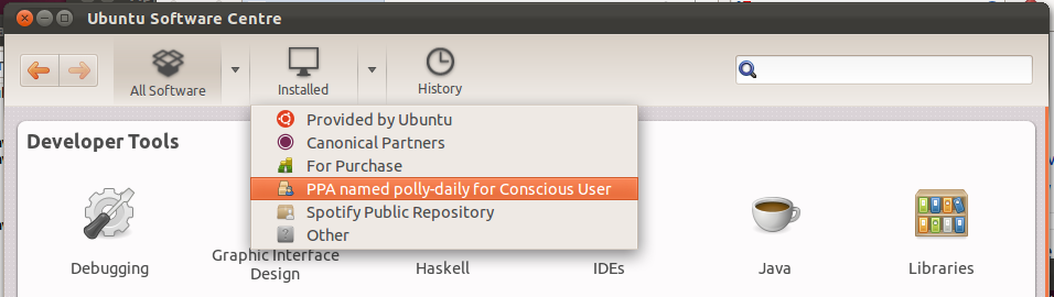
1. Launch USC.
2. Using gnome-tweak-tool or similar, switch to the Radiance theme (or any similar light theme, such as Raleigh), and the corresponding ubuntu-mono-light icon theme.
What happens:
A. The edges of USC's Back and Forward buttons are hard to see.
B. The section buttons ("All Software", "Installed", "History" etc) have unnecessary black borders.
C. The button for the current section has an odd shiny background.
D. The section button icons are grey on grey.
E. The section button text is grey on grey.
Screenshot of Radiance: https:/
Screenshot of Adwaita: https:/
This bug is Low importance if bug 828073 will not be fixed, but High importance if it will be.
It may save time to fix this bug at the same time as bug 828762.
Related branches

| description: | updated |
| description: | updated |
| Changed in software-center (Ubuntu): | |
| status: | In Progress → Fix Committed |
Could we please just use the primary-toolbar class that is used in gnome-control-
Code is at http://
Beware that that key isn't recognized in Glade yet.