

© 2004
Canonical Ltd.
•
Terms of use
•
Data privacy
•
Contact Launchpad Support
•
Blog
•
Careers
•
System status
•
1b1ed1a
(Get the code!)
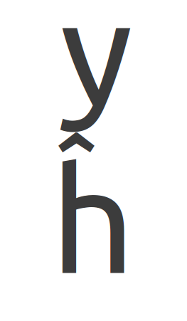
There is also a problem with the height of the char: probably the highest one from Latin-A – if there is the character "y" in the upper line, they are nearly touching one the other, which is really unsightly.