Style: Cyrillic glyphs ДЦЩЪ (дцщъ) could benefit from a bit of rounding

Bug #613277 reported by Artem Popov
56
This bug affects 10 people
Affects Status Importance Assigned to Milestone
Ubuntu Font Family
Status tracked in Phased-beta
Phased-beta
Opinion
Undecided
Unassigned

Bug Description

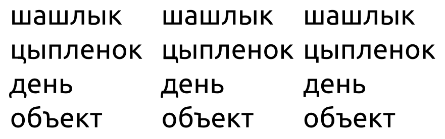
Rendered in 24pt Regular

Sample Glyphs:

Description:

Medium: screen
Font version: 0.1.7
Application: any

Some cyrillic glyphs in the font look very "rectangular" compared to the English alphabet (f, t). Letters like Ц or Щ might benefit from a rounded "tail" (the angled dash in their lower-left). The same applies for letters Д and Ъ.

UA String:

Mozilla/5.0 (X11; U; Linux i686; en-US) AppleWebKit/534.5 (KHTML, like Gecko) Chrome/6.0.484.0 Safari/534.5

Revision history for this message
Artem Popov (artfwo) wrote :

Automatic Screenshot

Ivanka Majic (ivanka)
visibility: private → public
Ivanka Majic (ivanka)
Changed in ubuntufontbetatesting:
status: New → Confirmed
importance: Undecided → High
Revision history for this message
Mark Shuttleworth (sabdfl) wrote :

I do think these seem unnecessarily squared. What's the rationale?

Revision history for this message
Lukas Paltram (lukas-daltonmaag) wrote :

In our experience Cyrillic lowercase fonts tend to have the look and feel of Latin small capitals - there is a rigidity and 'squareness' in many of the letterforms which doesn't always sit comfortably with the softer and more fluid shapes of Latin lowercase. This contrast is more apparent when 'square' characters such as длмнпцч are sitting alongside Latin аеорсуѕ which are also part of the Cyrillic alphabet. This textural contrast between the two scripts is something we don't particularly like, but in the majority of classical and contemporary fonts this is something which seems to be expected by most native speakers and has been accepted by our Russian consultants.

Revision history for this message
Mark Shuttleworth (sabdfl) wrote : Re: [Bug 613277] Re: Cyrillic glyphsДЦЩЪ (дцщъ) could benefit from a bit of rounding

Lukas, could you present us with a softer option, and let us do a
side-by-side comparison please?

Mark

Paul Sladen (sladen)
tags: added: uff-cyrillic
tags: added: uff-style
Revision history for this message
Malcolm Wooden (malcolm-daltonmaag) wrote : Re: Cyrillic glyphs ДЦЩЪ (дцщъ) could benefit from a bit of rounding

Was the design not approved by Canonical weeks ago?

Revision history for this message
Mark Shuttleworth (sabdfl) wrote : Re: [Bug 613277] Re: Cyrillic glyphsДЦЩЪ (дцщъ) could benefit from a bit of rounding

 On 19/08/10 16:51, Malcolm Wooden wrote:
> Was the design not approved by Canonical weeks ago?

Not by me it wasn't, no.

Paul Sladen (sladen)
summary: - Cyrillic glyphs ДЦЩЪ (дцщъ) could benefit from a bit of rounding
+ Style: Cyrillic glyphs ДЦЩЪ (дцщъ) could benefit from a bit of rounding
Revision history for this message
Deejay_TNT (idaho) wrote :

Also think these glyphs are a little too squared. Some rounding could make the font look closer to the latin characters. As of now - when you type English and Russian side-by-side, it somewhat seems like a different font. The glyphs are good, but I must admit some rounding could be beneficial.

Revision history for this message
Paul Sladen (sladen) wrote :

There has (outside of the updates to this bug report) been quite a bit of behind-the-scenes to-ing and fro-ing about the advantages/disadvantages of a more angular vs. Slavonic curved Cyrillic script by default.

Regardless of what the characters look like, they will (as far as the layout engines are concerned) be the same width. Changing the shape of the glyphs in the boxes will not cause reflow, therefore it is immaterial whether the technical change is made now, made next week, made next year, or not made at all.

It is /important/ to figure this out by release. But it is not /essential/ (from a technical point of view). It is possibly something that we may wish to illicit wider feedback on ...more easily done post opening with wide dissemination in the target market. If one design or the other design annoys people, we *are* going to hear about it and we can move to a solution that annoys the least number of people.

So, I'm sticking my neck out on this one and triaging it down to "Medium" since we can address the Cyrillic shapes later without technical impact. If it gets reverted I'll accept that I've been overruled by higher-powers.

Changed in ubuntu-font-family:
importance: High → Medium
Paul Sladen (sladen)
tags: added: uff-glyph-redesign-request
Paul Sladen (sladen)
Changed in ubuntu-font-family:
milestone: none → 1.0.0
Revision history for this message
Mark Shuttleworth (sabdfl) wrote :

Thanks Paul.

Yes, we have gone over this in some detail with Dalton Maag, who have brought us to a consensual view that the styling is appropriate and in keeping with the rest of the font. So, we'll close this bug as a difference of opinion.

Paul Sladen (sladen)
Changed in ubuntu-font-family:
status: Confirmed → Opinion
milestone: 1.0.0 → none
Revision history for this message
Paul Sladen (sladen) wrote :

The angular design of certain Cyrillic letters was raised again in the duplicate. Hopefully we can record and keep the reasoning here and then discuss it further if need be.

Revision history for this message
adoa (adoa) wrote :

I would like to see some rounding, too. But I cannot decide what kind of rounding.

Revision history for this message
Denis Moyogo Jacquerye (moyogo) wrote :

On bug #712542
iTux proposed designs for ц, п, н, л https://bugs.launchpad.net/ubuntu-font-family/+bug/712542/+attachment/1828315/+files/Screenshot.png
It was argue by others that the rounded or Latinized shapes might diverged too much from the nature of Cyrillic.

I'd say that Ubuntu already diverges from the nature of Latin or Greek! Just in Basic Latin, the designs of a, n or r are quite divergent from more traditional forms and give the typeface its identity. Shouldn't the same apply to other scripts, especially those closely related?
More rounded or Latinized designs are not foreign to Cyrillic users, and can easily be found.

Here are some common alternate designs:
- п like n
- л and љ like turned v (ʌ)
- ф like ligature dp
- ц and џ like u
- ш and щ like turned m (ɯ)
- ъ, ы, ь with a loop (fully rounded bottom left angle)
- д like script g (ɡ)
- г like reversed s (ƨ)

Obviously some might be too original at first glance. Most are from italic so people are familiar with the shapes.

If anything, these variants should at least be in the font as OpenType alternate or stylistic variants for those who specifically want those shapes.

Revision history for this message
Paul Sladen (sladen) wrote :

Many of these variants are designed, already included in the font and turned on a language-by-language basis; for example see the cursive 'шщ' in the following attachment:

  https://bugs.launchpad.net/ubuntu-font-family/+bug/708578/+attachment/1811451/+files/bg-school-primer-layout.pdf

but the cursive form and upright form tend to be quite different. The following school sample text is Bulgarian, not Russian Cyrillic, but it's possible to see some of the diversity:

   http://launchpadlibrarian.net/62975117/IMG_7470.JPG

the question is then, what should the /default/ for each language be, as this is the one that users in a particular language or country will see first.

Revision history for this message
Denis Moyogo Jacquerye (moyogo) wrote : Re: [Bug 613277] Re: Style: Cyrillic glyphs ДЦЩЪ (дцщъ) could benefit from a bit of rounding

I was merely suggesting the designs of upright characters could be as
original as their Latin counterparts.

The variants I mentioned are maybe not widely used in non italic but
they are common.
See for exemple "плљфцџшщъыьдг" with some of Paratype's typefaces
http://new.myfonts.com/fonts/paratype/mellnik/
http://new.myfonts.com/fonts/paratype/pallada/
http://new.myfonts.com/fonts/paratype/lunokhod/

Revision history for this message
Paul Sladen (sladen) wrote :

A good test is probably "can this be used out-of-the-box in a primary school in $country/region". If we're too extreme the answers might start to be "no".

Revision history for this message
u3othtjuzwlepazr4gtv (u3othtjuzwlepazr4gtv-deactivatedaccount) wrote :

I suggest you do not get involved in an unprofessional approach like "Let us do all the corners rounded".

With respect to work done on cyrillic part of font, if someone is really care to help maybe the better approach is to involve Russian type designers?

As I recall, in Russia there is a handful of companies and a small number of freelance professionals in type design field, so all of them can easily be found.

I believe there are people who can possible participate on that, the only need is to contact them and describe your needs and intentions.

To post a comment you must log in.
This report contains Public information  
Everyone can see this information.

Duplicates of this bug

Other bug subscribers

Remote bug watches

Bug watches keep track of this bug in other bug trackers.