long 'mail list' subjects are unreadable when right-hand pane is open

Bug #736444 reported by landroni
14
This bug affects 2 people
Affects Status Importance Assigned to Milestone
Postler
New
Wishlist
Unassigned

Bug Description

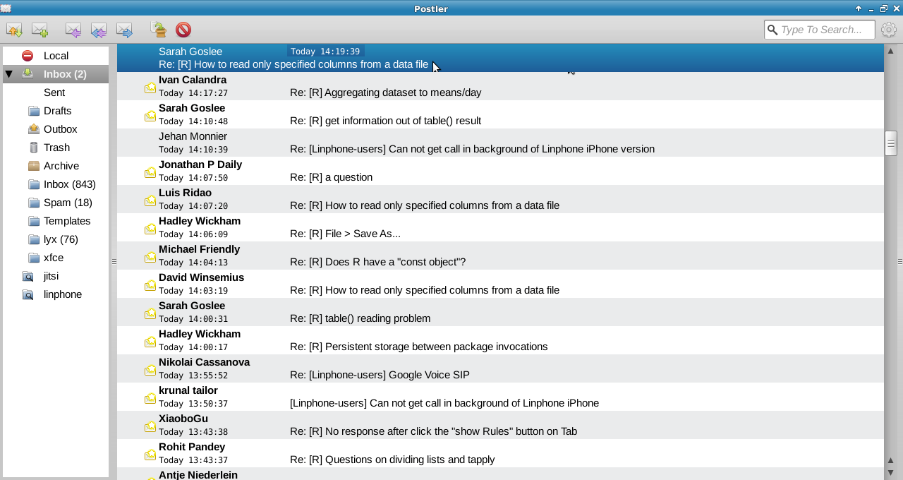
The current interface e-mail list interface is very nice and practical in its default state, that is when opening Postler and clicking on Inbox (shot 1).

Things get very messy, however, when a message is opened and its content pops up in the right-hand pane (shot 2). Although the current interface works fine for short Subject fields (such as "Re: [R] a question"), it is disastrous for longer ones ("Re: [R] How to read only specified columns from a data file"). Long Subject fields are truncated from the beginning: "Re: [R] How to read only specifi" is replaced by an ellipsis and the only part that stays visible is "ed columns from a data file".

The result is a cryptic and not very useful e-mail list. Thus, the mail list is useful only for the initial inspection of new mail and up until the first message is opened. To continue inspecting the mail list, in many cases one should manually resize the right-hand pane, which is sub-optimal.

One solution would be to re-design the interface of the default mail list. Now the info is roughly presented as follows:
Sarah Goslee
Today 14:19:39 Re: [R] How to read only specified columns from a data file

I would suggest to change that to something similar to the following (mockup in shot 3):
Sarah Goslee Today 14:19:39
Re: [R] How to read only specified columns from a data file

The date should possibly be right-aligned. This arrangement would allow for much longer Subject lines to be displayed in a readable form in the list, even when the right-hand pane is open. A secondary improvement would be that the mail list layout would be consistent with that of the message headers in the right-hand pane:
[From] [Date]
[Subject]

This bug basically comes as an argument against the interface request in #672828 [1].
[1] https://bugs.launchpad.net/postler/+bug/672828

Revision history for this message
landroni (landroni) wrote :
Revision history for this message
landroni (landroni) wrote :
Revision history for this message
landroni (landroni) wrote :
tags: added: layout
Revision history for this message
Sergio Spinatelli (spinatelli) wrote :

If the problem is ellipsizing,the mockup doesn't show how this should work when you have the viewer pane visible on the right side.
However,this problem is due to the fact that the subject and the date are in the same label,which then gets ellipsized (which usually causes the beginning of the subject being hidden).

Revision history for this message
landroni (landroni) wrote :

Ellipsizing is an issue (to me), but secondary.

The main problem is that with the current layout there is much too little space available for the subject line. In the mockup layout more space is available for long subjects, hence fewer truncated and confusing subject lines. Let me know if I haven't explained myself well enough.

As for the ellipsizing behaviour, it would be more useful if the beginning of the Subject stayed visible, while the end hidden.

Revision history for this message
Danielle Foré (danrabbit) wrote :

I think the problem stems from the fact that the layout is meant to work with the horizontal pane, in which case it makes more sense. However, as landroni points out, it doesn't make sense in the vertical pane.

I think we either need to have a different layout for each view or we need to drop the horizontal view and optimize for the vertical view. (personally I lean more towards simplifying than making it more complex)

Revision history for this message
Cris Dywan (kalikiana) wrote :

Your concerns remind me of myself. Before having an insightful discussion about this, I was absolutely convinced that there must be a full line reserved for the subject. Because that's how I used to use it. And it turned out that 415 pixels of subject with ellipsis are perfectly usable on a daily basis. Including bills and bug trackers with overly long subjects.

A point worth keeping in mind is that the left side doesn't have to be as wide as the right column, so there will typically be more space for subject and except (once implemented). On your screen that means 825 pixels.

Changed in postler:
importance: Undecided → Wishlist
Revision history for this message
Lee Hyde (anubeon) wrote :

Has the horizontal pane layout been removed in favour of an exclusive free column vertical layout? I can't seem to locate a pane view toggle in the current daily, and to be frank, the lack of a horizontal pane view is a deal breaker for me precisely because of bugs like this. I've never been able to adapt to the pure vertical layout personally, there's something unnatural about scanning vertical column (works for file managers a'la miller collumns, but not so well for e-mail and other reader applications in my opinion).

Revision history for this message
Lee Hyde (anubeon) wrote :

*why did I wite 'free column vertical layout'? Of course I meant three (as in 3; not beer or speech ;-)) column vertical layout.

To post a comment you must log in.
This report contains Public information  
Everyone can see this information.

Duplicates of this bug

Other bug subscribers

Remote bug watches

Bug watches keep track of this bug in other bug trackers.