

© 2004
Canonical Ltd.
•
Terms of use
•
Data privacy
•
Contact Launchpad Support
•
Blog
•
Careers
•
System status
•
1b1ed1a
(Get the code!)
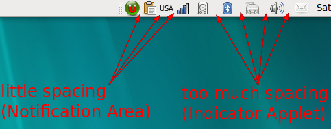
It affects me using 'Clearlooks' theme. I really don't care that the icons with more spacing are 'more organized', all I see is inconsistency with Notification Area. Either decrease spacing in indicator-applet or increase spacing in Notification Area. Or better yet, give users the option to choose the spacing they want.