
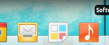
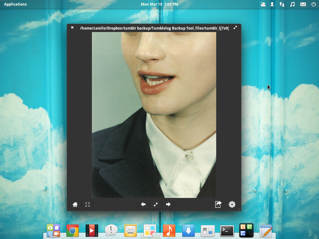
Foto image viewer needs a new icon
Bug #1073708 reported by
Camilo Higuita
This bug affects 2 people
| Affects | Status | Importance | Assigned to | Milestone | |
|---|---|---|---|---|---|
| Foto |
Fix Committed
|
Low
|
Camilo Higuita | ||
Bug Description
on plank: http://

| Changed in foto: | |
| status: | New → Fix Committed |
| importance: | Undecided → Low |
| Changed in foto: | |
| status: | Fix Committed → Confirmed |
| assignee: | nobody → Camilo Higuita (kxmylo) |
| Changed in foto: | |
| status: | Confirmed → Fix Committed |
| milestone: | none → foto-1.0 |
To post a comment you must log in.
I like the way this is going on.
Here a proposal based on your icon. I used strong colors (I think it looks better this way) and a different border, also I removed the shadow and glass effect.
This thread is for the discussion of the icon now, please don't create any new bugs reports about interface or icon, just post here the icon related stuff, and the interface design stuff here: https:/