

© 2004
Canonical Ltd.
•
Terms of use
•
Data privacy
•
Contact Launchpad Support
•
Blog
•
Careers
•
System status
•
a60fb26
(Get the code!)
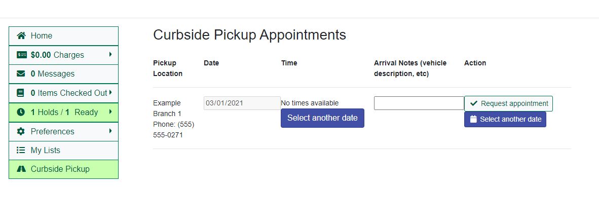
The functionality works great, but there are a few some small styling / usability issues:
1 - Styling: The fields and buttons are scrunched (technical term) together and could use a little breathing room.
2 - Styling: The date box is unnecessarily wide (at least on my screen) with excess white space between the date and the calendar icon when active, and just a lot of excess white space in the box when inactive. Reducing the white space might help with #1.
3 - Usability: The date box allows you to pick a date in the past - if you submit it, it says that there are no times available and gives you a button to select another date. This isn't critical, but it's a little clunky and it would be nice if it didn't let you select a date in the past to begin with.
4 - Bug: If you do select a date in the past, you end up with two "Select another date" buttons instead of one (see screenshot).
5- Styling: The "Arrival Notes (vehicle description, etc)" column header is very long. Suggest breaking that into two lines or just saying "Arrival Notes" with a little "?" pop-up helper. This should also help with #1.
6 - Usability: After clicking "Alert staff of arrival", the button disappears, but it would be nice if there were some sort of confirmation message.