

© 2004
Canonical Ltd.
•
Terms of use
•
Data privacy
•
Contact Launchpad Support
•
Blog
•
Careers
•
System status
•
1b1ed1a
(Get the code!)
https:/
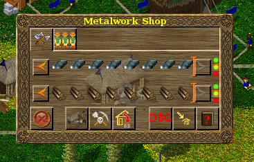
I reread SirVer's summary #15 and he suggested separating enhance/
As a result:
* the Stop/Go button is on the left.
* Enhance/
* Workarea/
Exception for Warehouses (and anything else that has no Stop/Go/
* Workarea/
* Help is on the right.
* Why: it looks odd having the 4 resource management controls on one line left justified, then the 3/4 other buttons on the next line right justified.
Proposing for review/merge.