Style: Greek 'γ' (gamma) and 'ν' (nu) ambiguity

Bug #609289 reported by Simos Xenitellis 
28
This bug affects 4 people
Affects Status Importance Assigned to Milestone
Ubuntu Font Family
Opinion
Wishlist
Shiraaz Gabru

Bug Description

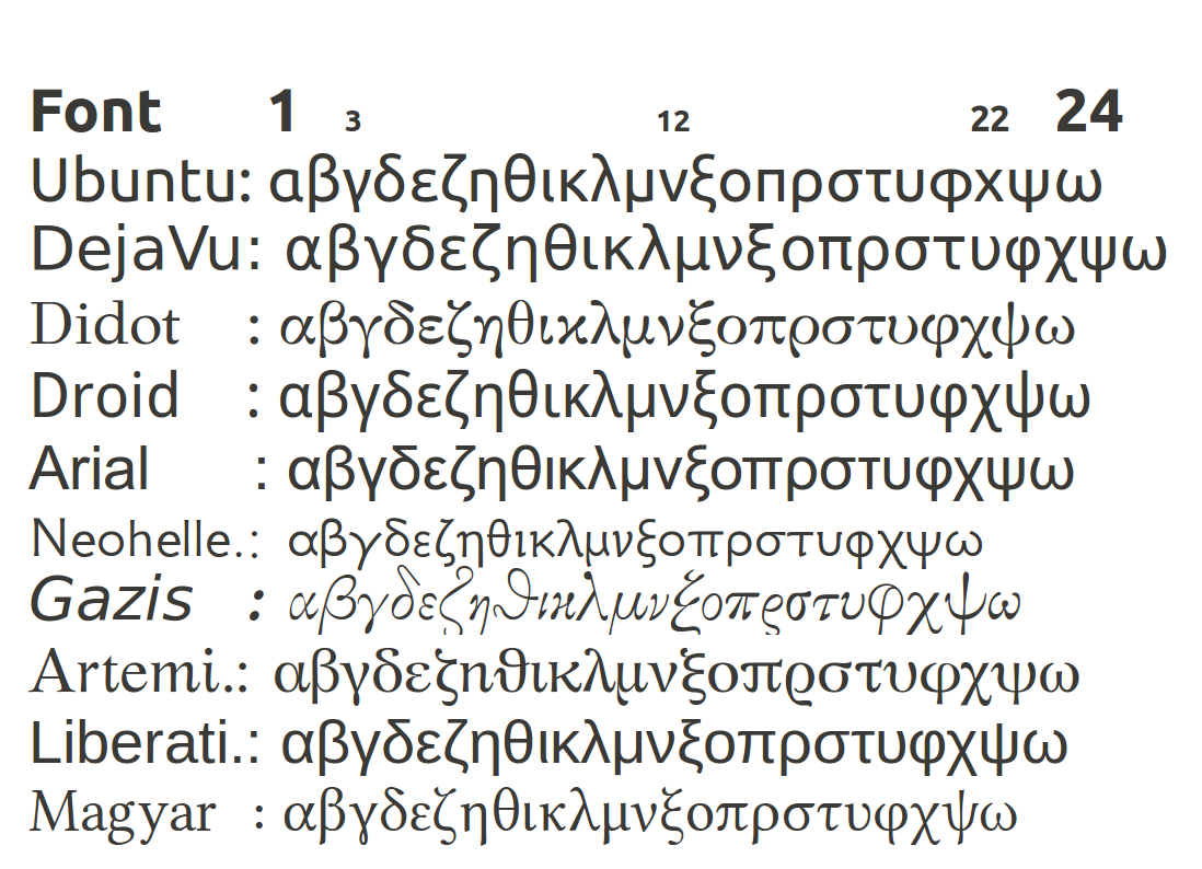
Rendered in 24pt Regular

Sample Glyphs:

γ

Description:

The way the letter γ (U03B3) is styled is different from the typical you would expect in a Greek font. https://launchpadlibrarian.net/56392150/GreekFonts.png

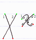
A Greek user would notice the peculiarity in this character and should take a bit to get used to it. What a Greek speaker expects is the 'leg' of γ to be vertical.

If γ follows a design principle then I believe it's OK to have it like that.
I believe one requirement here is that γ and ν look different.

Currently γ looks very similar to the ν from DejaVu Sans (currently default Ubuntu font) but with a 'leg'.

See http://simos.info/blog/archives/1144 for blog post and comment regarding γ.

UA String:

Mozilla/5.0 (X11; U; Linux x86_64; en-US; rv:1.9.2.7) Gecko/20100716 Ubuntu/10.04 (lucid) Firefox/3.6.7

Paul Sladen (sladen)
visibility: private → public
Ivanka Majic (ivanka)
Changed in ubuntufontbetatesting:
status: New → Confirmed
importance: Undecided → High
Paul Sladen (sladen)
summary: - Letter γ ((U03B3) has an untypical style
+ Letter 'γ' (gamma, U+03B3) has an untypical style
tags: added: uff-greek uff-style
summary: - Letter 'γ' (gamma, U+03B3) has an untypical style
+ Style: Greek 'γ' (gamma) and 'ν' (nu) confusion
summary: - Style: Greek 'γ' (gamma) and 'ν' (nu) confusion
+ Style: Greek 'γ' (gamma) and 'ν' (nu) ambiguity
tags: added: uff-ambiguity
Ivanka Majic (ivanka)
Changed in ubuntu-font-family:
assignee: nobody → Shiraaz Gabru (shiraaz)
Revision history for this message
Shiraaz Gabru (shiraaz) wrote :

There isn't a correct style in this regard. The designs were reviewed by an expert native speaking Greek typographer with about 20 years of experience.

We don't think there is any ambiguity between the 'γ' (gamma) and 'ν' (nu), most notable the γ has a leg.

You might be interested in a recent blog post on the development of the Greek, entitled 'It’s all about Greek', http://design.canonical.com/2010/09/it%E2%80%99s-all-about-greek/

Changed in ubuntu-font-family:
status: Confirmed → Invalid
Paul Sladen (sladen)
Changed in ubuntu-font-family:
status: Invalid → Opinion
Revision history for this message
Paul Sladen (sladen) wrote :

Moving the closure of this to "Opinion". The issue reported was a valid one, just one in which there is a stylistic opinion between a Greek typographer of 20 years standing and a Greek reader of 20 years standing. What hopefully sets us above other typeface development projects of the past is out ability to make the most of both sets of experience.

Simos: We have the breathing space to re-open this is after deployment of the Ubuntu Font Family to a wider group of people, if it is further reported as being an issue―it may turn out to be acceptable or something that everyone gets used to it. Neither of these affect the validity of the concern raised (I appreciate your feedback and the time taken to provide it), but do have a bearing on the outcome. Equally, thank you for Dalton Maag and Shiraaz for taking the time to write about the rationale that lead to the current outlines.

Revision history for this message
Nick Demou (ndemou) wrote :

As you can surely understand some typographers would gladly sacrifice functionality (in our case this means readability) to gain a little bit of subjective elegance -- how can you be sure that this SINGLE typographer is not one of them?

Personally I've seen with my own eyes children (with low reading skils) and a lot of older men (with low vision) having real -not subjective- trouble with this specific form of gamma. So I honestly can't give a lot of weight on what a SIGNLE typographer has to say.

Revision history for this message
Paul Sladen (sladen) wrote :

Nick: there is no 'them' and 'us', only *we*. We (including you, including I, including Dalton Maag and including Canonical) are collectively working on this Ubuntu Font Family to make something that is better for everyone. There is no 'single' typographer, but many. There is no 'single' user, but many.

It is *very* useful to know about the personal feedback experiences (old people, young children), as we pass this back and forth. Everybody contributing here is right and correct about something, and *we* (you, I, D-M, C.) need to take that data and apply it pragmatically. If we can prove (eg. over a 3 month period with 10,000 people) that it is an issue, then it makes sense to re-address it. This crowd-sourcing of feedback is the advantage, and we must use it.

Please remember the Ubuntu Code of Conduct, please keep discussion non-personal and completely pragmatic:

  http://www.ubuntu.com/community/conduct

Once again, thank you for contributing and taking the time to get involved!

Revision history for this message
Simos Xenitellis  (simosx) wrote :

Paul: Thanks for the reply. I understand the deadline situation for 10.10.
Let's try the font as is and I'll come back if there are concerns from users of deployed Ubuntu 10.10 systems.

Paul Sladen (sladen)
Changed in ubuntu-font-family:
milestone: none → 1.0.0
Revision history for this message
Mark Shuttleworth (sabdfl) wrote : Re: [Bug 609289] Re: Style: Greek'γ' (gamma) and 'ν' (nu) ambiguity

Of the two approaches, out of interest, which seems more modern?

Paul Sladen (sladen)
Changed in ubuntu-font-family:
importance: High → Wishlist
Revision history for this message
Nick Demou (ndemou) wrote :

Paul: sorry for the rough language. It wasn't because of high temper - just lack of time.

I wanted to point out that this issue is not at the black 'n' white zone of correct -vs- wrong and that the opinion of one man (no matter how skilled) is not enough to mark this bug as invalid. That's why I emphasized the word SINGLE and not because I wanted to attack any particular typographer. I find his work very beautiful but think that readability is more important when it comes to the default font of an OS.

My company serves people with visual impairments for many years so I'm looking at the issue more from the perspective of people with low-vision than from that of the typical user. From that point of view alpha and gama are difficult to read characters because alpha can easily be mistaken for an omicron and gamma for an ni. (I've also noted that children of the first years of elementary school seem to get confused from the same characters as low-vision people but I don't have much experience there).

> If we can prove (eg. over a 3 month period with 10,000 people) that it is an issue

That's almost impossible. There aren't 10,000 Greek users of Ubuntu let alone users bellow 9 and above 60 years old. And even if we find a proper set of people some serious difficulties remain (e.g measuring "reading difficulty", collecting their feedback in a usable form).

Revision history for this message
Νίκος Αλεξανδρής (nikos.alexandris) wrote :

Hi all!

To me the font as it is now isn't that bad. True, the "gamma" looks a bit unusual, but, hey... it's a new (root-breaker) style. It might be liked from people or it might not. Time will tell.

I understand and respect Nick Demou's professional experience. And if his point of view lies within the main goals of the ubuntu design team, then yes, his view should be seriously considered.

I know that typography can be a higly complex thing (and have no special knowledge on the subject actually). Anyhow, I did some fingerpainting to give two alternative ideas for the "gamma" (based on flipping/rotating and cropping of the current "gamma" and "lamda").

Revision history for this message
Simos Xenitellis  (simosx) wrote :

@Mark: Typically, modern would be the approach that is different from what people are used to.
Then, the γ (gamma) in Ubuntu Font is indeed modern.

There was a similar situation for Greek when the default Ubuntu font was changed from Bitstream Vera to DejaVu. The weird character at that time was the Greek 'ν' (for 'n'). There were some complaints but people eventually got used to it and the glyph remained as is.

Revision history for this message
Mark Shuttleworth (sabdfl) wrote :

I notice that the Ubuntu font Latin v and Greek ν are identical. Can someone from Dalton Maag comment on the appropriateness of that ambiguity?

Mark

Revision history for this message
Nick Demou (ndemou) wrote :

@Mark: There are many fonts containing a few Greek letters that have identical "glyphs" with Latin characters. In fact 15 Greek letters have almost always identical glyphs with latin ones [1]. This is expected since the Latin alphabet is a "fork" :-) of the Greek one and the two evolved in close contact for many centuries.

This is not a problem in 99.9% of the time because you know if the letter is supposed to be a Greek or Latin one depending on the context. Ambiguity between characters of the same alphabet are a bit more troubling and should be avoided if possible (hence my previous complain on the new glyphs of ν and γ)

PS: A huge *thank you* for your work with Ubuntu is an understatement of my feelings :)
______________
notes:
[1] I'm talking about A,B,E,Z,H,I,K,M,N,O,P,T,Y,X,o)

Revision history for this message
Kevin Godby (godbyk) wrote :

It's important in mathematics that the Latin v and the Greek ν have different glyphs because the two alphabets are used in close proximity all the time.

Revision history for this message
Mark Shuttleworth (sabdfl) wrote :

Is the mathematical invocation a different glyph, or the same one? If
so, I think we can argue that Ubuntu is a font that we want to work well
in technical documentation, and should therefor have some variation
between v and nu.

Mark

Revision history for this message
Nick Demou (ndemou) wrote :

I will put the bottom line first for those with little time:

There is little point in changing Greek ν to make it look different from Latin v. If however you choose to go that path then you still have a serious problem: If you make minor changes so that the letter still fits well within the font then you defeat the purpose of removing confusion between the two letters. If on the other side you make major changes then you risk making the letter look like it doesn't belong to its font.

@Kevin: I can't imagine a case where the similarity between the Greek ν and Latin v is a problem except if someone uses both of them as special symbols within the same context (e.g. Greek ν as a symbol for a counter and Latin v as a symbol for velocity) . If you really-really must use both in the same text you can do the same trick that you see in most books: use another style or font for one of them (e.g. serif and sans-serif font or normal and bold style).

@Mark:
> "Is the mathematical invocation a different glyph, or the same one?"
I can't really tell if I understand your question. I can however think of one Greek letter which has been so special that often Greek people feel the need to use a different glyph for it. I'm talking about the Greek π when used to represent the ratio of circles circumferences to their diameters. I do note that even for this "superstar" of symbols we use the regular glyph in many cases. And if you visit the Unicode standard and go to the position of the regular Greek letter π it says "Index entries: GREEK SMALL LETTER PI, pi, mathematical constant 3.141592...". I hope these remarks help with what is bothering you.

Revision history for this message
Kevin Godby (godbyk) wrote :

@Mark: The Greek lowercase nu (U+03BD) is the only upright, non-bold lowercase nu. (That is, there are not separate nu glyphs for math and text in this particular instance.) There are special bold, italic, and bold-italic nu glyphs for math, however. So then the question becomes, are upright, non-bold lowercase nu glyphs used in typesetting mathematics?

The short answer to that question is: there is is no short answer. Traditionally, TeX uses italic lowercase Greek letters and upright uppercase Greek letters for variables. In contrast, the ISO standards mandate the use of italic forms for both upper- and lowercase. (Furthermore, the French often use upright uppercase Latin letters as well as upright Greek.)

In any case, it's conceivable that a mathematician may have need to use both Latin lowercase v and Greek lowercase nu in the same formula. A few such occasions are shown here: <http://www.latexsearch.com/latexFacets.do?searchInput=\nu%20v&stype=exact>

@Nick: Mathematicians do often avoid using nu and v in the same equation because they're easily confused at first glance. If we're willing to say that this font should not be used for mathematics, that's fine. But if we do want to allow for this font to be used for mathematics, we need to adjust the nu glyph.

Additionally, the italic v and italic nu look the same, too.

Revision history for this message
Kevin Godby (godbyk) wrote :

It appears that lowercase chi and lowercase x are also the same glyph, also.

Revision history for this message
Nick Andrik (andrikos) wrote :

@Kevin:
From the examples in the latexsearch, I see that the greek (lower-case) \nu is always typeset in italic. Is this the rule for every greek letter in mathematic formulas?
About upper-case, I would guess that normal (not italic) is more appropriate, because of cases like \sum (Σ, capital sigma) and \prod (Π, capital pi).
So, I guess latex does what is (is it?) the norm for scientific formulas.

Nick

Revision history for this message
Nick Demou (ndemou) wrote :

> It appears that lowercase chi and lowercase x are also the same glyph [...]

Greek lowercase chi ("χ") has always had one significant difference: half of the letter falls below the base line just like latin letters jyqg. It also usualy is a litle bit more stretched in the vertical axis compared with latin x. Here is the one next to the other if you can see Greek characters xχ.

Revision history for this message
Simos Xenitellis  (simosx) wrote :

Here is a screenshot that shows the lowercase Greek characters for several fonts.
This should probably had to be added in the initial report description above.

Revision history for this message
Paul Sladen (sladen) wrote :

Kevin/Simon: Can you file the non-descending Chi separately, as I think we will need to document some rationale for that choice either way (regardless of outcome).

Revision history for this message
Kevin Godby (godbyk) wrote :

@Paul: I've filed bug <https://bugs.launchpad.net/ubuntu-font-family/+bug/647092> for the x/chi issue.

Revision history for this message
Paul Sladen (sladen) wrote :

I think this bug report is getting a bit off-track beyond the original issue of just gamma/nu ambiguity. Please could we move the general discussion of when/how to alias glyphs over to bug #647443 ("Style: when and to what extent to re-use glyphs between scripts") and which I've opened for this purpose and populated with a full list of current aliasing that is in use, push some Python so that people can investigate further.

Revision history for this message
Paul Sladen (sladen) wrote :

De-duped from bug #654748 about the ambiguity when hinted. It might be that changing the shapes would help the legibility at small sizes anyway.

description: updated
Revision history for this message
stavros daliakopoulos (stavrosd) wrote :

Here are some interesting comments about Greek handwriting that may be useful;

http://www.foundalis.com/lan/hw/grkhandw.htm

Personally when I write, not very often now because of computers, ( and as a child) I have a few preferences like;

I prefer gamma like this http://www.foundalis.com/lan/hw/hwlg.gif (see Magyar in Simosx image)
In my mind I want it to be different from the English "y" which is a different letter.

However I don't have an issue with the greek "ν" as I write is in the fashion of the second form because the first form takes more time. (time is money right ?)
http://www.foundalis.com/lan/hw/hwln.gif .
Although I would prefer it the first way as it is more Greek. I have learned not to confuse it with the small latin V.

As for the "τ" I usually write is as the second form http://www.foundalis.com/lan/hw/hwlt.gif
Again it is faster for me but if I want to write better I use the first "τ".

Lastly as for the Chi, I tend to use both forms http://www.foundalis.com/lan/hw/hwlx.gif
The proper form is of course the first, but again the second is faster to use as it is smaller, and Greeks that are bilingual will tend to use the second form also (note that it is the same later, different sound).

Stavros

To post a comment you must log in.
This report contains Public information  
Everyone can see this information.

Other bug subscribers

Remote bug watches

Bug watches keep track of this bug in other bug trackers.