

© 2004
Canonical Ltd.
•
Terms of use
•
Data privacy
•
Contact Launchpad Support
•
Blog
•
Careers
•
System status
•
35a32c5
(Get the code!)
I investigated a little further and I think OpenOffice uses the same font for the user interface as "normal" gnome applications, since "Use system font for user interface" in the OpenOffice configuration is enabled by default (Tools -> Options -> OpenOffice.org -> View).
It seems to have an influence which hinting method is selected in System -> Appearance -> Fonts. By default "Best shapes" is selected which means hinting is set to "medium" (if you click on "Details"). If you select "Best contrast" instead, hinting is set to "full" which doesn't make a visible difference to "normal" gnome-application compared to "Best shape". But the OpenOffice interface looks now the same than gnome applications (if you restart OO).
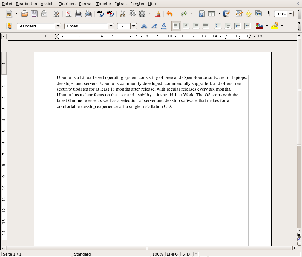
You can see the different of the look of OO in the two screenshots attached below. What I found interesting is that also the (default) document font is rendered differently, as you can see, to me the document text looks better from a subjective point of view with medium hinting.
Kind regards,
Jan