Window List has bad contrast between active and inactive windows

Bug #350046 reported by Fred
4
Affects Status Importance Assigned to Milestone
human-theme (Ubuntu)
New
Undecided
Unassigned

Bug Description

Binary package hint: human-theme

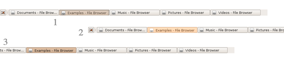
In the Window List in the panel (task bar), the active windows and inactive windows are too hard to distinguish due to poor contrast.

I've attached a demonstration file, but in it is actually pretty clear which is the active and inactive window. However, in real-world scenarios with more windows open, and showing the whole screen instead of just this little image where your eyes will be focused, it is actually difficult to distinguish between active and inactive tasks. Check your own window list, and you will see it takes some time to find the active one.

This results in poor usability and poor productivity.

Tags: usability
Revision history for this message
Fred (eldmannen+launchpad) wrote :
Revision history for this message
C.Kontros (coryisatm) wrote :

Well wait. Why post a screenshot that's contrary to your issue? :)

Here, my screen looks like yours (in the "real-world") and it's clear what is the active window. :)

Though, I will concede some changes to latest versions of gtk-engines have made this a *little* less clear. Nothing so bad though that I had trouble.

Revision history for this message
Fred (eldmannen+launchpad) wrote :

Hehe, I am not sure.
On the screenshot I see the active one immediatly. However, on my real desktop, it is much more tricky to see it.

Revision history for this message
Dave M (davenoto) wrote :

I think the same... This low contrast is pretty annoying. By the way why not use the selection color? Or any color because besides a higher contrast, a color different from the inactive windows (even if just with a light shade!) would be much striking...

...Meanwhile I made three example on what I'm talking about, see the attached file:
1: A bit darker, coloured shade, with a shadow inside the button.
2: Higher contrast/light colour button
3: Just a darker, coloured shade.
By the way, inner shadow would highlight a button even if it's colour is the same as the other one's...

So what do you think?

Revision history for this message
Dave M (davenoto) wrote :
Revision history for this message
Fred (eldmannen+launchpad) wrote :

I think your examples look good, they're much easier to distinguish active and inactive windows.

To post a comment you must log in.
This report contains Public information  
Everyone can see this information.

Other bug subscribers

Remote bug watches

Bug watches keep track of this bug in other bug trackers.