
Simple changes to make the grub menu look more elegant
Bug #391774 reported by
Wouter Stomp
This bug affects 1 person
| Affects | Status | Importance | Assigned to | Milestone | |
|---|---|---|---|---|---|
| NULL Project |
Invalid
|
Undecided
|
Unassigned | ||
| grub2 (Ubuntu) |
Expired
|
Low
|
Unassigned | ||
Bug Description
Binary package hint: grub2
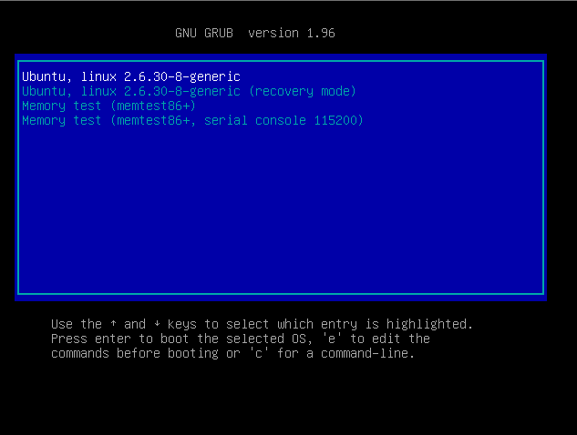
It looks really messy as it is now, and i don't really need any fancy graphics, or animations (although that could be nice) - just the ability to have grub not point me in the eyes so much by default.
Remove:
* borders
* Version info text at the top
* Help text at the bottom
Simplicity is much more pleasing to the eyes. With a splashimage, it looks even better, where the borders on the "standard grub" would spoil it a bit.
Please see the screenshots in this forum post:
http://

| affects: | hundredpapercuts → null |
To post a comment you must log in.
Ubuntu 9.10 might hide the grub menu by default, which means this wouldn't be a 'paper cut'.
A 'paper cut' is a minor usability issue likely to be encountered by an average user the first day using vanilla Ubuntu 9.10.
Leaving this as Incomplete until it is confirmed that grub won't be seen in Karmic. Reference: http://