
Fonts are mapped to ugly fonts (which also causes problems with OOo)
Bug #41411 reported by
Daniel James
This bug affects 5 people
| Affects | Status | Importance | Assigned to | Milestone | |
|---|---|---|---|---|---|
| fontconfig (Ubuntu) |
Incomplete
|
Medium
|
Unassigned | ||
| Hardy |
Invalid
|
Medium
|
Unassigned | ||
Bug Description
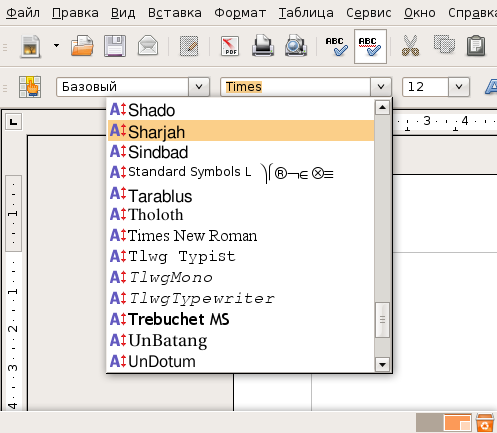
/etc/fonts/
Times to Nimbus Roman No9 L
Helvetica to Nimbus Sans L
Courier to Nimbus Mono L
The problem with this is that the Nimbus set of fonts renders really badly (on my machine at least). The fonts appear with blue pixels to the right of about 50% of letters.
Can these be changed to map to DejaVu or Bitstream fonts instead? DejaVu and Bitstream map beautifully.
I'll attach screenshots of these current fonts in action.

| Changed in fontconfig: | |
| milestone: | none → ubuntu-8.04-beta |
| Changed in fontconfig (Ubuntu): | |
| status: | Confirmed → Triaged |
| tags: | added: patch |
| Changed in fontconfig (Ubuntu): | |
| status: | Triaged → Incomplete |
| Changed in fontconfig (Ubuntu Hardy): | |
| status: | Confirmed → Incomplete |
To post a comment you must log in.
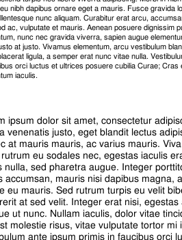
This is a screenshot of the problem. I've also zoomed a section of the screenshot so that it is easier to see.
Please note that this is on an lcd monitor.. so there is sub-pixel anti-aliasing turned on..