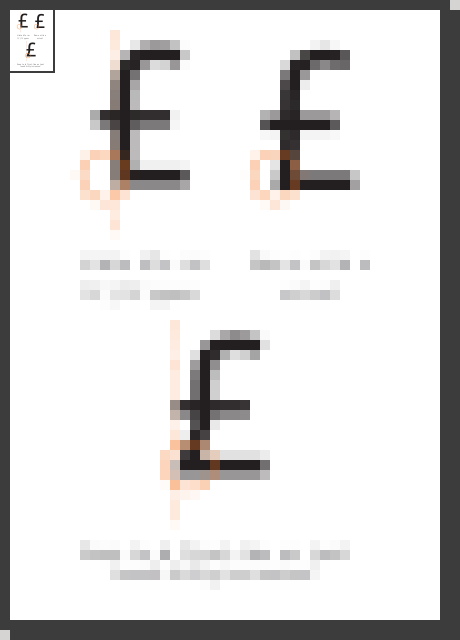
Hinting: Current: £ and € ambiguity at 13/15 ppem (difficult to read at small sizes)

Bug #685562 reported by Mackenzie Morgan
6
This bug affects 1 person
Affects Status Importance Assigned to Milestone
Ubuntu Font Family
Status tracked in Phased-beta
Dalton-maag-expansion
Fix Released
Low
Unassigned
Phased-beta
Fix Released
Low
Unassigned

Bug Description

I'm using Kubuntu Netbook, which defaults to size 7 & 8 fonts. At these sizes, the £ and € symbols become a bit difficult on the eyes. I'm attaching a screenshot comparing the Ubuntu font and Liberation Sans at sizes 7, 8, and 12 so the difference can be seen.

Mainly, I think the bottom line of £ needs to extend further to the left like it does at size 12 (at sizes 7 & 8 it almost looks like a C with a graphical artifact making it slightly crooked) and that the €'s bars should be a bit closer together since at sizes 7 & 8 it turns into a muddle of horizontal lines with the top edge, two bars, and bottom edge all being equidistant.

The screen is running at its native 1366x768 and is 11.6" (256mm x 144mm) making a DPI of 135. And yes, KDE obeys the X DPI. The DPI is being forced with `xrandr --dpi 135` in /etc/kde4/kdm/Xsetup since the autodetection was wrong

Revision history for this message
Mackenzie Morgan (maco.m) wrote :
description: updated
Paul Sladen (sladen)
summary: - £ and € are difficult at small sizes
+ Hinting: Current: £ and € ambiguity at 13/15 ppem (difficult to read at
+ small sizes)
Revision history for this message
Paul Sladen (sladen) wrote :

135 dpi at 7/8 pt makes this 13/15 ppem, this appears to be rendered with hinting enabled, so I can see the potential for tweaking it. Perhaps in the hinting for the node at the bottom-left of the £ would do with pushing out a bit, so that the rasterised shape has less of a curved/'C' appearance at smaller sizes; eg. more akin to the Hebrew bet ('ב') in reflection and a more definite corner.

maco: to confirm, please can you retake the screenshot with the magic '' character pasted in after each of the pound signs. This will confirm the hinting and ppems in use.

Changed in ubuntu-font-family:
status: New → Confirmed
Revision history for this message
Mackenzie Morgan (maco.m) wrote :

Adding in a debugging glyph at sladen's request

Revision history for this message
Paul Sladen (sladen) wrote :

Confirmed per second screenshot.

Changed in ubuntu-font-family:
importance: Undecided → Low
milestone: none → 1.00
status: Confirmed → Triaged
description: updated
Paul Sladen (sladen)
Changed in ubuntu-font-family:
milestone: 1.00 → 0.71
Revision history for this message
Shiraaz Gabru (shiraaz) wrote :

Thanks for the feedback, looking at the screen shots attached, the £ and € symbols don't seem ambiguous to me at the point sizes specified. The two middle horizontals are visible even at the 7 points.

Revision history for this message
Mackenzie Morgan (maco.m) wrote : Re: [Bug 685562] Re: Hinting: Current:£ and € ambiguity at 13/15 ppem(difficult to read at small sizes)

When they're sitting an inch apart, you can tell them apart, but the first time
I typed £ I was confused because it looked more like a crossed-C than a
crossed-fancy-L with the lack of little...thingy...sticking out the left side.

I imagine the DPI with which you view the screenshots would make a difference
to what you see too though. As in the original report, my screen is 135 DPI,
which means my pixels are about 3/4 the size of "normal." Maybe try scaling it
down to 75% in the GIMP and look at it?

Revision history for this message
David Marshall (dave-daltonmaag) wrote : Re: [Bug 685562] Re: Hinting:Current:£ and € ambiguity at 13/15 ppem(difficult to read at small sizes)

The DPI setting isn't relevant here as we're specifying the
"problematic" sizes in ppem. I don't believe the shapes are ambiguous in
themselves or with each other, even at such small sizes, and the choice
of form for the £ is standard for a sans-serif typeface. You wouldn't
expect to see a loop on a sans-serif £ design.

Dave

Revision history for this message
Paul Sladen (sladen) wrote :

David: I what is happening here is that the feature that makes the £ unambiguous is the concave knee at the bottom left, but the current hinting loses this at 13/15 ppem by snapping to the vertical, rather snapping in the opposite direction (to be level with the left-hand extent of the cut-line). See the attached PDF for what is happening and the likely solution ensuring that the knee always remains concave.

Revision history for this message
Paul Sladen (sladen) wrote :

...and the PDF version of that.

Revision history for this message
David Marshall (dave-daltonmaag) wrote : Re: [Bug 685562] Re: Hinting: Current:£ and € ambiguity at 13/15 ppem (difficult to read at small sizes)

I'm afraid that proposed solution - which exaggerates the feature - will
result in a very unpleasant shape. Unambiguous, but glaringly ugly. I
would contend that the current solution is completely unambiguous, however.

Dave

Revision history for this message
Mackenzie Morgan (maco.m) wrote : Re: [Bug 685562] Re: Hinting: Current:£ and € ambiguity at 13/15 ppem(difficult to read at small sizes)

Here's a screenshot of the £ character at 13ppem in every sans-serif font on
my system. All but Ubuntu have that concavity. Some even have a ~ shape to
the bottom line. There are only two I'd call ugly (Deja Vu & URW Gothic)

Revision history for this message
David Marshall (dave-daltonmaag) wrote : Re: [Bug 685562] Re: Hinting:Current:£ and € ambiguity at 13/15 ppem(difficult to read at small sizes)

Ah, apologies - that's a different issue to the one I'm referring to -
the horizontal stem at the bottom should extend to the left of the
vertical stem in this case, because we can't preserve the slight
curvature without overly-distorting the character.

So yes, I would amend the current form, but by clarifying the bottom
stem, not by distorting the vertical stem.

Dave

Revision history for this message
Paul Sladen (sladen) wrote :

Dave: I don't really mind how it's done, as long as in the hinted forms, the bottom-lefthand node is always rendered >= 1-pixel past the left of the main vertical stem! :)

It's "only" 1-pixel, but that pixel is critical in preserving the legibility of the /apparent/ shape.

Revision history for this message
Paul Sladen (sladen) wrote :

Screenshot of PDF rasterised at approximate sizes under discussion. Hopefully showing how the suggested hinting adjustment should improve the legibility whilst increasing the /perceived/ similarity to the true outline form with its slight back-kick in the bottom-left.

Revision history for this message
David Marshall (dave-daltonmaag) wrote : Re: [Bug 685562] Re: Hinting: Current:£ and € ambiguity at 13/15 ppem (difficult to read at small sizes)

Yes, I'm in complete agreement that the bottom horizontal stroke needs
to clearly extend beyond the vertical. I was arguing at cross-purposes
earlier.

Dave

Shiraaz Gabru (shiraaz)
Changed in ubuntu-font-family:
milestone: 0.71 → mono
status: Triaged → Fix Committed
To post a comment you must log in.
This report contains Public information  
Everyone can see this information.

Other bug subscribers

Remote bug watches

Bug watches keep track of this bug in other bug trackers.