
[1 mod] hinting: 'g' baseline and descender merge
Bug #605856 reported by
Paul Sladen
This bug affects 1 person
| Affects | Status | Importance | Assigned to | Milestone | |
|---|---|---|---|---|---|
| Ubuntu Font Family |
Fix Committed
|
Medium
|
Unassigned | ||
Bug Description
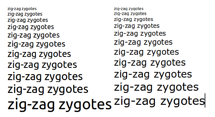
The lowercase 'g' normally as a raised baseline to counter-act its closeness to the descender. At normal on-screen viewing sizes (eg. 12 pt), the hinting aligns this raised baseline to the normal baseline, bring it closer to the descender (1 pixel separation) and removing the white space. The result is an unbalanced 'g' that looks heavy at its bottom end.
Ideally the baseline of the 'g' should be kept raised slightly towards the median of the glyph.
| visibility: | private → public |
| Changed in ubuntufontbetatesting: | |
| status: | New → Confirmed |
| importance: | Undecided → Medium |

To post a comment you must log in.
Hinting will improve this on next version.