
© 2004
Canonical Ltd.
•
Terms of use
•
Data privacy
•
Contact Launchpad Support
•
Blog
•
Careers
•
System status
•
bbfa235
(Get the code!)
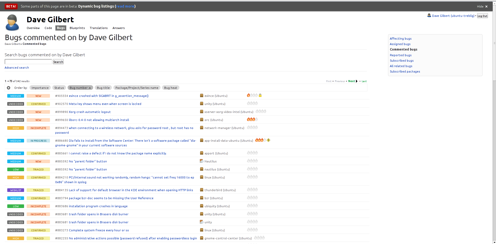
Hi,
That's much better than it was - thank you!
I think it could still get denser without harming anything though, here are two thoughts (although just thoughts):
1) You could remove the horizontal separation line if you alternated having a slightly shaded background
for every second bug (I'm thinking of Gnucash's listings, without getting too close to old school fanfold paper!)
2) It's still not using a wide display that well; see attached picture. The long bug names are wrapping and the heat flames are out of line, yet it's nowhere near the end of the horizontal lines.
Dave