Fill and Stroke window should be smaller
Bug #208689 reported by
Gatonegro
This bug affects 1 person
| Affects | Status | Importance | Assigned to | Milestone | |
|---|---|---|---|---|---|
| Inkscape |
Confirmed
|
Wishlist
|
Unassigned | ||
Bug Description
The Fill and Stroke dialog is too large to be used comfortably in a docked mode --- or to keep open in a windowed mode at that. It should be made at least as smaller as the Arrange and Align dialog, which the other oft-used window likely to share space with the Fill and Stroke one.
While this may not be too noticeable in larger resolutions, when working at 1024x768 the amount of space the docked windows take in this manner is very significant.
Tangentially related to https:/
| Changed in inkscape: | |
| importance: | Undecided → Wishlist |
| status: | New → Confirmed |

To post a comment you must log in.
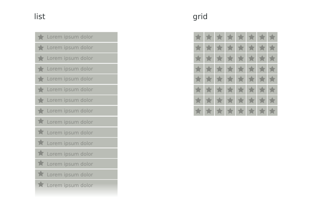
Part of what makes the dialog very wide seems to be Markers, or more specifically the name of the markers (EmptyDiamondMStart being the longest of those).
One way to fix this would be to give the markers shorter names, or to set a upper limit on the length of markers.
Another way to fix this is to de-empathize the names of the markers and change the presentation model from a list to a grid, perhaps with the names showing up as tooltips. This would also allow people with smaller screens to get a overview of all the markers available. If the grid is made 8x8 squares, all 64 markers will fit, even on netbooks.