

© 2004
Canonical Ltd.
•
Terms of use
•
Data privacy
•
Contact Launchpad Support
•
Blog
•
Careers
•
System status
•
73416ba
(Get the code!)
This is not a bug in the session menu. It is a bug in GTK, or more precisely, a lack of sophistication in the way GTK lays out menus.
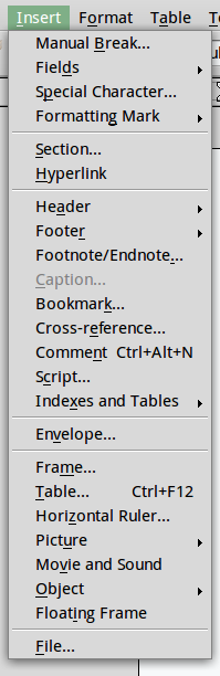
It is bad for the horizontal area used to display keyboard combos to overlap a lot with the horizontal area used for the item text, because this makes it harder to scan both the items and the combos. You can see this for example in OpenOffice.org Writer's "Insert" menu (screenshot attached): it's difficult to see that the "Comment" item has a keyboard combo, because it's smothered by the longer "Cross-
Native GTK menus go to an extreme length to make sure this never happens: all menu item labels, and all keyboard combos in that menu, occupy completely separate columns, with space between the columns. Unfortunately, this makes some menus very wide. The session menu is just one example of this. For an even worse example, see Evolution's "Search" menu: the "Clear" item label is miles away from its Shift+Ctrl+B keyboard combo, because the combo is trying to keep clear of the much longer "Create Search Folder From Search..." item further down the menu. <http://
Native Windows and Mac OS X menus take a more sophisticated approach. I'm not sure exactly what they do, but they seem to allow a *small* amount of overlap between text and combos in adjacent items
<http://
<http://
and a much greater overlap between text and combos in non-adjacent items.
<http://
<http://
<http://
I think GTK should do the same.