
GTG needs a UI redesign
| Affects | Status | Importance | Assigned to | Milestone | |
|---|---|---|---|---|---|
| GTG |
Fix Released
|
Wishlist
|
Unassigned | ||
Bug Description
I think everybody has seen the new approach in UI design by the GNOME design team(Contacts, documents...). It would be awesome if GTG gets such a redesign using the same principles. Especially since a lot of applications are becoming available on Linux that look(and work) way better than the existing old GTK2 programs(e.g. Wunderlist).
There is an separate bug for porting GTG into GTK3 - bug #897136

| Izidor Matušov (izidor) wrote : | #1 |
| Reda Lazri (0rAX0) (0rax0) wrote : | #2 |
I mean redesign the whole interface(
1- GTK3
2- Consistent with the new GNOME programs such as, GNOME Contacts, Documents...
http://
3- Make the UI as straightforward as possible, which means removing the duplicate fuctions, making it easier to add a task and change it/remove it...
About Wunderlist, I wasn't talking about the look. That design came from OS X and it will never work/integrate with GNOME. I was talking about how easy and straightforward you'll manage your tasks, it is NOT cluttered; it's a well-made app that anybody can learn how to use it in minutes.
I'm willing to help with art-related part if you are interested. :)
| Izidor Matušov (izidor) wrote : | #3 |
There is a plan for using GTK3 in GTG in the future.
"I'm willing to help with art-related part if you are interested. :)"
Those are the words I like :-) I think that GTG can use a redesign. Be ware, Lionel and Bertrand has spent a lot of time to get the current simple design (Compare it to TaskCoach) and it is hard to create really good UI. Many features might seem to be just cluttering UI, but they are important, e.g. quick add toolbar. The philosophy of GTG is (should be) that adding a new task requires no effort at all. It is important to reflect the philosophy in UI.
I am willing to implement a prototype and help you. Please, look at the current trunk version because there are a lot of ongoing changes. A small redesign of some UI is in progress by Bertrand https:/
What would you suggest as a next step?
| Changed in gtg: | |
| status: | New → Confirmed |
| Reda Lazri (0rAX0) (0rax0) wrote : | #4 |
Yes, TaskCoach is cluttered; Well, the quick-add feature is a must. I was talking about the way you mark tasks as done, dismiss and make subtasks; There are currently four ways to mark a task as done: through File>, from the toolbar, with a right click and CTRL+D. This IS clutter. And the same same can be said for other features as well.
Here are some additional mockups on Github: https:/
I suggest:
1- Doing things like the GNOME design team i.e. gathering information about similar programs on other platforms and see what the "other guys" are doing right.
2- Make use of existing GNOME technologies and tools (e.g. GNOME Online Accounts for importing information and GNOME Shell integration). I know goa is limited to Google right now, I think you have a better knowledge of what should be used and how.
3- Be in-sync with the GNOME project, that means anticipating the upcoming features and make plans for them. For instance, if the GNOME guys are thinking about getting rid of Evolution and making separate applications for the Calendar, Mail client...we shouldn't be wasting time working on how we should integrate GTG better with Evolution.(this will involve asking them directly for their plans)
That's all for now,
| Lionel Dricot (ploum-deactivatedaccount) wrote : | #5 |
GTG is already very document centric. There's no need to discuss stuffs like "it should be…"
One great way to improve the situation is to propose mockups or very specific changes. We can discuss them and improve the situation.
Without mockups or very specific proposals, discussion is just useless.
| Reda Lazri (0rAX0) (0rax0) wrote : | #6 |
Well, mockups aren't always the first thing to do. I'm making sure we're on the same frequency. :D
Anyway, I already started working on it. Expect something soon :)
| Lionel Dricot (ploum-deactivatedaccount) wrote : | #7 |
Well, I can confirm that we definitely want to be as close to GNOME as possible. So any proposal to go that way will be well received (but it has to be discussed, of course). Thanks for working on that, I'm impatient :-)
| Reda Lazri (0rAX0) (0rax0) wrote : | #8 |
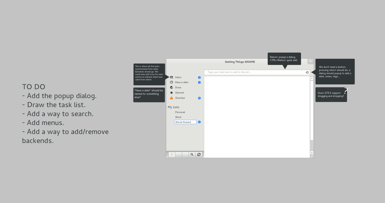
- Main Window Edit (77.1 KiB, image/png)
Here's the first mockup, it contains the main window. It is still missing some parts. The more complete version is coming shortly. :D
| Izidor Matušov (izidor) wrote : | #9 |
To be sure we are on the same frequency:
You are talking about two levels of changes:
1, "Tasks won't be able to be dissmised" -- Change paradigm and concepts of GTG. I think those are strongs and users like GTG because of it.
2, "Tasks won't be able to be dissmised from the main menu. Instead of the main menu, uses a special button..." -- UI redesign. Features stays but the user works with them differently.
Changing both levels at the same time is really complex and in the principle it means to rewrite 90% of the app what is bad. We should make a lot of smaller steps instead of a big leap.
On the other side, it does not mean, that UI things like quick add toolbar must be preserved. We need a way how to enter a lot of tasks just by a keyboard without using a mouse. The idea is:
I am starting a new project and want to insert this set of tasks:
- Conquer the world
- Learn the geography of the world (I should know which country I should conquer)
- Europe
- Asia
- Africa
- Australia
- North America
- South America
- Create the weapon
- Google a tutorial for it
- Buy things I need for it
- Build it
At the moment, there is no simple way how to put those task structure into GTG. Compare it to WorkFlowy: https:/
Do you get my message? Do you understand my thoughts?
By the way: which tool do you use for creating that mockup?
| Reda Lazri (0rAX0) (0rax0) wrote : | #10 |
1- No, nothing is going to be removed(as a functionality) users will be able to dismiss tasks, I just haven't put it there yet. :)
2- Again, yes. The feature is staying.
3- I'm thinking about a popup dialog, it should let you add everything task-related, so by the time you click 'add' everything should be in place with a single click.
4- I think the quick add is something important on a GTD-like program(at least for me). Let me think of possible variations.
5- Everything is clear, please give five minutes to finish the current piece and I'll upload a PNG of the progress so far.
6- I reuse SVG's from the GNOME mockups in Inkscape.
| Reda Lazri (0rAX0) (0rax0) wrote : | #11 |
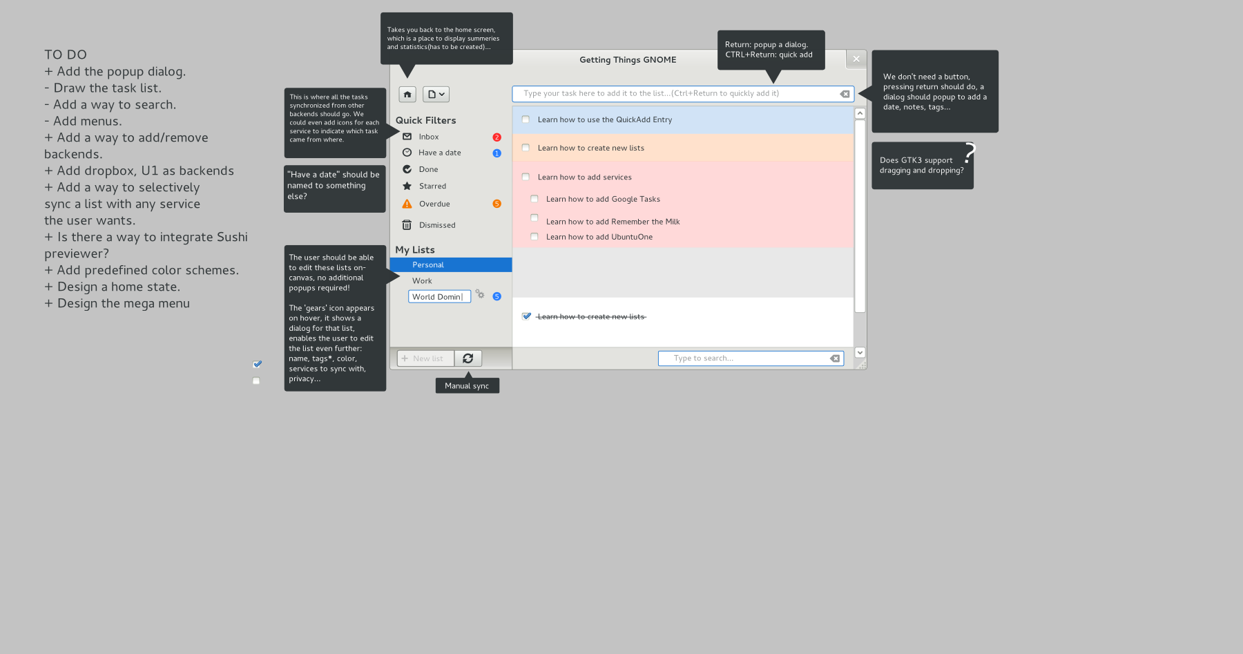
- Main Window_2.png Edit (198.1 KiB, image/png)
Note that, things are going to be different on the task list(based on your last comment).
Also, please take a look at some of the comments (and To Do) and answer the ones with the question mark.
| Izidor Matušov (izidor) wrote : | #12 |
Thanks for the mockup.
I don't know anything about missing Drag'n'Drop in GTK3 - yeah, GTK3 supports Drag'n'Drop.
You are missing in your mockup way how to switch to WorkView.
I don't see a reason why we should have "Have a date" view. Start date and due date should be shown next to a task. Another option is to adopt tasque view: http://
What should be the function of Inbox? It is a "reserved" word from GTD terminology. I would prefer, if Inbox would be the current "tasks without tags".
Do we need Starred tasks? I find it just a clutter. (Lists/tags are there for that)
Why the new button has that menu button within it? People find it hard to use (quoting somebody from this bugzilla when i proposed this kind of button).
There is a proposal for using small icons as well as color for tags. It should be shown next to the name of the list. Another proposal was to show the name of tag in the tasklist - look at it - lp:~bertrand-rousseau/gtg/new-tag-label-in-taskviews
User should be able to associate tag with its color and its task easily
What about tag tree? (A tag is parent for other tags?) This is hard to think about it. You will probably need the treewidget to get it right and I don't think it would be possible to put it into right panel. The question is: clutter (but features) or simple list of tasks?
I would put list of backends' tasks into list section.
How do you think it would be the best way to hide done tasks? When I mark a task as done, I would prefer to stay here (at least for a while). When I have a lot of done tasks, I can't see tasks to do.
I hope that search toolbar down there is only when you press a keyboard shortcut (CTRL+F) and is not there the whole time. We want for user to create live list. After searching, he could save the search and use it as quick refrence.
There is an idea, that GTG doesn't need main menu at all. (We need to launch settings and backends configuration dialog) Maybe you should consider that.
I think that home screen with the overall statistics would be cool. If it is done properly, it would cool feature! But it must provide so unique information, that the user doesn't matter one more click to get to the tasks. User story:
Jan is an active young boy who has a lot of things to do. He has so many tasks, that he needs an intelligent preview, whats going on, which project needs his attention. He can find that information on the home screen.
I think to design home screen would be challenging and really hard.
Why do you want to integrate Sushi? I don't see any reason for that. Could you explain it?
When I look at the whole mockup, it looks a little bit cluttered. (It might be because everything is edited and showed at the same time)
Thanks for your work on the mockup.
| Reda Lazri (0rAX0) (0rax0) wrote : | #13 |
- mockups3.zip Edit (99.2 KiB, application/zip)
So, the user can actually drag a task from a list(or the inbox?) and drop it on another list?
What's the purpose of Workview? I tried it, but couldn't see its role.
I removed the 'Have a date', I also changed the section to "notifications"; The user will be notified about his overdue tasks now in case he was covered (the case were you put it in the task list, scrolling down will cover it.). So, I think 'the Overdue notification' is a must.
The inbox, is the place where you receive tasks from other backends(RTM, GTasks, Evolution...). I tried to sync my tasks with the current build 0.3dev, GTG added them to the main list directly, I want to give the users the privilege of choosing where to put these new tasks. Also it has to be a notification about it in case of a collaboration(where someone adds a task in RTM for you). A very detailed mockup will give a clearer image, please, let me finish it and you'll see how cool it is :D.
'Starred' was removed!
What new button?
I was going to propose the same idea too. I will make something for it.
The treeview is bad, confusing and old IMHO. I was thinking about 'Smart lists' instead, this is how they work:
I have 10 tasks with the tags of: sports, daily, home, wife. Creating a list with the name of 'Personal' and specifying the same tags in it(mockup in the works) will add all these 10 tasks to 'Personal' automagically! How about that, no need to the parent tag and it will make the life of millions easier. :)
I will either add 'Online services' to the sidebar. OR, we add special tags for every service i.e. "rtm" for RTM and let the user decide if he wants to add a (neW)list for it using the smart lists idea.
I will have to think about that too.
I changed things about the search(see mockups), and I need some explanations about the live lists :)
OK, removed the need for a main menu, backends and configuration should be integrated in the same window and launched from the 'settings' button. the plugins have to be configured from there too. (see Gedit)
I will take care of the Home screen when its time comes, I'm glad we agreed on its importance. :)
About Sushi, I had an idea about a quick previewer(probably a nice way to see everything about a selected task) for GTG, still needs thinking. let's skip this item for the time being.
OK, cleaned! How about now? :D
About the mockups:
- There's now an 'omni' section. it should host everything: tasks, searches and another view(not done yet)
- You can now search : text, tags and even colors!
- I changed few things too.
| Izidor Matušov (izidor) wrote : | #14 |
> So, the user can actually drag a task from a list(or the inbox?) and drop it on another list?
It should be possible.
> What's the purpose of Workview? I tried it, but couldn't see its role.
Workview shows you only tasks you are able to work on. It filters out tasks which have start_date in future or they have children (because children should be done firstly). It is really useful thing. :-)
> The inbox, is the place where you receive tasks from other backends(RTM, GTasks, Evolution...). I tried to sync my tasks with the current build 0.3dev, GTG added them to the main list directly, I want to give the users the privilege of choosing where to put these new tasks. Also it has to be a notification about it in case of a collaboration(where someone adds a task in RTM for you). A very detailed mockup will give a clearer image, please, let me finish it and you'll see how cool it is :D.
I don't agree with you. In the current version, it depends on backend. (Tasks might be assigned a special tag or not). Inbox should be only for new tasks without any tags. For example, if somebody assigns to me a bug and I have configured launchpad backend to assign tags by project, it will miss my inbox and go directly to list for that project. If I don't want it, I can turn off assigning tags.
> What new button?
That you have removed. I think quick add toolbar should be optimal and not shown on default. It would simplify UI for newbies in the exchange for some functionality.
> The treeview is bad, confusing and old IMHO. I was thinking about 'Smart lists' instead, this is how they work:
I have 10 tasks with the tags of: sports, daily, home, wife. Creating a list with the name of 'Personal' and specifying the same tags in it(mockup in the works) will add all these 10 tasks to 'Personal' automagically! How about that, no need to the parent tag and it will make the life of millions easier. :)
We will loose a feature but it could simplify UI a lot.
> I will either add 'Online services' to the sidebar. OR, we add special tags for every service i.e. "rtm" for RTM and let the user decide if he wants to add a (neW)list for it using the smart lists idea.
Definitely tasks from a single backend should be accessible in one list. The name of the list will be the name of the backend.
> I changed things about the search(see mockups), and I need some explanations about the live lists :)
Look at Banshee and it's smart lists. The idea is to provide option to save search. Search is mighty (you can specify that you want to several tags, but not that tag, certain phrase, date time between X and Y). Writing queries all the time is not possible so you craft a query and after that you save it. On activating the query is applied. Another name could be "saved search"
> OK, removed the need for a main menu, backends and configuration should be integrated in the same window and launched from the 'settings' button. the plugins have to be configured from there too. (see Gedit)
Great
> I will take care of the Home screen when its time comes, I'm glad we agreed on its importance. :)
I am looking forward to it.
> About Sushi, I had an idea about a quick previewer(probably a nice...
| Changed in gtg: | |
| importance: | Undecided → Wishlist |
| Carl Symons (carlsymons) wrote : | #15 |
simple and clean
add tasks, tag them, start and due dates, delete, mark complete
Consistent with other GNOME applications in look and common sense
No need for a bunch of fancy tie-ins, such as with Zeitgeist. Zeitgeist is a great project, but too much for GTG.
| Lionel Dricot (ploum-deactivatedaccount) wrote : | #16 |
Reda > I greatly appreciate your effort here.
But I'm a bit concerned. The fact that you didn't understand the workview seems to show that you didn't take the time to understand GTG at all.
GTG is *not* a simple todo-list (like Tasque). GTG has a powerful set of features and answer to *a lot* of use cases.
When designing GTG interface, we took two months without writing any line of code. Only for the design. Doing an application design is not just putting some fancy pictures together. You've to:
1) Identify your target audience
2) Identify the needs for each category of your audience (we used personas)
3) Identify the different workflows
4) Demonstrate that you UI allows the different categories of your audience to work with their own workflow.
Your mockups are really nice but I don't see any deep usability analysis. It looks like we are currently in the process of doing that study "after" the mockup. (Where's the X button? There's not, because I don't use the X button).
In fact, I now realize we are all doing it wrong. We should start from scratch the UX analysis and see if we can come to something more GNOME 3 than the current solution (which was heavily influenced by GNOME 2 HIG).
I admit that it sucks that our first analysis is not available somewhere. Unfortunately, it was never written anywhere else tan on sheet of papers.
| Izidor Matušov (izidor) wrote : | #17 |
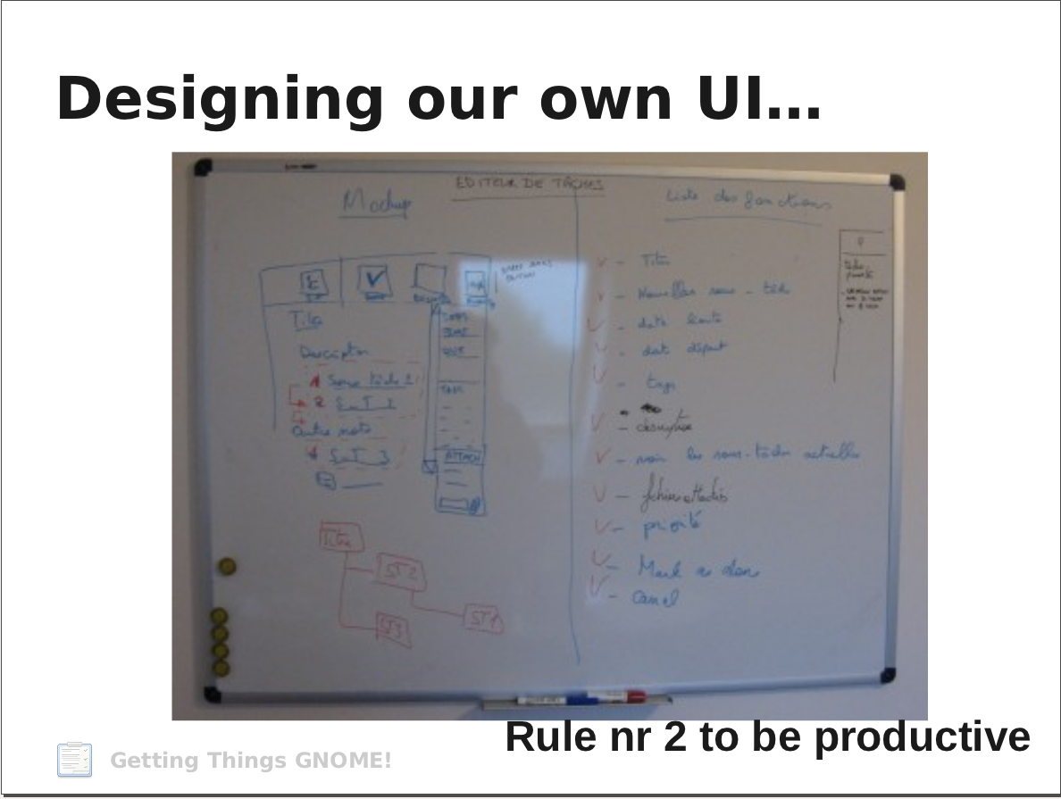
- design.png Edit (356.9 KiB, image/png)
Lionel > I suppose you throw away those sheets of paper and this is our only UI documentation :-)
| Lionel Dricot (ploum-deactivatedaccount) wrote : | #18 |
Exactly. But where did you get that picture?
| Izidor Matušov (izidor) wrote : | #19 |
| Reda Lazri (0rAX0) (0rax0) wrote : | #20 |
@Lionel
You are the one who wanted to see mockups and said "Without mockups or very specific proposals, discussion is just useless."
My whole point was to port to GTK3 and remove the clutter. As for the work view, I'm not one of the developers, I'm an end-user. The fact that I didn't understand a functionality means it is either badly designed or at least no one cared about showing it to the end-users.
Let's say you added an option to import documents using Zeitgeist, you don't add a button 'Zeitgeist' in the interface and expect people to know what it does, you don't expect people to read documentation either, you show them how it works and why you think it's a cool feature INSIDE the program.
There is nothing in "work view" that suggests something about "filtering the tasks you're able to work on now", in fact, you'd expect something like a calendar view(see Evolution).
So, the name doesn't explain the feature and the program doesn't explain it; Without actually needing it, the user wouldn't even click on it. Which it wouldn't do anything if your tasks are date-less.
| vovkkk (vovkkk) wrote : | #21 |
Izidor Matušov (izidor) wrote on 2011-11-03:
At the moment, there is no simple way how to put those task structure into GTG. Compare it to WorkFlowy: https:/
-------
Look at Tomboy: you can change level of item of bullet list by press Tab and Backspace or Alt+right and Alt +left.
So in GTG it may be like this
1. Ctrl+N, type name of project, Enter
2. -, type name of subtask, Enter
3. type name of subsubtask, Tab
And get this:
Project
-Subtask
--Subsubtask
-------
Carl Symons (carlsymons) wrote 11 hours ago:
No need for a bunch of fancy tie-ins, such as with Zeitgeist. Zeitgeist is a great project, but too much for GTG.
-------
Lets see:
6. Usability. We don't want thousands of options. We want to follow the Gnome HIG and we aim to be simple but powerful at the same time.
7. Integrated with your desktop. We aim to become a Gnome project. We hope, in the future, to integrate more and more with your gnome desktop and other applications.
http://
Obviously that users make something with files, read some text in web browser and other apps, have IM conversations and more.
Most likely that all these activities (or some of them) are related to some project(s).
«Zeitgeist is a service which logs the users's activities and events (files opened, websites visites, conversations held with other people, etc.)»
I have no idea how to integrate GTG with Zeitgeist, but it would be very great.
For example, Jim write diploma, he create project with subtasks in GTG, text file(s) (odt or doc or maybe tex), get pictures for illustrations, presentation, get some ebooks, abstracts, make few researches on internet, have conversations with instructor by IM or email.
See? a lot.
| Reda Lazri (0rAX0) (0rax0) wrote : | #22 |
But Zeitgeist isn't part of GNOME!
Read Allan Day's comments: https:/
| Lionel Dricot (ploum-deactivatedaccount) wrote : | #23 |
vovkkk > to be able to enter tasks with subtasks and subsubtasks in GTG was one of our first idea. And it was even implemented.
Then, we realized that it simply doesn't work because people write down tasks in the order they will make it:
- take out the old lightbulb
- buy a similar lightbulb
- replace the lightbulb.
The structure should be the following:
1) Replacing the lightbulb
2) Buying lightbulb
3) Taking out the old lightbulb.
Do you see the point?
We had no choice but to remove this feature completely before the first release because even us were confused!
Reda > Thanks for the mockups. What I want to say is that "doing mockups" is not just "trying to draw an interface using your intuition". There's a whole process behind it. If you don't start by identifying the needs and the workflows, your mockups might be worthless anyway.
The workview is described in the first time tasks you have when starting GTG for the first time. Approximately 50% of GTG users don't use it. That's not a problem because the feature is not in your way if you don't use it. The other half cannot live without that feature, which is one of the key selling point of GTG.
That's where UX becomes hard. You cannot judge from your experience. You have to take into account the global audience. And your experience itself is not even relevant at all (not more than mine or Izidor's one).
| Izidor Matušov (izidor) wrote : Re: [Bug 885320] Re: GTG needs a GTK3 port and a UI redesign | #24 |
@vovkkk:
> Look at Tomboy: you can change level of item of bullet list by press Tab
> and Backspace or Alt+right and Alt +left.
>
> So in GTG it may be like this
> 1. Ctrl+N, type name of project, Enter
> 2. -, type name of subtask, Enter
> 3. type name of subsubtask, Tab
> And get this:
> Project
> -Subtask
> --Subsubtask
> -------
I think, it is good idea to implement something similar, I've created a
new bug for that. Bug #887089
@Lionel:
> to be able to enter tasks with subtasks and subsubtasks in GTG
> was one of our first idea. And it was even implemented.
>
> Then, we realized that it simply doesn't work because people write down
> tasks in the order they will make it:
>
> - take out the old lightbulb
> - buy a similar lightbulb
> - replace the lightbulb.
>
> The structure should be the following:
>
> 1) Replacing the lightbulb
> 2) Buying lightbulb
> 3) Taking out the old lightbulb.
I think vovkkk showed something different. You are talking about
changing linear structure into that kind of special tree. What about
giving user to ability to see all substructure right in the editor and
to be able to create a complete project from a single window just using
a keyboard? We should discuss this at the separate bug #887089
---------------
@Reda Lazri:
> My whole point was to port to GTK3 and remove the clutter. As for the
> work view, I'm not one of the developers, I'm an end-user. The fact that
> I didn't understand a functionality means it is either badly designed
> or at least no one cared about showing it to the end-users.
>
> Let's say you added an option to import documents using Zeitgeist, you
> don't add a button 'Zeitgeist' in the interface and expect people to
> know what it does, you don't expect people to read documentation either,
> you show them how it works and why you think it's a cool feature INSIDE
> the program.
FYI: Although old famous "nobody reads documentation", GTG provides
nifty tutorial as a set of introduction tasks which is IMHO fabulous
idea. All concepts are described and demonstrated. However, it doesn't
contain all features of development version at the moment.
ad Zeitgeist:
GTG has already got an infrastructure for Zeitgeist support. You are
able to write a backend which export your data into zeitgeist. There is
an option to open a certain task through gtg:// handler in GNOME. The
opportunity waits until somebody grabs those basic block, interconnect
them and then debug and polish them for smooth user experience. (The
most time consuming part)
I personally don't like Zeitgeist because the idea behind it. Some users
love it. Using backend infrastructure it is able to enable/disable this
feature on user request and ship gtg by the wish of a distributor who
can turn it on/off by default.
| Reda Lazri (0rAX0) (0rax0) wrote : Re: GTG needs a GTK3 port and a UI redesign | #25 |
@Izidor,
Yes, I've seen. But you know what, I've seen it a hundred times before on every programs I used. When was the last time you actually learned something new from those pre-made messages.
The solution? interactivity. (see workflowy for example).
OK, the things are slowing down now, what's next?
| Izidor Matušov (izidor) wrote : | #26 |
There is an feature request (bug #844963) to add infobars for special modes which explain the current mode in an interactive way. The more interactive way how to teach the user the better. Showing video tutorials in application is de facto a standard for web applications. I was thinking why it is not for desktop applications. I wasn't able to find any reason besides it would take more space to ship application (videos are data-intensive). If you have an great idea how to make the learning curve more acceptable, feel free to express it.
I guess the next step should be to do the dirty work: write down user stories, list down features that are important (more frequently used) and try to optimize / recreate your mockups so they serve well for those cases.
Actually, I have found that we have a few of them at https:/
| Changed in gtg: | |
| status: | Confirmed → In Progress |
| assignee: | nobody → Reda Lazri (rAX) (the-red-shortcut) |
| Lionel Dricot (ploum-deactivatedaccount) wrote : | #27 |
Reda > That would be a great work. You could maybe join us during our small hackfest on November 26th. You would work on user stories then on mockup that would implement those stories. We would be able to answer your questions.
Also, if some very specific improvements are identified, they might be solved directly.
| vovkkk (vovkkk) wrote : | #28 |
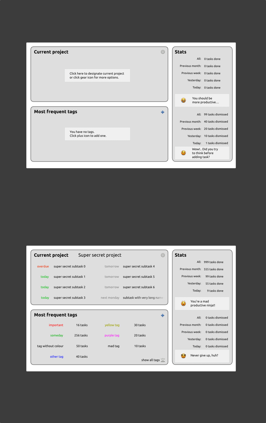
- gtg-home-screen.png Edit (173.1 KiB, image/png)
Home screen mentioned?
Here is mock-up, i think it's very obvious, except one thing:
Section “Current project” might display task with tag. The point here is that one task may have few tags and sometimes it might be hard to navigate by tags… um… get it?
Attached png
And svg (if you want edit it) here http://
Reda Lazri (rAX) (the-red-shortcut) wrote:
> But Zeitgeist isn't part of GNOME!
> Read Allan Day's comments: https:/
-------
Well officially not yet, but read about http://
see what Federico Mena-Quintero maintain http://
Allan Day, afaik, hinted at Tracker which is another pair of shoes. The bad thing about Tracker is that it's indexer and search tool, so basically it's heavier than Zeitgeist which is just a logger of events.
Also, afaik, they going to implement Zeitgeist as plugin (or extension) for Tracker.
I found a bug for Zeitgeist plugin https:/
But it's just about adding events from GTG to zeitgeist journal.
Anyway, we need a way to easily interact with files and events which are related to project/task.
I will try done that, but not promise anything.
I think it should be very similar to Tomboy/Gnote plugin, i.e. button in toolbar and window with events.
Meanwhile the window(s) of any task(s) is open, all events, which logged by Zeitgeist, associated with this/these task(s).
So user can click zeitgeist-button in task's window and interact with it:
open files
pin files
dismiss unnecessary files?field.
Here is mock-up, i think it's very obvious, except one thing:
Section “Current project” might display task with tag. The point here is that one task may have few tags and sometimes it might be hard to navigate by tags… um… get it?
Attached png
And svg (if you want edit it) here
Reda Lazri (rAX) (the-red-shortcut) wrote:
> But Zeitgeist isn't part of GNOME!
> Read Allan Day's comments: https:/
-------
Well officially not yet, but read about http://
see what Federico Mena-Quintero maintain http://
Allan Day, afaik, hinted at Tracker which is another pair of shoes. The bad thing about Tracker is that it's indexer and search tool, so basically it's heavier than Zeitgeist which is just a logger of events.
Also, afaik, they going to implement Zeitgeist as plugin (or extension) for Tracker.
I found a bug for Zeitgeist plugin https:/
But it's just about adding events from GTG to zeitgeist journal.
Anyway, we need a way to easily interact with files and events which are related to project/task.
I will try done that, but not promise anything.
I think it should be very similar to Tomboy/Gnote plugin, i.e. button in toolbar and window with events.
Meanwhile the window(s) of any task(s) is open, all events, which logged by Zei...
| vovkkk (vovkkk) wrote : | #29 |
Hey, guys!
I'm really sorry about mess up in my previous comment, but it was not my fault, seems like Launchpad's bug or Firefox's bug…
But i'm curious, is the mock-up so bad that nobody cares?
Maybe i should add some description for easier understanding.
The conception of “Home screen” (as it mentioned in this thread) is pretty simple — provide to user some statistics and summaries (i prefer word “overview” though).
Izidor Matušov (izidor) wrote on 2011-11-04:
I think that home screen with the overall statistics would be cool. If it is done properly, it would cool feature! But it must provide so unique information, that the user doesn't matter one more click to get to the tasks. User story:
Jan is an active young boy who has a lot of things to do. He has so many tasks, that he needs an intelligent preview, whats going on, which project needs his attention. He can find that information on the home screen.
So, now lets look at mock-up: it has three section
Current project
Most frequent tags
Stats
Stats , obviously, shows statistics, how many tasks were done and dismissed.
The point of this section is motivate user.
Also there are sarcastic comments about this statistics… Perhaps somebody will find it offensive, but i think a little bit of humour is good ;)
Current project is place for focusing, it is similar to “Work view”, but only for one project.
Also if user never mind about projects, then this section might show tasks with specific tag. User may choose what it should display by clicking gear icon on top right corner of section.
The point is focusing on current project and/or most important tasks.
Most frequent tags shows tags and numbers of tasks for each tag.
The point is
1) provide to user information about which tag is most used (kind of statistic)
2) ability navigate by frequency order instead of alphabetical order
3) ability to add tag before creating any tasks.
Certainly, user can click name subtask to open its window, or click tag to see all tasks with this tag.
-------
So what you think? is it bad? or unnecessary?
| Reda Lazri (0rAX0) (0rax0) wrote : | #30 |
@Izidor,
Yes, videos take more space, also fetching them from an online source wouldn't work(can't say the same thing for *web* apps). This needs some heavy study.
@Lionel,
Yes, I also prefer working directly, but I can't right now, sorry.
I'll take a look at the user stories. But I need help of course. :P
| Reda Lazri (0rAX0) (0rax0) wrote : | #31 |
@vovkkk
I see. Honestly, I'd hate to have Zeitgeist and Tracker doing the same thing. Let's see how things will turn out.
As for the mockup, it is not bad, it shows everything the user needs to know, not what I had in mind but it's OK. The problem right now is what are the best features to include that serve the user the best and how to present them well and let the user know about them. So, it's kind of not the prefect time for designing the home screen(not speaking on behalf of the team).
| Izidor Matušov (izidor) wrote : | #32 |
@vovkkk:
thanks for your mockup. What about changing some information from text to a graph? (Done vs dismissed tasks over the last week) In a graph you can compress more data, it looks cooler (when done with a help of designer) and less text to read.
How would you deifne current project? I have several ongoing projects and I don't know what I should see on homescreen. Can you write down a simple algorithm in a pseudocode?
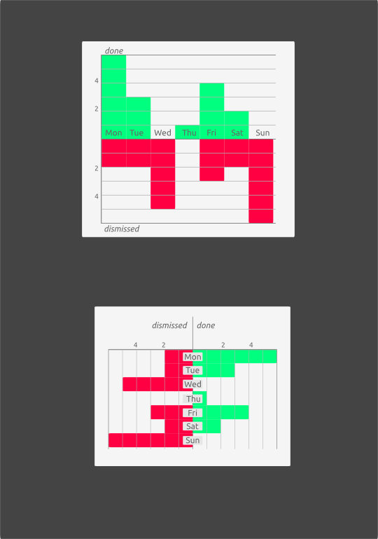
| vovkkk (vovkkk) wrote : | #33 |
| Izidor Matušov (izidor) wrote : | #34 |
@vovkkk: yes, I like it (I personally like the first one)
| vovkkk (vovkkk) wrote : | #35 |
I think “Current project” was bad idea, because i meant that user should choose what project should be current. Most users won't use it, because it demands additional actions.
So here is another idea — “Brief”.
It is similar to “Work view” too, but it allows to filter tasks by dates and to see dependency of subtasks
One thing looks very strange: why the heck we see “today” at “Overdue”?
The answer is very simple: because the user don't want to do additional actions, because gtd app shouldn't steal time, but save it.
So there are three overdue tasks, we can be sure that user want done them first, but there are today tasks also, and displaying today task(s) in Overdue tab is the way to show to user “what's actually going on”
If user want to see only today tasks then s/he click Today tab.
Next tab shows tasks begins from tomorrow.
Perhaps No date tab needed, not sure.
Perhaps, if it possible, tabs that doesn't show any task becomes hidden.
User can click task's name to open its window, and click project's name to see all its subtasks.
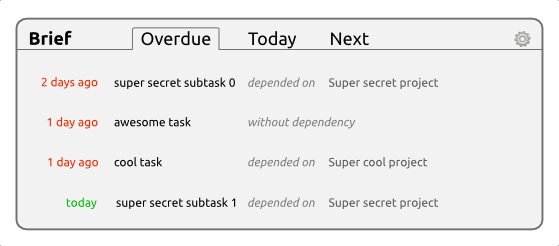
| Izidor Matušov (izidor) wrote : | #36 |
@vovkkk: What about tasks which have more than one parent/project? I don't like idea of just showing tasks which are overdue/
Can you think of some other thing that we want to show on the home screen?
| vovkkk (vovkkk) wrote : | #37 |
- Снимок-2011-11-11 16:49:01.png Edit (33.1 KiB, image/png)
> What about tasks which have more than one parent/project?
subsubtask depended on subtask depen…
or
subsubtask ← subtask ← …
if entire path is too long it might be showed in tool-tip
> I can very easily to get that information from main screen. Tasks are ordered by duedate and I can see those lists.
First, i don't see any reason why “Home screen” can't be main screen, which showed to user then application launched.
Second, how you deal with it if it contains, lets say, 50 tasks?
What will you see if task have startdate, but haven't duedate? For example, if task starts today (and haven't duedate) in “Work view” it goes to bottom of list, but “hey! why it goes after task which starts tomorrow and due next Monday?!” If it starts today, it means i should do something with it today.
Third, see attach: it doesn't care about order of creating tasks. It's wrong in some cases.
> Can you think of some other thing that we want to show on the home screen?
I will try.
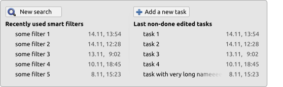
| Bertrand Rousseau (bertrand-rousseau) wrote : | #38 |
vovkkk> I really like the concept of "Home Screen" providing some kind of dashboard to GTG. This is a feature that is really important in productivity apps: users are interested in getting easily an overview on how well they perform. So, I find it very interesting.
I've had a quick look at your mockups. Here are my comments:
1) Your first one (https:/
2) Still in you Home Screen, I like the "stat" box, which providing some information about someone's current performance. As you said it, the "current project" doesn't really fit the actual GTG flow since there's no such concept, so I'm not really convinced. The 'frequent tag' is nice, but it feels a bit gadget-ish since I don't really see what use it provides, or even what information (the stat box is way better at this). The alternative 'brief' (https:/
3) Maybe the lower box could be replaced by shortcuts to useful actions ("Add a new task", A list of about 5 shortcuts to recently used saved searches/smart filters ordered by last-used dates., A list of about 5 tasks that the user might want to read/edit, e.g.: 5 last non-done edited tasks)
| vovkkk (vovkkk) wrote : | #39 |
- ideas-from-multiverse.pdf Edit (419.7 KiB, application/pdf)
Ideas from multiverse for our home screen attached. Hope it will give inspiration to somebody.
Also i would note that my idea “Brief” suits to the first user story (especially, if home screen will be first thing that user see when launch GTG):
“Albert opens GTG and quickly sees the first thing he should work on today.”
https:/
| vovkkk (vovkkk) wrote : | #40 |
Bertrand > i will answer to you at Monday (supposed), tomorrow i'll be really busy, and now want to rest :p
| Bertrand Rousseau (bertrand-rousseau) wrote : | #41 |
Reda> I really like (https:/
I really like the sidebar you suggest. I've grown to find the current GTG sidebars not useful enough (tag filtering is too low-level), and it nicely merge the different possibilities to alter the task views (Overdue, tags, etc.) in a single place. I think it should also include the 'work view' (a.k.a. 'actionable items').
Your mockup also introduces concepts that will require some discussion, and even re-discussion. Since:
1) In the first days of GTG, we discussed the idea of having an inbox. Not being directed with GTD-only use in mind, the feature eventually didn't land in the app. Collaborative work and muti-source synchronization could however change since it introduced a de-facto need for preprocessing new tasks before integrating them in one's tasks pipeline.
2) In you last mockups, you rearranged the sidebar in "notifications" and "My lists". I'd actually preferred the first versions (https:/
- Inbox
- All task
- Done
- Dismissed
- Overdue
Then introduce the 'My List' section. Putting "Personal" and "Work" list as a default is a nice idea.
3) I'm kinda confused by all the buttons you introduced in your last mockups. Their use is not clear to me. I guess it was some kind of experiment. Maybe you should refined those ideas.
for all>
Something has not been discussed up to now: it this redesign, how would the editor look like (still in separate window? integrated in the main ui/task list?) This has to be rethought as well.
About UI redesign stuff: I agree with Lionel: UI redesign is a hard work (as he put it, we spent *weeks* discussing together buttons colors, etc. at the start. - it's been nice to see this picture of my drawing board btw, it brings back memories). It's often misunderstood that UI discussions is about mockuping and suggestion. It's however way larger than that since it involves creating and driving complete *experiences* for hypothetical users. Redesigning GTG will require a hard and *continuous* work, since this is really difficult to do it in an organic way where we progress "one step at a time" towards something different. There should first be a really clear and consistent foundation on how a redesigned GTG should appear and behave. This is also a very ungrateful work since UI discussions are bikeshedding (http://
The best way to progress in this matter would have to get someone taking responsibilities for that. Driving the discussion and trying to make them land on something. This could happen on the GTG wiki for instance. I used to do something close to that in the ear...
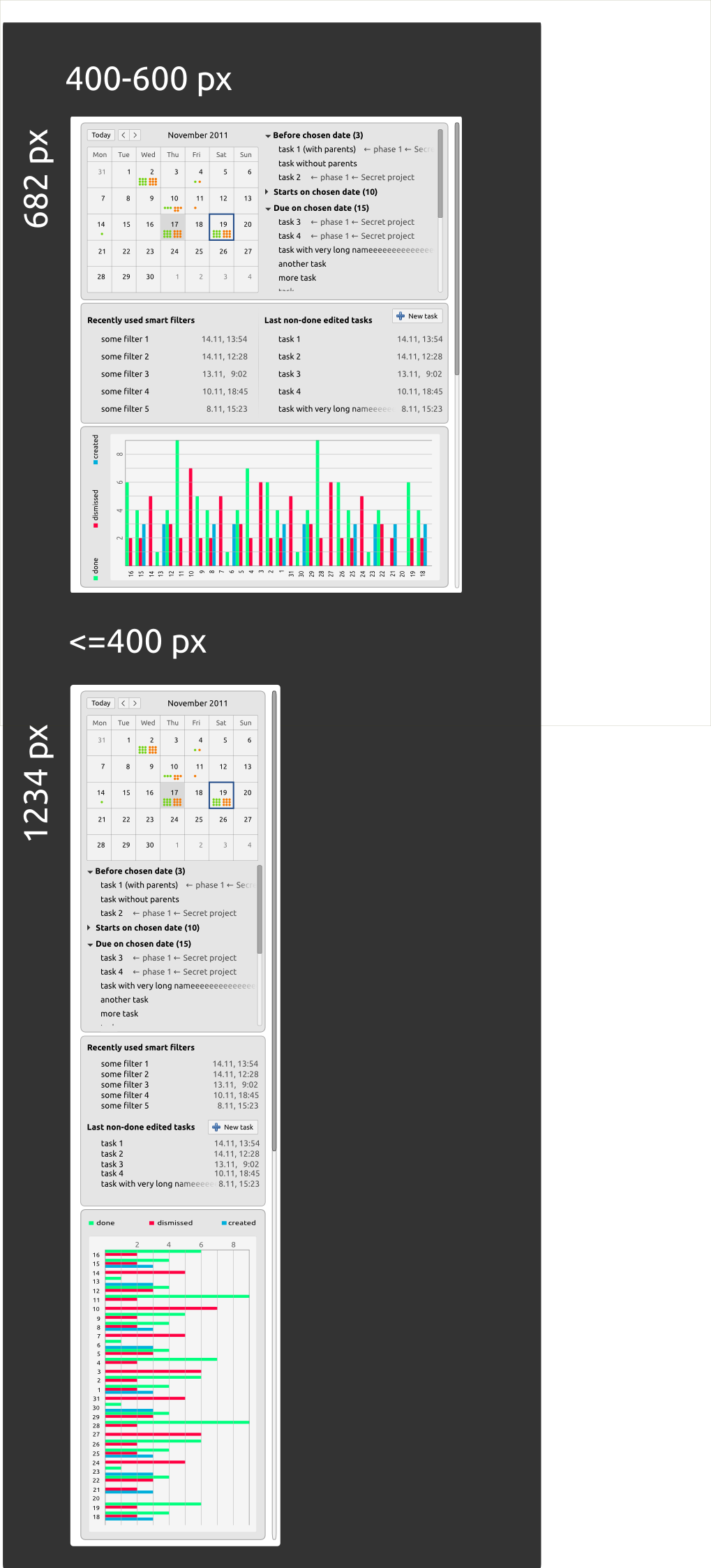
| vovkkk (vovkkk) wrote : | #42 |
- history.png Edit (31.3 KiB, image/png)
> Driving the discussion and trying to make them land on something.
What exactly you mean?
> However I wonder if it isn't a bit large and crowded. Up to now, GTG has been thought to present itself initially as a very simple apps (main window, no sidebar, small size).
I agree that small size of window is important for GTG.
I see few ways to fit home screen and small window:
1) Sections adapts to window geometry — if window is narrow then sections arranged one under the other.
2) Separate tab for each section.
3) Different UIs for home screen and normal mode (for example, Banshee with its MeeGo interface and ability to switch between different ui on the fly by clicking button on toolbar).
Also, about a small window, look at Windows Live Mail (how minimalistic it may be, still usable) http://
Compact sidebar with ability to choose which folders should displayed.
In our case it might be tags, lists, smart filters etc.
> The alternative 'brief' box is nice, and should replace the "current project" box I think.
Indeed, though since Izidor (and i think, some other users and maintainers) dislike this, perhaps it could be replaced by, e.g. some kind of calendar.
> Maybe the lower box could be replaced by shortcuts to useful actions
Certainly, smart filters would be more useful. (see attached)
> Something has not been discussed up to now: it this redesign, how would the editor look like (still in separate window? integrated in the main ui/task list?) This has to be rethought as well.
I think separate windows are important, it has a real use case.
But again, we can get inspiration from email clients which allow to view mail in main window or in separate window.
| Bertrand Rousseau (bertrand-rousseau) wrote : Re: [Bug 885320] Re: GTG needs a GTK3 port and a UI redesign | #43 |
Thanks for you answer, vovkkk. I'm sorry I only answer now, but I can only
spend a few time per week on GTG now.
On Mon, Nov 14, 2011 at 11:21 AM, vovkkk <email address hidden> wrote:
> > Driving the discussion and trying to make them land on something.
>
> What exactly you mean?
>
This was a general comment on the UI development, it is not directly at you.
From my short experience in the domain, I've had to discover that UI
development (mostly when thinking or rethinking an app) is hard to perform
in individual pieces. It is really important to consider every aspect of
the problem before deciding to adopt a particular UI implementation.
Consequently, it generally has to evolve on a parallel plan with the
codebase, and the discussion revolving around the UI must be mature enough
before any patch can be commited to the actual application code.
Therefore, starting the discussion about the future of GTG in a GTK3/Gnome
3.x environment requires some project planning and management (now that's
what I would call an understatement ;-) ). I think the best way to
correctly perform this is to have someone taking charge of this project.
This person should drive the discussion (make sure all aspects are
discussed correctly, and dismiss the irrelevant discussions, and close them
appropriatelyby a clear decision), and make sure to maintain some kind of
summary of the current state regarding UI proposals. The aim being so that,
at some point, it would be possible to switch in "development mode" and
actually write some code implementing the new UI.
This is only a suggestion, but IMHO, this should be performed on the GTG
wiki (in the same spirit as the Gnome 3.x). Perhaps a motivated person
should create the page, list the required views that should be defined,
link relevant existing bugs and create others if needed. It should also
maintain the page so that each page correctly reflect the present state of
the proposal. Last but not least, this person should keep in contact with
the developers, in order to make sure everyone is in sync and agree on what
will be adopted, and how to proceed towards the redefinition of the UI
(switching to GTK3 + changing the UI require significant logistics in
regard to the project: versioning scheme, schedule, releases, maintainance
of older versions, etc.)
Yes, that's a large amount of work. It also a very interesting one that
would result in significant merit inside the project. IMHO, it could be
proposed as a GSoC.
> > However I wonder if it isn't a bit large and crowded. Up to now, GTG
> has been thought to present itself initially as a very simple apps (main
> window, no sidebar, small size).
>
> I agree that small size of window is important for GTG.
> I see few ways to fit home screen and small window:
> 1) Sections adapts to window geometry — if window is narrow then sections
> arranged one under the other.
>
Ok, maybe you should provide some test for that, to see if what it would
look like.
> 2) Separate tab for each section.
>
It kinda miss the purpose of the home screen: getting a quick look a the
current situation.
> 3) Different UIs for home screen and normal mode (for example, Banshee
> with i...
| vovkkk (vovkkk) wrote : Re: GTG needs a GTK3 port and a UI redesign | #44 |
Bertrand, now i see what you meant, for me it would be too hard i think.
> Ok, maybe you should provide some test for that, to see if what it would
> look like.
Yes, later; here is some changes (incomplete): http://
> > Also, about a small window, look at Windows Live Mail (how minimalistic it
> > may be, still usable) http://
> > Compact sidebar with ability to choose which folders should displayed.
> > In our case it might be tags, lists, smart filters etc.
> >
>
> I'm not sure to understand what kind of solution you suggest here.
Windows Live Mail has sidebar (as many other mail clients) which shows folders of email accounts.
When user try make this sidebar a more narrow it turns to vertical toolbar (look at screenshot) which show only inbox folder from each account by default, but user can add any other folder to this vertical toolbar if s/he like.
Also there are numbers how many unread mails in each folder.
Certainly, user may click any folder icon on this vertical toolbar to switch between folders.
Now back to GTG: it would be nice if tag sidebar would have the similar ability: turning to vertical toolbar with colours/icons of tags/lists and numbers of tasks in each.
In this case the window might be really narrow, but still with all functionality that user needs.
> Yes, that one's nice. I like it. However, I'm not sure about the "new
> search" button (what would it do? prompt a dialog?) It's probably better to
> keep a search field in the UI at all time, even when displaying the home
> screen.
Okay, I deleted New search. But wondering how it supposed to create new smart filters?
I thought “smart” means that it's not just search, but a few parameters united in one thing…
| vovkkk (vovkkk) wrote : | #45 |
| vovkkk (vovkkk) wrote : | #46 |
| Izidor Matušov (izidor) wrote : | #47 |
vovkkk> I don't think, that when scaling window, the histogram should grow/shrink. I would prefer to scale calendar.
Just an idea from top of my head: What about making (simplified) gantt diagram on the home screen?
| vovkkk (vovkkk) wrote : | #48 |
- gtg-hs-big-cal.png Edit (166.0 KiB, image/png)
'Big calendar' mock-up attached.
Gantt chart (diagram), as it was discussed on irc, isn't really suits to home screen (too big; similar to normal mode; also, unclear how to show timeline or how scale should look, interactions, etc.)
| Izidor Matušov (izidor) wrote : | #49 |
I am splitting this bug into two parts:
1) port/refractor GTG into GTK3
2) redesign GTG
Both parts are a quite big steps to be done at the same time. I've open the bug #897136 for porting GTG into GTK3.
| summary: |
- GTG needs a GTK3 port and a UI redesign + GTG needs a UI redesign |
| description: | updated |
| Changed in gtg: | |
| status: | In Progress → Confirmed |
| assignee: | Reda Lazri (0rAX0) (0rax0) → nobody |
| Changed in gtg: | |
| milestone: | none → 0.4 |
| status: | Confirmed → Fix Released |
Could you please specify what do you mean? Can you give more pointers? To applications, blog post about it and so? Do you have a concrete idea?
Wunderlist is made to look on every platform the same and has the very specific look. In my personal opinion, Wunderlist has too much clutter when you compare with GNOME applications.