Lenses icons should be next to the search field (at least the default ones!)
Bug #924923 reported by
Michele Kipiel
This bug affects 4 people
| Affects | Status | Importance | Assigned to | Milestone | |
|---|---|---|---|---|---|
| Ayatana Design |
Invalid
|
Undecided
|
Unassigned | ||
| unity (Ubuntu) |
Opinion
|
Wishlist
|
Unassigned | ||
Bug Description
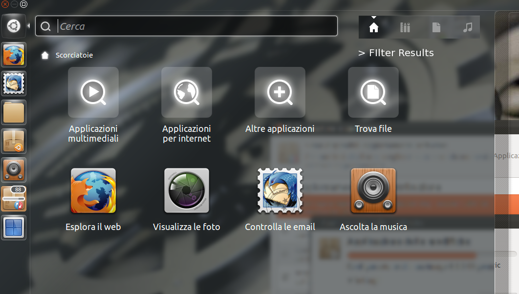
a quick scenario:
hit the super key, start typing, try to refine your search using the applications lens.
notice something? you have to move your mouse across half of your screen to reach the lens icon!
this is a usability issue that should be addressed as soon as possible. since the very idea of the dash is speed, it is nonsensical to place a filtering option so far away from the search box it is related to.
the filtering option should be placed _under_ the lenses icons since the kind of filters the user is allowed to apply depends on the lens he is using.
i attach a simple screenshot of what i mean.

| Changed in ayatana-design: | |
| status: | New → Invalid |
| no longer affects: | unity |
| Changed in unity (Ubuntu): | |
| status: | Incomplete → Opinion |
To post a comment you must log in.
added ayatana-design as affects so we get feedback from design team.