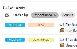
Gear icon maybe too subtle
Bug #894729 reported by
Jonathan Lange
This bug affects 1 person
| Affects | Status | Importance | Assigned to | Milestone | |
|---|---|---|---|---|---|
| Launchpad itself |
Fix Released
|
Low
|
Huw Wilkins | ||
Bug Description
I actually didn't realize you could customize visible information on the bug listing pages until I actually re-read Dan H-G's post about it. It took me a while, even then, to figure out that there was a gear icon I could click.
I could understand that this bug might be a matter of opinion.
Related branches
lp:~huwshimi/launchpad/gear-icon-visibility-894729
- Ian Booth (community): Approve
-
Diff: 44 lines (+6/-4)3 files modifiedlib/lp/app/javascript/configutils.js (+1/-0)
lib/lp/app/javascript/ordering/assets/ordering-core.css (+4/-3)
lib/lp/app/javascript/ordering/ordering.js (+1/-1)
| Changed in launchpad: | |
| importance: | Undecided → Low |
| status: | New → Triaged |

| Changed in launchpad: | |
| importance: | Low → High |
| Changed in launchpad: | |
| assignee: | nobody → Huw Wilkins (huwshimi) |
| status: | Triaged → In Progress |
| tags: |
added: qa-ok removed: qa-needstesting |
| Changed in launchpad: | |
| status: | Fix Committed → Fix Released |
To post a comment you must log in.
This came up in one session during our paper prototyping but hasn't since, until now. We didn't revisit it as it didn't come out as a problem for everyone.
I'm going to ask Huw and Dan to come back with some suggestion for what we can do to make it more discoverable without making it stick out nastily on the page.