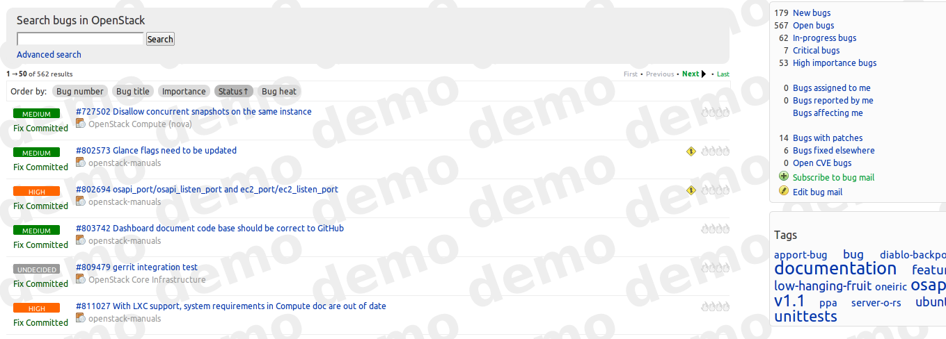
new bug listing importance is difficult to read
Bug #887576 reported by
Diogo Matsubara
This bug affects 1 person
| Affects | Status | Importance | Assigned to | Milestone | |
|---|---|---|---|---|---|
| Launchpad itself |
Fix Released
|
High
|
Unassigned | ||
Bug Description
In the UDS session we showed the new bug listing to LP users and one of the things raised is that the importance is difficult to read. See screeshot.
Their suggestion was to make the text bold.

| description: | updated |
To post a comment you must log in.
I think there are a few aspects here:
* the status and importance are vertically stacked
* they use overlapping color palettes with different meanings
* they are differently aligned which is jarring
* they use different font sizes which is also jarring
Key uses are that people be able to get overall awareness of the
spread of values in the displayed bugs, and also to scan for bugs with
a particular value. That will probably be easier if they are distinct
in both color and space.