
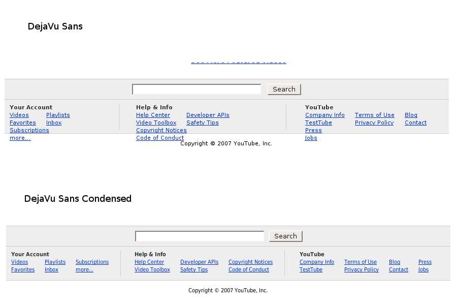
Please use DejaVu Sans Condensed as the default font
| Affects | Status | Importance | Assigned to | Milestone | |
|---|---|---|---|---|---|
| kubuntu-default-settings (Ubuntu) |
Won't Fix
|
Wishlist
|
Unassigned | ||
| libgnome (Ubuntu) |
Won't Fix
|
Wishlist
|
Unassigned | ||
Bug Description
This is a wishlist bug that I discussed with Ken Wiimer.
We now ship DejaVu Sans in Feisty, which contains Condensed and Condensed Bold flavours. These are great screen fonts that are quite legible and can be used for user-interface elements like window titles, menus, and tooltips. They're clean, since they are based on Bitstream Vera Sans, but also thin so that more information fits in the available space.
I recommend against using them as the document fonts, since their hinting is not up to par with Bitstream Vera Sans, so they look a bit blurry. But for everything else, they're excellent.
There is some concern that DejaVu is not good for character sets outside the Latin-Greek-
In summary, please use DejaVu LGC Sans Condensed as the default user-interface font for Ubuntu and Kubuntu.

| Changed in kubuntu-default-settings: | |
| importance: | Undecided → Wishlist |
| Changed in libgnome: | |
| assignee: | seb128 → nobody |
| status: | Fix Committed → Unconfirmed |
| Changed in kubuntu-default-settings: | |
| status: | New → Triaged |
| Changed in kubuntu-default-settings: | |
| status: | Triaged → New |
I hope that you realize that changing the default font of the operating system is a gigantic change. I really cannot stress this enough. It will affect everybody, and everybody is going to notice it. Making such a change requires extensive discussion and consideration by everybody involved in the making of this system, including the programmers and most notably the designers.
I'm currently at work, so I'm unable to see how this font looks for all screen elements. It would seem that if the hinting is not as good as DejaVu Sans, that's a big argument against using DejaVu Sans Condensed. Could you attach two screenshots, one that shows our current default font and one that shows DejaVu Sans Condensed? And I personally would prefer some more screenshots that show multiple amounts of hinting ("medium", "low", "none").