Need to look very close to know with what accounts I'm going to send the message

Bug #531775 reported by Jorge Suárez de Lis
30
This bug affects 5 people
Affects Status Importance Assigned to Milestone
Gwibber
Confirmed
Undecided
Unassigned

Bug Description

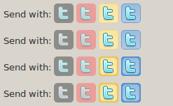
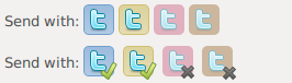
In some early versions of this new Gwibber 2.29 the bottom bar the "send with" buttons had some dark gradient when selected. Now they don't, and it's true that they look somewhat more elegant, but it's harder to tell at first glance whether they're selected or not, and some times I send messages to wrong accounts if I don't pay enough attention.

I attached an image with four bottom bars. The first one is the original, and the other 3 are mockups made with Gimp:

1 - The unselected ones have the icon with 0% saturation (This would work great for all icons except for Dig accounts)
2 - The selected ones have a 2px and darker border.
3 - A combination of both.

Tags: mockup
Revision history for this message
Jorge Suárez de Lis (ys) wrote :
Revision history for this message
Steve Holmes (bouncysteve) wrote :

This is a usability problem. The difference between enabled and disabled graphics is not sufficient.

Changed in gwibber:
status: New → Confirmed
Revision history for this message
Steve Holmes (bouncysteve) wrote :

Ivanka, subscribing you to see if you have a view on this.

Revision history for this message
Omer Akram (om26er) wrote :

Is the situation improved since this bug was reported? isn't it?

Revision history for this message
Jorge Suárez de Lis (ys) wrote :

No, it's still the same. I'm using 2.31.1~bzr723-0ubuntu1~daily1 from the PPA

Revision history for this message
mlissner (mlissner-michaeljaylissner) wrote :

Yeah, I have this exact problem. Would love a patch...even a monkey patch that pointed me towards icons I could replace myself.

My suggestion would be for the buttons to have a red X on them if they are disabled. It needs to be obvious at a mere glance, because people are thinking about what they're writing, and it's very easy to just press enter when finished...

Revision history for this message
Jorge Suárez de Lis (ys) wrote :

I like your approach, mlissner. I've made another mockup.

Revision history for this message
John Drinkwater (johndrinkwater) wrote :

#7,
Looks good, as ticks and crosses can be seen if you're colour blind or not. Imagine you'll need to use stock icons for disabled overlay though.

To post a comment you must log in.
This report contains Public information  
Everyone can see this information.

Duplicates of this bug

Other bug subscribers

Remote bug watches

Bug watches keep track of this bug in other bug trackers.