Article title is redundant, takes up space
| Affects | Status | Importance | Assigned to | Milestone | |
|---|---|---|---|---|---|
| Wikipedia Dump Reader |
Incomplete
|
Undecided
|
Unassigned | ||
Bug Description
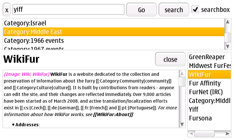
The article title (along with the article close button) is displayed in large text above the rendered article. This takes up perhaps 15% of the vertical space on an 800x480 screen. This display is redundant, as the fact that it is the selected item in the list identifies the current article.
I recommend that the title be removed and the article be expanded so that it fills the space that was previously occupied by the title. The close button could be moved to the top of the article list, or displayed as a small X button above the selected list item, or changed to an X and placed next to the searchbox checkbox control (which could maybe be shortened to "search").
The article should also extend down to the very bottom of the screen - right now it only extends down to the top of the horizontal scrollbar on the article list.
| description: | updated |

| Changed in wikipediadumpreader: | |
| status: | New → Incomplete |
Attached an example of the Dump Reader in 800x480 on a Nokia N800 showing this problem. Bear in mind that this is in full-screen mode - the article space is even more limited (down to 6 lines of text) if it is not.