Indicator area

Bug #1560143 reported by GTriderXC
12
This bug affects 2 people
Affects Status Importance Assigned to Milestone
Canonical System Image
Opinion
Undecided
Unassigned
Ubuntu UX
New
Undecided
Unassigned
indicator-display (Ubuntu)
Opinion
Undecided
Unassigned

Bug Description

Hi!

It's not gonna be a typical bug report though it is actually one. It is rather a message to people responsible for the users experience. I was adviced to report it as a bug. I do not won't do look like a hater or a "fell in love with iPhone" cause I'm not the one. I love the idea of Ubuntu and Ubuntu phone but I do not like the way the system grow up what I'm gonna show in the photos below.
We can all remind the words of hatred which occured after first version of Unity in Ubuntu 11.10 and 12.04. These were the absolutely best working (even bluetooth worked perfectly! :-P with !EVERY! device) and most intuitive systems ever! I stiil have many friends who do not switch from 12.04 to MATE just because the system works perfectly (even if not supported any more). Most intuitive? As You released Unity in 11.10 and 12.04 I raised many bugs. Many bugs that left untouched until today and which become actual. Many people on Ubuntu's Facebook profile many times touched the problems I reported as bugs but noone seemed to care. And now we have this phone. Since April 2015 I'm an owner of Aquaris E4.5 - the pioneer. I think the best testing device because of its poor tech parameters and (!!!) and what's most important while creating a mobile system the tiny screen. If You want to be successful and get the very best of users opinions You should think about people with the poorest environment. If I'm happy with my BQ 4.5 then anyone with 5'' MX will be delighted. At the moment I'm waiting for release the official BQ Ubuntu tablet. Though I'm not "delighted" with my phone I'll buy the tablet. It would be awesome however if developers took into account what end users have to say (also these thousands that changed distro after Unity release). Seems like in a phone changing distro won't be as easy. So let's start with all the problems I see in today's interface that makes me that I long for my old Nokia.

I'd like to start with a small answer on a question: why my opinion matters. Otherwise I wouldn't waste my time to write this message. As You released Unity, one of Ubuntu developers argued with me that there were made some tests which confirmed "a lightness and intuitive way a user can use a Ubuntu-Unity powered PC ". I sent it to trash with a single stroke: a photo of a 7-year old child sitting in front of an Unity-powered laptop. As I can remember until 12.10/13.04 there was an option which allowed us to choose between GNOME 2.X and Unity. Do You know what was the best way of changing the mind of a child that wanted to play with my PC? Switching to Unity. Same thing about my mother and many other friends. Intuitive is something different that having to learn by heart how my device work. You can have Your opinion, everyone can have his own opinion, I have my experience with many people that use today Ubuntu and forgot M$ Windows only because of me.
I'm gonna share below any in my opinion wrong idea or a bug in a users environment of an Ubuntu-Phone powered device. "My opinion" and my experience so that You couldn't tell me that the opinion is only mine. I hope what I'm/?we are gonna work out below will create a more user friendly device.

So let's start with an indicator area, let's compare it think of its bugs. As "bugs" I'm gonna define every weak point that makes a user misses his/hers Android, iOS or even Symbian powered Nokia.

Revision history for this message
GTriderXC (gtriderxc) wrote :

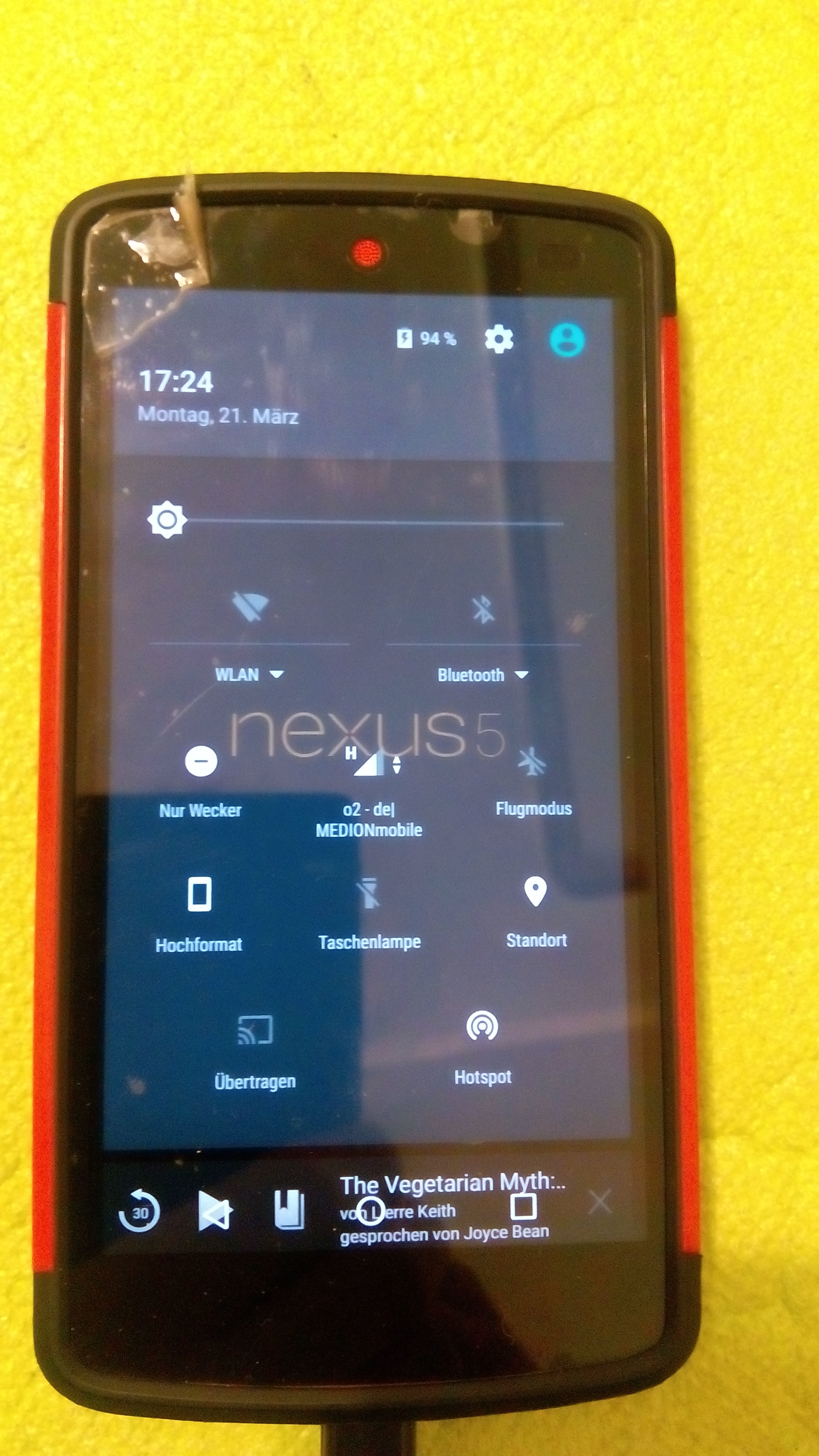
The best indicator solution I've seen: Nexus 5. Why the best? With TWO strokes of a finger I can turn on/off every most important function of a phone: flight mode, hotspot, WIFi, Brightness, Volume or torch. I'm totally in love with it as I was in love with Ubuntu 12.04 and as I'm in love with my MATE today. Just bacause it is: EASY, INTUITIVE and !!!FAST!!!

I DO NOT HAVE to look for an app/Scope to turn the torch on/off. I can easily switch to offline mode, manage my wifi, buetooth etc. I love the guys who developed it just because it is so extremely user friendly!!!

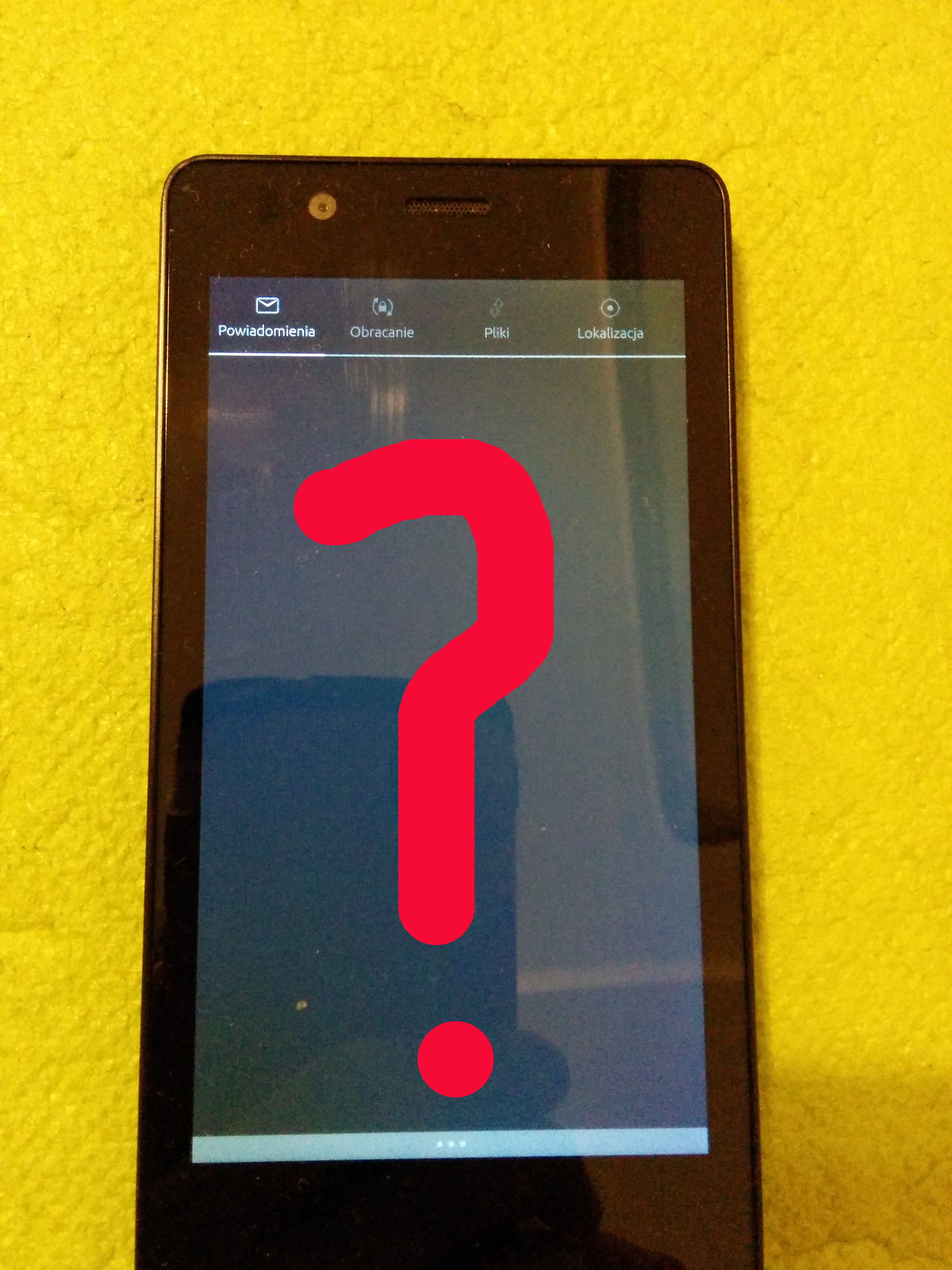
Let's take a look now what we get in Ubuntu...

Revision history for this message
GTriderXC (gtriderxc) wrote :

What we get is either nothing, or... or what I'll show in a next photo.

Sure there is no messages in a message notification area, cause I have no messages. But tell me please... why oh WHY do I see an empty screen and have to scroll the grey icons on a grey indicator area (invisible in a sunlight: applause! great idea!) only to find (after after how many fingerstrokes?) the wanted function of turning the offline mode on manage the sound level or (OH LORD!) brightness?

I'm falling to my knees mates and I'm asking You with full respect: HOW AM I GONNA MAKE THE SCREEN BRIGHTER if at first I have to find that switch. To find means: 1. click the power button; 2. activate the indicator area by pulling screen down; 3.scroll the grey icons on a grey background (if I can see them); 4. click the battery indicator (why to hell "battery"?!) if i'm fortunate enough to see it; 5. and then on condition that I know the brightness lays under battery and I see the battery, then in a FIFTH step i can do something with a brightness.

How was that on a previous picture by Android? two steps? Three?

But let's go back to the very first sentence: "either nothing or..."

Revision history for this message
GTriderXC (gtriderxc) wrote :

...or too much.
Too much but perhaps still nothing what we're looking for.
I like the idea of having all the function under one finger. So I like the menu in a photo. However I still can see there some possibilities of not killing the idea of usability and making more space + expanding usability of other menu icons. I GIMPed fast the solution. What would be if we had the indicator icons along the longer phone edge? Choosing the right edge seems to be a problem of Ubunu phone. Either You scroll open programs from right to left on a vertical screen (Nexus 5 from bottom to the top) or You scroll indicators that could easily be put along the longer edge, visible, with no need to scroll anything Just as I pasted it in the GIMP in a photo.

As I understand these area is to allow people to manage the most important functions easily and fast. The way we have it today is neither simple nor fast nor intuitive.

The left app launcher can be easily deactivated and the icons put there or another much better idea: two parallel rows with the icons. This idea is better cause we use the lenght of the screen by putting all indicators visible (without a need to scroll) in two rows either along the upper and lower edge or all at the top in two rows.

We should be able to change brightness at ANY time after activating the indicator area. The switcher could be put there along the lower edge, indicator at the top.

Revision history for this message
GTriderXC (gtriderxc) wrote :

That's the idea from above: two rows instead of scrolling and brightness either as a slider or as two buttons.

Revision history for this message
GTriderXC (gtriderxc) wrote :

The last thing from me for today are colours and icons. Can You see the photo above? If You want to launch a program from a list (also from a Unity Launcher) do You read or look for an icon or a colour?

I think I described the problem well enough here:

https://bugs.launchpad.net/ubuntu/+source/unity8/+bug/1412780

First there was an iOS. Then Android developed because of the price of the Aplle product and intuitive solutions as well. Then there it comes: Ubuntu-phone. The way to beat a "competitor" with a price is closed. There is a well developing Android with a good financing from Google. The only way to the user is the way Nokia did some years ago with its 3210 etc. People loved to use these devices.

What people think about Ubuntu today we can read in Internet. For example under this review: www.youtube.com/watch?v=a0oQy7jgH_w

"Faethe1
Ubuntu has to be just trolling everyone. They promise a superphone and never deliver. Now they finally deliver a phone and it's just awful, the exact opposite of a superphone. It's like a top of the line phone from 2011."

If someone delivered a simple phone that has no bugs in the simpliest functions of a Nokia 3210, a colourful user friendly device, then 1 181 174 watchers (21.03.2016) wouldn't have read the comment I quoted above.

GTriderXC (gtriderxc)
description: updated
Revision history for this message
Launchpad Janitor (janitor) wrote :

Status changed to 'Confirmed' because the bug affects multiple users.

Changed in indicator-display (Ubuntu):
status: New → Confirmed
no longer affects: indicator-display
GTriderXC (gtriderxc)
description: updated
Changed in canonical-devices-system-image:
status: New → Opinion
Revision history for this message
Kristijan Žic  (kristijan-zic) wrote :

I only agree with you on one thing that is gray color on gray background in indicator panel. I can't agree with anything else. I own Nexus4, Nexus5, Nexus5x, Nexus9... And I hate the android indicator panel on every single one of them. On the other hand I find ubuntu touch indicator panel to be much more usable and advanced. It is the best feature of UT in my opinion. You can easily find and access any indicator with just one swipe and then you press the toggle or whatever. That is 1 action less than on android. I don't know how you counted 5. However, I think that the indicator panel as it is now is still lacking content. Bluetooth indicator should show devices like wifi shows networks and battery could include a graph. Empty indicator and panel like it the case with notification should be hidden until it has something to show.

Revision history for this message
GTriderXC (gtriderxc) wrote : Re: [Bug 1560143] Re: Indicator area
Download full text (5.1 KiB)

You know i just do not know what to say.You just explained me how the indicator panel works. I really didn't know it! These is now one step not five but I didn't know it and I can bet no other user will not know it either. However with a one single e-mail, You killed everything what I had written in my bug :-)The only thing I miss now is a torch :-P but I know there is an app.
Thanks :-)

      From: Kristijan Žic  <email address hidden>
 To: <email address hidden>
 Sent: Wednesday, March 23, 2016 11:18 AM
 Subject: [Bug 1560143] Re: Indicator area

I only agree with you on one thing that is gray color on gray background
in indicator panel. I can't agree with anything else. I own Nexus4,
Nexus5, Nexus5x, Nexus9... And I hate the android indicator panel on
every single one of them. On the other hand I find ubuntu touch
indicator panel to be much more usable and advanced. It is the best
feature of UT in my opinion. You can easily find and access any
indicator with just one swipe and then you press the toggle or whatever.
That is 1 action less than on android. I don't know how you counted 5.
However, I think that the indicator panel as it is now is still lacking
content. Bluetooth indicator should show devices like wifi shows
networks and battery could include a graph. Empty indicator and panel
like it the case with notification should be hidden until it has
something to show.

--
You received this bug notification because you are subscribed to the bug
report.
https://bugs.launchpad.net/bugs/1560143

Title:
  Indicator area

Status in Canonical System Image:
  Opinion
Status in Ubuntu UX:
  New
Status in indicator-display package in Ubuntu:
  Confirmed

Bug description:
  Hi!

  It's not gonna be a typical bug report though it is actually one. It is rather a message to people responsible for the users experience. I was adviced to report it as a bug. I do not won't do look like a hater or a "fell in love with iPhone" cause I'm not the one. I love the idea of Ubuntu and Ubuntu phone but I do not like the way the system grow up what I'm gonna show in the photos below.
  We can all remind the words of hatred which occured after first version of Unity in Ubuntu 11.10 and 12.04. These were the absolutely best working (even bluetooth worked perfectly! :-P with !EVERY! device) and most intuitive systems ever! I stiil have many friends who do not switch from 12.04 to MATE just because the system works perfectly (even if not supported any more). Most intuitive? As You released Unity in 11.10 and 12.04 I raised many bugs. Many bugs that left untouched until today and which become actual. Many people on Ubuntu's Facebook profile many times touched the problems I reported as bugs but noone seemed to care. And now we have this phone. Since April 2015 I'm an owner of Aquaris E4.5 - the pioneer. I think the best testing device because of its poor tech parameters and (!!!) and what's most important while creating a mobile system the tiny screen. If You want to be successful and get the very best of users opinions You should think about people with the poorest environment. If I'm happy with my BQ 4.5 then anyone with 5'' MX will be delighted. At the moment...

Read more...

Revision history for this message
GTriderXC (gtriderxc) wrote :

Ladies and Gentlemen I just got an e-mail in which someone explained me how the indicator panel works. You can find it stupid but I lived one year in this world and didn't know that when I swipe the battery icon down, I can change the brightness so simple, that I can manage a hotspot, offline mode etc. so fast. That it makes a difference whether a put the finger more left or right.

Funny? I find it sad. That shows how I was right in one point when it comes to intuition. The icons on the panel shouldn't stick so closely to each other. Perhaps then a user will find out than it makes a difference where we put the finger.

Changed in indicator-display (Ubuntu):
status: Confirmed → Opinion
Revision history for this message
GTriderXC (gtriderxc) wrote :

One of the reasons I wrote all this things above:

https://bugs.launchpad.net/ubuntu-rtm/+source/unity8/+bug/1565243

To post a comment you must log in.
This report contains Public information  
Everyone can see this information.

Other bug subscribers

Remote bug watches

Bug watches keep track of this bug in other bug trackers.