
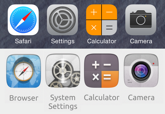
[icons] browser, settings and calculator icons too similar to another well known mobile O/S
Bug #1351424 reported by
James Hunt
This bug affects 20 people
| Affects | Status | Importance | Assigned to | Milestone | |
|---|---|---|---|---|---|
| Ubuntu Calculator App |
Opinion
|
Low
|
Unassigned | ||
| Ubuntu UX |
Opinion
|
Wishlist
|
Matthieu James | ||
| camera-app |
Opinion
|
Undecided
|
Unassigned | ||
| webbrowser-app |
Opinion
|
Undecided
|
Unassigned | ||
| ubuntu-themes (Ubuntu) |
Won't Fix
|
Undecided
|
Unassigned | ||
| unity8 (Ubuntu) |
Invalid
|
Undecided
|
Unassigned | ||
Bug Description
The browser and system settings icons in image #165 looks extremely similar in both content and colour to another well-known mobile operating system. IMHO they are also too busy
Please can we change these to make them simpler and more uniquely Ubuntu.

| Changed in camera-app: | |
| status: | New → Invalid |
| status: | Invalid → Opinion |
| Changed in ubuntu-ux: | |
| assignee: | nobody → Matthieu James (tiheum) |
| summary: |
- browser, settings and calculator icons too similar to another well known - mobile O/S + [icons] browser, settings and calculator icons too similar to another + well known mobile O/S |
| Changed in ubuntu-ux: | |
| status: | New → Triaged |
| Changed in ubuntu-calculator-app: | |
| status: | Confirmed → Opinion |
| importance: | Undecided → Low |
| Changed in ubuntu-ux: | |
| status: | Triaged → Opinion |
| importance: | Undecided → Wishlist |
To post a comment you must log in.
... Same applies to the calculator and the camera. And yet, oddly, other icons deviate distinctly (such as the calendar).