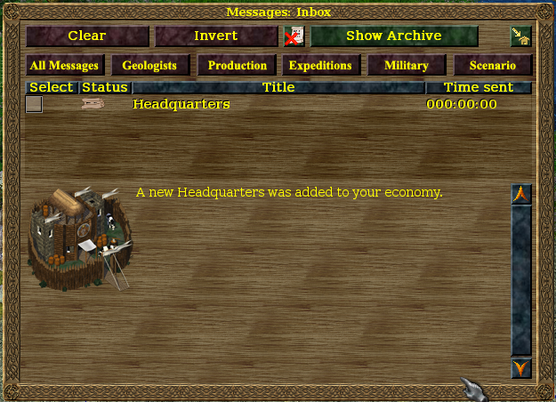
Filter for Messages

Bug #987510 reported by Shevonar
12
This bug affects 2 people
Affects Status Importance Assigned to Milestone
widelands
Fix Released
Wishlist
Unassigned

Bug Description

I had the idea to add a filter to only show messages of a certain category. I think I somewhere read about this before, so if someone had this idea before, speak up ;) I suggest the following categories:
- Geology / Resources
- Military
- Ships / Expedition
- ... (I surely missed something)

The idea is to add a toggle button for each category so you can toggle whether the messages are shown or not. An alternative could be different tabs for each of the categories.

This idea was inspired by this post: https://bugs.launchpad.net/widelands/+bug/939026/comments/10

Tags: ui

Related branches

Revision history for this message
wl-zocker (wl-zocker) wrote :

That would be a great feature. Just some more categories:
- Run out of ... (I would seperate this from geologists because it is more important than dozens of found ressources)
- Built new warehouse/port
- maybe the military section should be splitted to war (attacked/conquered) and normal occupying a building. Would it be possible to play only the war sound without receuving the message?
- basic news (headquarter/win condition/victory) should always be displayed

I do not like the different tabs idea because the player has to click through different categories it he wants to see more than just one.

Changed in widelands:
status: New → Confirmed
Revision history for this message
SirVer (sirver) wrote : Re: [Bug 987510] Re: Filter for Messages

I actually had the very same idea. Mainly for shared kingdom games where
it would be useful to split responsibilities (you do military stuff, I
do resources stuff). I think it should be at most 5 or 6 categories and
the toggle buttons should be big buttons which a nice symbol on them.
Someone interested in making a mockup?

Revision history for this message
SirVer (sirver) wrote :

Setting to incomplete for bug sweeping.

Changed in widelands:
status: Confirmed → Incomplete
Revision history for this message
wl-zocker (wl-zocker) wrote :

I like this idea very much. Having too many messages is sometimes a problem I encounter.
I think there are also some bugs that refer to this one ("Once we have different categories for the messages, ..."), but I cannot find any.

Revision history for this message
Launchpad Janitor (janitor) wrote :

[Expired for widelands because there has been no activity for 60 days.]

Changed in widelands:
status: Incomplete → Expired
Revision history for this message
SirVer (sirver) wrote :

I want to work on this so bad.... but so much other stuff keeps coming up that asks for more time :(.

Changed in widelands:
status: Expired → Confirmed
Revision history for this message
GunChleoc (gunchleoc) wrote :

Here's a mockup for buttons. Is this all we need?

We should consider using images + tooltips to prevent string length issues in the translations.

If we have the buttons toggle with default state = on, the "All Messages" button could go.

We could use the message "sender" property for the filtering - see, I've found a use for it! *lol*

Revision history for this message
wl-zocker (wl-zocker) wrote :

It looks good so far. Will the "new warehouse" and the "empty productionsite" messages be both listed under "production"? I do not see a category where "new warehouse" really fits in. Or we could show them only when all messages are shown, and in none of the categories.

Some ideas for the images:
- All messages: no real idea. Either many scrolls or simply the text "all", hoping that every language has a short translation for that (does Gaelic?)
- Geologist: some of the resource signs
- Production: if it covers only empty buildings: the sign from the empty mine/the geologist's "no resources" sign
- Expedition: the "start expedition" image from the port
- Military: the menu icon of the soldier
- Scenario: the "objectives" button from the bottom of the screen

And it would be nice when the buttons would change their appearance when there are unread messages in that category.

Revision history for this message
SirVer (sirver) wrote :

One of the main things in this change is for me to separate warfare messages (you are attacked, you have conquered this buidling) from everything else (like your building has been manned). This is super useful in shared kingdom games.

Production could be Economy and contain messages about new warehouses. Expedition could be seafaring.

Revision history for this message
GunChleoc (gunchleoc) wrote :

"Your Building has been manned" could go with production - this way, Production/Economy would cover "Out of resources" messages and "not enough soldiers" - if we think of soldiers as linked to the availability of resources, both indicate a lack of resources. I agree we could also put "new warehouse/headquarters" in there.

Do we have a "New Port" message, and should this go into Economy or Seafaring?

Revision history for this message
wl-zocker (wl-zocker) wrote :

> "not enough soldiers"
I have never received such a message. Did I miss anything?

For me, having the "soldiers occupied your building" message in the economy tab is very counterintuitive. While I can understand SirVer's reasoning, there are still soldiers involved. Maybe renaming the military to "warfare" solves the problem.

There is a "A port has been added to your economy" message, which is the same as the "new warehouse" message. It would therefore make sense to put it into the economy section. On the other hand, ports are definitely linked with seafaring. I would expect the message about a port constructed via an expedition to appear in the expedition tab. I therefore suggest to rename expedition to "seafaring" (as SirVer mentioned) and put the new port always there.

Revision history for this message
GunChleoc (gunchleoc) wrote :

>> "not enough soldiers"
> I have never received such a message. Did I miss anything?

That's what I get for posting in a hurry - you're right, we don't. We have a message "enough soldiers", i.e. "Your <militarysite> has been occupied".

SirVer suggested separating this from the attacker/defeated messages, which is why I thought we might put these into the economy section. The military makes more sense though, or yet another button? We would definitely need icons then though, because we will run out of space for string labels if we add a 7th button. We don't have dynamic button width, so all these buttons need to be the same size to fit the translations.

Revision history for this message
wl-zocker (wl-zocker) wrote :

My proposal:
- "warfare" includes "Your militarysite discovered an aggressor", "Your ms is under attack", "The enemy defeated your soldiers" and "Your soldier defeated your enemy".
- "economy" includes "Out of ressources", "new warehouse/headquarters" ("new port" goes to seafaring) and "Your soldiers occupied your ms".

Otherwise, there would probably be too many categories (imho). Is it possible to differentiate between occupation and the others based on the sender (in both cases, it is a militarysite).

If someone does not like the apportionment, he will report it has a bug for further discussion. I think it will be easier to decide that case when the system is implemented and can be tested in-game.

Revision history for this message
GunChleoc (gunchleoc) wrote :

LGTM.

The sender is defined as a string when creating each message, so we could recycle these as category, because they aren't used by anyone at the moment. We can then rename the "sender" argument to "category" in the constructor declaration/class member to make it more clear what it is used for.

Revision history for this message
Tino (tino79) wrote :

Why not go for "flags/labels" instead of categories? Each message could be assigned more than one label and e.g. would be displayed with both "economy" and "seafaring" filters...

Revision history for this message
SirVer (sirver) wrote :

I dislike the idea of using strings for the labels - that is too easy to mistype and does not convey that in the end of the day they are a fixed number of possible options. An enum is the way to go (one for each button).

I also dislike the complexity of labels and the idea of having a message in more than one category. Reason is that one of the points of this filter system is that you can divide responsibilities between players controlling the same tribe (i.e. "you do military and seafaring, i do the rest") - if a message shows up in more than one category this no longer works cleanly.

Otherwise I like the shape this takes :).

Revision history for this message
GunChleoc (gunchleoc) wrote :

To summarize:

All messages
Geologists: Found resource
Economy: Out of resources, New Warehouse/Headquarters, Militarysite occupied
Seafaring: New Port, Expedition ready, Port space found
Warfare: Agressor, Occupied building, Lost building
Scenario: Scenario instructions & updates

Use an enum for categorising the messages.

If buttons toggle, we won't need "All messages"

I have attached a new mockup with both image suggestions and the text that would go on the buttons (if we don't use images) of the tooltips (if we use images). I went for images used in other menus.

GunChleoc (gunchleoc)
Changed in widelands:
assignee: nobody → GunChleoc (gunchleoc)
status: Confirmed → In Progress
Revision history for this message
SirVer (sirver) wrote :

While we are on it, can we loose all text in this dialogue (i.e. invert selection and clear?). Also replacing archive through the more common trashcan paradigm (i.e. instead of "Show archive" have a show Trash and a trashcan for archiving).

In general, is the selection useful to anybody? I'd much prefer there was one button to quickly archive the current message. the two step of selecting something is never useful and often annoying. Having a "go to" button and a "trash" button under the message window that work immediately on the message without selecting might unclutter the button masses at the top of the window.

all messages is unnecessary. And scenario should be "misc" for everything that does not fit the others.

Revision history for this message
GunChleoc (gunchleoc) wrote :

The only type of messages that we have that don't fit are system error messages, I don't think we need a category for these.

I agree on getting rid of "all messages" once we get the buttons to toggle.

I'm all for getting rid of the text on buttons, but we will need some good new icons then.

Revision history for this message
GunChleoc (gunchleoc) wrote :

P.S. Pressing "Archive" without prior selection will archive the currently selected message already. I have never used the selection thing myself, has anybody else? If not, let's get rid.

Revision history for this message
wl-zocker (wl-zocker) wrote :

Currently, I never use my mouse - only the keys n, g, and Del. I do not know how I will use the new feature, but maybe tying the buttons 1-5 to those buttons is an idea. Speaking in general, using shortcuts is always faster than the mouse.

Please also think to keep the lua interface. The tutorial uses #plr:inbox to check for the number of messages. This can be adjusted, of course.

Revision history for this message
GunChleoc (gunchleoc) wrote :

Hotkeys should definitely be provided.

And don't worry, I won't remove anything from the Lua interface that's actually being used. The message sender was only used to play some different sounds for military stuff, nothing else.

Revision history for this message
GunChleoc (gunchleoc) wrote :

Screenshot :)

The buttons are a bit bigger than the other ones because of the size of the graphics. We can pretty this all up once we have finished deciding on the redesign of the other buttons.

Revision history for this message
wl-zocker (wl-zocker) wrote :

Looks good so far.
I am not very happy with the military icon though. Neither the one from comment #17 nor the one from comment #23 do make me think of warefare instantly. I know they are used at other places (for the soldier tabs in training sites or for launching an attack, iirc), but it took me some time to link the to military. Maybe you should use simply use the same image. When someone creates a new one, all get updated at once.

Lua interface: My worries were not about stuff being removed on purpose, but rather about stuff being broken by your new design and not being fixed.

Revision history for this message
GunChleoc (gunchleoc) wrote :

New screenshot - all buttons are working now.

Group 1 (only 1 of them can be active at the same time, so it all toggles through:
- Geologists on/off
- Economy on/off
- Seafaring on/off
- Warfare on/off
- Scenario on/off

Group 2:
- New messages / Read messages / All messages. Deactivated for archive.

Group 3:
- Clear selection
- Invert selection
- Archive/Restore selected messages
- Show archive/inbox

Please let me know if you're not happy with the design or the order of buttons. Once the layout has been finalized, we need to update the README and check if the tutorial needs updating as well.

Revision history for this message
SirVer (sirver) wrote :

> Lua interface: My worries were not about stuff being removed on purpose, but rather about stuff being broken by your new design and not being fixed.

The paradigm for lua is not changing - there is only a inbox and an archive (trash). The filtering is purely UI and will only change what is shown in the list. Even if the list shows nothing (due to filtering) the inbox might be non-empty.

Concerning the UI here:

The toggle buttons should be flat (IMHO), so that their toggle state is easier to see and to distinquish them from the one button press buttons. I also think that the buttons that act on the lists state (i.e. the toggle buttons, clear selection, invert selection) should be separated into one line. The actions acting on the messages (go to, archive) should be one group. I am not a fan of Group 2 - I think this feature is not that useful as most actions in Widelands are actionable and will be archived very quickly, and the feature is not immediately obvious to the user and adds quite some complexity to the Window.

One more thing that would be useful to visualize is the category of the message, best in the message window. this will give users an idea why a message is displayed with the current filtering settings.

Revision history for this message
GunChleoc (gunchleoc) wrote :

> The toggle buttons should be flat (IMHO), so that their toggle state is
> easier to see and to distinquish them from the one button press buttons.

I don't know what you mean by flat.

> I also think that the buttons that act on the lists state (i.e. the
> toggle buttons, clear selection, invert selection) should be separated
> into one line. The actions acting on the messages (go to, archive)
> should be one group.

The selection is only relevant for archive/restore actions, which is why
I grouped them there.

Rather than having a new line, I vote for widening the gamps between the
button groups. Ths will save space on the UI

> I am not a fan of Group 2 - I think this feature is
> not that useful as most actions in Widelands are actionable and will be
> archived very quickly, and the feature is not immediately obvious to the
> user and adds quite some complexity to the Window.

I can remove that again, no problem.

> One more thing that would be useful to visualize is the category of the
> message, best in the message window. this will give users an idea why a
> message is displayed with the current filtering settings.

Good idea. Where do we put this? Another column would mean widening the
window, so it would be better to have this added as an extra line
somewhere. Or maybe a mini icon next to the status?

Revision history for this message
GunChleoc (gunchleoc) wrote :

New mockup.

I'm for putting the message type icon in position 3.

Is the button position on top OK?

Revision history for this message
SirVer (sirver) wrote :

> I don't know what you mean by flat.

See the player statistics menu (i..e the one where you can look at military strength, land size and so on) - you can toggle individual players on and off (by their flags). Those are flat toggle buttons.

> I'm for putting the message type icon in position 3.

looks good to me. It would be nice if those graphics would contain a scroll, similar to the general message icon. It would convey that this is a "message type" icon more clearly (imho of course).

Revision history for this message
GunChleoc (gunchleoc) wrote :

I'm not sure about the flat buttons - we would have a mix of flat and normal buttons in the same row. In any case, I have no idea how to prevent flat buttons from having a black background.

About adding a scroll to the icons, I'm not sure about that either. It will add noise and not echo the buttons on top anymore. I have added tooltips to everything, so that should help anyway.

Revision history for this message
GunChleoc (gunchleoc) wrote :
Tino (tino79)
Changed in widelands:
status: In Progress → Fix Committed
Changed in widelands:
milestone: none → build19-rc1
GunChleoc (gunchleoc)
Changed in widelands:
assignee: GunChleoc (gunchleoc) → nobody
GunChleoc (gunchleoc)
Changed in widelands:
status: Fix Committed → Fix Released
Revision history for this message
GunChleoc (gunchleoc) wrote :

Fixed in build19-rc1.

To post a comment you must log in.
This report contains Public information  
Everyone can see this information.

Other bug subscribers

Remote bug watches

Bug watches keep track of this bug in other bug trackers.