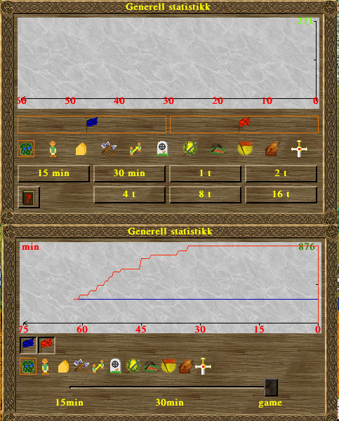
Player and category buttons in the general statistics window

Bug #887737 reported by Hans Joachim Desserud
8
This bug affects 1 person
Affects Status Importance Assigned to Milestone
widelands
Fix Released
Low
Unassigned

Bug Description

(Split out from bug 536543)
When the slider was added to the general statistics window, there was also some other changes to it. Previously the player buttons would fit to width based on how many players were in the game, and also the categories took more space. This is a bit repetition of what was mentioned on the other bug, and on IRC, but I'll try to list the argument for both approaches.

Current:
*All buttons consistently have the same size across all games.
*Players always know where the buttons will be and it is faster to switch players on and off, since the distance is shorter.

Previous:
* The current solution leaves a lot of unused space in the window, especially considering games with few players. The previous window adjusted the width of player buttons to always fill the entire row. The window looks like it takes up more space, than the previous solution which filled out and used the assigned area.
* Though the player buttons will not always have the same size from game to game, they will appear consistently in the same order. The player buttons in a single game will all have the same size though, but a game the player plays later may have different width if the number of players is different. (Personally I see this as a minor issue, as a player will only play one game at a time and the buttons will adjust according to the same system each time).

Presonally, I really liked how the players' width adjusted based on how many players were involved, so that no matter they would fill up the entire row. Now when you play a game with only a few players, a lot of the space on the right side is left blank. Though I am obviously quite biased, so what do others think?

Tags: statistics ui

Related branches

Revision history for this message
Hans Joachim Desserud (hjd) wrote :
Revision history for this message
Joachim Breitner (nomeata) wrote :

Just a remark about the window width: The current width is quite arbitrary; I had put some value in and did not change it later. So this is a related, but partly independent issue: Should the window be just as wide as necessary (probably the width of the second row of buttons) or wider? If wider, what is a proper width? Should both statistics windows have the same width?

Otherwise, this issue is a matter of taste, and has no clear right or wrong solution. So we need many opinions to find a consensus. Please comment ahead :-)

Revision history for this message
SirVer (sirver) wrote :

I chime in with my oppinions here:

* The current size of the window is good. It is wide enough to not feel crowded and it has an aesthetical h to w ratio
* I'd prefer to fill the whitespace as it was before. My main reason is that the clickable area of the buttons only gets bigger which is more important imho than having to move the mouse a little more. I also feel that the layout changes from game to game are intuitive to understand for the player and are not a problem.

Changed in widelands:
status: New → Incomplete
Revision history for this message
SirVer (sirver) wrote :

Setting this to incomplete for more opinions.

Revision history for this message
Shevonar (shevonar) wrote :

I totally agree with you SirVer

Revision history for this message
Joachim Breitner (nomeata) wrote :

An implementation note about spacing the buttons: If that is desired, this should be done by adding appropriate support in UI::Box, as the buttons already are there. This way, the layouting code remains confided to UI::Box, which allows easy adjustment to layouts otherwhere as well, then.

But I wonder: If we space out the buttons there, then why not also in the various building windows (the “capabilities” buttons)? They are also shoved to the left with constant size? Or the various resources in the building statistics or the stock windows – some rows have less items, should we space them? I’m playing devil’s advocate here. But the point is: It seems to me that the spacing of buttons, as it was before, was an exception to the usual look’n’feel and that this is more consistent.

Revision history for this message
Astuur (wolfsteinmetz) wrote :

Yes, it was an exception, but for some other windows, like building material for construction sites, the changing
of the window width, that comes with left aligned orientation, serves a purpose.
In this case it gives a good visual feedback for the progress in delivery of the building materials.
There is hardly anything that alerts more attention than a jump in windows size on screen.
I like that and would not want it to change.

In the case of statistic views and players participating, it is a static display, and the width of the window
will not and should not change, because we want a defined resolution for the time axis.

So, in my view this justifies making it a special case.
The rest is a matter of taste.
I'd prefer using the space for an even distribution over the left aligned approach.

Revision history for this message
Joachim Breitner (nomeata) wrote :

I’m not arguing about changing window sizes here (that would be a different field :-)), just about the position and size of the buttons.

When you say even distribution, do you mean only the position of the buttons, or also the width?

Revision history for this message
SirVer (sirver) wrote :

I love that this is discussed in sincerity! I feel this looking at details sets widelands appart from other open source projects.

So here is my 2c: I feel that the buttons in the windows are left aligned and not spaced out is an indication of (future) groupings. In fact, one grouping is already in place: the buildings that have a help text will already show the help button to the bottom right, warehouses have some more buttons that could/should be seperated also by spaces.

I agree with Astuur for the statistics window but for a different reason: here, I do not see the need to use spacing to separate functionality as all buttons essentially do the same in a row. I therefore value clicking area over white space.

about the implementation: I agree that adding this to UI::Box is the way to properly do it. It can than be more easily reused in other windows as well.

Revision history for this message
Nicolai Hähnle (nha) wrote :

My opinion: Since the building windows can change their width, I would prefer the buttons to *not* expand.

The reasoning is as follows: By keeping the buttons at a constant width, users can get used to the exact pattern and shape of the buttons that constitute the bottom left of the building window. They get used to it and can therefore navigate them more quickly.

If the button widths adapted to the window width, their width would be different for different building types, which means you have to rescan where they are.

At least that is my intuitive feeling.

(One argument in the opposite direction would be due to Fitt's law. However, I'm not sure whether that really applies if you potentially need more time to identify where you actually want to move the mouse based on changing button widths.)

Revision history for this message
Astuur (wolfsteinmetz) wrote :

@ Nicolai: I'm not sure - there may be a misunderstanding. Let me try again:
I am not arguing about the statistic window size either. I just wanted to point out, that I feel not uncomfortable with
resizing the buttons in the case of the Statsitic window (which should never change its given size) and grouping some other buttons
with an unchanging button size in other windows to the left. This is because both cases are different.
I merely used the construction site window as an example, where the size change of the window which is linked to grouping left, gives an additional benefit.
Summing it up: I agree with Sirver that for the statistic window, filling the unchanging full width of the window with the evenly spaced active area of buttons, is the best way.
And I would not change the other windows, that group the buttons to the left just for the sake of uniformity,. because their gouping allows the window to shrink, which in itsself has some merit.
Phoo - hope that's clearer now :)

Revision history for this message
Nicolai Hähnle (nha) wrote :

@Astuur: No worries. For the statistics window the suggestion sounds nice. I was reacting more to nomeata bringing up the building windows.

Revision history for this message
Hans Joachim Desserud (hjd) wrote :

>I’m playing devil’s advocate here. But the point is: It seems to me that the spacing of buttons, as it was before, was an exception to the usual look’n’feel and that this is more consistent.

I see your point, and I am aware that this is not consistent with the other windows. However, the general statistics window is fairly unique. While all buildings share the same window layout and common elements, there is only on general statistics window. As such, it contains different information and works in a different way than for instance the building windows.

Also, I noticed the minimap also use buttons which scales depending on the size of the window. While it would be possible to squeeze them in on a single row, this would make it harder both to see what the button does and also to hit it when attempting to click on it.

Revision history for this message
Launchpad Janitor (janitor) wrote :

[Expired for widelands because there has been no activity for 60 days.]

Changed in widelands:
status: Incomplete → Expired
Revision history for this message
SirVer (sirver) wrote :

I see a majority of reverting to the old buttons that fill all the space. Nomeata seems to be the only one who is not in favor in this discussion. I therefore suggest reintroducing the old behaviour and set this to triaged.

Changed in widelands:
status: Expired → Triaged
importance: Undecided → Low
Revision history for this message
Joachim Breitner (nomeata) wrote :

Ok, I bow to the geneal consesus.

I’m not sure if you want this only for the player buttons or also for the information category buttons, so I made separate commits for them, cherry pick those that you want. The UI::Box improvement that makes this layout available generally is also separate.

Revision history for this message
SirVer (sirver) wrote :

Thanks! I just merged all of it.

Changed in widelands:
status: Triaged → Fix Committed
milestone: none → build17-rc1
Revision history for this message
SirVer (sirver) wrote :

Released in build17-rc1.

Changed in widelands:
status: Fix Committed → Fix Released
To post a comment you must log in.
This report contains Public information  
Everyone can see this information.

Other bug subscribers

Remote bug watches

Bug watches keep track of this bug in other bug trackers.