Reimplement resource indicators

Bug #1784208 reported by GunChleoc
8
This bug affects 1 person
Affects Status Importance Assigned to Milestone
widelands
Fix Released
Wishlist
Unassigned

Bug Description

Follow-up from https://bugs.launchpad.net/widelands/+bug/1713706

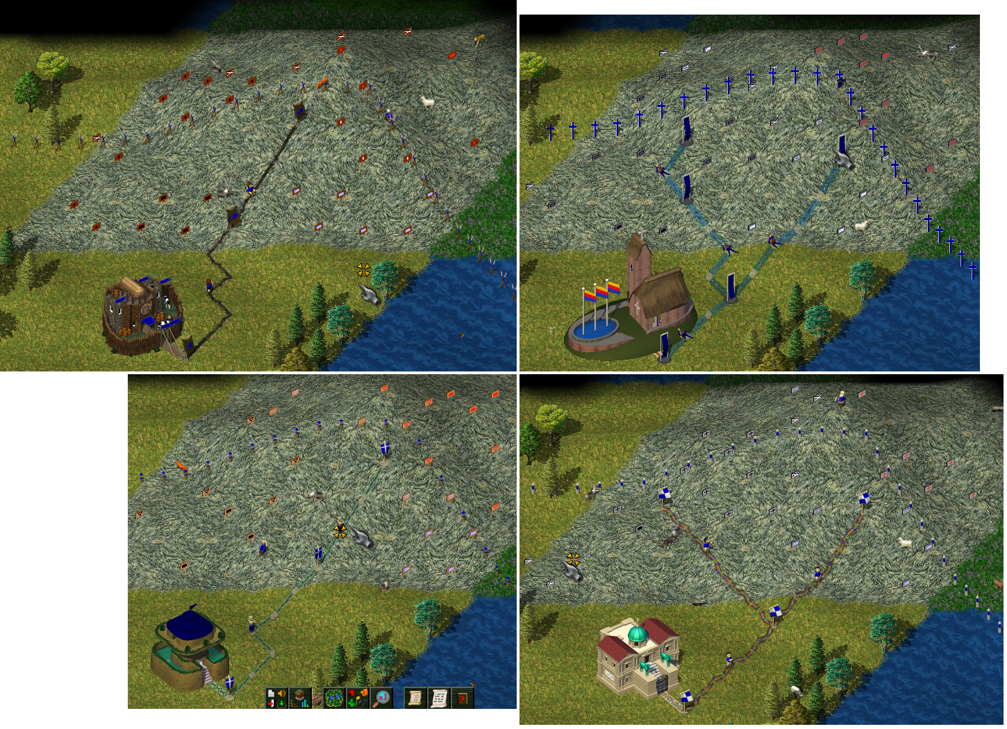
How do we ensure which resource gets linked to which resource indicator, and that the tribes have one for each resource? Maybe we can find a solution here that's more clever, i.e. moving their definitions from the tribes to the world. An additional check during tribe loading might also be sufficient here, in case we would like to have the possibility of individual graphics per tribe in the future.

Tags: tribes world

Related branches

Revision history for this message
Benedikt Straub (nordfriese) wrote :

I see two possibilities here:
a) Each resource gets a property
   resi = {
      [10] = "resi_coal1",
      [20] = "resi_coal2",
   }
like for editor amount images. The resi-immovables would be moved from tribe to world.

b) Each tribe specifies a table of
   resi= {
      coal = {
         [10] = "resi_coal1",
         [20] = "resi_coal2",
      },
      iron = {
         [10] = "resi_iron1",
         [20] = "resi_iron2",
      },
   etc.
   }

I´d prefer the latter one. We already have a beautiful collection of resource signs for bar, emp and atl in the media repo. A check during tribeloading that each tribe has for each detectable resource at least one indicator >= the resource's max_amount can go in the tribes/init.lua.

Changed in widelands:
assignee: nobody → Benedikt Straub (nordfriese)
Revision history for this message
Benedikt Straub (nordfriese) wrote :

Some screenshots of what it could look like to reuse the images in the repo for tribe-specific indicators
(I used the set "empire_blue" for frisians)

Changed in widelands:
status: New → In Progress
Revision history for this message
GunChleoc (gunchleoc) wrote :

I'm for option 2 too.

I'd like to have some tweaks to the graphics though, e.g. the crosses for Empire are very thin and hard to see. Maybe keep the inner symbols identical for all tribes (like they are now) and only change the material for the material they're mounted on?

Revision history for this message
Benedikt Straub (nordfriese) wrote :

We have five variants (triangle, hollow-rect, plus-sign, line, dot) for the "few resources" indicators. For the "none" indicator, we have the variants crossed-out and blank.
Editing the images might be difficult, I don´t know if there are blender files for the indicators, so we have to work with the material in "widelands-media/graphics/Misc/resource signs/<tribe>".

Personally, I´d like it to have more variation in symbols as well as backgrounds in the game. Perhaps we could have
atl – triangle (_alt2)
bar – plus-sign (_alt)
emp – line (_alt3)
fri – hollow rect (empire_blue _alt4)
Also, I like the "blank" indicators more than the crossed-out ones for the "no resources" indicator.
Could you take a look at the collection in the media repo and judge if those are visible enough?

Revision history for this message
GunChleoc (gunchleoc) wrote :

The plus signs in your screenshots are definitely too thin, so these need some work done in any case.

Revision history for this message
Benedikt Straub (nordfriese) wrote :

How about this?

Revision history for this message
GunChleoc (gunchleoc) wrote :

Much better for the empire :)

How about making the triangles for the Atlanteans a solid feel, and giving the Frisians filled circles?

Revision history for this message
Benedikt Straub (nordfriese) wrote :

Okay, I´ll try to edit or make new resource indicators then. Newly creating them will also make it possible to experiment with backgrounds, colors and other details. It´ll have to wait for a few weeks though until I´m back on my Blender machine.

Checking that each tribe has enough resource indicators is not quite as trivial as I thought. I´ll hardcode the checks in EditorGameBase::postload(). Is there a function to get all TribeDescrs and ResourceDescrs from the Tribes and World or will I have to add one to DescriptionMaintainer?

Revision history for this message
GunChleoc (gunchleoc) wrote :

Have a look at Tribes::postload on how to iterate through the containers. You might need some additional getter and setter functions in TribeDescr and World - the DescriptionMaintainer is the backend; you don't need to change anything in that class.

Revision history for this message
Benedikt Straub (nordfriese) wrote :

Thanks for the hint :) Check is implemented and working.

Revision history for this message
Benedikt Straub (nordfriese) wrote :

Back on my Blender machine.
Just an idea: Perhaps we could replace the resource signs with something different that fits to each tribe's character. Here a suggestion with marble sculptures for the Empire.

Revision history for this message
GunChleoc (gunchleoc) wrote :

I think they look great - we need to see how this will work in-game though, to make sure that the colors and amounts are easily distinguished.

Revision history for this message
Benedikt Straub (nordfriese) wrote :

Edited them a bit to improve their in-game looks. These columns have the advantage that they don´t disappear completely behind the buildhelp overlays, unlike the signs in trunk. Columns have a sphere on top for large amounts. Coal is dark grey, iron red, gold yellow/orange, granite white, water blue. Twisted columns mark empty places. What do you think?

Revision history for this message
Benedikt Straub (nordfriese) wrote :

For atlanteans, how about a coloured silk canvas spanned between poles?

Revision history for this message
kaputtnik (franku) wrote :

I like the idea and they look great, although its a bit illogical that a geologist carry, and set that much marble columns :-D

The marble plates in the first screenshot fits better, imho.

I am not sure if the amount of ore is good to distinguish on the marble columns, or the silk canvas for the atlanteans. For the marble columns the columns may can have different sizes to show the amount of found ore?

For the silk canvas maybe span them between two poles and let them point in the same direction as the current signs? Maybe they can be animated and wave in the wind...

Not sure if it is importand to show them behind the buildhelp, but sometimes it has been irritated me not to see them behind it.

Revision history for this message
Benedikt Straub (nordfriese) wrote :

Good idea for the canvasses, how about this? These are animated (4 frames each); one piece of silk shows few resources, two for many.

I´ve never seen a geologist carry those wooden signs either, but yep, from that point of view, the columns are a bit too massive ;)
I´ll try mounting a marble plate onto a (lighter) column, perhaps that´ll look better.

I always find it very annoying not to be able to see the resis behind the buildhelp, so I want to make sure at least the highest indicator for each resource is clearly visible.

Revision history for this message
kaputtnik (franku) wrote :

Yeah, thats impressive :-)

Revision history for this message
GunChleoc (gunchleoc) wrote :

How about having twisted columns for resources and straight columns for no resources? Since the twisted columns look more elaborate.

> These columns have the advantage that they don´t disappear completely behind the buildhelp overlays

+1 :D

For Atlantean stones, I find the color hard to see against the grey background, because there is no framing at the edge of the canvas. So, maybe give them all a colored border? Animating them should also help, because our brains carry a motion detector.

Revision history for this message
Benedikt Straub (nordfriese) wrote :

Gave the atl canvasses an iridescent border pattern. Stones is still a bit inconspicuous while the game is paused, but there´s no overlooking it when it waves in the wind (or at 4x zoom) now ;)

Revision history for this message
Benedikt Straub (nordfriese) wrote :

... and frisians love flags!

Revision history for this message
Benedikt Straub (nordfriese) wrote :

Next attempt for empire

Revision history for this message
GunChleoc (gunchleoc) wrote :

For the empire, I think straight columns will look better with the last design.

Desaturate the blue in the Frisian water a bit?

What do we want for Barbarians, stone cairns or some pained wood construction?

Revision history for this message
Benedikt Straub (nordfriese) wrote :

Modified frisian flags and empire columns, and a suggestion for Barbarians: wooden signposts

Revision history for this message
GunChleoc (gunchleoc) wrote :

I liked the previous version of the empire better - the "little resources" indicators are hard to see now.

I like the concept for the Barbarians - turn the water signs in the same direction as the mountain resources? At the moment, they are turned the same way as the "no resources" indicators.

Revision history for this message
kaputtnik (franku) wrote :

What about giving the buildhelp icons some transparency? So a player can see if resources were found.

In my opinion the columns are too massive.

Revision history for this message
Benedikt Straub (nordfriese) wrote :

Adjusted barbarian water sign. Here´s another version for empire, with the plates mounted only on a small marble stick instead of a column, more like the old signs. It disappears behind the buildhelp though, so I´ll need to make that transparent (good idea!) if we go with this look.
(I remember there used to be a different symbol for the mines-buildhelp-icon with crossed picks; no idea why it was changed, I liked it better than the current one…)

Revision history for this message
kaputtnik (franku) wrote :

I would also prefer crossed picks for the mine buildhelp :-)

Revision history for this message
GunChleoc (gunchleoc) wrote :

+0.5 for the crossed picks, I like them better too. We should dig into why the symbol was changed though, it might have fixed another UI issue.

Revision history for this message
Benedikt Straub (nordfriese) wrote :

List of changes to the builhelp icon: https://bazaar.launchpad.net/~widelands-dev/widelands/trunk/changes?filter_file_id=pics/mine.png
I guess it was changed in 5893 or 6565. The old symbol is a bit hard to see on some terrains, I guess that´s why it was changed. I can adjust that with GIMP though, and it won´t hide the resi signs then.

Revision history for this message
Benedikt Straub (nordfriese) wrote :

...like this.
More changes needed, or is the branch ready for a merge proposal?

Changed in widelands:
milestone: build21-rc1 → build20-rc1
Revision history for this message
GunChleoc (gunchleoc) wrote :

I'm not happy with the crossed mining symbol. It's more visible with your edit, but it does not look good :(

Revision history for this message
Benedikt Straub (nordfriese) wrote :

Not changing the colour then. Good visibility on all mountain terrains is difficult if I don´t edit the original image too much, here are two different versions with slighter changes only in contrast and brightness…

Revision history for this message
kaputtnik (franku) wrote :

The problem with crossed picks is that it does not fit with the other buildhelp symbols, which are abstract. Maybe the picks can be simplified and giving the sign the same color as the current mine symbol?

Revision history for this message
Benedikt Straub (nordfriese) wrote :

Difficult... I´d like this branch to get in before feature freeze, so perhaps it´s better if we use the attached modified version of the current symbol for now (slightly smaller and offset) and discuss more elaborate changes in a follow-up bug.

Revision history for this message
kaputtnik (franku) wrote :

Also a good solution imho. Made a short usability test with empire and found no flaws :-)

Revision history for this message
GunChleoc (gunchleoc) wrote :

That last screenshot works for me :)

Revision history for this message
GunChleoc (gunchleoc) wrote :

I have dome some in-game testing of the graphics. The mining symbols really work well the way they are now. I think the resource indicators need more tweaking though, mainly because the visual contrast has gotten really low for some of them, so they are hard to see.

The following indicators need more contrast between the frame and the symbol:
- Barbarian coal
- Empire; Everything except coal

Atlantean symbols are hard to notice that they are there at all. We need more saturation or something.

Frisian little iron blends in too much with the build help symbol - give the flags a white border?

Changed in widelands:
assignee: Benedikt Straub (nordfriese) → nobody
status: In Progress → Fix Committed
Revision history for this message
GunChleoc (gunchleoc) wrote :

Fixed in build20-rc1

Changed in widelands:
status: Fix Committed → Fix Released
To post a comment you must log in.
This report contains Public information  
Everyone can see this information.

Other bug subscribers

Remote bug watches

Bug watches keep track of this bug in other bug trackers.