Ware statistics window too small for empire warelist

Bug #1205806 reported by cghislai
18
This bug affects 2 people
Affects Status Importance Assigned to Milestone
widelands
Fix Released
High
cghislai

Bug Description

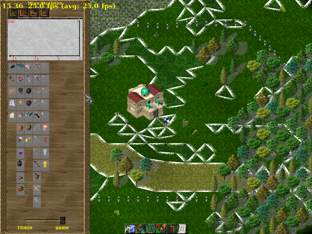
The ware statistics window is too small for the empire warelist, at least at 800x600. The last ware buttons are cropped and the slider not visible. See attahed screenshot.
I noticed wrapping of the last ware of a column to a new one (fire tongs), maybe this should be made earlier. I didn't test with empire while reviewing this reversal to vertical warelists.

Related branches

Revision history for this message
cghislai (charlyghislain) wrote :
Revision history for this message
cghislai (charlyghislain) wrote :
Changed in widelands:
milestone: none → build18-rc1
status: New → Confirmed
tags: added: statistics
tags: added: empire
Revision history for this message
SirVer (sirver) wrote :

Dammit. I think the most prudent way here is to break the 'food' column and the 'tools' column. This should not even widen the window by the looks of it. It just breaks the nice ordering (a bit). :/

Changed in widelands:
importance: Low → High
Revision history for this message
cghislai (charlyghislain) wrote :

I am adding a max_height parameter to the constructor, which default to the value you used. I don't know if it is ok or if it is better to have the exact same display of wares for all window.

Changed in widelands:
assignee: nobody → cghislai (charlyghislain)
Changed in widelands:
status: Confirmed → In Progress
Revision history for this message
SirVer (sirver) wrote :

I think it is better to have the exact same ordering for wares in all windows. Some folks poored in a lot of time to figure out a sorting that makes sense and is as consistent as possible for all tribes. And clicking muscle memory is very strong.

Revision history for this message
cghislai (charlyghislain) wrote :

I agree. However, as you said, the default sorting make sense and when you have your stock window that only takes about half the screen height because the columns are wrapped, it looks a bit awkward... But, yes, you can't play against memory

Revision history for this message
wl-zocker (wl-zocker) wrote :

Haven't the categories been ordered vertically some time ago? I would prefer it that way; it is more compact than the vertical order presented in the screenshots (and in r6880). This would solve the height problem, too. (What about the width?)

Revision history for this message
SirVer (sirver) wrote :

I heard a lot of complaints about the wide ordering - I myself prefer the slim layout, because it sits better at the edge of the screen and blocks less real estate. The width does not seem to be a real problem.

Revision history for this message
Nasenbaer (nasenbaer) wrote :

Set to fix committed as the branch containing the fix was merged at revision 6697.

Changed in widelands:
status: In Progress → Fix Committed
Revision history for this message
SirVer (sirver) wrote :

Released in build-18 rc1.

Changed in widelands:
status: Fix Committed → Fix Released
To post a comment you must log in.
This report contains Public information  
Everyone can see this information.

Duplicates of this bug

Other bug subscribers

Remote bug watches

Bug watches keep track of this bug in other bug trackers.