
Web design lacks contrast
Bug #1746528 reported by
GunChleoc
This bug affects 1 person
| Affects | Status | Importance | Assigned to | Milestone | |
|---|---|---|---|---|---|
| Widelands Website |
Won't Fix
|
Medium
|
Unassigned | ||
Bug Description
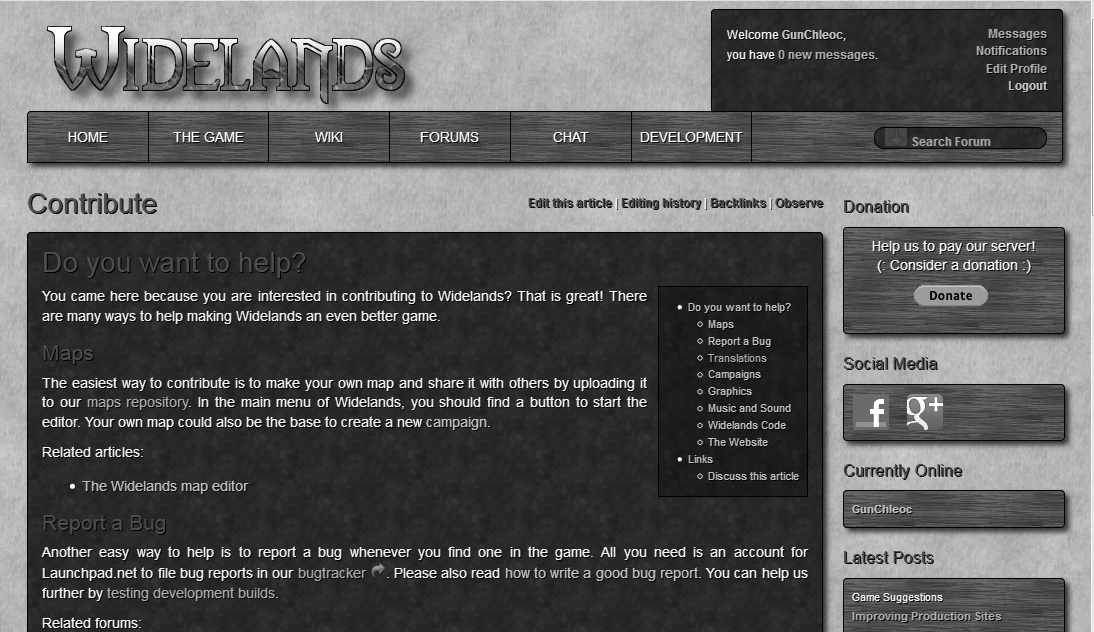
I just showed our homepage to a friend who is somewhat vision impaired. He could not read the green headers at all, and distinguishing between normal text and links was also a big problem for him.

To post a comment you must log in.
I have attached a desaturated screenshot. Both the titles and the links (especially visited links) are indeed hard to distinguish.
How about the following:
1. Make the green brighter, while making sure that t's not oversaturated (=glaring)
2. Underline the links