
Regression in usplash artwork
| Affects | Status | Importance | Assigned to | Milestone | |
|---|---|---|---|---|---|
| gnome-screensaver (Ubuntu) |
Invalid
|
Medium
|
Unassigned | ||
| usplash (Ubuntu) |
Fix Released
|
Medium
|
Unassigned | ||
Bug Description
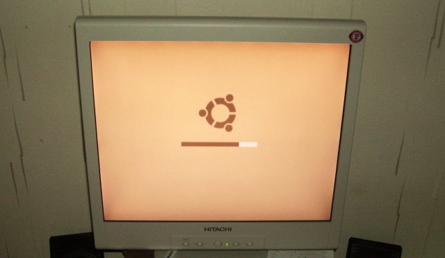
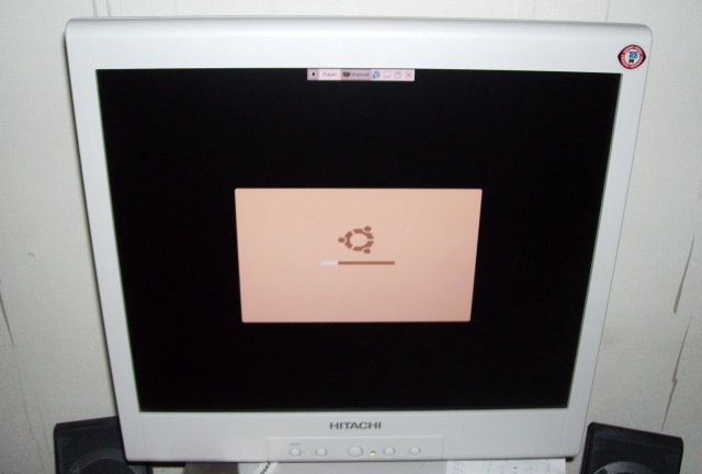
I don't mean to disrespect the efforts that have been put to usplash, but i sincerely think that the artwork in usplash-0.1 was a lot better than the new artwork in 0.2.
The images from both versions can be seen here:
http://
Personally i'd like to see the package reverted to the 0.1 artwork.

| Emmanuel Touzery (emmanuel-touzery) wrote : | #1 |
| Tormod Volden (tormodvolden) wrote : | #2 |
What happened to the brown "human" colours? Now I can't even see the "OK"s at the right side of the boot progress messages.
| Changed in usplash: | |
| status: | Unconfirmed → Confirmed |
| Ricardo Pérez López (ricardo) wrote : | #3 |
I absolutely agree! The previous artwork was much much better and the colors matched better with the environment.
And I think the new logo is a bit displaced to the left :/
I believed we are in the UserInterfaceFr
| Gaëtan Petit (gaetanp) wrote : | #4 |
I can confirm this
this is clearly a regression,
this artwork is less professional morez "amateur" like Emmanuel Touzery said.
Believe me i'm not against design and/or interface changes, but this new artwork is a wrong choice
| Pekka Salmela (pisalm) wrote : | #5 |
I agree with this, too. The former one was quite good looking, but this one and especially the bright colors are quite irritating.
| Oren_B (oren.barnea) wrote : | #6 |
I agree - the old one looks much better.
| Changed in gnome-screensaver: | |
| status: | Unconfirmed → Rejected |
| Frank Schoep (frank-ffnn) wrote : | #7 |
I'm sorry but I have to agree with the others on this one. The "ubuntu" name is visibly aliased with the round bottoms of the u's and b's completely cut off. There's also a lot of aliasing in the logo - the glow does not smoothly blend in with the colors, this is also apparent in the name - the black shapes which form the letters do not blend smoothly into the glow, instead it's a harsh contrast between the letters and the glow.
I really started to love the "old" bootsplash, it's really amazing considering the limitations on the graphics format for bootsplash images. With respect to all the work gone into the new splash I'm sorry to have to call it less professional.
| Bruce Cowan (bruce89-deactivatedaccount) wrote : | #8 |
I don't think the old one was that good, but the new one is worse. These things only work when there is a small range of colours.
| Simon Gray (simongray) wrote : | #9 |
I agree as well.
| Mark W. Tomlinson (mark-tomlinson) wrote : | #10 |
Revert! Revert!
Sorry, but this latest usplash just looks bad. Even on my desktop's CRT, I can't read the "OK"s to the right for each step.
Keep trying new stuff, but at least make it something readable!
| Nalthien (nalthien) wrote : | #11 |
I'm going to have to throw my name in on this one; the old artwork wasn't great, but it was at least decent.
This new stuff looks like a 14-year old got ahold of photoshop in 1997 and picked up the eye candy filters. Blech!
| Removed by request (removed30301) wrote : | #12 |
As many people, I'd prefer the first one.
If there is no time enough to make a new great one, just put back the old one.
It's really my first desapointment with ubuntu artwork, new icons look great to me.
| Cédric Cichowlas (cedric-cichowlas-deactivatedaccount) wrote : | #13 |
I also prefer the previous one... I liked the effect of reflection and its colour. Nevertheless, I'm not against the fact we try to change it. But the problem with the actual one is its quality. More over it's not centered.
I hope my remarks will help the team.
Cédric
| David Planella (dpm) wrote : | #14 |
I couldn't agree more with all this, especially with the first comment posted by Emmanuel Touzery.
In fact, I myself thought there had been something wrong when after upgrading usplash I saw the new artwork on shutdown. I had to restart again to make sure that that really was the new artwork.
>What happened to the brown "human" colours? Now I can't even see the "OK"s at >the right side of the boot progress messages.
Exactly. Why did we go to *grey* "human" colours?
And why did the artwork change 3 weeks before release? Why not create a thread in the forums in the early stage of development to get users to throw in their ideas, for example?
I think the best option would be to make usplash easily themable so the user can choose between console font colour and logo. I realise there probably won't be time to implement this in Dapper, but it is just a thought for the future.
I cannot add more to this discussion. I think everything I was thinking has already been said by other users already.
And again, this is not a rant. We fully appreciate the developer's work. It is because we so much like this distro that we want it to be as good as "humanly" possible.
As a side issue, my Breezy usplash artwork used to look better than the one in Dapper (was the screen mode changed or something in Dapper?) before 0.2. I thought this was just a minor issue and I did not report it. But now, the change from 0.1 to 0.2 is something else...
Thanks.
| GonzO (gonzo) wrote : | #15 |
I agree. The old one was way better, and actually fit in with the color scheme. I don't see why it was changed, actually. If anything, the old usplash only needed the text or progress bar to be slightly more orange - to fit in with the Dapper desktop.
| David M. Carney (carney1979) wrote : | #16 |
Aside from the new splash (which I also don't like over the old), the progress bars work backwards.
David
| Viper550 (viper550) wrote : | #17 |
Okay, we've been having an active discussion on the Ubuntu-Art list about this, and I posted a pretty good one that I made (which I shall attach to this bug).
The new one I made is simliar design wise to the current one, but has a redone gloss effect and better intergration style wise to the new desktop design.
| Viper550 (viper550) wrote : Viper550's Usplash Artwork | #18 |
- Viper550's Usplash Artwork Edit (65.2 KiB, image/png)
Okay, so this is the new Usplash artwork I refered to in my comment. This picture of it is in 24 bit color, but it scales down to 16 colors very nicely (using Macromedia Fireworks MX's GIF optimizations), and I do not doubt GIMP can do it just as nice!
| Loe Spee (lgespee) wrote : | #19 |
Bad choice.
1) The Ubuntu logo comes out quite bad.
2) The messages are sometimes unreadible, especially on a TFT with a little bit of surrounding light.
3) The progressbar colors are a bad choice, a little bit of light can make the progressbar useless, for colorblind people I think it is a nightmare, you can't clearly see if progress has been made.
My opinion, adjust or revert ;)
| Ricardo Pérez López (ricardo) wrote : | #20 |
The artwork proposed by Viper550 is by far better than the "current", IMHO.
| Ricardo Pérez López (ricardo) wrote : | #21 |
Viper550: your artwork fits the Usplash constraints? (resolution, number of colors, etc.)
| Viper550 (viper550) wrote : | #22 |
It's called, Mark told me about that little problem. Attached is a new dithered version, came out pretty good! They were designed at 640x480 anyway so that doesn't matter to me
| Viper550 (viper550) wrote : Usplash Artwork, dithered! | #23 |
| Viper550 (viper550) wrote : Goofed Up | #24 |
Sorry, I goofed up and used 640x480, not knowing it has to be 640x400 now! Here it is...again...
| Viper550 (viper550) wrote : | #25 |
| Viper550 (viper550) wrote : Now it should work | #26 |
- Now it should work Edit (1.7 KiB, image/png)
GIMP, why must you torture me? I had to redo it using a Windows application to get it all to work right, ignore the one with ignore spelled wrong.
| Matthew Garrett (mjg59) wrote : Re: [Bug 44339] Re: Regression in usplash artwork | #27 |
That's been drawn at 640x400, but using a 4:3 aspect ratio. As a result,
it'll look distorted if displayed in usplash. I'm afraid it's quite
awkward to produce 640x400 artwork that's the right aspect ratio...
--
Matthew Garrett | <email address hidden>
| Viper550 (viper550) wrote : | #28 |
So, how the heck do you do that?
| leonardoo (bm-iliass) wrote : | #29 |
Hello, i was unlucky because i was in the "console mod" because of a wine problem, and i've got the usplash, so, i've been thinking during the evening that i've screwed my graphic card, and that i'm in the vga mode. now i'm rassured, but it does not change the fact that the new usplach is a little ugly, i prefer the human look. this new look isn't so bad, but it's not as good as the previous one. Cordially
| David M. Carney (carney1979) wrote : | #30 |
leonardoo wrote:
> Hello, i was unlucky because i was in the "console mod" because of a
> wine problem, and i've got the usplash, so, i've been thinking during
> the evening that i've screwed my graphic card, and that i'm in the vga
> mode. now i'm rassured, but it does not change the fact that the new
> usplach is a little ugly, i prefer the human look. this new look isn't
> so bad, but it's not as good as the previous one. Cordially
>
I like Viper's artwork better, too.
David
| Adam Conrad (adconrad) wrote : | #31 |
Viper550 wrote:
> So, how the heck do you do that?
What I did here was take your 640x400 image, bump the canvass size (ie: no rescaling) to 640x480, then take THAT and rescale the image to 640x400. That gives you the right "shapes" for everything, so it's at the correct aspect ratio.
With the old artwork, that's where I stopped, because I assumed we were getting something new and prettier.
With yours that would be a good point to tweak and refine the dithering, now that the "shape" is right. If this is all being renedered down from a vector, you may be able to approximate this whole process much earlier, so you get a well-dithered version for free.
| Mickey (michael.z) wrote : | #32 |
Agree without a full rehash what was said above. This new style is worse, the alphas and beta 1 had better art.
| Yotam Benshalom (benshalom) wrote : | #33 |
I agree with all the above. New artwork is both tacky and depressing. Viper's suggestion is worth looking at.
| Viper550 (viper550) wrote : | #34 |
What I tried to do was take a screenshot of the splash screen from OSDir (that shows the squished aspect ratio because it was in VMWare), and use one of my programs to resize the graphic to the same proportions. I might wanna try that other technique...
| Johannes Langlotz (johannes-langlotz) wrote : | #37 |
usplash-0.1 is the nicest (IMHO). Something like this shouldn't be changed in less than three weeks before release.
| Paul Sladen (sladen) wrote : | #39 |
Ideally it should probably be produced to an aspect ratio half-way between 4:3 and 8:5 (eg. 16:11, or working with a base image of 640x440) so that it looks vaguely correct both:
a) when strectched to a VGA screen
b) when centred on an LCD display or VMware screenshot
The biggest reason why the current artwork doesn't work is that there are too many transitions of colours; really there is only space for one gradient of colours (eg. brown->black). In the case this new artwork it attempts to use:
black->white
orange-
yellow-
red->
which is far too much to dither and provide immediate colours for when there are only 14 palette entries.
The new Kubuntu one is very good and was done by somebody who understood the restrictions of the environment; It uses 3 shades of blue in total, all of which effectively share the same gradient (blue->black).
Vipper550: your artwork looks much better. If there /has/ to be a change I hope it's considered. At this moment in time, I think we'd be better reverting to the breezy artwork.
This would have the effect of promoting the image of stability/
| Frank Schoep (frank-ffnn) wrote : | #40 |
I've been able to withhold myself from posting this in the bug report, but for the people not on ubuntu-art or ubuntu-devel here's a small update on what I've been doing the past hours: I've been working on a splash screen for Ubuntu Dapper, I've already got a working version here (please test it):
http://
Screenshots:
http://
http://
I'm polishing this tonight, expect a new version tonight which looks even better, more crisp and even less intrusive. I hope you all like this work I'm doing.
Sorry to post this here, but it seems there's quite a discussion going on here.
| Viper550 (viper550) wrote : | #41 |
To Paul:
Thanks for the excellent comments.
If you wonder, my artwork was actually inspired by the current 0.1 artwork, but was redone in the same style and also looks way cleaner! They were actually pretty easy to make; I just used Alpha to Selection on the current Ubuntu High-Res PNG, filled it with a gradient of 2 close colors, made a new layer (keeping the selection), using the Subtract Selection tool to remove the bottom half of the fill, then filled it with white. Then, I fooled around with the transparency of that layer and it was done!
The design doesn't go far away from the current one because I loved the current artwork, but Dapper is got tons of new artwork designs, so the splash should be redone to show off this slick new image, and the fact that Brown is no more! I don't even think a recoloring of the current one is enough pour moi!
| Johan Kiviniemi (ion) wrote : Re: The minimalistic theme | #42 |
IMO the concept in Frank Schoep's minimalistic usplash theme is excellent – definitely worth considering as the default for dapper.
Users are always able to go to a virtual console, remove "splash" from the kernel command line or install another usplash theme if they want to see the messages.
There are some things that that should be fixed or changed, though:
• Currently all the other messages are invisible, but "failed" is visible – not what failed, just the word "failed".
• Either 1) use black as the color 0 in the palette or 2) remove the rounded corners. Many laptops that show 640x400 centered in a bigger monitor fill the border around it with the color 0. When that is the case, the user sees four strange chunks of black pixels in the corners of (otherwise indistinguishable) 640x400 area in the middle.
• Everyone probably has her own opinion about this, but IMHO the progress bar colors should be switched (white bar on a brown background).
• It wouldn't hurt to experiment with different shades for the palette.
Keep up the good work. :-)
| Mathias-K (mathias-k) wrote : | #43 |
Lovely work as always, Viper550.
I really hope the devs change this. Seeing Fedore Core 5 and SUSE 10.1 splashes, Ubuntu is lightyears behind, unfortunately..
| Frank Schoep (frank-ffnn) wrote : | #44 |
Anyone interested in what I and the other members are doing with the "Minimalistic" and other splashes should either subscribe to ubuntu-art and possibly ubuntu-devel. It's not that I don't want to keep you informed, it's just that the discussion on this is now running on three separate locations and so far I'm managing pretty well, but I can't assure everything being up to date anytime. It would be easier to get discussion rolling on ubuntu-art and try to keep discussion out of the bug report.
Anyone who disagrees is welcome to voice his opinion, I'm only suggesting what I think is right.
| Étienne BERSAC (bersace) wrote : | #45 |
Please use minmalistic. Setting gdm background to the same tan colour would improve greatly the smoothness of ubuntu;
| Clemens (clast) wrote : | #46 |
IMO, Frank is doing an excellent jobwith minimalistic :)
unfortunately though, it's probably too late in the development cylce to include such a major change.
nevertheless, the current usplash needs to be replaced. it's horrible!!! sorry, but it's probably the worst usplash screen I've seen in a linux distro.
reminds me of the first computers with color screens.
the one in breezy was way better.
for edgy we should definetely switch to bootsplash or something more modern than usplash.
regards,
clast
| Michiel Sikma (msikma) wrote : | #47 |
Please, please, please, please revert this to the original. I'm a professional designer but I don't need to make a technical explanation on why this new logo sucks. I wonder who authorized such an awful change. This is truly appaling.
I've made a wiki page for design propositions for Edgy Eft, by the way. People who have made propositions can list and rationalize it here: https:/
| Arash Yadegarnia (arash) wrote : | #48 |
Developers have made some new propasals...their great!
check ubuntu forum threads!
| Michiel Sikma (msikma) wrote : | #49 |
I doubt we could still make one of the new propositions to be included in Dapper. It would require that there's a vote on which one we should use, and that's difficult. Consensus is difficult to achieve.
I do believe that it's possible to simply revert this graphic change to the way it was before, since it seems to be consensus that regardless of whichever new proposition is the best, the usplash 0.1 artwork is much better than the usplash 0.2 artwork.
Actually, I believe that this is a very high-priority bug. We're way past UI freeze and yet the logo that millions of people will see every single day when they turn on their computer is pretty much collectively thought to be awful.
| Ted O'Hayer (tohayer) wrote : | #50 |
I also hate the current artwork, and I'm also voicing my support behind the 'minimalistic' theme shown above. It's fantastic, professional, and very simple.
| Athurva Gore (agore187) wrote : | #51 |
The minimalistic theme looks amazing. I think that should be the default as well, maybe with a message saying "Press CTRL-ALT-F# to see details" or something like that.
If not that, the old one should be brought back; the new one looks terrible IMO.
There's a poll in the forums about it now as well, and the majority of people that have voted so far want the old one back.
http://
| Nathan Haines (nhaines) wrote : Human Splash | #52 |
- Human Splash Edit (1.4 KiB, image/png)
While I hate to push my own solution, I created a splash screen two weeks ago that I thought might better match the default gdm welcome screen, and missed seeing the new screen until now. While I'm sure it could be improved (it's my first indexed color image ever), and suffers from the same dithering/
It uses a brown/tan progress bar, brown text, and uses the red from the Ubuntu logo for "failed". If there's any interest I can throw it into VMware and screencap it in action.
| Ricardo Pérez López (ricardo) wrote : | #53 |
The old Usplash artwork has been reverted with the new 0.2-2 version.
| Paul Sladen (sladen) wrote : | #54 |
usplash (0.2-2) dapper; urgency=low
* Revert artwork to 0.1-36, Frank was asked to provide better artwork
over the weekend but instead appears to have spent the weekend working
on a text-less version which we already said was not going to make
dapper.
Don't expect this to be the last change before Dapper is released.
-- Scott James Remnant <email address hidden> Sun, 14 May 2006 18:02:09 +0100
| Changed in usplash: | |
| status: | Confirmed → Fix Released |
| Viper550 (viper550) wrote : | #55 |
BOOYAH! A WINNER IS US! YATTA! Now, all it needs is updated artwork for Dapper that is similar to the current one (hint hint, my works maybe), and we'll be all set!
| Mickey (michael.z) wrote : | #56 |
Thank You Dev's
i must say, this is also my opinion. actually when i saw it, i said "i'll search for the bug instead of creating a new one: it's clear somebody else has already reported that".
i think in the new splash the colors are too violent, and the logo comes out "amateur". i also have the feeling the text/logo "ubuntu" are not centered but maybe it's just an impression.
maybe it would be better if the logo and text for ubuntu were made much smaller, and/or were in a corner instead of center.
also i think it's good that the boot messages are less seen, in gray on black, but the scrollbar is useful so it's half-half. and gray is a bit "sad" color, not matching the new orange of ubuntu.
anyway, to me as well, the previous artwork was MUCH better. i must say, that artwork was really amazing given the constraints (colors, resolution).