
Unconfigurable position of notification
| Affects | Status | Importance | Assigned to | Milestone | |
|---|---|---|---|---|---|
| notify-osd (Ubuntu) |
Confirmed
|
Wishlist
|
Mirco Müller | ||
Bug Description
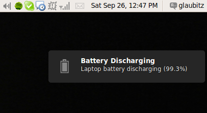
No natter how I configure them at the "Notification Settings" dialog, notifications always show at the top right corner of the screen and with what I believe to be their standard theme (a glassy black background with white text). I'm using Ubuntu jaunty and notify-osd version 0.9.11.
| description: | updated |

| John Paul Adrian Glaubitz (glaubitz) wrote : | #1 |
| John Stowers (nzjrs) wrote : | #2 |
I also see this unsightly gap between the notification and the panel.
| Mirco Müller (macslow) wrote : | #3 |
That's an intended gap. The top area is reserved for synchronous notifications (e.g. volume, brightness).
| Changed in notify-osd: | |
| status: | New → Invalid |
| importance: | Undecided → Wishlist |
| assignee: | nobody → Mirco Müller (macslow) |
| milestone: | none → ubuntu-9.10 |
| Waldir Leoncio (wleoncio) wrote : | #4 |
Hey, Mirco, wait! Do't mark it as invalid yet! The bug I'm reporting has nothing to do with that gap! I'm reporting that the Popup notification settings dialog is not working! It won't change the position of the bubble form the default top right to something like bottom right.
| Edder Rojas (edder-rojas) wrote : | #5 |
"That's an intended gap. The top area is reserved for synchronous notifications (e.g. volume, brightness)."
What about get rid of that gap when synchronous notifications are not showing.
| John Paul Adrian Glaubitz (glaubitz) wrote : | #6 |
I totally disagree with the new gap-design. The down-shifted notification just looks ugly, no matter how you justify it. Anyone with some sense for logic would expect *any* notification at the exact *same* position. Just take a look at things in your daily life: TV channels always have their logos in one of the four corners and not shifted somewhere towards the center because people expect it like this. And when you look onto your computer's desktop, you always expect to find the clock somewhere in the corner. Or the "Start"-button and so on.
And if there are more than one notification, just put on top of each other, adding the newer notifications to the bottom. Sometimes I really don't understand the logic behind such weird design decisions. And if you're really convinced that the positioning should be the way it is, then please make it configurable because obviously many people just disagree here and prefer different postions.
Seriously, until I read this bug report I considered the gap to be a bug, because it looks absolutely mispositioned and disturbing when there is just one notification. Please address this issue, it's really annoying.
Adrian
| Paul Leger (pleger) wrote : | #7 |
Sumarizing my opinion, I think the same that Adrian. Mantaining a space for possible notifications is useless and a little bit stupid. The mental model of anyone is similar to Adrain mentions.
I'm sorry if I seem so hard, but it is difficult to understanding your opinion about the "default" semantics of notify-osd
Paul
| Changed in notify-osd: | |
| status: | Invalid → Confirmed |
| Waldir Leoncio (wleoncio) wrote : | #8 |
I really don't wanna sound like an ass, but the bug you're talking about is *not* the one I'm reporting. If this is not clear on the bug description, please let me know so I can improve it. Cheers!
| Paul Leger (pleger) wrote : | #9 |
@ Waldir Leoncio,
You are right, the bug that Adrain and I are describing is different that you describe. Even, I think you are not describing a bug, rather you are describing a wish (wishlist), aren't?. In the end, I think it is better I publish another bug.
Greetings.
Paul.
| Waldir Leoncio (wleoncio) wrote : Re: [Bug 436975] Re: Unconfigurable position of notification | #10 |
Thank you, Paul. My intention is not to describe a feature request, as
there is already an app that is supposed to do what I'm saying (just found
out its name: notification-
working. The changes I make on it just seem to be ignored by the system. :(
On Sat, Oct 3, 2009 at 5:14 PM, Paul Leger <email address hidden> wrote:
> @ Waldir Leoncio,
> You are right, the bug that Adrain and I are describing is different that
> you describe. Even, I think you are not describing a bug, rather you are
> describing a wish (wishlist), aren't?. In the end, I think it is better I
> publish another bug.
>
> Greetings.
> Paul.
>
> --
> Unconfigurable position of notification
> https:/
> You received this bug notification because you are a direct subscriber
> of the bug.
>
| Steve Dodier-Lazaro (sidi) wrote : | #11 |
notification-
and is not related to notify-osd. Implementing positioning in the different
corners would be imo rather easy with the new placement system, but not if
it is reverted to what it used to be.
| Waldir Leoncio (wleoncio) wrote : | #12 |
On Sat, Oct 3, 2009 at 6:04 PM, Steve Dodier <email address hidden> wrote:
> notification-
> and is not related to notify-osd.
>
Oo, now I think I understand why nothing happens! So maybe Paul is right
after all, should this be tagged as wishlist?
| VoaNerges (gotham48) wrote : | #13 |
> Please see this screenshot:
> <http://
I've same problem.
| Botond Szász (boteeka) wrote : | #14 |
First of all, Mirco is doing a great job on this. I closely followed the development of notify-osd and I must say that the idea of this kind of notifications is awesome. Also the notify-osd implementation is super cool too.
But I have to agree with Edder Rojas, Adrian Glaubitz and Paul Leger. Leaving that gap there looks as if there is something wrong with the notification system. As there would be a notification that is invisible and without a timeout. Confusing, none the least.
I can see where this idea is originated from, I guess. The decision was taken because if you want to display synchronous notifications among other (possible) notifications, you need to be able to track them. So, reserving a gap for this seemed like a good idea. But it isn't, in my -- and apparently other people's -- opinion.
I would suggest as a possible solution that notification bubbles should always respect the gravity setting (without the reserved gap) AND if a synchronous notification bubble appears, the other already displayed bubbles slide down and create that reserved space when necessary so the synchronous notifications can appear at the top (if gravity is set to NE).
| jhfhlkjlj (fdsuufijjejejejej-deactivatedaccount) wrote : | #15 |
Yes, I think Mirco needs to be commended. I think the notification system is extremely wonderful. I really love it. However, everything has its quirks, and the biggest one with Notify-OSD is the lack of personalization. Some people would benefit greatly from having the bubbles appear in different places. With this stuck behavior, it's really kind of saddening because almost everything else is customizable.
There's discussion on the placement at bug 436975 about the position.
| jhfhlkjlj (fdsuufijjejejejej-deactivatedaccount) wrote : | #16 |
argh, that's the wrong bug report. I meant bug 438536
| Mirco Müller (macslow) wrote : | #17 |
- slot allocation explanation Edit (28.5 KiB, image/png)
There is the gconf-key for gravity you can set to influence the positioning of the bubbles. Use these commands to set the key:
(for East-gravity, right edge and vertically centered)
gconftool-2 -s /apps/notify-
for (NorthEast-gravity, top right)
gconftool-2 -s /apps/notify-
For an explanation of the bubble placement, take a look at the attached screenshot pointing out notify-osd's slot-allocation scheme. Top slot will take only sync. notifications (e.g. volume, brightness), bottom slot will only take async. notifications (instant-messages, wifi-connection
| Changed in notify-osd: | |
| milestone: | ubuntu-9.10 → none |
| John Paul Adrian Glaubitz (glaubitz) wrote : | #18 |
Hi Mirco,
I understand your argumentation and the idea behind it. Nevertheless I think the concept is bad. No average user will ever be able to tell the difference between a synchronous and an asynchronous notification. They just see, that some messages pop up at different position and that's just ugly and unintuitive in my opinion. As I said before, people don't expect the messages to pop up somewhere on the screen but just right at the top-right corner and first time I saw it, it appeared to me as a bug. I am very sure, once Karmic is released people will complain and write bug reports. Please try to see things from the perspective of the user and not of that of a developer. Seriously, if you have to explain a user interface to the user, it's not intuitive anymore!!
The down-shifted notifications are also very annoying, they overlap with tabs in a full-screen Firefox, so I have to hover the mouse over the notification to see what's below. The original behavior was way less intrusive and I hope we can get back to that behavior or at least, I can. I will try your gconftool-tweaks.
Adrian
| John Paul Adrian Glaubitz (glaubitz) wrote : | #19 |
Additional comment:
I followed the bug report at: <https:/
Adrian
| jhfhlkjlj (fdsuufijjejejejej-deactivatedaccount) wrote : | #20 |
May our sanity remain when they decide to start putting it in the middle of the bloody screen again...
"It's for your own good! It makes sense! It really does!"
| Waldir Leoncio (wleoncio) wrote : | #21 |
Adrian is right, few people will buy the "this is a feature, not a bug"
argument. :-P
On Sat, Oct 24, 2009 at 2:35 PM, Adrian Glaubitz <
<email address hidden>> wrote:
> Additional comment:
>
> I followed the bug report at: <https:/
> /notify-
> and there are 16 people reporting this as a
> bug. If you consider that not everybody who is annoyed by the behavior
> knows how to file a bug or wants to, I guess the number of users being
> annoyed by the new behavior is quite large. Again, user interfaces are
> meant to be as intuitive and less intrusive as possible. And if lots of
> people complain about a design or default setting, it should be changed.
> Isn't it, that Ubuntu is "Linux for human beings" ;-).
>
>
> Adrian
>
> --
> Unconfigurable position of notification
> https:/
> You received this bug notification because you are a direct subscriber
> of the bug.
>
| jhfhlkjlj (fdsuufijjejejejej-deactivatedaccount) wrote : | #22 |
Waldir: Somehow, we find ourselves still using GNOME after dealing with that very sentence for so long...
Forgive the noise, I'm done.
| John Paul Adrian Glaubitz (glaubitz) wrote : | #23 |
One additional note (sorry for the spam):
@Mirco:
Your gconftool-2 tweaks do NOT help at all. I can either position the notifications at the new default position or (value=1) or right in the center of the screen (value=2) which is even more intrusive. I cannot get it back to the position where it was in Jaunty. I cannot imagine anybody wanting this.
Adrian
| Mirco Müller (macslow) wrote : | #24 |
The rational for the current positioning of notification bubbles (async. and sync. ones) can be read up here: https:/
| Waldir Leoncio (wleoncio) wrote : | #25 |
Good to know that this is being discussed with the big boss. :) Nonetheless, I think that if the bubbles went to midpoint it would look even worse. What if Julien's patch (https:/
| jhfhlkjlj (fdsuufijjejejejej-deactivatedaccount) wrote : | #26 |
Mr. Shuttleworth had a pretty adamant stance on having no configuration. In his own words, he said that Ayatanta's purpose was to reduce customization, not expand it.
I guess in the end, the community could always provide a package that would give customization if it's still not available.
| Vanessa Dannenberg (vanessadannenberg) wrote : | #27 |
I've used Linux for 10+ years now, and have found myself gravitating toward a "use it, don't program it" model - hence the reason I stick with Ubuntu. To that end, I installed Karmic today and have run into this notification system issue.
It is my opinion, as a *normal user*, that one should be able to configure most everything about the way these notifications show up on the screen: colors, font face and size, time out period, translucency, etc. Otherwise, it could end up looking pretty bad with some desktop settings. I suggest that a generic tool (in the same vein as nvidia-settings or even gconf-editor) be created to provide this functionality. Maybe base it on the tool Gnome apparently provides.
I respect the notion that the programmer(s) may not have thought of this need initially, but it remains a need. I don't care if the powers-that-be say that it should be the way it is now - not even Mark himself. It's my computer and my desktop. As such, they need to behave the way I want them to without me having to meddle with potentially important files or tinker with undocumented keys, let alone switching distributions
| WvBraun (wvbraun) wrote : | #28 |
I second post #27 by 100%. Things behaving different from expectations of the user do not contribute to a good and intuitive overall experience. I also think, that configuration should be possible for normal users. Yes, I can install apatch and compile it myself and yes I can also use workarounds, but this is not my idea of 'configuring' a system.
In my opinion the desktop animation configuration for compiz is the right way: For not so interested users there are 3 levels (off, medium, full). That's all - it will accomodate most of the normal users. If not, you can easily install a configuration tool and you configure virtually anything in desktop animation. One can easily imagine a comparable procedure for other aspects in daily desktop life.
And a word or two regarding fixed standard configurations: this is typically NOT what users of Ubuntu or other Linux distributions want. I want a working system out of the box (well done now in Ubuntu) and I want to configure it to do what I want in the way I decide (still good with Ubuntu I think, but improvement is possible).
| Paul Leger (pleger) wrote : | #29 |
Hi again, I agree with Vanessa and WvBraun. Concretely, I think the last WvBraun's paragraph is the correct thought that Ubuntu users expect.
In a particular case. In my humble opinion, It is really annoying the popup showed then a somebody sends a message (by empathy) because I *cannot immediately respond*, I have to go to "empathy" or "indicator applet" and select the person and just respond him/her. I would really love to be able to respond to in the same Popup (similar to Digsby (http://
Despite I am disagree with the current popup, I am very thankful for this work. It is very cool
Greetings
Paul
| Tim Perry (pimterry) wrote : | #30 |
+1 against of the current positioning - I'd assumed this was a bug until now, which isn't the impression the UI should give!
The argument from the attached list against putting async bubble (IM, music changes, wireless connections) above sync bubble (volume, brightness) seems to be that having async bubbles expand (e.g. for showing an growing list of IM messages) and push down the sync bubble is a problem, since the since bubble is directly connected to what you are actively doing, and it's annoying if it moves.
I'd suggest that the way to solve this would be to have everything appear in the top right, in time order like jaunty, and to then have sync bubbles push async bubbles down if they appear also. So that (ignoring bubbles fading away) your music change would appear first (top right) then a growing IM trail in a bubble (just below) and then as you started to change the volume those two bubbles would be pushed down one space each to add a volume bubble at the top, which would then disappear when you were done, and pull the other two bubbles back up again. Opinions?
I think the main argument against that is that it breaks the nice time-ordered list of bubbles, by putting a bubble volume up with the oldest async bubbles. That feels to me like it's a) not too bad, as you can anticipate the volume bubble, since it's what you're actively doing, so it's not like you're going to lose it and b) the least of many possible evils.
| David Megginson (david-megginson) wrote : | #31 |
I'm with everyone else. The fixed-slot placement scheme is terrible, and I'd consider that a UI bug rather than a wishlist item. I'm disappointed that it hasn't been fixed in Lucid.
| Waldir Leoncio (wleoncio) wrote : | #32 |
Meh, I've lost hope, the guys who make the final calls don't seem to care
about what the majority thinks. It's unlikely we'll even see notification
placement to be configurable before maverick+1. :(
| Tigre-Bleu (tigre-bleu) wrote : | #33 |
I totaly agree with what Tim is suggesting:
If a sync bubble needs to appear it appears on the top right, pushing down async ones. When the sync bubble disappears, remaining async notifications get back to upper right corner.
| Hell Pé (hellpe) wrote : | #34 |
Actually, this "wishlist" item may be an actual "bug".
Those bubbles are supposed to follow the placement of the notification area. If I move it to the bottom panel, for instance, notifications should appear right above that panel. But they're still at the top left corner.
I'm not bothered by that "gap" though.
| affects: | notify-osd → notify-osd (Ubuntu) |
Hi,
I am having a similar problem which I would consider a bug. On my karmic installation, the position of the OSD seems to vary it's vertical position randomly but most of the time the display appears shifted downwards by about it's vertical size.
Please see this screenshot:
<http://
Adrian