
libreoffice icons too hard to see
| Affects | Status | Importance | Assigned to | Milestone | |
|---|---|---|---|---|---|
| libreoffice (Ubuntu) |
New
|
Undecided
|
Unassigned | ||
Bug Description
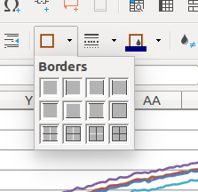
The LibreOffice icons are poorly designed and too hard to see in the latest Ubuntu 16.04 version of LibreOffice (5.1.4.2). The problems are that
* the red colour on the menu is misleading as it suggests that the button is to control border colour, but it's not.
* the grey background fill inside the icons is quite dark and makes it difficult to distinguish the subtle difference in border shapes on the different icon options
* the white colour used to imply the absence of a border doesn't have any visual correspondence to how borderless cells appear in the main window (they don't appear white; they appear black and thin)
I suggest reverting to the earlier icons, which were much easier to see, and I suggest a more general review of the icons being distributed with LibreOffice, because this issue is likely to cause significantly reduced usability especially for older users.
