
Make the toolbar/statusbar font smaller
Bug #92661 reported by
Eugenia Loli-Queru
| Affects | Status | Importance | Assigned to | Milestone | |
|---|---|---|---|---|---|
| GTK+ |
Unknown
|
Low
|
|||
| gtk+2.0 (Ubuntu) |
Triaged
|
Wishlist
|
Ubuntu Desktop Bugs | ||
Bug Description
One problem with the toolbars/statusbar on gtk/gnome apps is that the font size of the
descriptive text below the icons is the same size as the desktop font size. And
that font size is too big to be used as a toolbar font. Icons are stretched out
far away from each other because of that, and it makes the Gnome desktop look
ugly and disconnected.
Please make the font size of the toolbar smaller than the desktop font. For
example, if the desktop uses Vera size 10 (which is a good readable font size
for general usage), use Vera size 8 for toolbars. Don't go below 8 though.
Mac OS X also uses smaller font for its toolbar font than the rest of the
dekstop. It is small DETAILS like these that make OSX feel better than other OSes.

| Changed in gtk: | |
| status: | Unknown → New |
| Changed in gtk+2.0: | |
| status: | Confirmed → Triaged |
| Changed in gtk: | |
| importance: | Unknown → Low |
| Changed in gtk: | |
| status: | New → Unknown |
To post a comment you must log in.
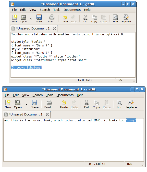
Here is a showcase of how it would look like.