
[address book] Delete dialog is inconsistent with design recommendations
Bug #1517560 reported by
Sebastien Bacher
This bug affects 1 person
| Affects | Status | Importance | Assigned to | Milestone | |
|---|---|---|---|---|---|
| Ubuntu UX |
Triaged
|
Medium
|
Olga Kemmet | ||
| address-book-app (Ubuntu) |
New
|
Low
|
Unassigned | ||
Bug Description
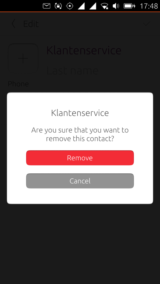
Similar to what is reported on bug #1389617 for camera/gallery, when deleting a contact the current dialog has some issues
* it uses yes/no descriptions rather than verbs, it makes interaction more difficult (if you tap "delete" you now what you are doing, if it's "yes" you need more context)
* the colors are non standard, the delete action is green where https:/
Related branches
lp:~seb128/address-book-app/delete-dialog-tweaks
- PS Jenkins bot: Needs Fixing (continuous-integration)
- Ubuntu Phablet Team: Pending requested
-
Diff: 25 lines (+4/-4)1 file modifiedsrc/imports/Ubuntu/AddressBook/Base/RemoveContactsDialog.qml (+4/-4)

| summary: |
- Delete dialog is inconsistent with design recommendations + [address book] Delete dialog is inconsistent with design recommendations |
| Changed in ubuntu-ux: | |
| status: | New → Triaged |
| importance: | Undecided → Medium |
| assignee: | nobody → Olga Kemmet (olga-kemmet) |
To post a comment you must log in.
that dialog use actions for the buttons and red for the delete one