[toolkit] ListItem.Header should be horizontally aligned with standard elements

Bug #1190234 reported by Sebastien Bacher
6
This bug affects 1 person
Affects Status Importance Assigned to Milestone
Ubuntu UI Toolkit
Invalid
Undecided
Unassigned
Ubuntu UX
Invalid
Undecided
Xi Zhu

Bug Description

Using saucy and the current toolkit version:
ii qtdeclarative5-ubuntu-ui-toolkit-plugin:i386 0.1.46daily13.06.05.1-0ubuntu1

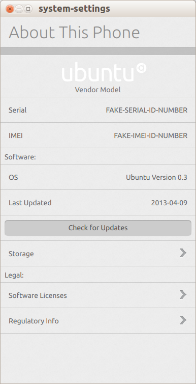
I'm working on the "About this device" panel:
https://wiki.ubuntu.com/AboutThisDevice#Phone

This panel has 3 sections, I grouped them using an Header element for "Software:" and "Legal:" items, but the result is not really conform to the design.

Saviq recommended that Header elements are the right ones to use there, and that we should adapt the look of the standard widgets if they don't provide what the designers expect.

I'm adding a screenshot of my current version of the UI

Revision history for this message
Sebastien Bacher (seb128) wrote :
summary: - ListItem.Header should be horizontal aligned with standard elements
+ ListItem.Header should be horizontally aligned with standard elements
Revision history for this message
Tim Peeters (tpeeters) wrote : Re: ListItem.Header should be horizontally aligned with standard elements

I think this bug is invalid, because the header indentation is different by design.

I added this bug to Ubuntu UX to get feedback from design.

Revision history for this message
Sebastien Bacher (seb128) wrote :

Well, I filed this bug because:
- mpt said that he would (as the designer for the UI I'm working on) prefer to have items aligned
- Saviq said that I should use the Header standard widget for that usecase and file a bug if it conflicts with what design want
- it provides a better discussion medium than IRC pings

I'm fine either way, if that's not the right widget to use, which one do you recommend to fullfill the design requirements?

Revision history for this message
Matthew Paul Thomas (mpt) wrote :

Sebastien, the introductory labels are not headers. They are just labels, and should use the same font, color, and alignment as labels inside list items do.

A clear example of this is in the "Cellular" settings, which has "Choose carrier automatically" and "Choose carrier manually" options. <https://wiki.ubuntu.com/Networking#cellular> The "Choose carrier:" words are presented as an introductory label, but that doesn't mean they should use separate alignment from the rest of the phrase.

Similarly in the "Lock when idle" screen, the phrases "Lock the phone when it is not in use after 1 minute" etc are split across an introductory label and a series of list items. <https://wiki.ubuntu.com/SecurityAndPrivacySettings#Phone> The whole of the phrase should use the same font and alignment.

I can imagine using headers to group items in a long screen. (And if I did, I'd think their current presentation was bizarre.) But I haven't used any headers in the System Settings design.

Revision history for this message
Sebastien Bacher (seb128) wrote :

Sorry Matthew, I think I got confused looking at http://design.canonical.com/wp-content/uploads/phone-overview-visual.small_.png where the labels of the sections look different from the text used for the standard items ... I will change those to use standard entries

Changed in ubuntu-ui-toolkit:
status: New → Invalid
John Lea (johnlea)
summary: - ListItem.Header should be horizontally aligned with standard elements
+ [toolkit] ListItem.Header should be horizontally aligned with standard
+ elements
Changed in ubuntu-ux:
assignee: nobody → Xi Zhu (xi.zhu)
Changed in ubuntu-ux:
status: New → Invalid
To post a comment you must log in.
This report contains Public information  
Everyone can see this information.

Other bug subscribers

Remote bug watches

Bug watches keep track of this bug in other bug trackers.